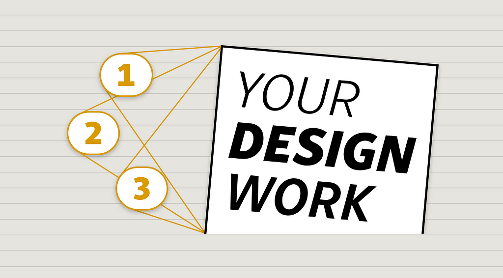
Three lifelines to call on when you’re feeling stuck creatively
I’ve been a professional designer for over twenty years, working across a wide range of media: UX/UI, motion, branding, web design, mobile apps, and creative coding. Most lately, I’ve been developing my font design practice. Design is a long journey of exploration and growth. You live through bouts of self-doubt and self-criticism but ideally, you also experience many moments of pride in the work you put out into the world. As a designer, you strive to create captivating work that reaches people and has impact.
I’ve been reflecting on how you can make your design work better, especially when you’re feeling stuck. While working on my first original font design, Peasy, I realized the same advice that works in my day job in product design is true in type design as well.
If you’re feeling stuck with your designs, here are three strategies you can call on to breathe new life into your creative work.
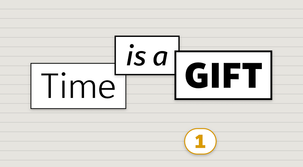
1. Time is a gift
When you work as a practicing designer, deadlines are tight, rounds of iteration are fast-paced, and time is a precious resource. However, don’t underestimate the value of stepping away from your work for a while and coming back to it later. What designer hasn’t had the experience of coming back to something you’re working on the next morning, and saying to yourself, “What was I thinking?”
When you put the work away for a time, sleep on it, and revisit your work again with fresh eyes, you get to experience it new again, and you notice things that you became blind to as you worked on it for an extended period. Flaws or missed opportunities for improvement become obvious to you when you see things anew. Time away is also a gift because the in-between time is when you do your best thinking. Some of my best ideas come to me when I’m in a state of transition and my mind is free to wander, problem solve, and make connections: showering, driving, walking, or falling asleep in bed.
I experienced “time away” to an extreme with my font project Peasy. It began as my thesis project when I was a student in the Type@Cooper West extended program in 2018, where I spent many nights and weekends learning the craft of type design and creating this sans serif typeface family. I put type design aside as the pandemic started and ended up taking a two-and-a-half year break from Peasy. When I cracked it open again, I saw so many things I wanted to change. Ideas I thought were quirky and fun originally became weird and clunky. I had so many “what was that about?” moments. But having so many things I wanted to fix and change motivated me to put in the work to make Peasy into a typeface I’m proud of and would want to use myself.
When you’re immersed in a project, sometimes the best thing you can do to propel the work forward is give yourself the gift of time. Try setting aside your work for a day or two. When you revisit it, you’ll be surprised at what you see when you see it with a fresh perspective.
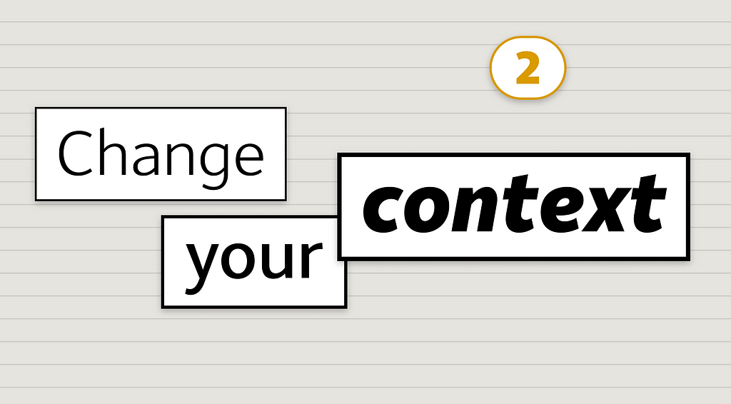
2. Change your context
Digital designers use tools like Figma to create frames, duplicate them, and make variations. Just in the normal process of working on your designs, you’re often passing through many different contexts.
A part of the workflow that’s so natural you probably don’t even think about it is changing your magnification level— you’re constantly zooming into details of the design, zooming out to get a bird’s-eye view of a full flow. You work across different contexts in terms of levels of fidelity, from sketches and wireframes to hi-fi visual designs. Another way to change the context includes creating working prototypes to experience it much closer to how an actual user would. For mobile apps, seeing it on a phone or tablet lets you try it out with the same form factor, scale, and interactions (tapping, swiping, pinching) that an end user would.
Digital designers could benefit by reviewing their work in even more contexts. Seeing it projected on a big screen can magnify details you missed on your laptop. Similarly, watching others test drive your designs (user testing or play testing) helps you see it in a new light. These days it’s rare for UX/UI designers to print out their designs, but seeing them in physical space, pasted up on a wall, can reveal new insights, inconsistencies, and connections. Printing out the screen designs also makes them more visceral, and you can better judge if they “feel” right to you.
In type design, you’re also looking at your work in a lot of different contexts. Letters don’t exist in isolation, so you always have to look at your type designs in the context of words, headlines, or paragraphs. You want to look at the curves and shapes zoomed way in to look at the details, and zoomed out, so you can see how the positive and negative spaces work together and look at the overall “color” of the type. Your type design tools let you reverse glyphs like ‘S’ upside-down and mirrored, so you can check that your curves are balanced and not lop-sided in any direction.
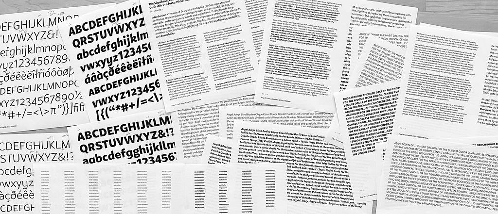
You want to see your typeface in the context you intend it to be used. For Peasy, I spent a lot of time typesetting and reviewing book, magazine, or web page layouts at body text sizes. Printing out your proofs at high resolution is key. You want to see the type design is well-balanced and works across many different settings and contexts.
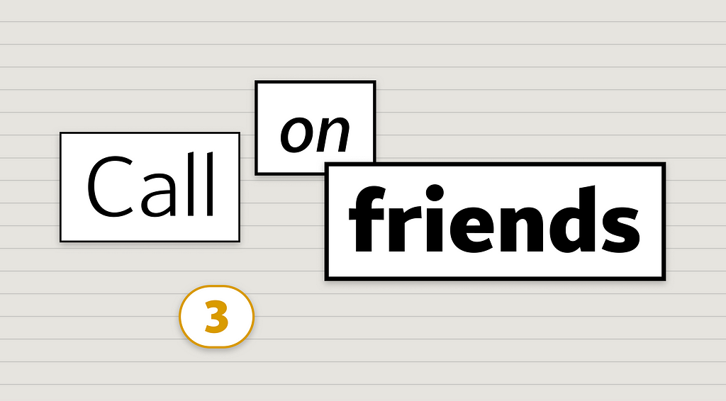
3. Call on friends
Your third lifeline is the “phone-a-friend.” Much of the practice of design is a solo event. You’re at your desk, staring at the screen, moving pixels or paths with your mouse. But design doesn’t have to be a solitary endeavor. You can reach out to friends and colleagues for feedback and critique. Ask them to walk through your designs and talk out loud about what they are seeing and thinking. Set up a time to “pair design” and jam on the designs in a collaborative tool like Figma. Outside perspectives can offer invaluable insights that you might have missed, identify weaknesses, and uncover areas for improvement.
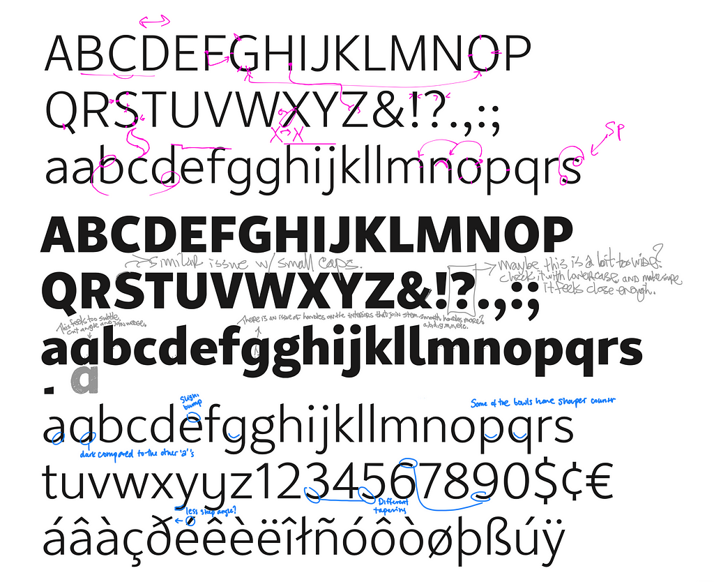
I’ve found type designers to be a uniquely generous community. Many type designers I’ve met give their time freely to offer opinions and help others improve their craft. When working on Peasy, I got invaluable feedback (in the form of emailed suggestions, 1:1 Zoom sessions, and liberally marked-up PDFs) from a whole crew of friends and colleagues.
If you seek feedback, be open to both praise and constructive criticism. Try not to defend your designs too hard and listen to what others are trying to tell you. Feedback is a gift and a powerful tool for growth if you want it to be. I believe most people in your life are kind and want the best for you — try calling on friends, colleagues, or experts you respect to give you honest and open advice.
When your design work is leaving you feeling stuck, you can always call on these three lifelines: time, context, and feedback. Give yourself the opportunity to take a break so you can approach your work with fresh eyes, see your designs in different and unexpected contexts, or seek input from those you trust. By incorporating these practices into your creative process, you’ll improve your craft and elevate your design work to a new personal best.
Peter Cho is founder of Typotopo.com, a studio for font design and experimental typography. Learn more about his original typeface Peasy at this link.
![]()
How to ‘un-stuck’ your design work was originally published in UX Collective on Medium, where people are continuing the conversation by highlighting and responding to this story.