
In order for any website to be truly successful, there are many different aspects that need to be considered and put into motion. For instance, aspects such as visual design, the consistency of your brand, and overall usability are all things that can determine whether or not a user is truly happy with your website.
Users should not only be able to easily find their way around your entire website and trust both you and your content, but they should also be able to obtain an amount of fun out of using your website as well.
Pay attention to a website’s footer
The home page and header are two of the most common things that designers tend to focus on the most when it comes to constructing a website. As a result, the footer generally becomes more of an afterthought, practically becoming the prime location for content such as disclaimers, copyright information, etc.
However, the footer does not always have to be this way, nor should it ever be. In fact, the footer is just as much important as the header is, perhaps even more so. This is because the footer serves as the last “port of call” for many of your website’s visitors.
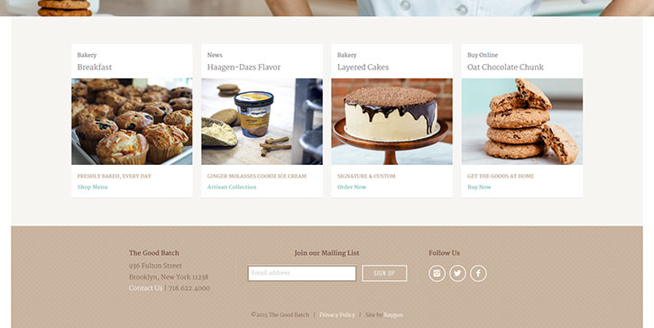
This is generally where you will want to include the opportunity for these individuals to register for some kind of service, check out another article elsewhere on your website, or request details of how to get into contact with you with any questions or concerns that they may have.
Regardless, start by asking yourself exactly what it is that you want your visitors to see once they reach the bottom of your page.
Why is it important, again?
Designing website footers the right way is extremely important because they essentially give users the chance to learn new information on your website. In addition, not only can it be an excellent tool in terms of navigation, but it can also be a great way to help make a first impression on others.
You should not forget that the footer should be able to provide links of high value that will enable users to navigate through the website easily.
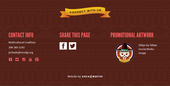
Also, it should be able to engage website users with quality content, as well as adding hooks to various social media platforms to allow for further engagement later.
Besides that, it needs to build trust with individuals and provide them with easy enough means to contact you with any questions or concerns that they may have.
Even though the footer is traditionally located at the bottom of the page, this does not, in any way, mean that you have carte blanche to slack off in terms of good design practices, especially since these footers can help you to connect with even more individuals.
Make it visual
The most basic and effective aspect of any footer is the visual appeal of it. This is even the case if you don’t include anything in your footer such as buttons or any other kind of information – the footer can still be an extremely powerful part of your website.
While you may wish to keep your website as clear and simple as possible, you also will want to keep it from looking sterile and boring at the same time. Regardless, consider adding some kind of visual details to your footer in order to help grab at the attention of your users.
Focus on your brand
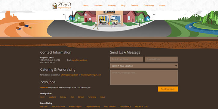
Another great use for the footer of your website is to showcase information regarding your brand, as well as its overall message and other aesthetics. While a footer can be a great way to enable navigation, a marketing team can only do so much on the off-chance that individuals are not able to find the information or other things that they are looking for on your website.
Regardless of the design style you ultimately choose to go with, it’s important that you ensure that it goes along with the general purpose of the footer.
Keep it clean
This is obviously one of the most important keys in any kind of design process that is always worth repeating in any case. When you are working with a great deal of information, utilizing a simple design style is the best way to go.
This is especially the case in terms of working with a footer. Always make sure that you use clean elements and plenty of space, as well as purposeful organization.
Take the time to think about what elements should be in your footer the most while, at the same time, avoiding the use of any kind of clutter.
Promote products or services
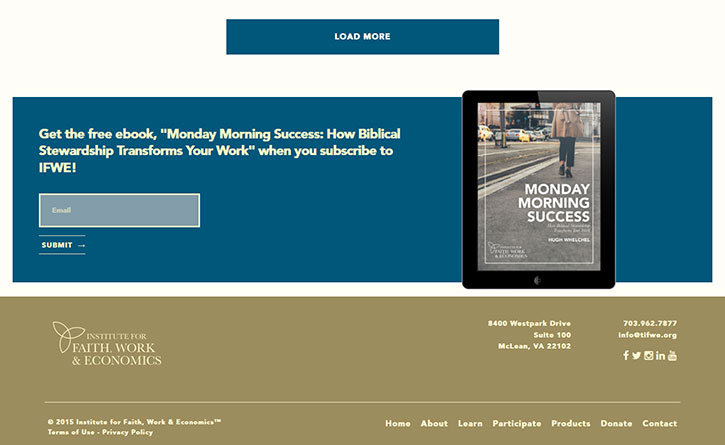
If you operate a website that is designed to sell various products or services, footers are an excellent way to get individuals to act on these things.
They act as great reminders of what a user has just seen, as well as the many different benefits that are offered should they decide to act on these offers. In cases like this, footers should be seen as more persuasive rather than informative, and should also give incentives for them to take action as soon as possible.
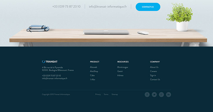
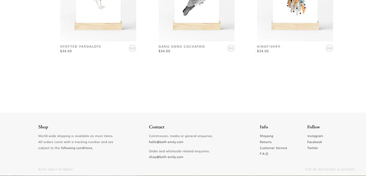
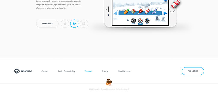
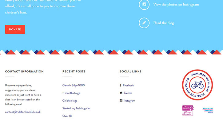
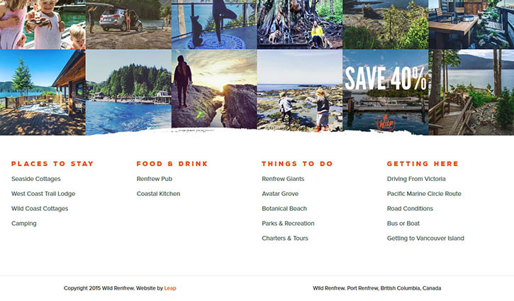
Elements to be found in a footer
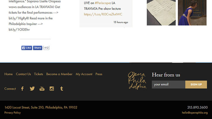
There are some things that are generally supposed to be located in a footer. These are things that may be expected by individuals who visit your website, and these can include the following: contact information, links to social media platforms, navigational links, various information regarding copyright, links to terms and conditions, and/or privacy pages.
There are also some other general ideas of what you should include in your own footer in order to help attract even more attention.
All of your necessary contact information that you feel comfortable giving out and your company’s logo. If you’re just an individual, include a short biography and photo as well as a listing of articles written by you.
Designing the footer
Any kind of website design should always have a great style attached to it no matter what. Not only does it help to improve the look of the website, but it also help to improve the overall visualization of all of the website’s different content. Here are some useful tips to keep in mind when working on your own footer.
Have a good visual hierarchy
Users should be able to look at information without ending up getting confused in the long run. Hierarchy is also extremely important to showcase as well. The title should come first, then a little space, followed by the content of the footer.
Good list styling is something that is especially. It’s essential to adequately space things out because it will help to improve both focus and legibility.
Good typography is also something good to keep in mind, as a good footer should be both scannable and cleanly laid out.
Pay attention to white space
White space is another thing that is crucial in terms of footers because, at least when it comes to column layouts, it helps to draw a user’s eye to each different content block.
However, keep in mind that “white space” does not literally have to be white – this term just refers to empty space that contains no content whatsoever. White space can also be used to help separate the top of the footer from the content contained within the footer itself.
Separate your footer from the content
All footers traditionally have a darker-colored background, while others have backgrounds that contain either graphics or illustrations. Regardless of the route that you decide to take, ensure that the content contained within the footer is separated from the footer itself.