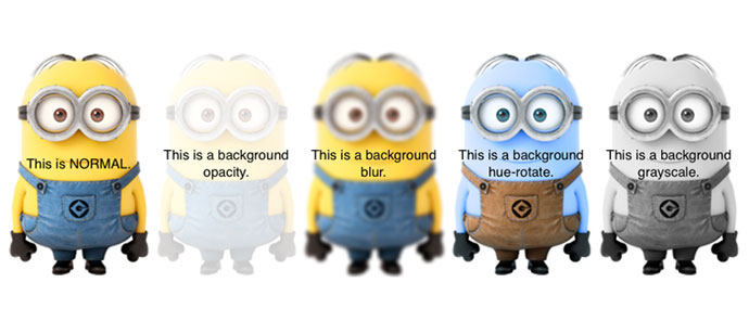
CSS filters can be used to create some fantastic image effects. They allow you to modify the display of images in a variety of ways, some of those ways of displaying images as black and white, grayscale, sepia, invert, saturate, hue-rotate, blur and more. Though, this feature is not yet widely supported, but you can use CSS filter polyfill as browser fallback. So to get our feet wet with CSS Filter Effects, here are some useful tutorials and examples to help us to create fantastic image effects.
Introducing CSS shaders: Cinematic effects for the web
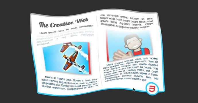
The following video shows a more sophisticated effect: when transitioning from grayscale to color, the content “wobbles” for a short while and, simultaneously, a color-swipe goes across the content, bottom to top.
Advanced CSS filters
As a result, you’re now able to apply filters to images before using them in backgrounds. You can think of it as a polyfill for background-filter (or background-opacity, background-blur, whatever), but it’s much more powerful.
CSS Filters are awesome!
CSS Filters introduce a few useful effects and some image adjusting functions, namely blur, drop-shadow, contrast, brightness, and a few others which can be really useful if used properly.
Frosting Glass with CSS Filters
This article will examine one such effect, frosted glass, and how CSS filters provide a cleaner, more flexible solution than static images.
Getting started with CSS custom filters
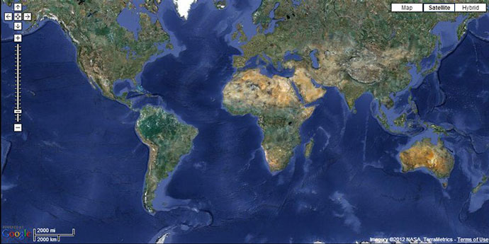
CSS custom filters, on the other hand, allow to create completely new types of effects where you can control not just parameters of an existing effect but also the define the very nature of the effect using shaders. For example here a map embedded into the document was transformed into a lit textured sphere:
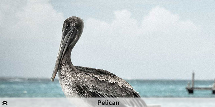
Cross-Browser Image Grayscale with CSS
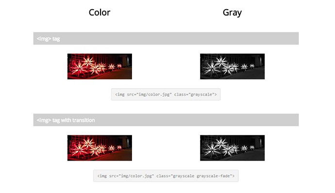
Make an image grayscale in all browsers.
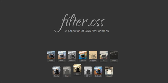
Filter.css
A couple CSS filter combinations to get you started.
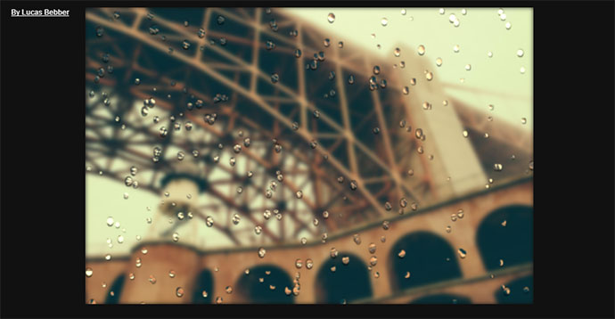
CSS Raindrops on a Window
Eamples of great use CSS filter blur effects.
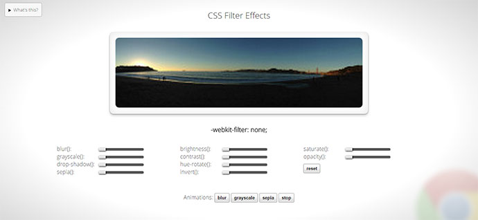
CSS Filters
Demo showing CSS Filter Effects 1.0, specifically the filter functions, which are being implemented in Webkit.
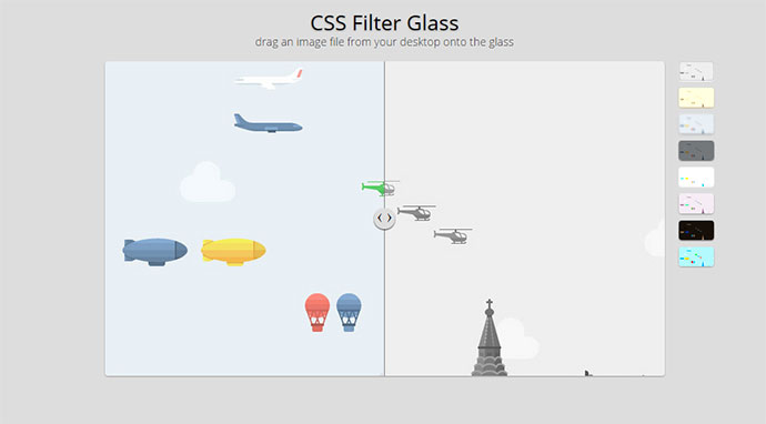
CSS Filter Glass
Examine CSS filters through fluid resizable window glass. You can drag and drop an image file from your desktop onto the glass and see the filters manipulate your image live. Available filters are: grayscale, sepia, blur, brightness, contrast, invert, hue-rotate and saturate.
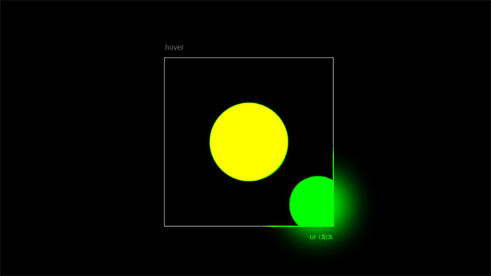
Playing with CSS Filters
Using contrast() to posterise the image, in turn rounding the overlapped blurred regions of the two circles to a block colour.

