Gradients, welcome back. Although it seemed that they had gone forever and without a trace, as practice shows, history always repeats itself, and material design, flat style and iOS8 inspired patterns have prepared the fertile ground for it. As a result, one cannot but agree that there is a rise in popularity in this direction. Not only do gradients affect mobile UIs but also extend their influence over website designs. Today we are going to take a look at 20 visual case studies of this.
Unlike the conventional use of gradients i.e. solely as backgrounds, the modern solution implies the utilization of gradients for various purposes. Subtle overlay screen with a low opacity, complimentary canvas for animations, focal point or even an instrument for giving prominence to selected elements – these are the most common ones. The point is not to destroy the aesthetics but to preserve harmony; that is why in the majority of cases white color, solid typography and outline graphics are chosen as the gradient’s primary companions, since they, like no others, are able to achieve consistency. So let’s explore our examples.
Transparent Gradients in Web Design
3 Minute Inc
3 Minute Inc has managed to ace a magnificent look. A gorgeous semi-transparent gradient overlay screen hides a dynamic video background in order to smoothen the appearance of the front page, vividly highlight content and not overwhelm users. White used as a core color is the best choice here.
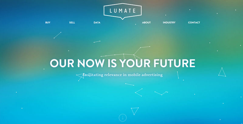
Lumate
Fantastic gradient background compliments the foreground content to a high level. As a result, a streamlined navigation bar, logotype and tagline naturally stand out from the canvas, even with the ultra-thin type. Fancy animated elements significantly add to the overall aesthetics.
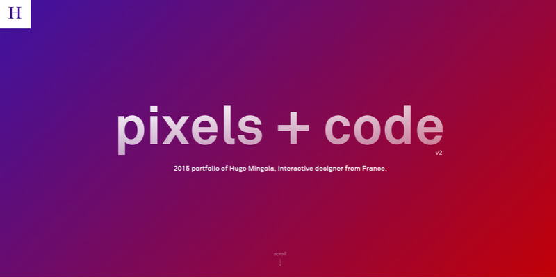
Hugo Mingoia
The personal portfolio of Hugo Mingoia evokes wonderful feelings from old-time days when drastic gradients ran the show. This blast from the past successfully keeps up with the current tendencies and looks modern and up-to-date.
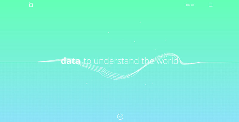
I.ngen.io
I.ngen.io owes its splendid appearance to the combination of a brilliant gradient background that radiates emotions and a small yet eye-catching animation that produces a powerful first impression. The website features a series of gorgeous visually-appealing gradients that naturally bring the content above everything.
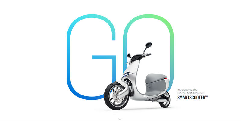
Gogoro
Gogoro smartly employs iOS8-inspired gradient in order to set the tagline off the canvas. From blue to green, with a delicate and smooth transition, the lettering draws the attention and easily takes up a central position. White solid color backdrop paired with tons of white space also helps to focus the whole attention on it.
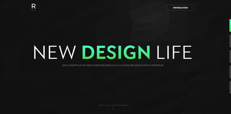
Robin Noguir
Robin Noguir utilizes a gradient as an accent in order to give a selected part of the sentence a higher priority. Not only does the artist explicitly stress out a key word ‘design’ but also slightly diversifies the dark background, providing the home page with an obvious focus anchor.
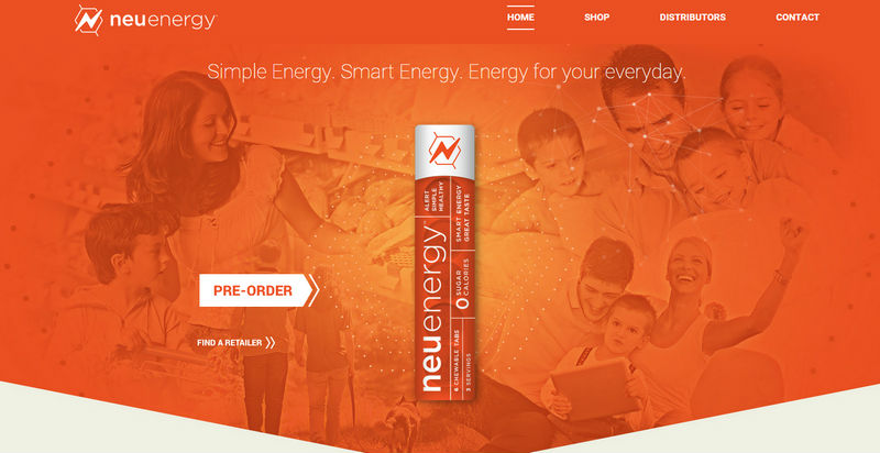
Neu Energy
Neu Energy opts in favor of a warm and energetic gradient that capably overshadows the lavish photo background and throws a spotlight on the content. Moreover, it serves as an excellent backdrop for complementary animations. The homepage skillfully balances content and dynamic elements due to the flat style, clear typography, and charming screen overlay.
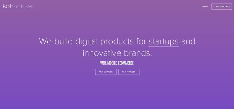
Kohactive
Kohactive utilizes a beautiful violet gradient that sets the rhythm of the project and provides the foreground elements with a solid and contrasty foundation. Elegant, ultra-thin typography in tandem with subtle ghost buttons effectively excel from the canvas and add to the design, making the front page look utterly fantastic.
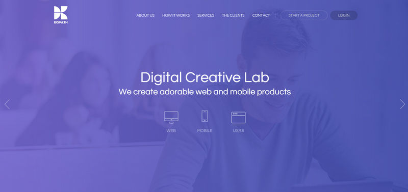
Eqipazh
Eqipazh maintains a wonderful simplistic feel where the gradient background saves the website from looking boring and dull. As usual, the designer goes for a white color and sharp and clean typography that perfectly collaborate with such a backdrop. Nifty contour graphics and ghost button on top also stand out without a hitch.
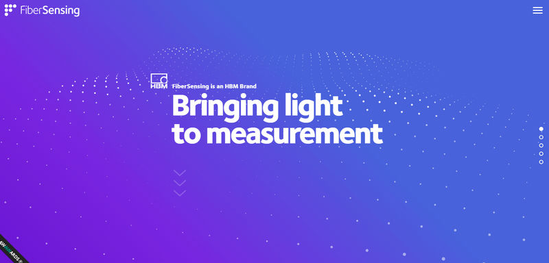
Fiber Sensing
Fiber Sensing depicts a harmonious symbiosis of a dynamic background and a static foreground. Such a solution enables the page to not overpower users and at the same time focus the whole attention on the content. Sumptuous gradient-based canvas highlights the tagline, bolster the brand, and reinforce a tech vibe on the page.
Alex Kratena
Alex Kratena leverages a truly ‘hot’ gradient that brings energy to the website and suits the video background, enhancing a dynamic feel. As a result, the ‘welcome’ section looks almost explosive and enticing.
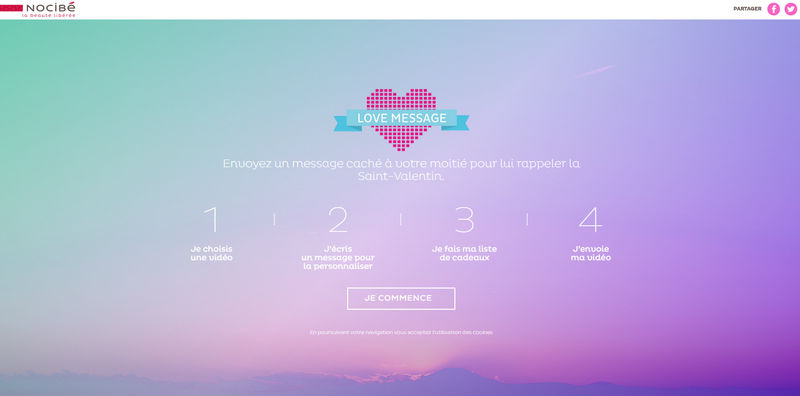
Love Message
Love Message features a pleasant and charming gradient background that elegantly delineates the content and contributes to the overall atmosphere. Here, every part exudes an image of love and passion that naturally showcase the attitude and spirit of a project.
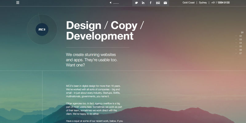
MC3
Here the gradient serves as a complimentary tool for a spectacular landscape backdrop. Used as some kind of a filter, each subtle gradient from a series significantly enriches the photo background and helps to express the big and bold personality of the team behind the project.
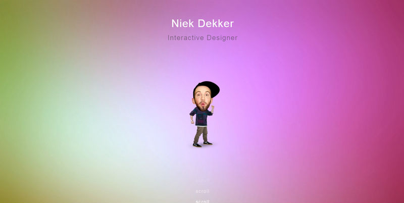
Niek Dekker
Niek Dekker has an original take on its canvas and opts for a time-tested gradient background. The latter lightens up the overall atmosphere and adds a little zest. Moreover, such choice of colors is suitable for a funny twist with a figure of the designer.
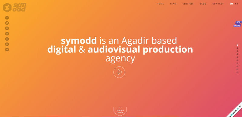
Symodd
Here a warm, positive gradient backdrop gives an edgy feel to the front page, making it look radiant and refined. It has managed to stand in a stark contrast to both the solid white typography and the dark logotype. Moreover, every section of the website has its own lavish gradient background that instantly strikes the eye.
Huggable
Huggable is a representative example of the professionally embodied “less is more” ideology. The landing page has a brilliant minimalistic look that is rich in whitespace. The latter creates a pleasant open feeling that enlivens the website design. The smooth angled gradient fits into the composition ideally, skillfully prettifying the page.
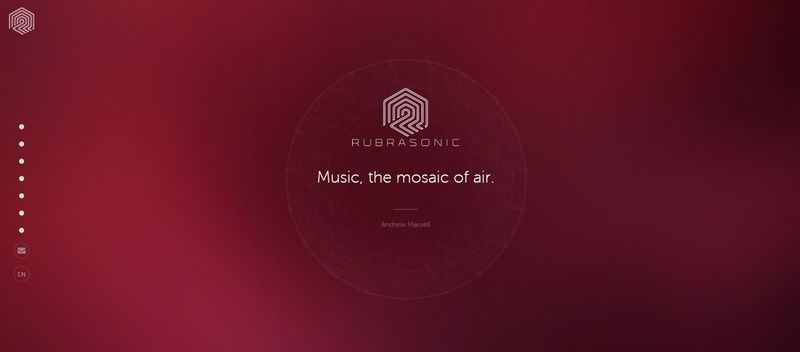
Rubrasonic
Rubrasonic features a deep and lush gradient backdrop that despite being based on a red spectrum does not overpower users. On the contrary, it evokes quite positive emotions that improve the atmosphere. The website has several other gradients that also beautify backdrops.
Pixel Palace
Pixel Palace has a charming front page design that just sparkles. The brilliant gradient choice significantly reinforces an effect produced by a exquisite yet powerful polygonal background. Tiny complementary decorative stars in pair with subtle thin type achieve the mind-blowing overall aesthetics.
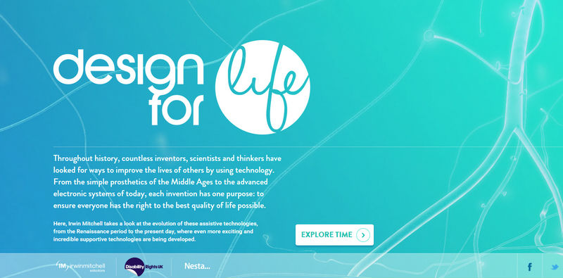
Design for Life
Here the gradient backdrop is aimed to reflect ‘life’, and with bluish and greenish tones it is certainly succeeds in this task. White color and some accompanying elements with low opacity enhance the concept and keep the theme alive.
Gifn
Gifn leverages a set of vibrant and splendid semi-transparent gradients that energize the website and express intense emotions. They overshadow image backgrounds, put the content on the center stage, and increase the visual appeal.
Conclusion
Modern gradients charm with their splendid and outstanding choice of colors that give websites top-notch looks. Used in conjunction with white sharp typography, solid graphics or accompanying fancy animations, they can work wonders.

