Recently the use of gradients in web design has been increasing, and gradients are used for a number of reasons. Firstly, they are now easier than ever to implement with the advent of CSS3 styling attributes including gradients. Another reason to use gradients is for visual effect, especially if your site is image-light.
Gradients are also starting to be used in transparent overlays on images. The currently trending geometric background patterns lend themselves perfectly to using a gradient overlay. In this article we have collected a selection of websites that use gradients on their landing pages very effectively. Some as highly colorful, some are muted and somber, and anywhere in between.
Gradients in Web Design
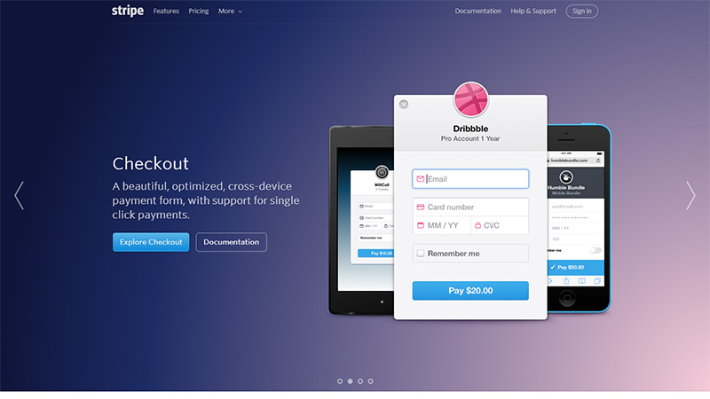
Stripe
This is a tool that enables businesses to accept and manage online payments. They use a full-width slideshow of 4 slides that are quite image-light. Therefore they have increased the visual appeal with the use of gradients. Each slide has a different colored gradient at a different angle.
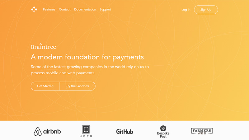
Braintree Payment Solutions
This is another tool for managing online payments. They use a simple orange to yellow gradient with some animated yellow lines floating around the background.
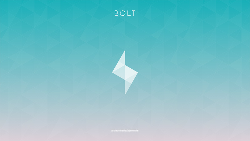
Bolt
This site is… well, I’m not quite sure what it is! It is only available in selected countries which is possibly why I can’t see anything more than the landing page. It uses a geometric background with transitioning gradients.
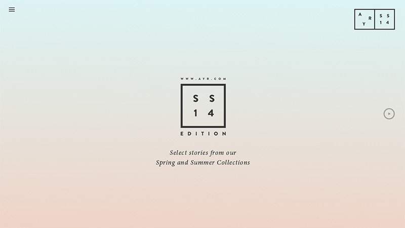
AYR Editions
This is a fashion house, and this is not their shop site, rather a landing page with some very flattering images contained in a slide show with very soft and gentle gradients as backgrounds. Each link will take you to their shop, or to their contact page.
Santosidaniel
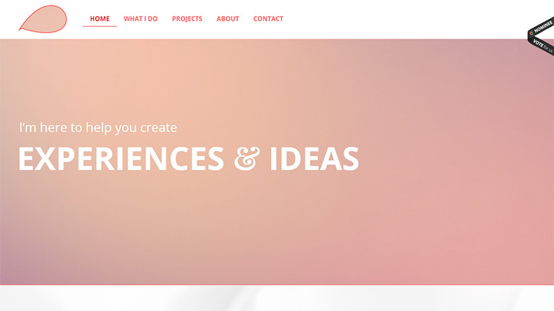
This is the portfolio site of a Brazilian freelancer called Daniel. He uses a gradient with very muted colors on his landing page – almost a blush!
W3
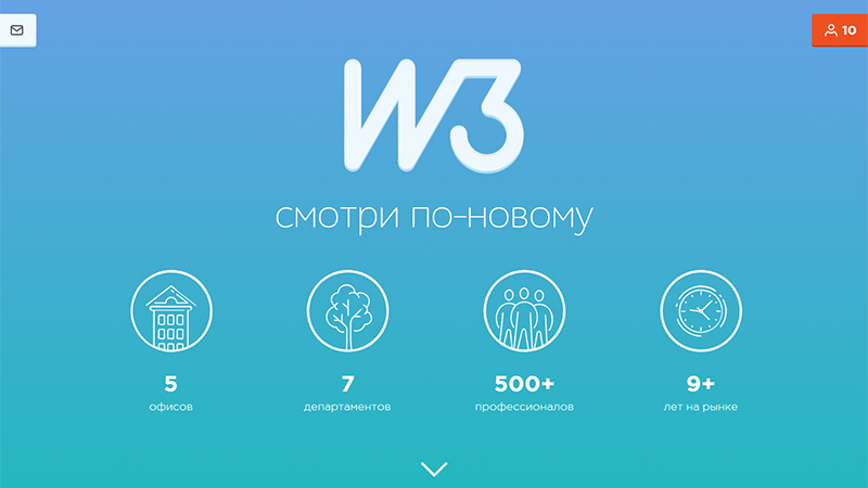
This company is advertising for staff on this site. The whole site is very clean and minimal, and they use a simple blue gradient on the landing page with white text and white line icons.
Sixpence
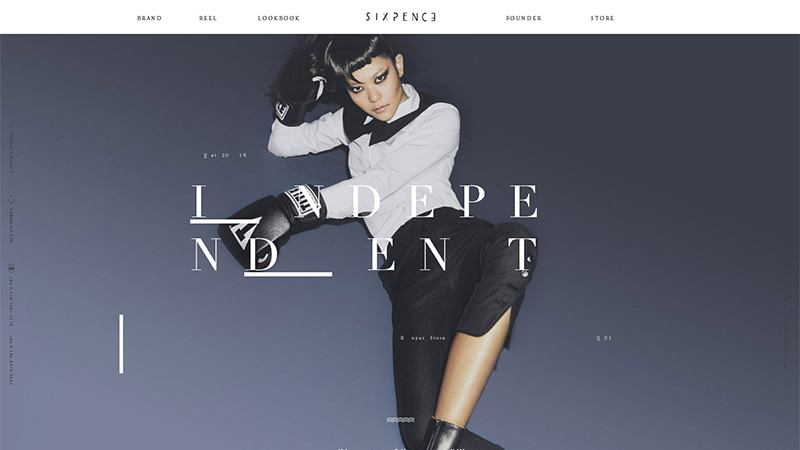
This Chinese company call themselves an ‘independent designers based buyer store’. They use a few gradients on their site, and all of them are in ‘dirty’ colors, which works well with their merchandise. There is also a very annoying slow dripping sound.
Duolingo
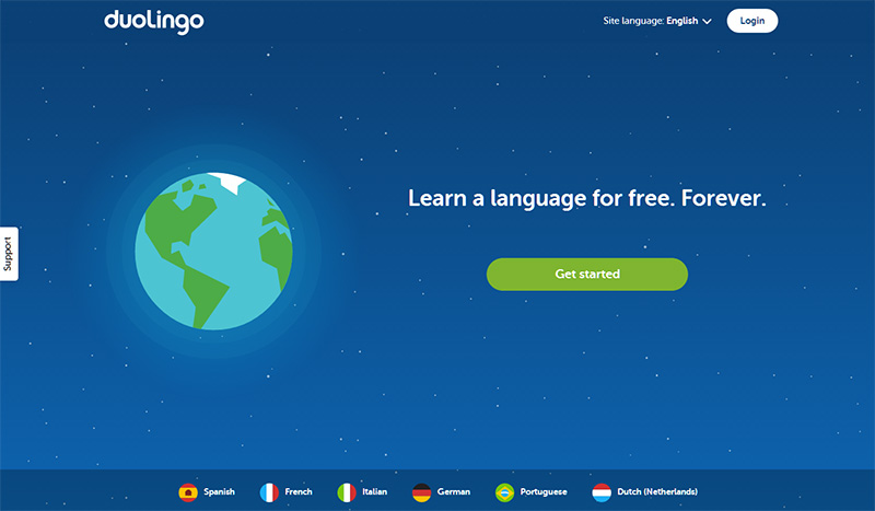
This site offers free tuition in 6 languages. They use a night sky gradient with a glow around the globe. A very clean and clear design.
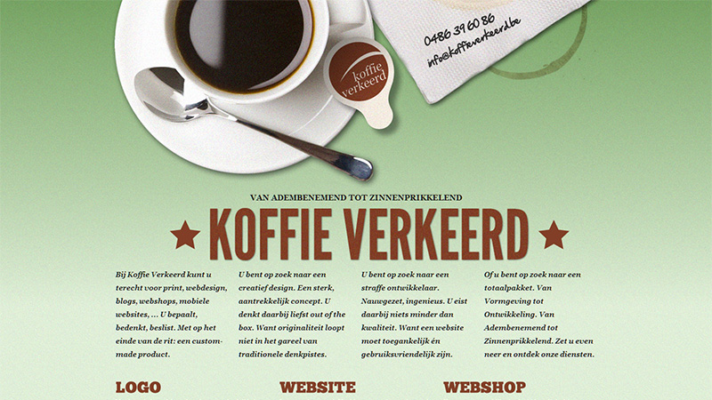
Koffie Verkeerd
The name of this web design and development agency roughly translates to ‘Wrong Coffee’. They use a simple green gradient with added noise to give it some texture.
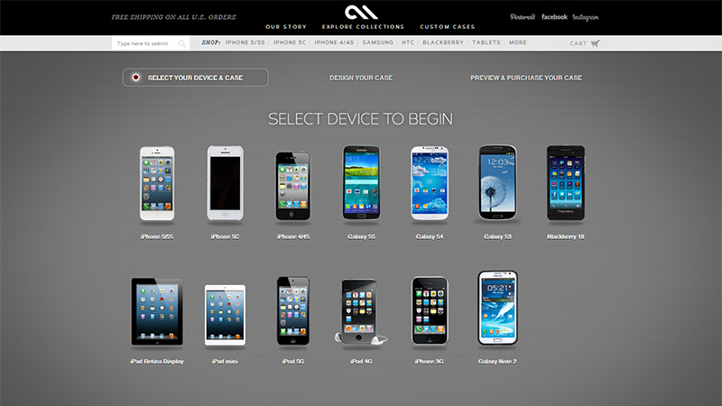
Case-Mate
This company make bespoke cases for mobile devices. On their landing page they use a black to gray gradient that is a very subtle touch.
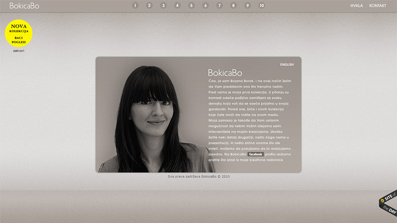
BokicaBo
This is the portfolio site of Bojana Borak, a Serbian fashion designer. She has a unique landing page, it is monochrome, but in a sepia-ish tone, and the gradient background and bottom strip has noise added for texture.
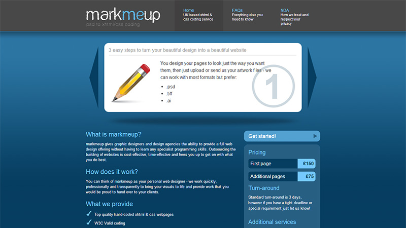
markmeup
This is an agency that offers psd to XHTML and CSS mark up service. They use a simple dark blue gradient on their landing page with the top part being noticeably lighter to highlight their slide show.
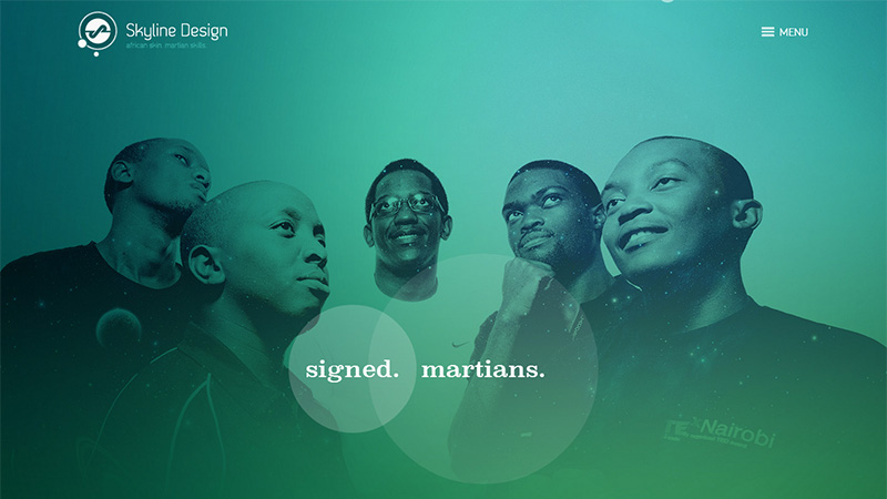
Skyline Design
This Kenyan design agency use a transparency over an image of their team. The transparency is a green gradient that works very well on the image.
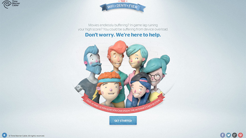
TWC WiFi-Denti-Fier
This Time Warner site walks you through a few questions about how many people in your home and the devices you use, then recommends one of their internet packages. They use a minimal light gray gradient on their landing page, highlighting the cartoon family in the middle.
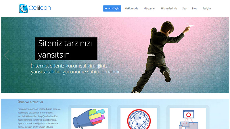
Celilcan
The landing page of this Turkish web design company’s site has a slide show that has a different colored gradient on each slide. They have not only used noise to add texture, but also a graph-paper style overlay as well.
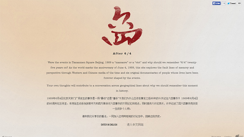
After 6/4
This is a site dedicated to the riots in Tiananmen Square, Beijing in 1989. They use a suitable somber beige-colored reflected gradient on their landing page.
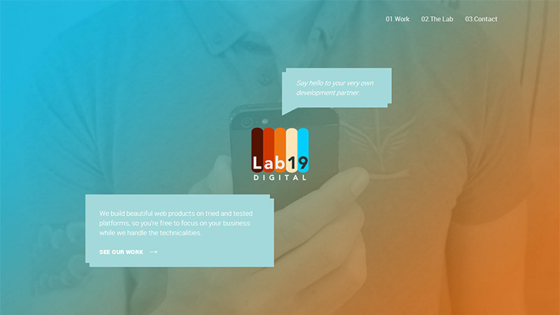
Lab19 Digital
This is another web design and development agency. They use a large image with a blue to orange transparent gradient on their landing page.
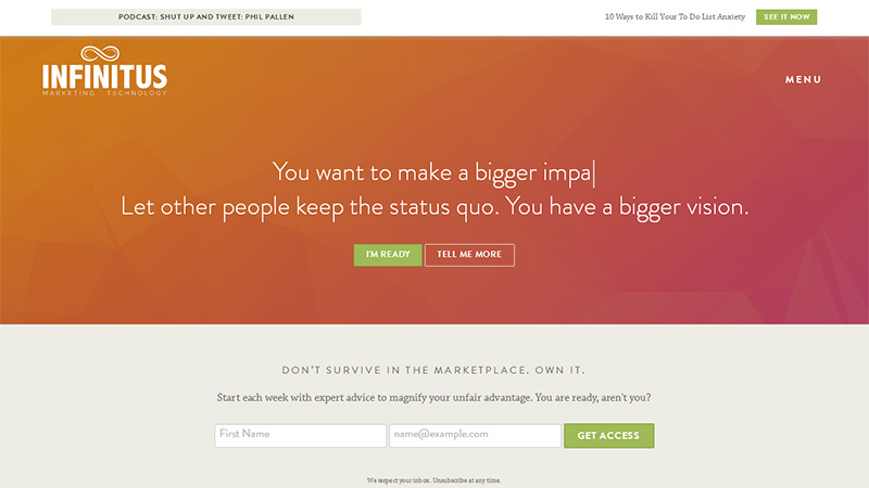
Infinitus
This is a web design, development and marketing agency. They use an orange to red gradient on their landing page and a ticker-tape style text effect.
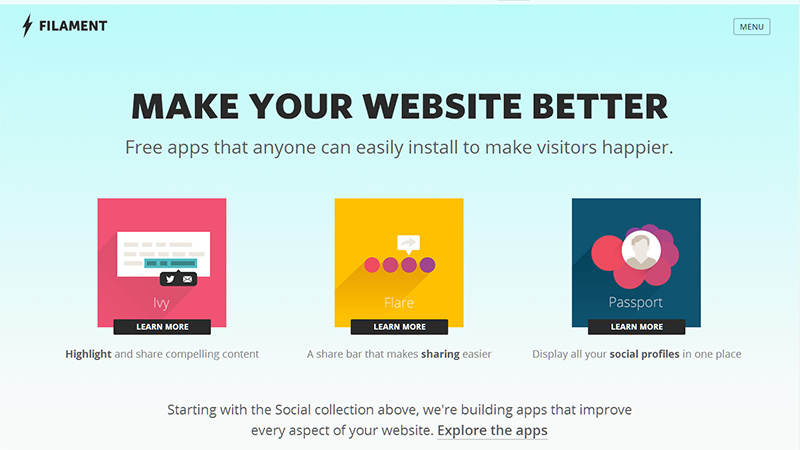
Filament
This company build apps, particularly to link to social media sites. They use a very gentle light blue gradient on their landing page, with large, black slab text and squares of bright colors.
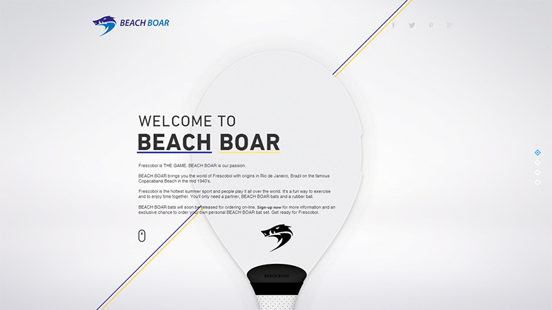
Beach Boar
Beach Boar make a bat for the game of Frescobol – and the site will tell you all about that game if you are interested. They use a gray radial gradient that gives the effect of a glow behind the head of the bat on the landing page.
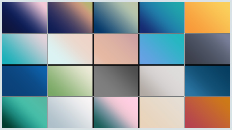
Below you will see the preview of a set of gradients that have been inspired by some of the above featured sites. They are free to download, using the button under the preview, and are completely free to use as you wish, or, of course, if you just want them for color inspiration.
Conclusion
Hopefully you will have found some inspiration among the featured designs in this round-up, and in the gradient set we have produced.
Do you like the use of gradients as large elements in web design? Have you designed such a site? Please share your thoughts and links with us in the comments section below.

