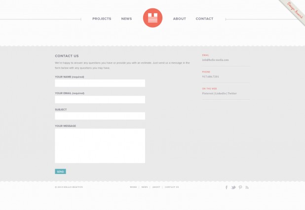
For most websites, the contact page is the last page on the sitemap and also the least important. This is a huge mistake. The contact page plays a very important role in your website as it allows potential customers to contact you, so it helps grow your own business. The contact page should be properly designed and we’ve selected 20 of the best designed contact pages to inspire you. Which ones are on you top 3 and why?
Haus
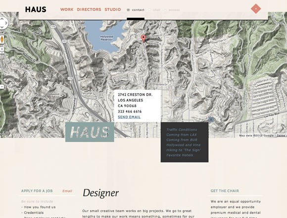
A design studio which combines design, technology and digital film making to create responsive, state-of-the-art websites, rich media campaigns, social media and more.
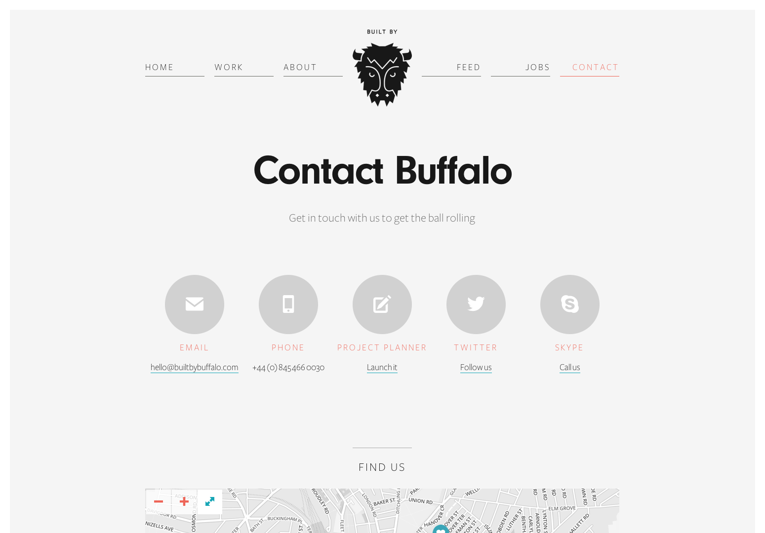
Built by Buffalo
Buffalo is a small web design & development agency based in Brighton, UK. They build websites that look great and are easy-to-use.
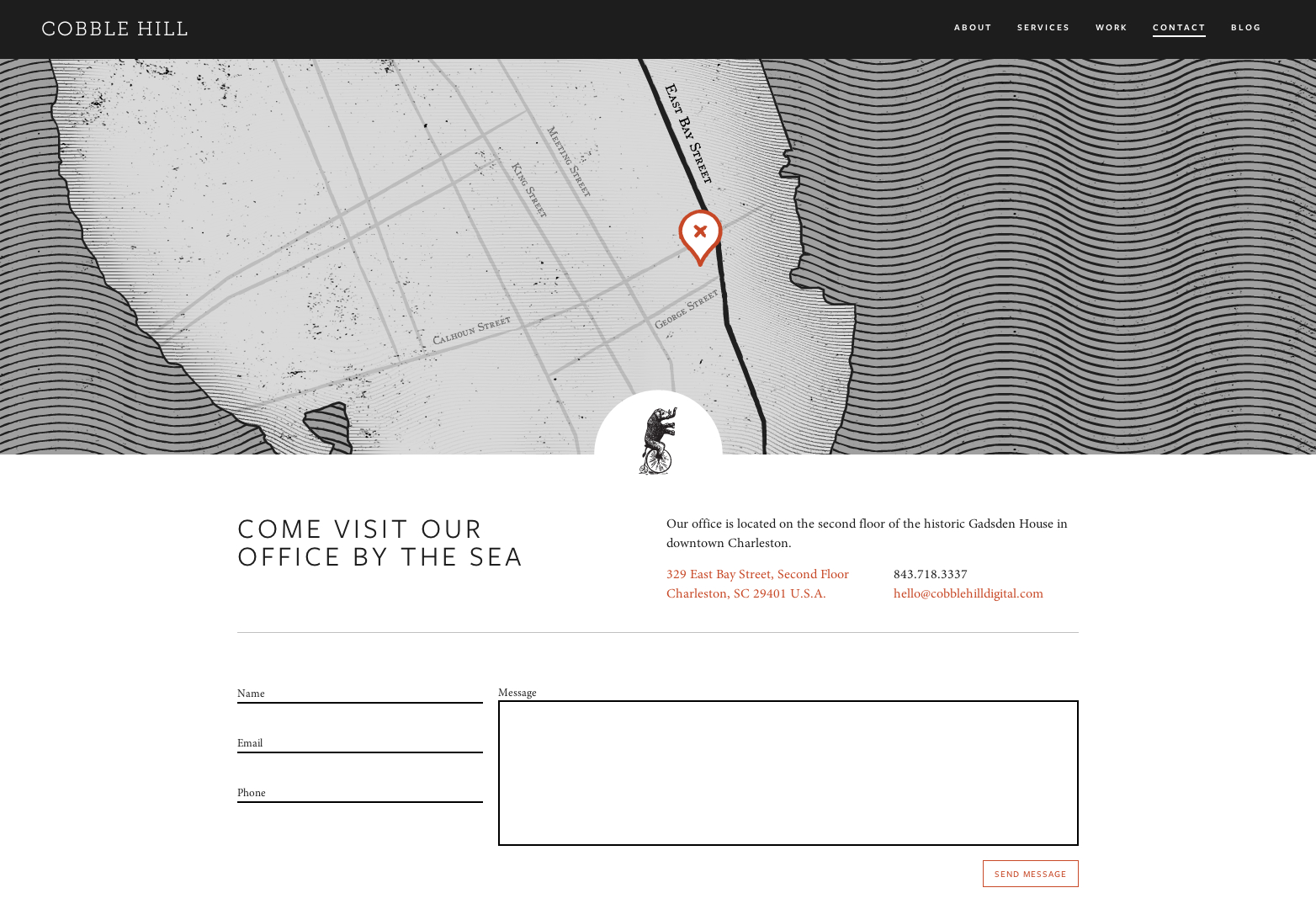
Cobble Hill
Cobble Hill is a Web Design, Graphic Design, Advertising, Digital Marketing agency in Charleston, SC. What makes this contact page stand out is the vectorized map above. Nice touch!
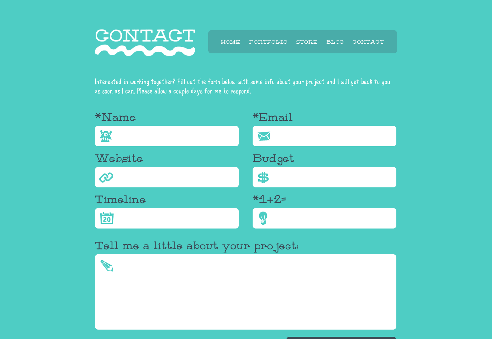
Denise Chandler
This is the web design portfolio of Denise Chandler. The contact page has a unique contact form with very nice, custom made icons.
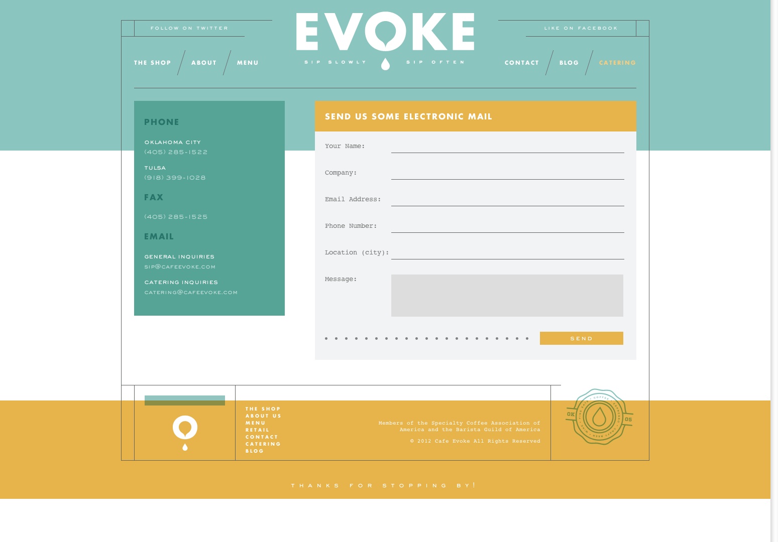
Evoke
Cafe Evoke is a great place to sip on coffee, wine or beer in Edmond, OK, and is Oklahoma City and Tulsa’s premier mobile coffee and espresso catering. The contact page seems a bit crowded at first but the info is very well spread and easy to read. The whole website has some very nice graphics and color choices.
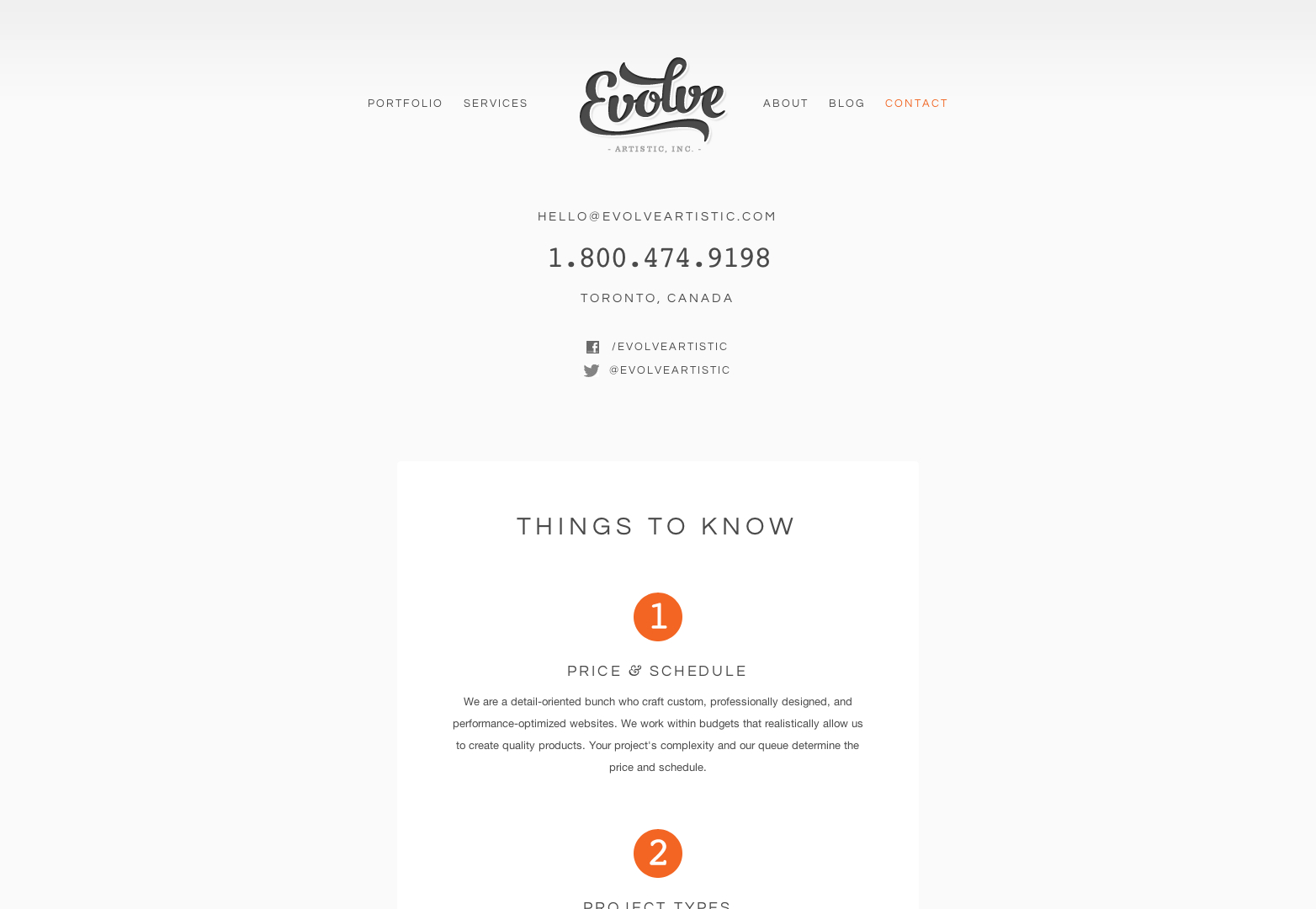
Evolve Artistic
This is a business presentation website for specialists in Website Design & Development, e-Commerce, Content Management, UI and IA. The contact page is very serious and they know how to attract potential customers.
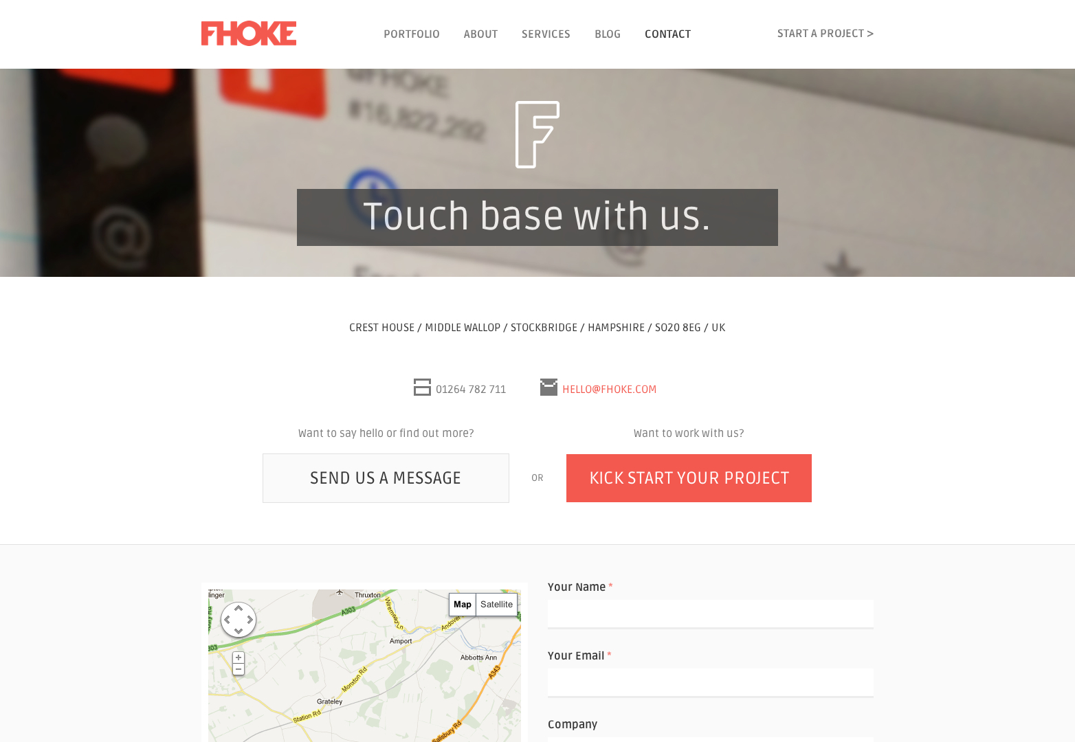
Fhoke
This is the website of an award winning Hampshire website design agency offering responsive web design, website development, branding and logo. Their contact page is simple and provides all needed info.
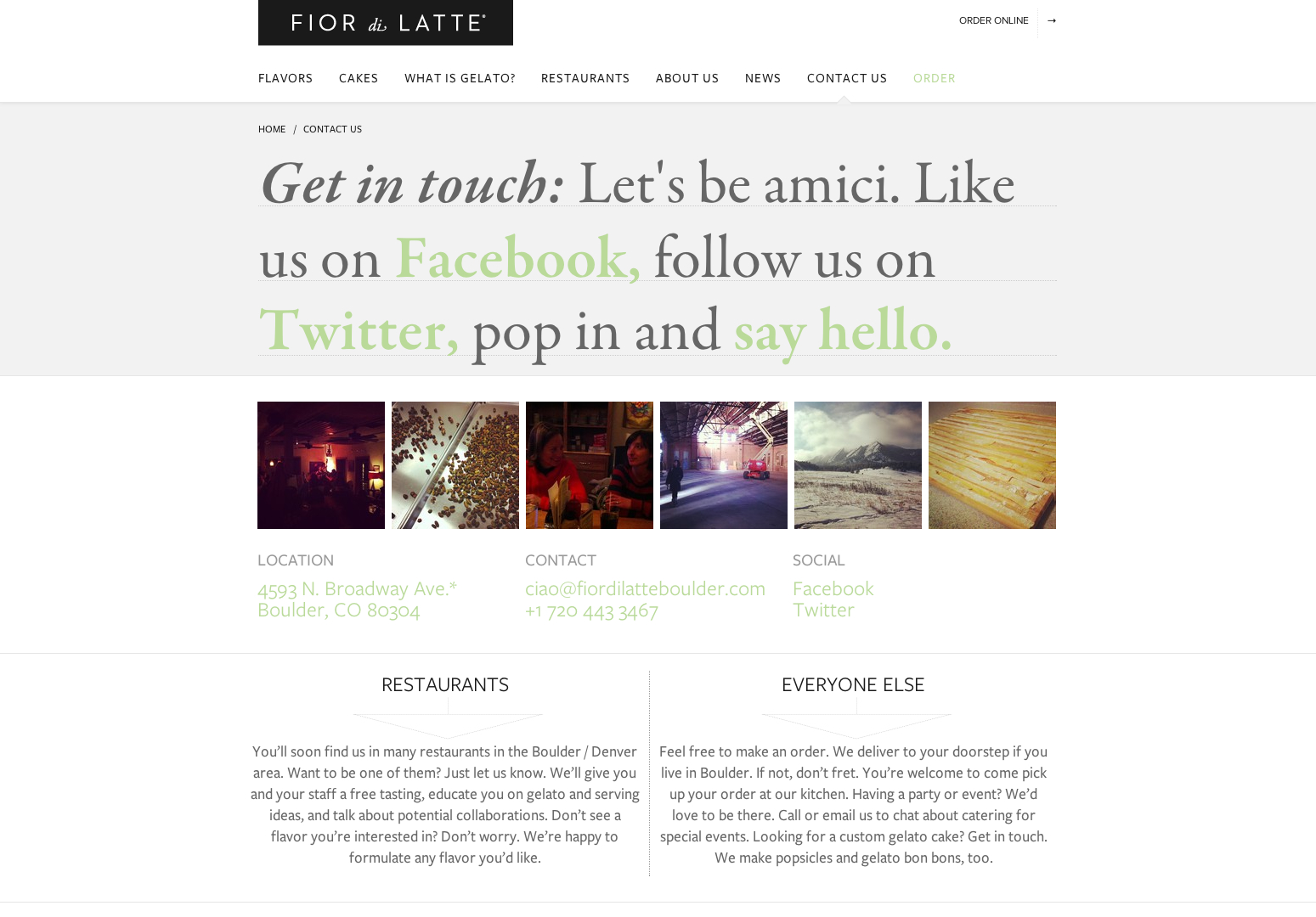
Fior di Latte
Fior de Latte makes Italian gelato and sorbet in Boulder, Colorado. Their contact page is unique because it is also used as a social media marketing campaign.
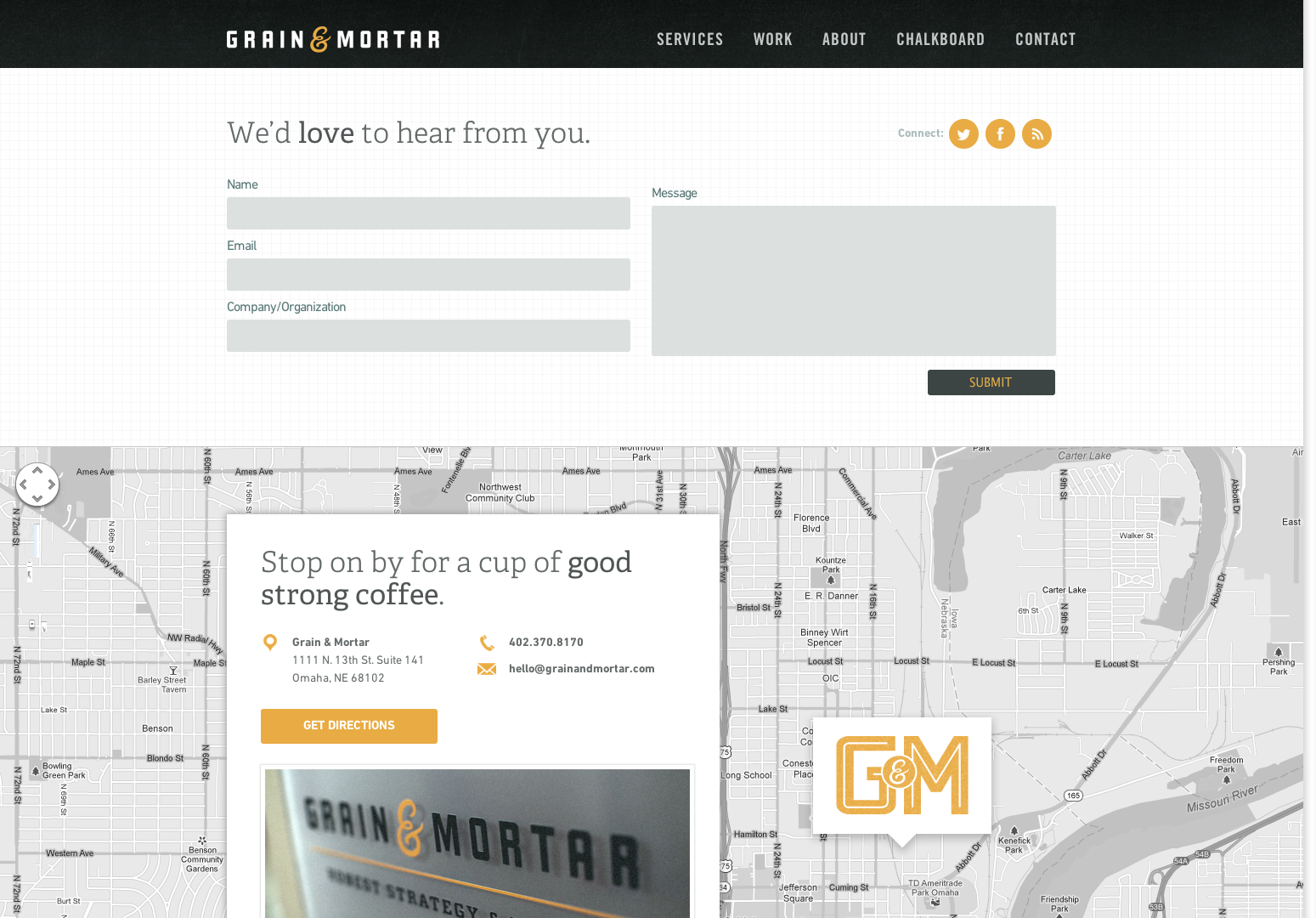
Grain and Mortar
Grain & Mortar is a strategy, branding, and design company located Omaha, Nebraska. Their website page is very well designed and it shows the contact form as the main element of the page, the map being the second.
Hello Creative Media
Hello Creative Media activates in the Online Marketing, Design & Strategic Engagement and Internet Marketing fields. Their contact page has a minimalist design and is very user friendly.
Let’s Travel Somewhere
Let’s Travel Somewhere is a project by Nisa Maier. She wants to capture the essence of every country on the planet through stunning photographs. The contact page has a unique design which fits the whole theme perfectly!
Social Design House
Social Design House is a full service design studio located in Rock Hill, SC. Their contact page is simple and effective and has some really nice pink accents to match the website’s theme.
Production Locations
This is a presentation website for a tool useful to find film and production locations in Los Angeles for exclusive use in motion picture, television, commercial and photography productions. Their contact page is interesting because it uses large, bold typography.
Planoform
Planoform’s contact page has very simple graphics and uses a beautiful photo as background.
fffunction
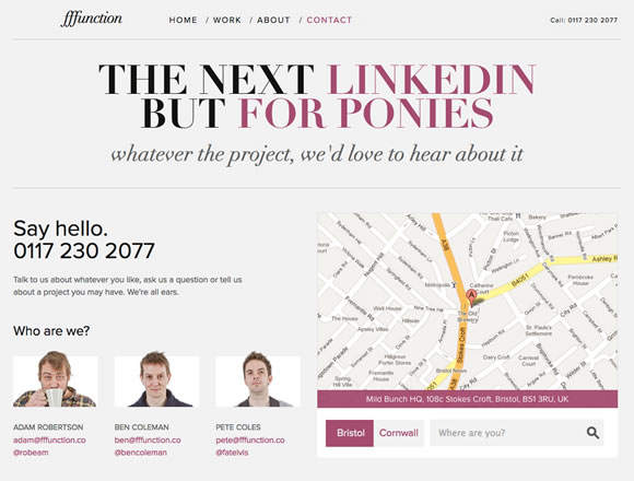
fffunction (form follows function) is a four man web design agency based in Bristol & Cornwall in the UK. Their contact page also has a “Who are we” section.
Bobadilium
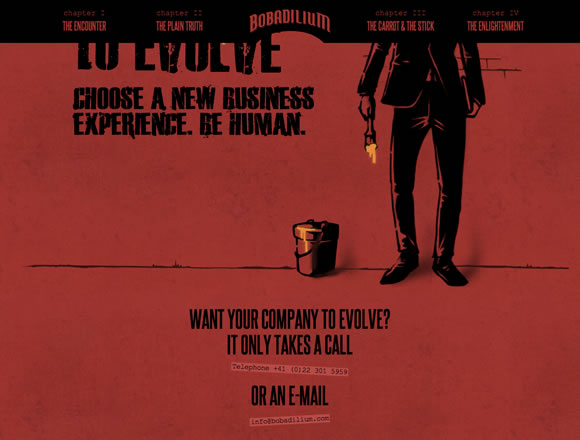
Bobadilium is a consulting company with a very interesting website design. Their contact page encourages the visitor to contact them.
Whiteboard

Whiteboard is a creative agency devoted to purposeful ventures.Their contact page is simple and uses large typography to catch the visitor’s attention.
The Barrelhouse Flat

Barrelhouse Flat features craft cocktails, punches, carefully selected beer and wine lists, and seasonal small plates meant to be shared. Their contact page has a vintage design and a very interesting, custom map.
TokioLab

This is another example of how to use larg typography successfully when creating a contact page.
Studio Chirpy

Studio Chirpy is the freelance identity of Bristol-based graphic designer Max Saunders. The contact page has a nice personal touch.
Web Design Tutorials | Design Inspiration | Create A Website

