Websites have flooded the way in which we perform in our day to day lives; they have changed the very world we live in and taken the shopping industry by storm.
It is estimated that a visitor on a website stays for around 8 seconds before clicking the “Back” button and leaving, it is through these 8 seconds that you have to deliver a long lasting memory of your website, intriguing the customer to come back and visit at another time.
User Experience And UX Design
User experience design involves placing a user friendly design within a given program, making it easier for the user to understand and comprehend the data. Visual designs and graphics play a large part in your website design, and you must ensure that the information is clear and visible for any visitor if you want them to stay on your website. It also involves building your website using user friendly programs, no visitor wants to arrive at a website, being greeted by a selection of code.
Navigation
Navigation also plays a vital part in the build of your website; if a user cannot navigate between areas of the site easily then they are less likely to stay. A user isn’t going to spend hours trying to work out how to get to a specific area if they can easily access the information somewhere else. Tabs are a great way to tell your visitor where information lies on your website; it allows them to view different aspects of your website within seconds, providing a good user experience. Try not to embed links, within links, within links. If someone wants to find a piece of information they don’t want to have to click on several links in order to get there, provide your information source at the beginning of the website, so they can click from the home page and be taken directly to the area they want.
The 8 Second Rule
The 8 second rule is a crucial element to understand, you literally have those few seconds to make a good impression. It’s a brutal world for web designers, as the hours spent designing a website can easily crumble into those 8 seconds and become a failure. If you understand the way a customer thinks, and then you understand why they leave, understanding this can give you a great insight to the online strategy needed to keep the visitation flow steady for your online business or company.
Results
When someone visits your website, they want results and this is something you cannot fall short on, for example:
“A Customer Looking For Holiday Locations In Spain“
If your website delivers what your customer is looking for, then it is a success. However as mentioned above, you only have 8 seconds for this to become a reality, although you may have the information needed to please the customer, if they cannot find it within 8 seconds they will leave. There are however other aspects that you should take into consideration, such as the layout of your information. You may have the information the customer needs, but if it is set out in an informative way then it becomes useless and unappealing, for example:
– A Customer Looking For Holiday Locations In Spain
The website then shows a list of locations:
- Majorca
- Tenerife
- Ibiza
- Lanzarote
Although this does satisfy what the customer was searching for, it is not classed as informative. The customer will take these locations, and find further information on another website.
You not only need to satisfy the customers need for information, you need to give them the whole package, pictures, descriptions, information, and quality.
The correct way to display information using the above topic would be to include information such as:
- Majorca
- A solid description, for example: “Golden sands and glorious sunsets await your presence, relax by the harbor and enjoy the captivating scenery that surrounds you on this island paradise”
- Local landmarks
- Weather information during set seasons
- Entertainment options
- Give advice on flight prices and times
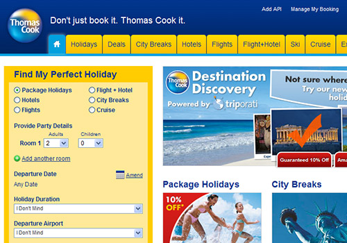
Thomascook.com shows a very good example of this, flowing pictures, and accurate information to demonstrate what they offer.

Thomascook.com results page.
Set it out so it is easy to understand on the page, list the information in an appropriate order and try not to complicate your language. This example does not just apply to a travel agent’s website, it can be put into place for any website you can think of, and aiding you in future design tactics. The information should be set out to walk the customer through the process, don’t place your flight times before the description and make it clear, and informative at all times. The customer won’t want to see how to get to the destination if they don’t want to visit that location, provide them with the information first, so if they choose to make the informed decision of travelling there then they can access the further information if they need to.
Picture Perfect
Images attract attention, and you need to utilize this fact in order to breach that 8 second rule. Web design is an art that truly requires mastering in order to gain the full effect, high quality images are a great way to gain interest to your website. Ensure that your images remain relevant to the source, for example:

– Majorca Holidays or A Picture Of Tenerife
Here you can see image is not related with the subject headline above. This is a disastrous move, one that could lose you the customers’ trust. Ensure that the images directly apply to the subject, choose beautiful, high quality, professional photos for your website and size them appropriately in comparison to your information. Having an extra large image will mean that the customer has to scroll down through a mass of pixels before arriving at the information they need. Large images can also impede the loading time of a website, which makes navigation and viewing difficult.
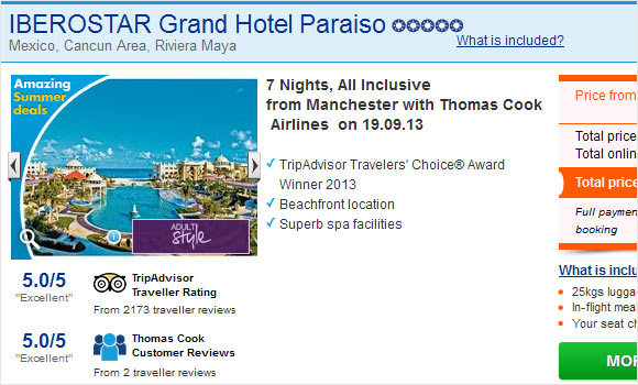
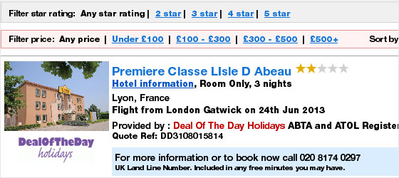
Icelolly.com shows you stunning images next to the information about the destination, enabling you to not only see where you are going, but it also provides you with an accurate description of the surroundings.

Icelolly.com results page.
The images arn’t overly large, meaning that they won’t impede loading times and the high quality images provide great insight for the customer.
Future Information

Provide the customer not only the information that will serve them now, but also in the future. Give them a reason to visit your site again, such as future deals. By providing them with information that will serve them time and time again, you can be sure to build a steady client base, thus increasing your publicity as a website.
Again, Thomascook.com provides an excellent example, providing you with both earlybird deals and offers that stem all the way to January next year, enticing the customer to visit, and book their holiday with them.
Home Page
Your home page should tell the customer who you are, and what you do. This is your one chance to truly sell yourself as an individual, or a company, make yourself out to be the best – the internet does not care for modesty and customers want the best service possible. You need to promise them a service unlike any other, assuring them that you are the right choice for them to invest in. The key to a good home page is a good reputation, place your good feedback on your homepage, this can be done in the form of a Shoutbox, or even just a comment section. If someone visits your site, even if it is just for a short time then they can take away the knowledge knowing that you value your customers, and that they also value you, a key part in customer success.
Secure Links

When you delve into the world of web design, there are many things you need to learn before you can start building a website. Links are crucial, and broken links can destroy the hard work that you put into the site, test all of your existing links before creating new ones, and preview your website in a web design program before hosting it. Tabs are a great way to provide information to your customers, tabs are usually located on the left side of the screen, and if you have an online shopping website then your tabs could include:
- Groceries
- Clothing
- Entertainment
- Outdoors
- Sale
This makes it easier for the customer to navigate your website, with a click of a button they can find exactly what they need. Each tab requires a link to that section of the site, so the Entertainment tab would link to the section in which televisions, consoles, and games would be sold. Regardless of the purpose of your site, whether your website is informative, sales oriented, or an online charity, links are crucial, and tabs can be used regardless of the purpose.
Asda.co.uk, although being a UK website demonstrates expert knowledge of secure links, it provides excellent navigation, and the tabs are not only clearly set out, but easily readable. The color scheme is fantastic, leading white on green for a colourful and easy layout. The shop not only sells clothes, but grocieries, and entertainment systems, leading them to a wider base of clients throughout.
Color Scheme

The color scheme to your website should be simple, eye catching colors render the website unprofessional, the last thing you need is your website resembling a Myspace page. Harsh main colors such as:
- Black And Orange
- Blue And Green
- Pink And Black
Should be avoided at all costs, the background to your website should be a light color, this makes it easier for the customer to read the text layered on top. Visit any website; you will notice in the areas that hold information, the background color is always white/cream. Reading black text on top of a pink page is hard work, whereas black text on a white page is easy on the eyes, and readable.
This doesn’t mean that you should not have any essence of color on your website however; color is fine as long as it is used appropriately. Try to limit yourself between 1-3 colors, the simpler your logo is the more chance there is of the customer remembering it in the future, again take a look at any website, you will notice that the majority of logos include the color white- and between 1-3 colors.
Complex color designs and logos deem your website unrecognizable, and this is the last thing you want when you require a high customer flow. Use your images in combination with your color scheme, when you upload your picture you don’t want it to be surrounded by a white box on a colored background. For example:
- A Business Mascot – If you were to move this picture onto a black background, then chances are your mascot would be surrounded by a white box, the dimensions of the image. This looks highly unprofessional, and you should go to lengths to remove the white surroundings. A simple photo editing program will suffice, erase the white background to make it transparent, you can now move the logo and have it blend into any background naturally. Harsh colors are not recommended, however if you have a banner on the top of your website you can indeed use color on this, just make sure your text is large, readable, and clear to the public. Color on a website is good, if used in moderation, nobody wants their website to look like the inside of a dictionary yet it must be clear and set out appropriately, this is a task that requires great time and dedication to perfect.
Facebook is a prime example of this; Facebook has a honourary color scheme and has become famous for this. The simple logo, being an F encased in a blue box has truly taken the world by storm, becoming widely recognisable due to the simple design, and flowing features. Sometimes simple is best and a recognisable logo can be the way forward for your website.
Smooth And Flowing
Your website needs to look natural, the flow of links and colors must work together in order to deliver an efficient service to the customer; make sure your information is well organized, informative and understandable. If your website involves clothing sales, then ensure that you have an adequate amount of pictures to support your sales, take several pictures of the item from different angles to give the customer a full view of what they are going to purchase. Nobody wants to purchase something they are unsure about, so it is your job to make them sure, make them want the item, provide gripping descriptions and well placed pictures throughout to captivate them and keep them interested. There is no set key factor to a successful website, a good website is made up from several working key factors, and it is by combining these key factors that you gain the status of a successful site, something that many people desire. Every page, and every tab needs to have the same thought and consideration placed into it as the one before, your “about us” page should be as professional as your “home page”. Although they are not of the same importance, consistency is a vital part of web design.
By following these tips, you are sure to make your website a great success among the online community, take the viewer’s thoughts into consideration and abide by the online regulations. Building a website can take some time, and may even become tedious for those who have little experience, but with time, dedication, and optimism you can be selling your products online in no time, making a steady profit from your high traffic of customers.
Gear4music provides a stunning example of pictures. They display musical instruments with a wide arrange of angles, documenting every feature and every small detail. They also show examples of the same instrument with a different color, so the same guitar in teal may also come in mahogany; they display this to ensure that the customer is comfortable with the purchase.

