If the navigation is confusing or if it trips up the user in any way, you run the risk that they will grow frustrated and leave the site altogether. Simply put, website navigation should be clear and intuitive. To achieve these traits, I outline 7 mistakes that you really need to avoid in the design of your website navigation.
1. Too Many Options
Give a person 15 options to choose from and it will take them longer to make a choice than if you had only give them 8 options. The fewer possible choices that someone can make, the quicker they can evaluate those choices and then make a decision.
Unfortunately, when it comes to website navigation, many companies try to cram everything possible into their site’s primary navigation bar so that visitors have immediate access to all page options.
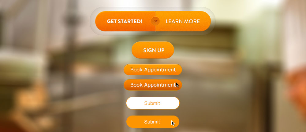
This may sound like a good idea since making content easy to get to is a worthwhile goal, but an overload of navigation links will actually end up backfiring. Instead of allowing visitors to easily see what pages are available, they will become overwhelmed by the breadth of choices and unable to quickly make a decision as to what to do next.
The minute those people start to question what they should click next, you run the risk that what they will actually do is click is the “Back” button that takes them away from your site and its confusing navigation scheme.
When planning and designing a site’s primary navigation, be aggressive in editing that menu down to the fewest, most important options possible. By presenting fewer options up front, you will actually encourage people to make quicker choices and go deeper into your site.
2. Wrong Options
Another mistake that people make when planning a site’s navigation, especially when they start deciding what to leave in the primary nav and what to move to subsection navigation, is that they cut the wrong items and leave in links that are not important to a site’s actual audience.
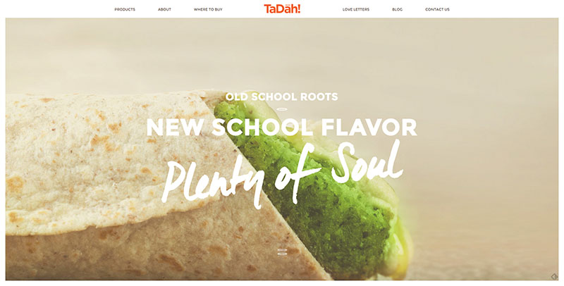
Remember, a website needs to be designed for the needs of the people who will use it. As such, the content or features that are important to them are what should be focused on.
A link like “Message from the President” may be important to a company’s CEO, but if that company’s customers are not looking for that content, then placing it in the navigation row is misguided, especially if it is in there instead of a link that actually is important to the site’s customers!
3. Go Big or Go Home
Today’s websites are being visited on a variety of devices and screen sizes. The days of only giant, desktop monitors being used to access web content is long over, so to succeed on the Web today, sites and their navigation need to accommodate this wide range of screens.
Navigation schemes are too often designed solely for large screen monitors. On smaller screens, including tablets and phones, that navigation will break down and become unusable. This is why websites need to be built with a responsive approach to multi-device support.
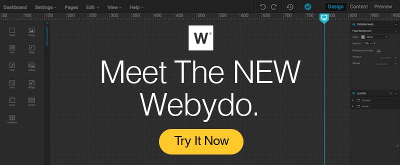
With a responsive site, navigation can be redesigned for different screen sizes to ensure that it is always clear and easy to use. A platform like Webydo, with their pixel perfect responsive editor, is a great way to design different navigation schemes for the various sizes that a website will display at – and with Webydo’s code-free development platform, once the navigation and pages are designed, they can be easily published as working webpages!
4. Fly Out Menu Mayhem
As you work to edit the number of options down for a site’s primary menu, you will begin to find links and pages that are better presented as submenus. For instance, the primary nav may have an option for “Our Company”, and underneath this button/section you may have other options that, while necessary for the site, are not important enough to warrant primary nav placement. These could include:
- Company History
- Leadership Team
- Testimonials
- Careers
One of the ways you can present these submenus is with a dropdown or a fly-out menu. This is where a menu appears once you hover your mouse cursor over a top-level link. This treatment, while common, can prevent some challenges, however.

For instance, on touch screen devices where there is technically no “hover” state, you want to make sure your links are still accessible to users. You also want to avoid fly out menus that have 3 or more levels. It is often difficult to navigate menu systems that have fly-outs that come from other fly-outs, so avoid these unwieldy menus in any site you design.
If you would like to learn more about which navigation type is best suited for your site, The Importance of Navigation Design Patterns discusses the the various types of navigation systems using examples from some of the hottest websites and web apps.
5. Inconsistency
Once a person figures out how to use your navigation menu and they are comfortable with where everything is, do not change that on them! Websites should have consistent navigation through the entire experience, regardless of what page they are on. Submenus may change from page to page, but the primary nav or controls should be set in stone.

6. Too Long
Editing a site’s navigation options to present fewer choices is important, but you also need to make sure that the text label for the choices that remain are short and sweet.
A link that says “All About Our Company” is unnecessary when just “Our Company”, “Company”, “About Us”, or “About” would all work just fine. This may not seem like a big edit, but we have gone from 4 words to just 1 or 2.
If you edit like this across an entire navigation bar, you will have effectively cut the amount of text that people have to process in half while still conveying the proper content for those links.
7. Wrong Tone
Every website has a tone. That tone could be loose and friendly, it could be professional and straightforward, or any number of other possibilities. Whatever the tone of a site is, the language of the navigation should reflect it.
If a website is meant to be friendly and helpful, a link that reads “How We Can Help” may be more suitable that one that simply says “Services”. By understanding the tone of a site’s message, you can design navigation that is consistent with that tone.
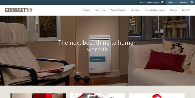
Yes, in this instance the first text is much longer than the second, which seems contrary to other tips presented in this article, but remember the goal is not necessarily to make the text as short as possible, but to make the right choices overall. This does include the proper text length, but it also includes the right tone, options, and more.
In Closing
The design of a website’s navigation can make or break an experience. By ensuring that the navigational structure is clear and easy-to-use, you encourage visitors to spend some time on a site and you help direct them to the content or features that are important to them and important to your business.
