Planning and executing your site for multiple platforms
Today’s digital data world is not inclusive of just the computer monitor or the laptop screen, but rather a combination of phones, tablets, smart devices, laptops, desktops, and mini-computers. As a business, it is vital that the information you present for such platforms have a level of continuity. By building sites which work well, aesthetically as well as functionally, on various platforms, a business grows the branding and the association of certain features and functions with that brand. But how do you go about ensuring that what you see on a phone will be useful or visible on a tablet or a laptop? The answer lies within the design.
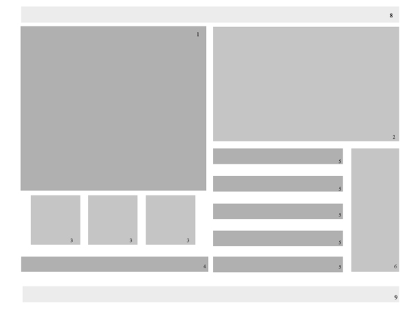
It is all about your wireframe
You may have heard the term wireframing before and gotten a bit confused as to what it entails. As such, the cross platform/device delivery of your business may have suffered for it. Wireframing, at its core, is just laying out of the material placement. It is using boxes and various hues to get the feel of how the data will rest on the devices and pages presented.
Ensure that you have the size of your devices, or at least a rough layout of the size so that you can layout the boxes like each platform. Keep in in mind that some features may need to be moved to another page or scaled down. The point is not to create the exact same thing for every device (as all you would need to do then is copy and paste), but rather to create a flow between the platforms that minimizes confusion and builds the continuity.
The Aesthetics
The second part of building continuity for your digital media is to have aesthetics which work well on various platforms. Do not have images which pixelate when blown up for laptops or for certain tablets. As stock images have a tendency to do this, it is advised that you use 3D models for interior space renderings when possible, as the models provide you with a means to (1) control the angle and the dpi of the picture allowing for multiple resolutions to be rendered as well as slight variations to the image while retaining the overall concept of the piece and (2) avoid any copyright issues or multiple distribution/duplicate content issues. CGTrader offers models which have royalty free use for both individual and commercial use. When looking for your 3D renders, whether it is on a 3D model site or on a free stock image site, ensure that there are no royalties involved for displaying and distributing the content.
Content
While you do not want to have the redundancy in your material, you do need to try to have the same information presented for your tablet, phone, and computer content. In most cases, using the same text on different devices will not result in a duplicate content on Google’s Algorithms as the pages are labeled the same. However, if you change the name association, for example you use index for your desktop and home for your phone, there could be an issue. To minimize the risk of duplicate content while at the same time keeping continuity between the various delivery options, change the text slightly but keep the message the same.
Keeping it simple
Perhaps the best way to ensure that you have digital content which can be shared and accessed across multiple platforms and retain the branding/identification that you desire is to use software which allows for you to export for phone, tablet, and desktop devices, such as Adobe Muse, or to create multiple pages in a coding program and then place a pixel limitation identifier to send people to the appropriately sized page and content, as can be seen below.
<script type="text/javascript">
<!--
if (screen.width <= 699) {
document.location = "YOUR-MOBILE-SITE.com";
}
//-->
</script>
Of Course, you would need to fill in the site name as well as adjust the screen width to the appropriate device, as Androids, Windows Tablets, and iPhones all have different screen widths. It is not recommended that you put a height variable, but if you can do so if catering to a specific device.
Test it out
Once you have the wireframe, the aesthetics, and the layout completed, test the continuity of your branding on multiple devices. Building continuity is critical for your brand. You do not want to have anyone associate your services with your competitor, become confused as to what your brand is about, or to feel as if you have not dedicated the time and focus to the development of your content. Remember, most of the world is on mobile and digital devices. Ensuring that your business is up to par starts with ensuring that your company crosses all means of delivery without a glitch.