In recent history, the digital channel has extended it’s already dominant reach, even further. Whether its COVID-19, omnichannel strategy, mobile, or driven by user behavior and expectations, the digital channel is key for business-to-consumer (B2C) organizations. As organizations are investing more in digital channels, it’s important that accessibility is included.
Not addressing accessibility can leave your organization at risk for accessibility complaints and lawsuits. In fact, ADA Web Accessibility-Related Lawsuits exploded 181% – from 814 lawsuits in 2017 to 2285 in 2018. They continue to rise from 2018-2019 as customers rely more and more on eCommerce in their daily lives. Real-world numbers from an accessibility-related lawsuit show that legal fees (not including settlement fees) alone could cost you more than $350,000.
Furthermore, having an inclusive website or application can significantly increase your organization’s potential market share. Approximately one in five people in the United States, or 64 million, have a disability. The total after-tax disposable income for working-age people with disabilities is approximately $490 billion. For comparison, African Americans’ disposable income is $501 billion and for people of Hispanic origin, it is $582 billion.
In this blog post, I’ll cover what it takes to quickly understand accessibility and how your organization can take action right now to become accessible to prevent risk and gain access to a huge, overlooked market share of customers.
What is Digital Accessibility?
The 5 major categories of disability are:
- Visual – Example: blindness, low-vision, color blind
- Hearing – Example: deaf and hard of hearing
- Motor – Example: not having the use of certain limbs and paralysis
- Speech – Example: people who are not able to speak or who have a speech impediment
- Cognitive – Example: dyslexia, autism, ADHD
“Digital accessibility” refers to the practice of building digital content and applications that can be used by people with disabilities. This can apply to websites, mobile apps, desktop apps, video games, electronic documents, and more.
In many (but not all) cases, people with disabilities will use some kind of Assistive Technology to navigate their computers, mobile devices, and their many applications. For example, people with visual disabilities may use a screen reader to navigate their computers and mobile devices. They may or may not use a braille keyboard. If they have low vision, they may use software and devices to increase the size of text and applications on the screen.
For people with motor disabilities, they may not be able to use a mouse and instead perform all navigation via keyboard or a device with keyboard-like inputs. Others might use dictation software. People with cognitive disabilities may be able to use a mouse, a keyboard, and a monitor, but they may run into barriers with certain user interfaces or design components.
How Do You Measure Accessibility?
WCAG, a.k.a. The Web Content Accessibility Guidelines, are the technical guidelines created by the World Wide Web Consortium (W3C) for creating accessible web-based content. WCAG serves as the basis of accessibility regulations across the globe including the US, Canada, the UK, the EU, Australia, and Japan.
WCAG Success Criteria are broken down into different “levels of conformance”: A (basic conformance), AA (intermediate conformance), and AAA (advanced conformance). Without question, the standard for compliance is both WCAG 2.0 Level A and AA.
Level A is the lowest level of conformance. It helps with many barriers for people who have blindness, deafness, or motor disabilities. Level AA picks up some very important barriers for low vision and has a tiny bit of help for people with cognitive disabilities while also being inclusive of Level A conformance requirements.
If you don’t have specific accessibility regulations that apply to your organization but want to avoid legal risk, WCAG 2.0 A and AA compliance is a pretty safe bet.
Easy First Steps
Now that you know what accessibility is, its importance, and how to measure it, it’s time to take a look at how you can test for accessibility .
Next, here are three easy steps you or developers and testers at your organization can do:
- Keyboard-only navigation
- Test your form labels
- Use an automated testing tool
Keyboard-Only Navigation Tests
People with motor disabilities often navigate the web by only using the keyboard tab key. Furthermore, people who use screen readers don’t use a mouse and this keyboard test will confirm they are able to navigate with their screen reader as well.
This simple test can be done by your developers and QA team. First, try navigating through your website using the tab key. As you hit tab, is it immediately clear where you are on the page? Does a focus indicator appear to show that you’re on the “About Us” section in the top navigation, for example, or in the footer or on a featured article, etc.?
If a focus indicator is visible, can you select all the elements of the page a person would want to navigate to? (All links, menu, items, search fields, etc.) Are you able to navigate away from each element by tabbing? If the answer to any of these questions is no, your site is not accessible.
In practice, I’ve found that developers are actually already pretty good at this. If you set this as a requirement, it is one of the easiest and most impactful first steps that you can do at your developer stage and at your QA stage.
Testing Form Labels
Form labels are one of the most frequent accessibility issues we find causing barriers. Ensuring form fields have the appropriate labels is crucial for people who use screen readers to navigate and read the page.
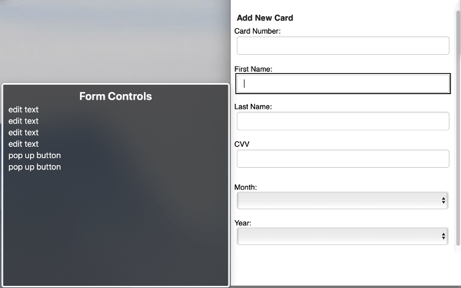
If a form isn’t properly labeled, a screen reader will not know what field to enter on the form. Furthermore, if the field is improperly labeled as required the screen reader user will not know why an error is being made on the form. Forms seem very simple, but the dependencies and rules must communicate properly to screen reader users, or else they cannot complete them.
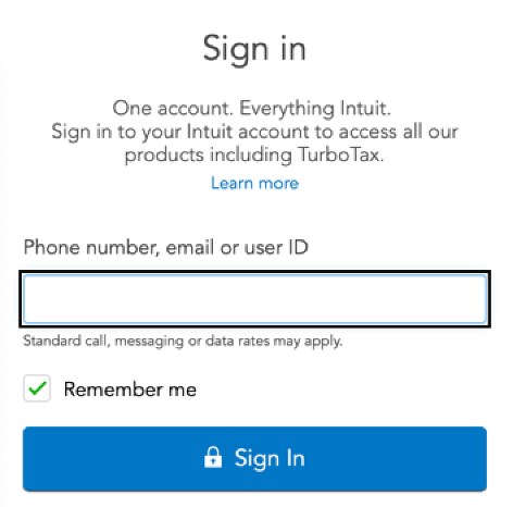
Here is an example of an accessible form:

|
0
1
2
3
4
5
6
7
8
|
<label for=”userid”>
Phone number, email or user ID
</label>
<input type=”text” id=”userid” … >
|
This example is a very simple coding fix that developers can learn and implement quickly. Fixing this critical blocker also has a profound impact on people with disabilities who are trying to complete check out on an eCommerce site.
Here is a screenshot example of an inaccessible form: Missing Form Labels

Easy Automated Tests
Open-source automated testing tools, such as Deque’s axe, are great and powerful ways to start testing accessibility now. Axe is free and works in Chrome or Firefox. You can run axe in the browser on any of your web pages and it will automatically list any found accessibility issues.
Axe can find up to 50% of total accessibility issues, so it’s a great start. Axe will also describe the problem and tell you exactly what piece of code is causing the problem. The learn more feature also has an explanation of how to fix the problem too.
If you’d like to learn more steps of how to test for accessibility, download our 12-step accessibility checklist.
What if You Need to Be Accessible Right Now?
What if your organization is in such a state of accessibility emergency, but you don’t have time to get your developers to start these simple steps? If your organization has an urgent need to be accessible now to stop the bleeding because of an accessibility complaint or lawsuit, a custom JavaScript overlay service is a great solution. Unlike tool-based or widget overlays, Deque’s service, Amaze, is a JavaScript overlay that is custom built and is not a magic pill that is a one-size-fits-all approach.
How it works: Amaze is JavaScript that runs after a page load and before the end-user consumes the page, providing accessibility corrections and enhancements as a temporary means to improve accessibility.
This service is a great short-term solution that actually fixes accessibility issues on a site and doesn’t require people with disabilities to download a separate tool or plugin that has its own set of accessibility issues.
Here is an in-depth blog post if you’d like to learn more about Amaze vs. tool-based overlays.
Other Ways to Get Started Today
If your organization’s need to become accessible isn’t urgent, it’s important to note that accessibility is a program, not a project. The most important step in an accessibility journey is getting executive buy-in. A successful accessibility program relies on transformational practices and change management that requires executive support.
Once you achieve executive buy-in, the most important starting point of this program is prioritizing public-facing customer content, your core service, and your functional part of your website. Prioritizing these important user flows will minimize the legal risk and fix the most important accessibility issues your organization has.
The next important step is ensuring your developers and designers are embedding accessibility into what they create. Training is a great way to approach this problem of culture change, in addition to hands-on experiences like Accessibility Empathy Labs. Tools are also a great way to make the process easier for developers and testers to automate accessibility.
The most important concept to understand and build into your accessibility practice is that accessibility must be embedded throughout the entire software development lifecycle; starting in design, then in development/QA, and then monitoring and fixing defects in production.
In Summary
Whether you’re trying to reduce your potential legal risk or reach the market share of people with disabilities, there are simple first steps your organization can take to jumpstart its accessibility journey. If you’d like to learn more or you’d like more information about strategic consulting, contact us today.
