Source: iStock
In the age of AI and “Human Centered Machine Learning”, it’s essential that we understand the needs and behaviour of our users. This is doubly true as a UX designer. In order to create work that better serves the needs of our users, it’s important to understand some basic psychological principles. Which is why I want to share with you Gestalt theory. With this toolkit under our belt, we can consciously design user experiences that truly fit the users.
Introduction of Gestalt psychology
Gestalt theory was founded by Max Wertheimer at early 20th century. This psychological philosophy addresses with perception, perceptual experiences, and related patterns of stimulation. The motto of the gestalt philosophy is:
“The whole is other than the sum of the parts.” — Kurt Koffka
When human perception meets with complex elements, we recognise the whole before we see the individual parts. As a designer if we understand these psychological principles, we can be more conscious during the design phase. One of the basic document of Gestalt principles stated by Max Wertheimer in 1923, called Laws of Organization in Perceptual Forms defined some basic principles (laws) that show how the mind tends to perceive visual stimuli.
Law of Proximity
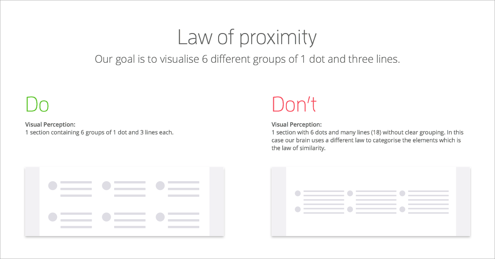
“Law of Proximity” states when objects are close to each other and they tend to be perceived together in one group. Basically proximity is closeness. If we use clear structure and visual hierarchy we will be less charged by the limited cognitive resource of users, so they will be able to quickly recognise and react.
Law of Similarity
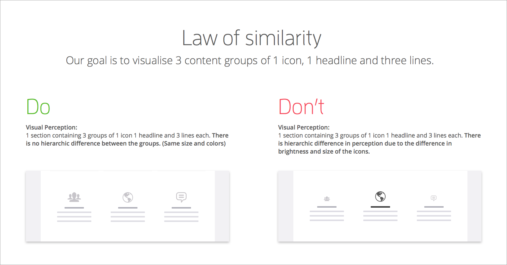
The “Law of Similarity” states that elements tend to be perceived into groups if they are similar to each other. That also means if you have elements with same functionality, meanings and hierarchy level, should visually matching.
“Consistent sequences of actions should be required in similar situations; identical terminology should be used in prompts, menus, and help screens; and consistent color, layout, capitalization, fonts, and so on, should be employed throughout.” — Ben Shneiderman
Law of Common Region
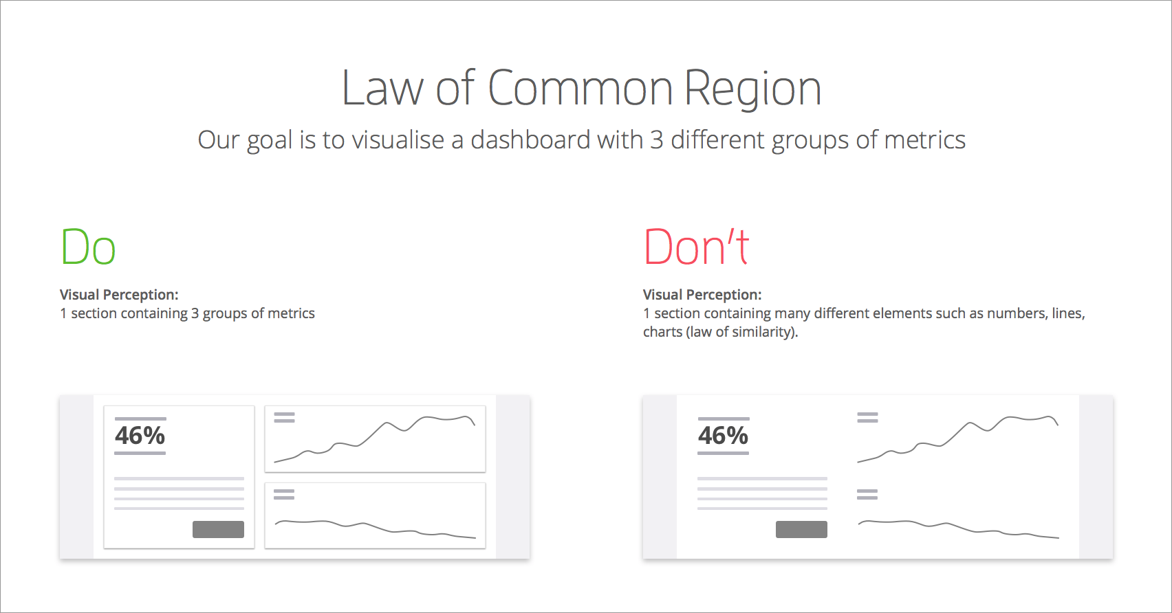
The ‘Law of Common Region’ by Stephen Palmer and Irvin Rock (1999), states that elements tend to be perceived into groups if they are sharing an area with a clearly defined boundary. In design we are often using cards to grouping coherent elements.
Law of Figure Ground
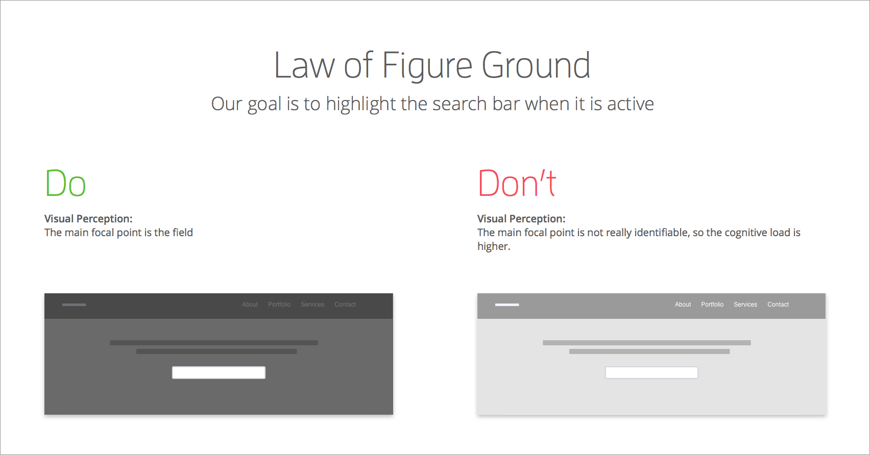
“Law of Figure Ground” states “Elements are perceived as either figures (distinct elements of focus) or ground (the background or landscape on which the figures rest)” Andy Rutledge. This law is very useful when we want to influence the focal point on the screen.
Law of Closure
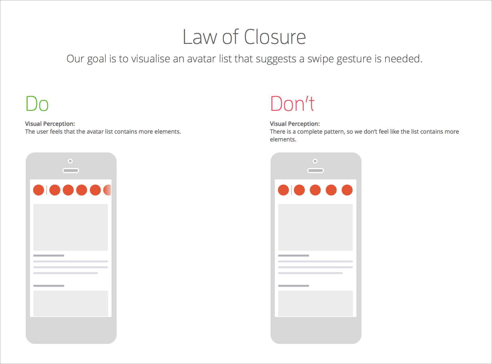
The Law of Closure states that when we encounter a complex element with a missing part, or with a break, we look for a continuing, smooth pattern. In other words, we fill in the gaps.
Conclusion
The intention to write this article was to emphasise the importance of basic knowledge cognitive psychology in UX design. We are using many different psychological principles, but not consciously all the time. Of course, while Gestalt psychology can help improve your UX, there are many other psychological theories that can help you create a better design process. Keep your eyes peeled for more articles from me about psychology in the design process.
Further reading
Are you still interested in Gestalt Theory? Here are some useful links to learn more about the topic:
