In this tutorial, we’ll look at how to express emotion through typography by exploring the premise of expressive typography. These techniques can help you make stronger font choices and more communicative design choices, too. We’ll take a look at some expressive typography examples and explore how you can use these concepts in your own work.
What Is Expressive Typography?
Expressive typography merges the use of type with visual communication—and often takes it much further than we would see in everyday typography. The type itself fully embraces itself as a highly visual medium. Think of it as type that not only says words but also communicates concepts too, with highly visual representation.
Many expressive typography examples are strictly type—no color, no imagery, only the font choice, scale, proximity, and shape. Others incorporate additional elements of art and principles of design, as we will here. Some fonts are very expressive fonts too, and will inherently have strong communicative elements as part of their design.
While this might sound experimental and even impractical, all type has the potential to be expressive and communicative. This is why expressive typography, as a concept, is a valuable one for designers to explore. It’s an especially useful concept if you’re a new designer, as it can be very tempting to choose fonts based on whether or not they “look cool” or are trendy at the moment.
That’s not to say aesthetics and trends aren’t important to professional designers—they are. However, designers speak the language of form. Our profession is often about communicating in strategic ways. Think of the principles of design as a language. We can use these tools to “say” or craft a visual narrative that meets a specific objective.
Let’s take a look at some expressive typography examples and how these concepts apply.
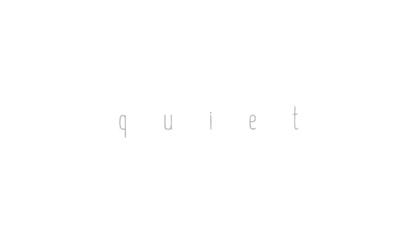
This type literally says “quiet”. However, notice how the visual qualities here also reinforce the idea of what quiet “is” in a visual way. For example:
- This is really low in contrast. The background is white, and the text itself is a very light gray. It makes its appearance look “quiet”, like a whisper.
- The font itself is very thin and light in weight. Again, this gives it a softer presence.
- There’s a lot of space between each letter. This also adds to the visual concept of quiet. Notice how airy it makes the text “feel”.
Let’s take this concept and take it in a different direction.
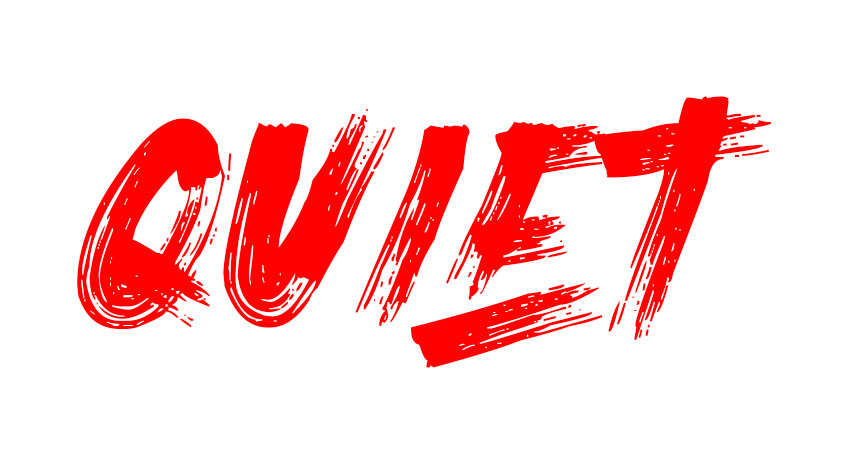
Does this visually “feel” quiet or like a whisper to you anymore? Chances are, the answer is no. Let’s take a look at why:
- Now, the text is higher in contrast. Bright red text on white can really “scream” at the viewer. It’s not delicate or gentle.
- The font is thick, bold, and heavy—these are not traits most people would normally associate with quiet.
- The strokes are really energetic. There’s so much movement and power in the way it looks like jagged brush strokes.
This text might say the word quiet, but it’s hardly quiet in how it visually communicates now. We could argue that it says quiet, but it actually communicates something more like “loud”.
That’s not to say that this second example is fundamentally wrong. Sometimes, visually communicating the opposite can be really effective. We can use strategies like this to make an ironic statement or to visually communicate complex subjects.
Let’s take a look at this idea in action.
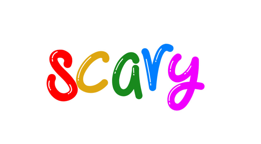
Here’s the word “scary”, but take a moment to think about how it’s been visually communicated here.
- The text is very round and plush looking. This gives it a certain playfulness, doesn’t it? It almost looks like long balloons, like the kind we’d see in balloon animals.
- Color has been generously applied here. The result is a bunch of mismatching colors, which really lends itself to an informal or even youthful aesthetic.
- The baseline is wobbly and inconsistent. This furthers the informal and bouncy look and feel in the text here.
So, is this text visually scary? Would you associate this text with something like a horror film or an intense drama? We might be able to associate this with clowns… we’ve created some kind of contradictory message here. There’s something childlike about this type.
And that’s why understanding the expressive qualities of type is so important. Your choice of font can have a huge impact on how the text itself visually communicates. Then, we can push that even further with other design principles that we opt to apply to our text.
Let’s try pushing this in the opposite direction.
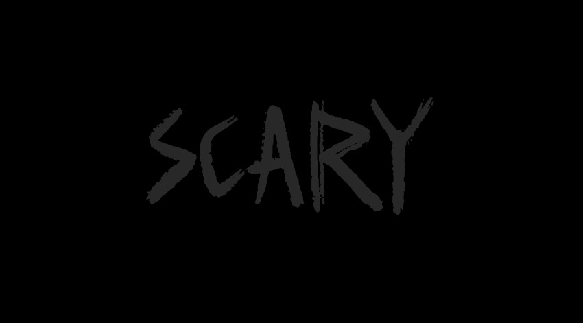
Now, this is looking a lot more like something we’d expect to see in a scary movie title. Isn’t it interesting how this solution is similar to our example for “quiet” too? Scary things can lurk in the quiet of darkness—but “quiet” does not necessarily have to be “scary”.
Think about what makes this effective (or ineffective). How would you change this example, and how does it visually communicate to you?
How to Express Emotion Through Typography
Emotion is a big part of visual communication—but how do we express it? Let’s consider this question with an abstract example. What does “expensive” look like?
Let’s say, for example, that you need to design a logo for the concept of “expensive”. The logo itself should say the word “expensive”, but it needs to visually communicate the concept too. What perspective would you take?
Here’s an example, for your consideration.
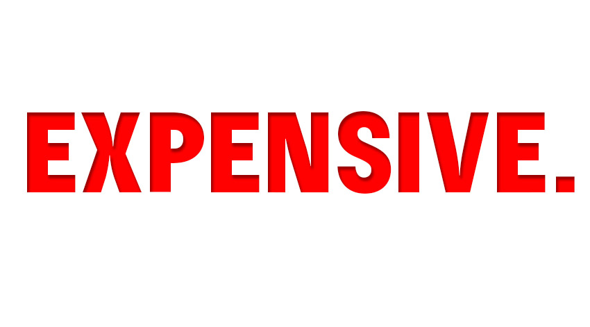
Ignore that the type reads “expensive”. Instead, let’s review what about this, from a visual perspective, communicates the concept of what expensive means.
- The font itself is quite bold and domineering. It feels reminiscent of something that might say “BALANCE DUE”.
- The color choice is intense. Red can often be associated with an important warning. We often see red on street signs, too.
- The way the text sits is very uniform, very stiff.
You might think this isn’t a very successful example of expressive typography. However, consider how this might visually communicate. It looks like some kind of stamp of disapproval, doesn’t it?
“Expensive”, to some audiences, might mean just that—something out of reach, depressing, and foreboding—something to avoid. If your rent is too expensive, it might actually feel a lot like how this type looks.
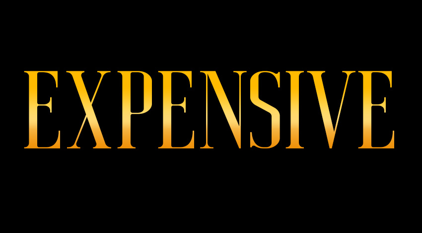
Here’s the same text with the same objective—but it illustrates an entirely different message. In this case, the text looks glamorous and wealthy. We see “expensive” illustrated in a way that makes it look appealing, desirable, and full of energy.
- The text itself has delicate serifs. The length also has a classy look and feel.
- There’s color and texture here that has a visual association with wealth. Gold and metallics tend to evoke those emotions.
- Similar to the previous example, the text is large, stiff, and a little ominous. It feels “big”, but notice how the vibe is entirely different.
And that’s a big deal here—neither of these examples are wrong, but the emotions they convey are very different. When you approach design—whether it is typographic or otherwise—it’s important to consider what you aim to communicate and how you plan to do it.
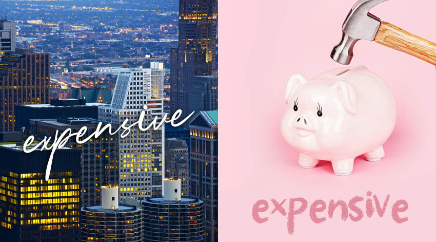
Here are a couple of different examples of the word “expensive” used differently and paired with different imagery. How do you think they visually communicate? Think about this in terms of the type itself and how the imagery adds to the message.
The Elements of Art & Principles of Design
Why do these expressive typography examples communicate the way they do, and how do we craft a narrative of our own? The answer lies with the elements of art and principles of design. For example, here’s a small selection of them:
- Line is inherently expressive. Think about a straight line versus a wavy line. One is still, one has movement. That movement could be soft curves, sharp lines, and much more.
- Shape tends to have many preconceived ideas. For example, what shape do you associate with a coffee cup?
- Color is very communicative and tends to have a host of associations. What color is a sunny day? What color is sadness?
- Scale refers to the relative size. For example, something large and imposing communicates every differently than something small and quiet.
Here’s an example of Proximity, another principle of design. Proximity refers to the relationship between different parts of the design.
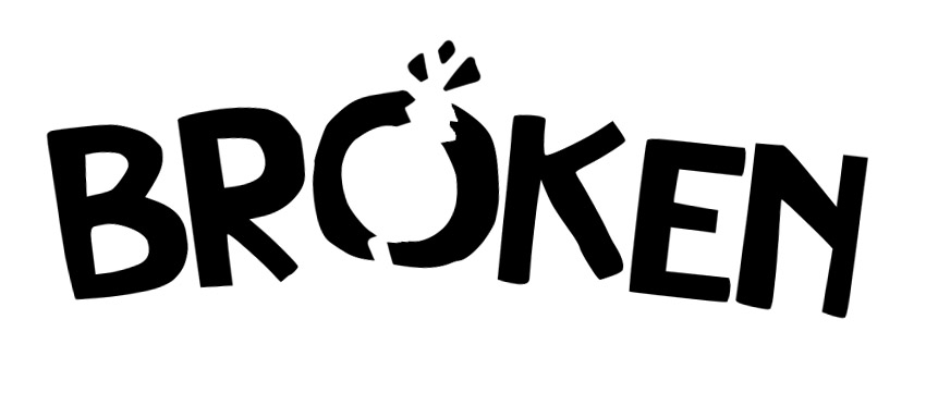
Our word here is “broken”, but notice how we can reposition the letters to make the word itself appear broken. Expressive type and expressing emotion through our design work isn’t exclusively about font choice or color. We can use our entire arsenal of design techniques to create visual experiences that express and evoke emotion.
Learning From Expressive Typography Examples
One of the best ways to learn about design and become a better design is to challenge yourself. You don’t need to take a formal class to take on a challenge and push your skills further.
If you’re looking for an assignment, take this list of words and experiment with visually communicating their definition. Or, for an extra challenge, try communicating the opposite.
- Organic. What colors do you think of when you hear this word? What kind of shapes, lines, and contours?
- Energetic. If you had to draw an energetic line, what would it look like? What are energetic colors to you?
- Peaceful. When you think of peaceful, what do you visualize? Think of shapes, colors, and objects too.
- Loyal. This one is a little more abstract. What’s a loyal color or a loyal shape? How could you visually express loyalty?
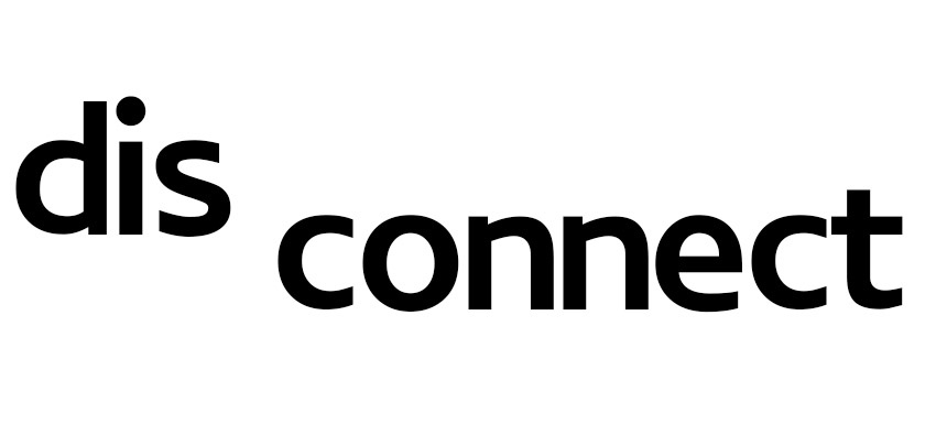
You can keep your concepts simple or really go over the top with color, texture, shape, and more. Here’s a simple example of this exercise, using the word “disconnect”. It’s not a complex solution, but it visually communicates what the word means.
The interesting thing is: these exercises directly relate to so many types of design. For example, let’s say you’ve been hired to design a logo. That logo needs to visually communicate the heart of a brand with very little real estate. Every part of that logo should be purposeful—you need to express a lot and evoke emotion in one mark. We can practice this concept by designing for keywords, like the list above.
Check out this sample typographic logo design. What do you think it visually communicates?
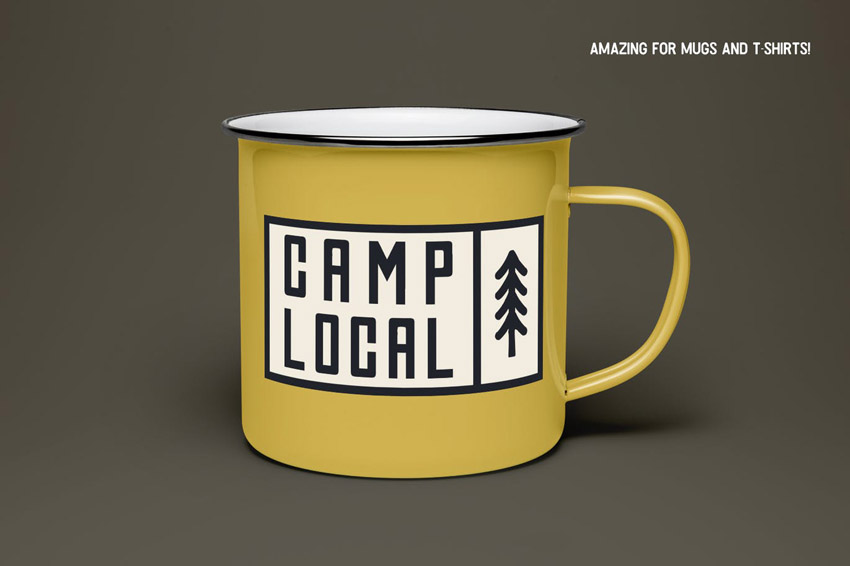
Notice how the type is long and tall, much like the tree icon beside it. It’s stacked together and placed on something that looks like signage—something we might expect to see at a campsite. These choices are deliberate visual associations.
But this isn’t just about logos. It applies to book covers, headlines, and even body copy. Now, we don’t want the copy in a book to be expressive in an exaggerated way. However, the type itself still has visual qualities. Think about it: a sans serif can evoke a different mood than a serif font.
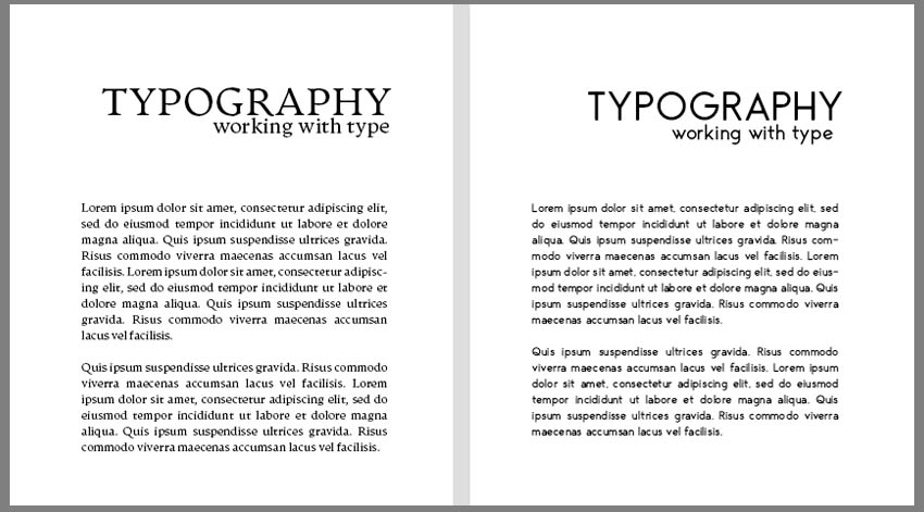
Here’s the same simple layout with two different fonts applied. They have a different look and a different feel. Depending on the subject matter and the objective, one could prove to be a much more successful solution than the other.
The Subjectivity of Expressive Type
Expressive type can be a really fun subject, especially if you’re exploring and experimenting on your own. It’s a great way to learn how to visually communicate, because one of the easiest audiences to communicate with is ourselves. We know what preconceived ideas of our own we associate with specific colors, shapes, and imagery.
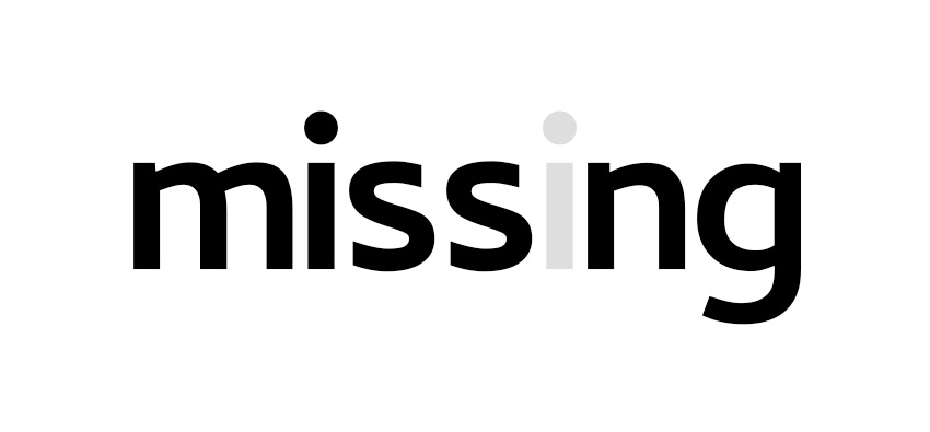
However, this is where things get complicated. In most professional settings, the target audience is not the designer themselves. We tend to design for a specific audience. While some communicative aspects might feel universal, others are more subjective. The above example is a good example of a simple word with a simple, expressive idea. The “i” is literally “missing”.
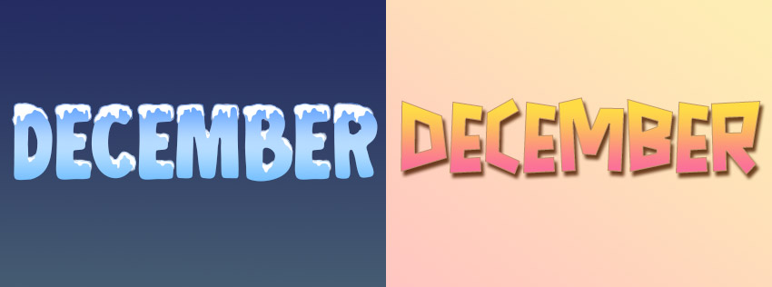
However, different people often have different preconceived ideas, especially when the subject is more complicated. This can be based on a whole host of factors, including location, culture, language, experiences, economics, personal preference, and more. For example, someone who lives in the southern hemisphere would have different associations with December than someone in the northern hemisphere. They each experience the seasons differently.
This is why it’s important to know your target audience when you take on a design project.
If you’re designing for yourself, you are the target audience. This is arguably one of the easiest audiences to design for—but that’s not to say that designing for yourself isn’t important. It can be an excellent way to learn how to be a stronger communicator. It’s also a great way to express yourself!
Analyzing Type Through an Expressive Lens
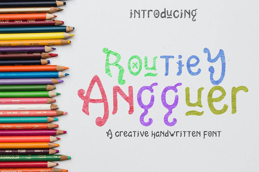
So we’ve discussed the question “What is expressive typography?” Let’s take a look at some fonts and analyze what their expressive qualities might be. A process like this can be helpful when it comes to selecting fonts for your projects.
Again, this could be subjective and vary depending on the audience—so feel free to draw your own conclusions. All fonts are essentially expressive fonts in some way, as they all communicate in some way, shape, or form.
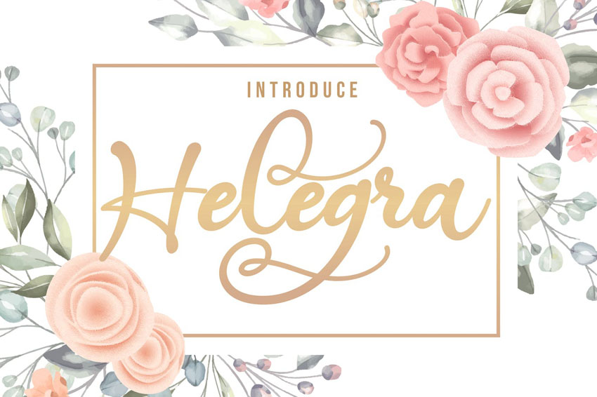
Script Fonts: Elegant, Romantic, Delicate
This font has long, pretty strokes with delicate curves. It gives it an elegant, romantic aesthetic. Something like this could be a great choice for invitations, beauty products, stationery, and much more. Dress it up in gold or try applying watercolor textures to it. What does it make you think of?
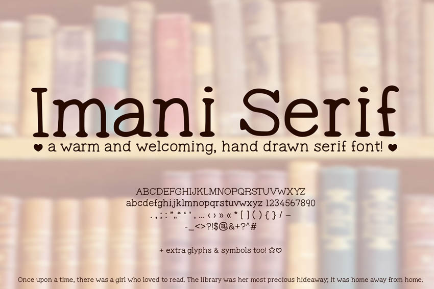
Hand-Drawn Fonts: Welcoming, Humanizing, Friendly
We have an informal aesthetic here, although it still has a rather bookish vibe. It’s too informal for something like a law firm or government agency—where we’d expect to see something far more formal and rigid. This could be more successful in a library or classroom.
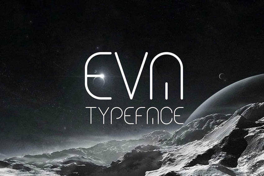
Geometric Fonts: Futuristic, Sleek, Stylish
The rounded, geometric aesthetic here lends itself to a futuristic feeling. Notice how some parts of the letters have been cut out, but it doesn’t necessarily hurt our ability to know what the letters are. This one could be a great fit on a book cover, album design, or on a T-shirt.
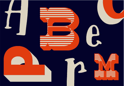
Display Fonts: Playful, Whimsical, Youthful
Isn’t this a fun, playful aesthetic? The variation here gives it a touch of whimsy. Presentation means a lot too—the varied colors here make it look more youthful and at home in a child-friendly environment. Imagine this one on the front of a children’s book or at a bake sale.
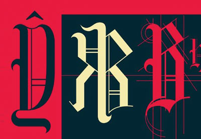
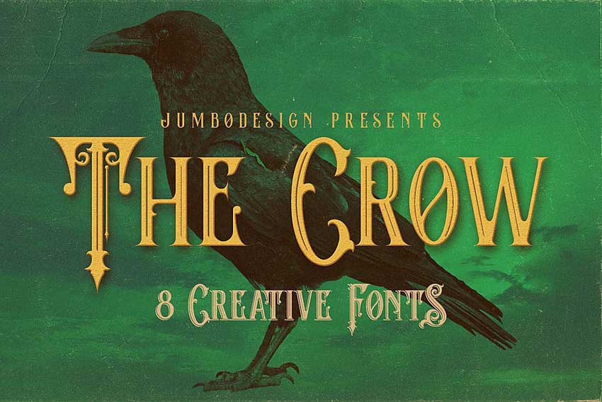
Ornate Fonts: Fantastical, Historic, Decorative
There’s an ornate, fantasy feeling to this font family. There are so many beautiful decorations in the letterforms. However, the aesthetic itself is rather vintage, giving it an aged feel. This one could work well for the fantasy genre, specific genres of music, metaphysical goods, and much more.
Want to Try Some Experimental Text Effects?
Experimental expressive type can be a lot of fun to try out. If you love type and you’re looking to have some artful fun, check out these fun text effects from some of the awesome artists on Envato Elements.
1. Cloud Text Photoshop Action
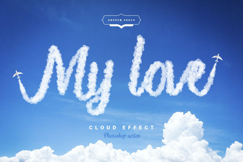
Isn’t this a fun text effect? Write whatever you’d like in the clouds. It even comes with the planes, so you can complete the look and feel. This is such a fun one to experiment with.
2. Hot Lava & Fire Photoshop Text Effects
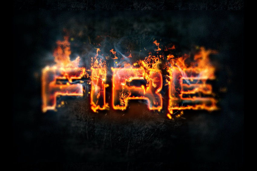
This fire effect is really visual. While this is most certainly not text you’d want in body copy, it’s wonderfully artistic and a fun fit for headlines and other points of interest.
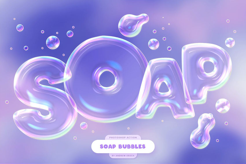
3. Liquid Tasty Text Effects for Photoshop
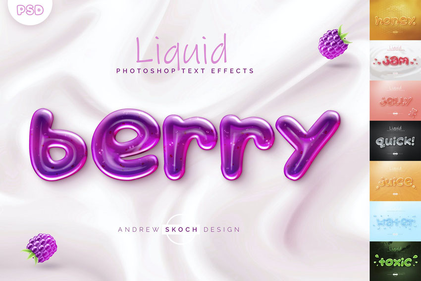
This effect is a fun one because it works for a variety of textures, like jam, water, soap, and even sticky goop! It’s easy to jump right in and apply this effect to different text and fonts.
4. High-Resolution Chocolate 3D Lettering
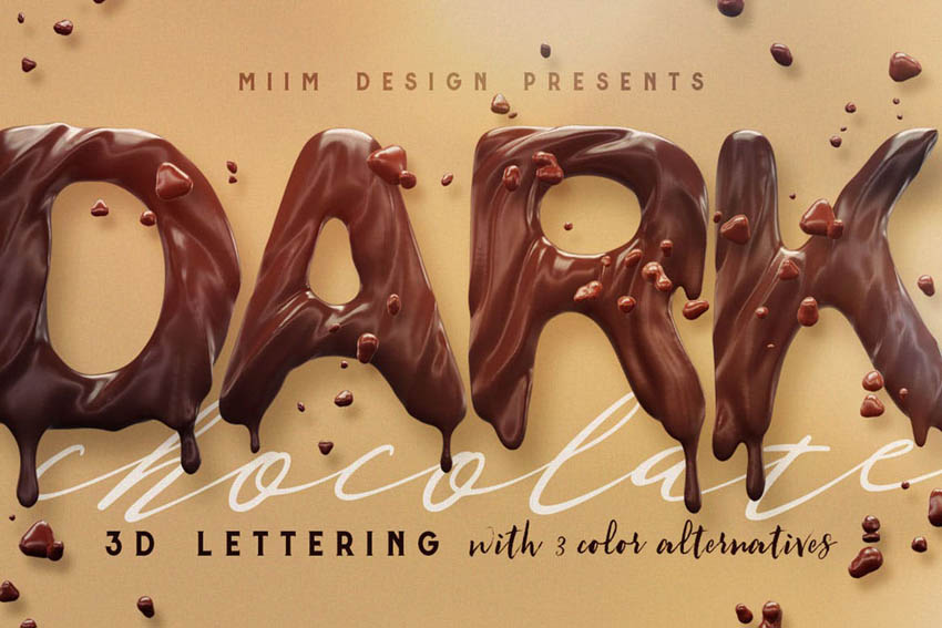
These chocolate letters look delicious, right? In this case, you can experiment with the rendered 3D lettering. Position and arrange them any way you like.
5. Foil Balloon Text Effects for Photoshop
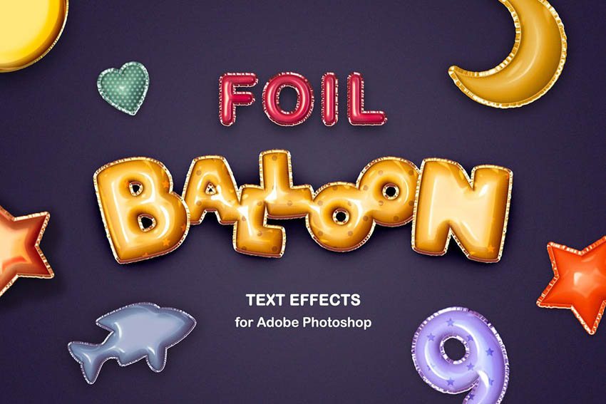
What a fun effect. Turn any text you like into cute, puffy, mylar-like balloons. Opening it up in Adobe Photoshop and experimenting with this effect is simple.
Want to Learn Even More About Typography?
Love typography? There are so many free tutorials on Envato Tuts+ to keep you reading. Check them out today, and continue to push your type knowledge further.
Happy designing!