In this quick tip, I’ll show you a simple and easy way to take control of the colours in your Photoshop documents using the power of adjustment layers. We will consider two scenarios, with the second being somewhat more complex than the first.
I’m always preaching about the importance of non-destructive editing in Photoshop, and adjustment layers have to be one of my favourite features. In today’s quick tip tutorial, I want to show you a really simple technique for using the Hue/Saturation adjustment layer to precisely control the colours in your photographs, illustrations and designs.
We’ll look at two different scenarios, and the slightly different techniques that can be used in each.
Scenario 1 – The Blue Dress
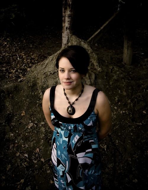
Okay, so here we have an image of a lovely young lady in an equally lovely blue dress. This photograph is by Jesse Therrien can can be found over at stock.xchng.
Here is our origianl image
Basically, all we want to do with this image is change the colour of the dress – and only the dress – from its current blue to a vibrant pink. Because there is really very little blue throughout the rest of the image, all we really need to do is focus on adjusting the cyan and blue values.
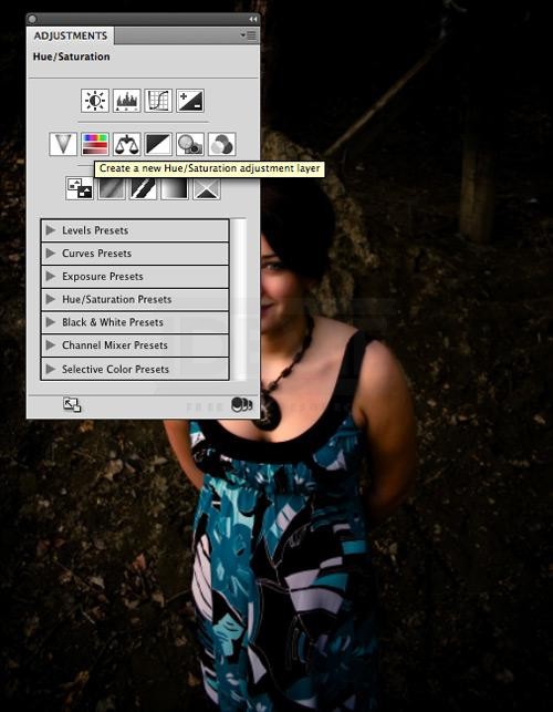
First, create a new Hue/Saturation adjustment layer.
First, add a new adjustment layer
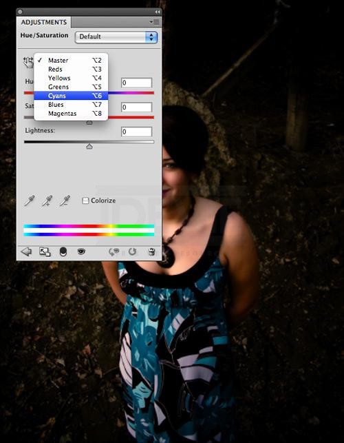
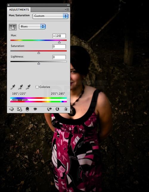
Then, in the drop down selection box, select Cyan to isolate that particular colour.
Isolate the Cyan colours
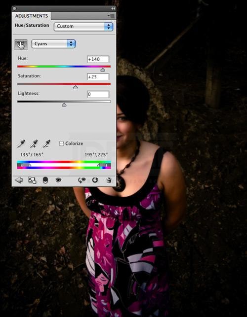
Now, adjust the hue properties as shown here:
Adjust the properties to match this
That pretty much does it. Now, I would just flip over from Cyan to Blue and adjust the properties as follows:
A slight adjustment for the blues
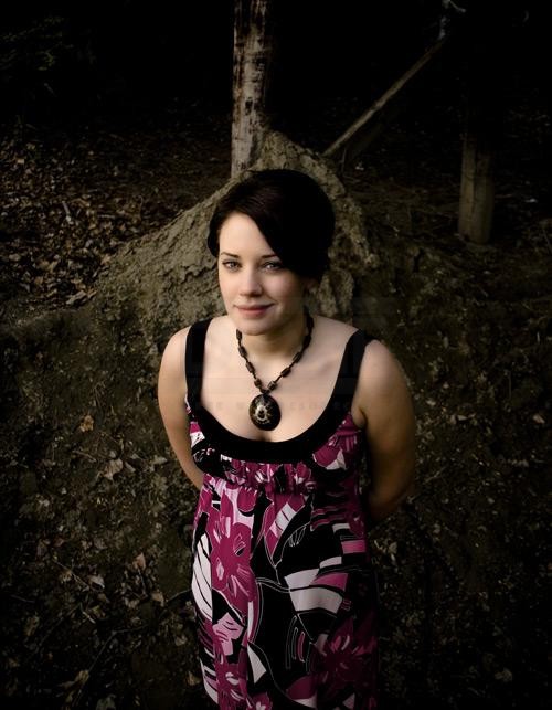
This extra step just fixes up some faint blue fringing around some of the edges of the design on the dress. And there you have it, a complete colour transformation:
The completed transformation
This technique is quick, super easy, and produces great results. Better yet, it’s entirely editable. You could go back and make the dress green or yellow or any other colour you might like!
Scenario 2 – The Red T-Shirt
Okay, the first scenario was pretty easy, and that’s partly because we were working with an ideal photograph, where the colour we wanted to change was entirely isolated to the dress. But what about something like
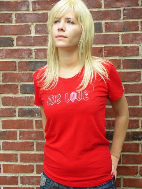
this photo by Carole Smith (aka mccheek), which I snagged from the Flickr Creative Commons?
Our original image
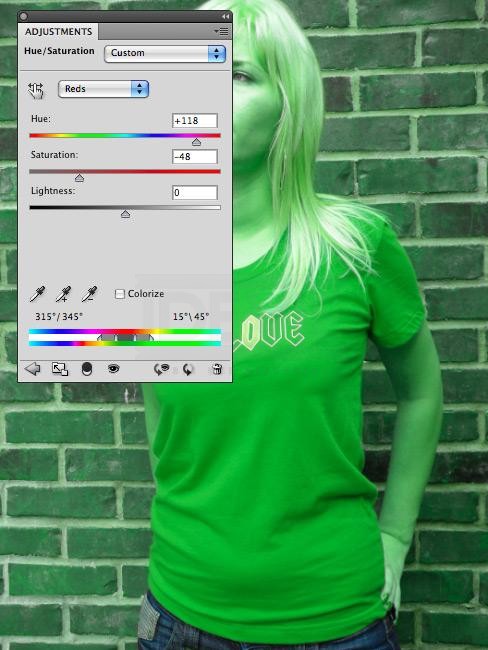
Let’s say we want to change the colour of the t-shirt from bright red to bright green. Go ahead and try the same technique that we used in scenario 1, by creating a simple Hue/Saturation adjustment layer and adjusting the hue for the colour red.
The entire image is effected
That’s a lovely shade of green that we’ve managed to get for the t-shirt itself, but the adjustment layer has also effected all of the reds in the woman’s skin and in the bricks of the wall behind her! It’s kind of a cool effect, but really not what we’re looking for.
Fortunately, we have a pretty awesome degree of control over colours through the layer mask that is automatically added to the adjustment layer when you create it. To take this control and use it to our own ends, we’re going to make use of some quick channel magic.
First, though, we’ll also need to adjust the Magentas (Hue: +103, Saturation: -8) and Yellows (Hue: +57, Saturation: 0) in the adjustment layer, just to round out the colour change.
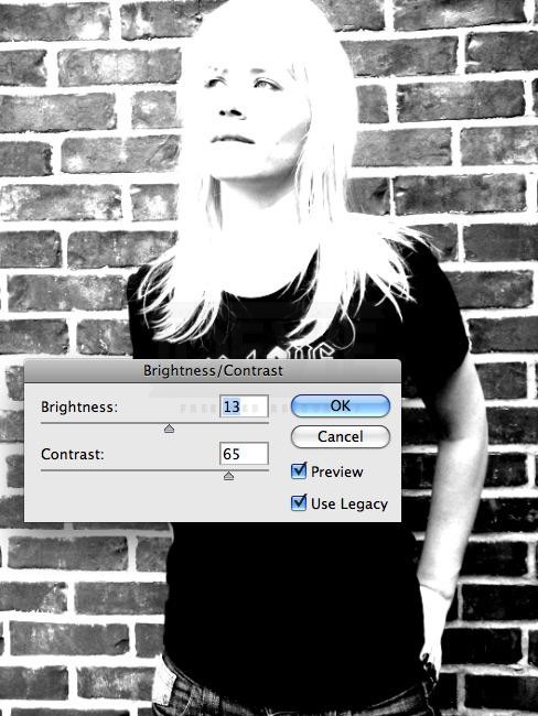
Now, open up your channels palette and duplicate the green layer, which has the best contrast. Then, quickly adjust the brightness and contrast of channel, like this:
Adjust the brightness and contrast on this channel
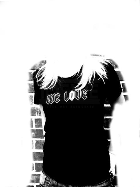
Alright, now, with a large white brush just paint away all of the outside details.
Start brushing away the excess detail
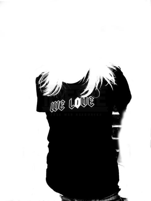
Next, use a smaller brush to paint along the edges of the t-shirt itself.
Get in closer with a smaller brush for finer detail
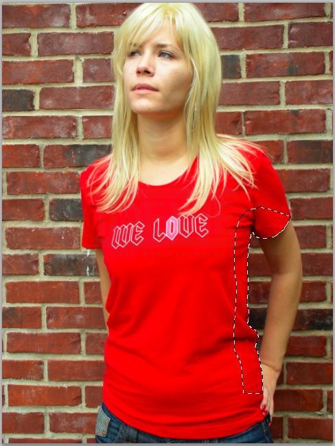
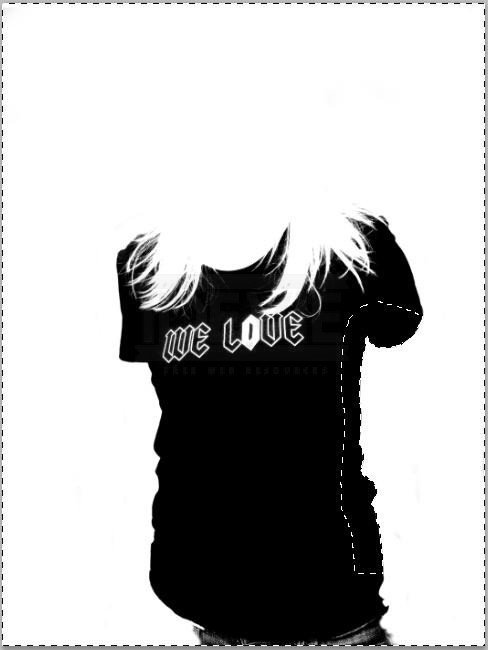
That inner part beneath her left arm is pretty tough, though, as the shadows caused a bunch of the details to blend together. So, I’m going to trace that part of the t-shirt with the pen tool and make a selection.
Use the pen tool to make a selection
Then, simply invert the selection and paint down along the edge of the t-shirt to control the shape.
Brush away the edges, based on the selection
Lastly, paint out the jeans at the bottom and paint in the words on the shirt.
Brush away the jeans
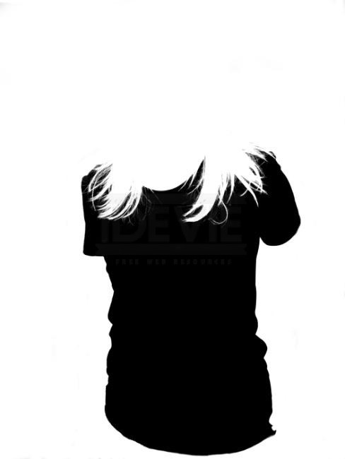
Now, Command-Click (PC: Ctrl-Click) on our channel to create a selection from it. Turn the main RGB channel back on and select the layer mask on the Hue/Saturation layer in the layers palette. Then, simply fill the selection with black.
The basic isolation is now complete
That’s the main part. The rest is all just clean up. Using another soft brush at about 50% opacity, go to work on the layer mask, blending the hair until it looks right.
The finer bits of hair have been blended
The trick here is basically to work somewhat slowly, and just brush away most of the red until you get a nice natural look. What you don’t want to do, though, is paint with a heavy black brush. If you do that, the hair will start to take on an unnatural green tinge. You just want to brush enough that the red will disappear and a bit of the green will be added in, making it look like a natural bit of light reflecting off the now green shirt!
Lastly, there will invariably be some red fringing around the outside of the shirt itself. Again, just take a smaller, soft brush and work those edges carefully.
Polished up the edges
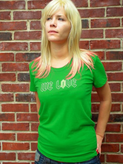
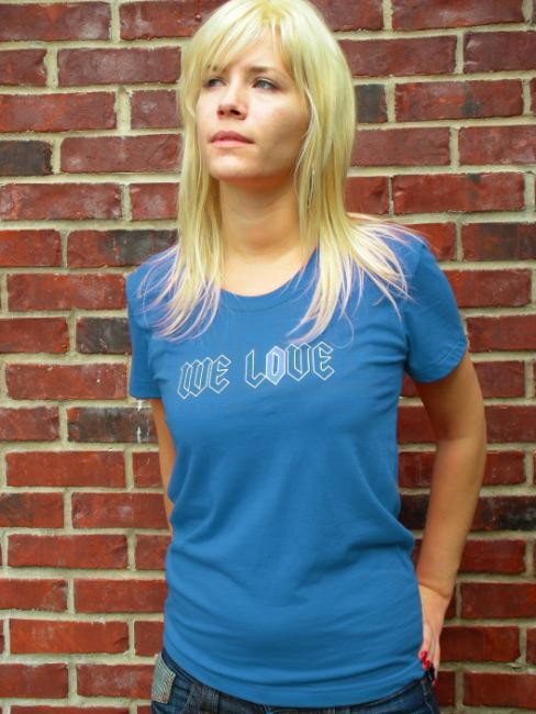
And there you have it. The shirt colour is completely changed, and blended nicely into the rest of the image, all using just a single adjustment layer and its layer mask. Even better, I can play with the settings in the adjustment layer and create an entirely different colour!
Another new colour by tweaking the adjustment layer
It’s a super flexible little technique that I hope you will find useful at some point. Also, I realize that I kind of blitzed through some of the channels stuff. If you’re not totally comfortable with creating isolations or extractions with channels, consider reading this article over on MyInkBlog. It’s a tutorial I recently had published, and which goes into quite a bit of detail about extracting with channels!
Conclusion
There are many other ways that you can use this technique, too. For instance, if you had a row of objects, where you wanted them to each have a different colour, you could create a separate Hue/Saturation adjustment for each object, and use the layer mask to force each adjustment to apply to the appropriate object.