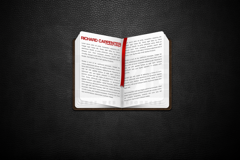
In todays tutorial I’ll be showing you how to create a sleek book with a nice leather textured background. Lets get started.
What We’ll Be Creating
Resources Used In This Tutorial
Lets Get Started!
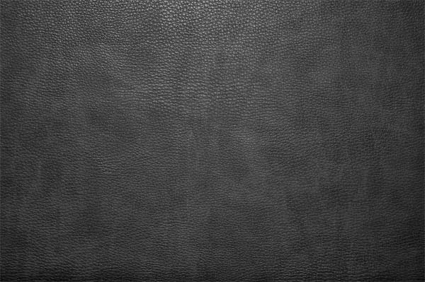
Create a new document (Ctrl + N) 1200 x 800 pixels with any colored background. Open the leather texture which can be downloaded from the resource list.
Drag the leather texture on to your canvas then resize it to fit the canvas by pressing (Ctrl + T), then desaturate the texture by going to “Image > Adjustments > Desturate (Shift + Ctrl + U).
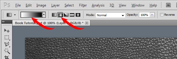
Create a new layer above the leather texture layer then drag a white #ffffff to black #000000 radial gradient (G) over the canvas.

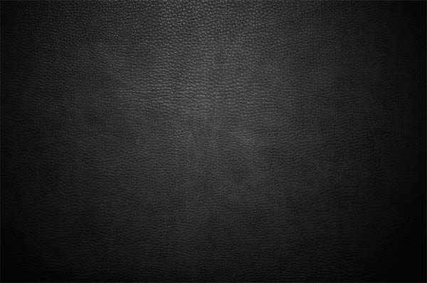
Once you have dragged the gradient over the canvas, set the gradient layers blend mode to “Multiply”.
Creating The Book Cover
Select the “Rounded Rectangle Tool” (U) with a radius of 15 pixels.
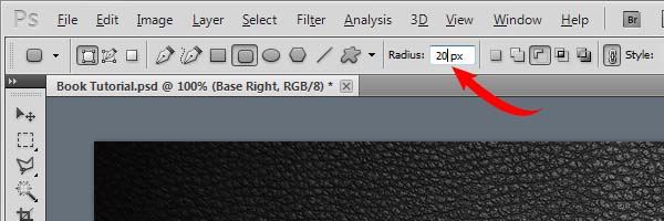
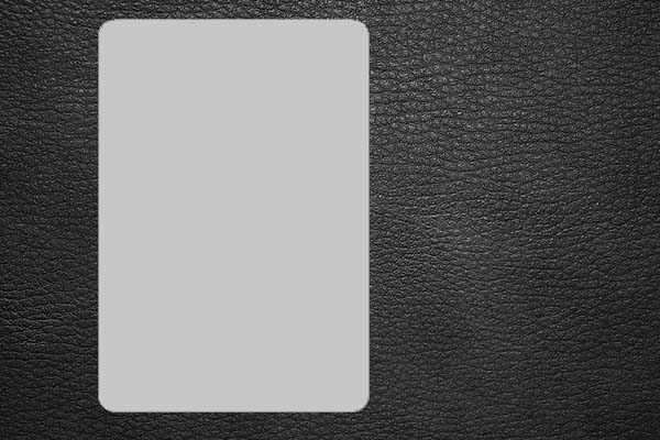
Now drag out a rectangle which will be the left side of the book cover.
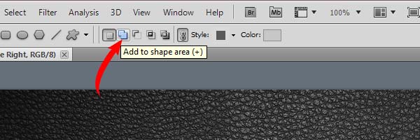
Select the “Vector Mask Thumbnail” from within the layers window then select the “Rectangle Tool” (U). In the rectangle option toolbar at the top change the option to “Add To Shape Area”.
Drag out a rectangle over the rounded corner to make it square.
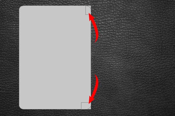
Repeat these steps for both corners then duplicate the layer and flip horizontally. Using the “Move Tool” (V) move the duplicated layer next to the original flat edge to flat edge, leaving a small gap in between..
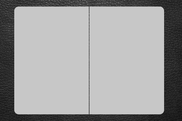
Adding The Texture To The Book Cover
Select one of the book rectangles then add the following layer styles.
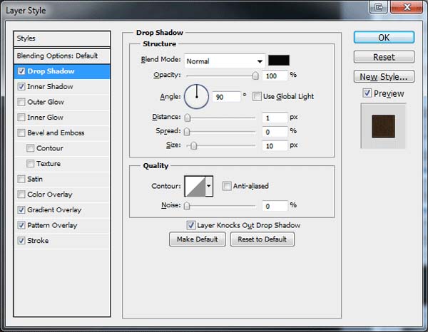
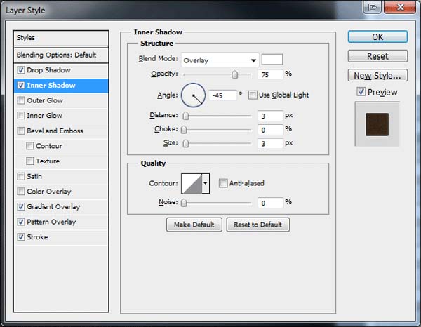
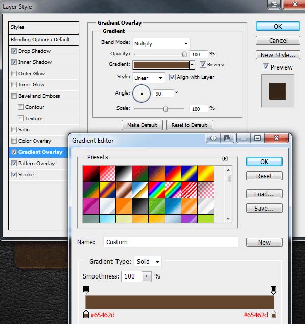
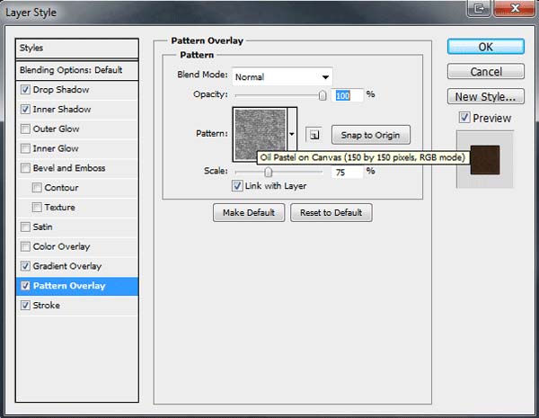
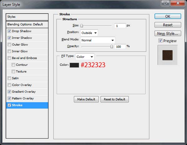
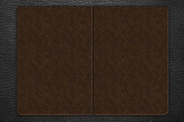
Once you’ve added the layer styles, right-click the layer and select “Copy Layer Styles”. Paste the layer styles onto the other rectangle layer. You should have something like this.
Creating The Paper
Select the “Rounded Rectangle Tool” (U) then drag out a rectangle half the size of the book cover.
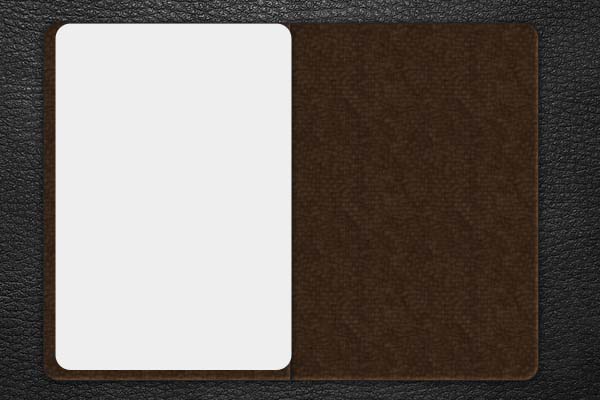
Select the “Rectangle Tool” (U) then in the options toolbar at the top change the option to “Add To Shape Area”. Now drag a square over the left or right rounded corner of the page (Depending on what side of the book your working on).
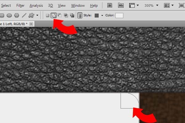
Make the square on both top and bottom corners. Notice also how the paper is aligned slightly towards the top of cover.
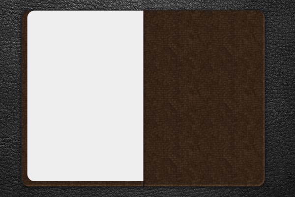
Duplicate the paper, flip it horizontally then align it next to the original layer.
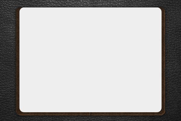
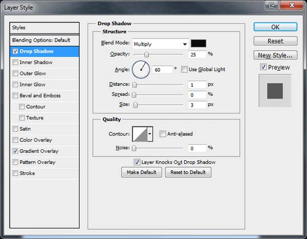
To the left rectangle add the following layer styles.
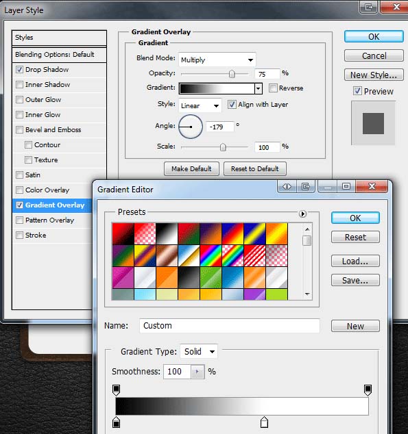
You should have something like this.
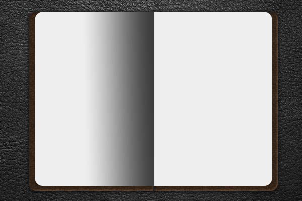
Now simply copy and paste the layer styles to the other rectangle only this time flipping the angle of the gradient.
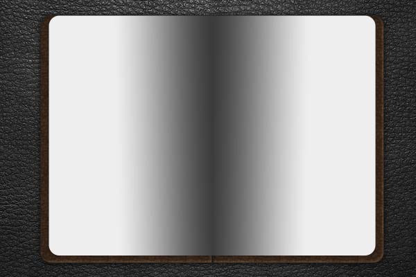
Duplicate one of the page layers, clear the layer styles by right clicking the layer and selected “Clear Layer Styles” from the fly out menu. Select the “Move Tool” (V) then move the duplicated page up then go to “Edit > Transform > Distort” move the left or right side depending on what page your working on downwards so the bottom corner of the page touches the bottom of the spine.
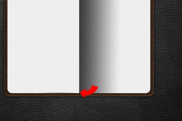
Now add the following layer styles to the book.
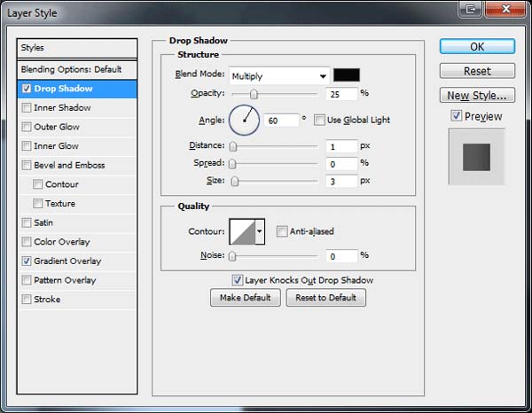
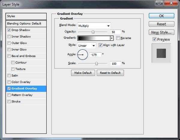
You should have something like this.

Repeat the steps above for as many pages as you want building up, distorting and flipping the gradient angle for each page.

Adding Noise To The Top Pages
Select the “Rectangular Marquee Tool” (M) then drag a marquee around the book covering both left and right pages. Fill (G) the marquee with the color black #000000 then apply the noise filter “Filter > Noise > Add Noise”.
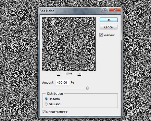
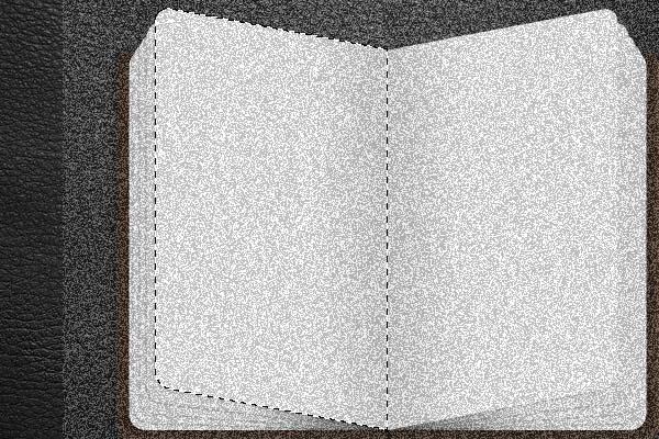
Load a selection around the left or right page of the book then invert the selection “Select > Invert”. Once inverted hit the delete key and set the noise layers opacity to around 3%. Repeat these steps for the other page.

Adding The Book Marker
Before we go ahead and create the ribbon let’s first define the spine area. Select the “Rectangular Marquee Tool” (M) then make a selection around the center of the book.
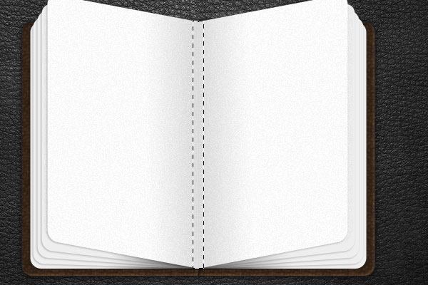
Select the “Gradient Tool” (G) then drag a reflected gradient over the selected area. Once your happy with the gradient set the layer opacity to 15%.

Select the “Pen Tool” (P) then starting from the top right page draw out a black ribbon like shape.

Once your happy with the shape add a “Gradient Overlay” using what ever color you think looks best. I went for a nice red reflected gradient.
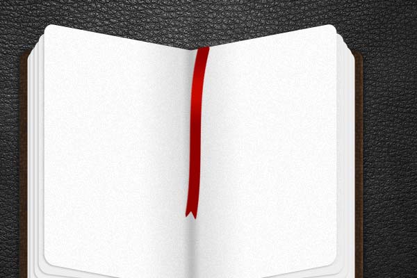
Now duplicate the ribbon layer and drag it underneath the original layer, clear the layer styles by right clicking and selecting “Clear Layer Styles” from the fly out menu. Select the “Move Tool” (V) then move the duplicated layer down and across by a couple of pixels, add a black #000000 color overlay then blur the shape by around 1-2 pixels. Finally set the opacity to around 42%, the aim here is to make a very subtle shadow.
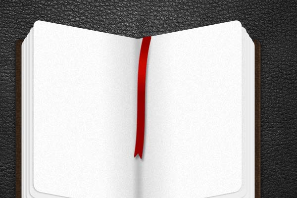
All that’s left to do now is add some text to the pages, then you should have something that looks similar to mine.

