In this tutorial we’ll explore HTML’s pattern attribute, using it to help us customize the way we validate our forms.
Form Validation Video
Check out the video tutorial below, subscribe to Tuts+ on Youtube, or read on to learn more about HTML form validation and the pattern attribute!

HTML5 Form Validation
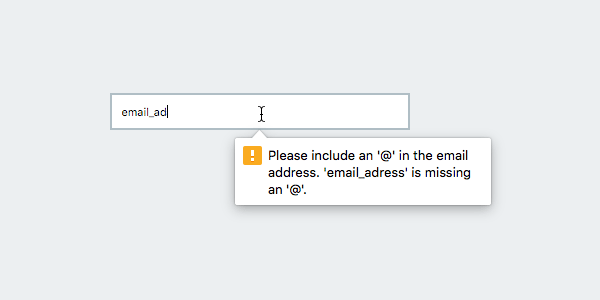
Form validation is of vital importance to a website’s security as well as its usability. The validation process evaluates whether the input value is in the correct format before submitting it. For example, if we have an input field for an email address, the value must certainly contain a valid email address; it should start with a letter or a number, followed by the @ symbol, then end with a domain name.
The HTML5 specification has made validation that bit easier with the introduction of new input types such as email, url, and tel, and these also come packaged up with predefined validation. Whenever the value given is not met with the expected formatting, these input types will throw an error message thus preventing submission.
Expecting every possible input scenario to be catered for is impractical, however. What if you have a username, zip code, or any special data types that are not specified as standard input types? How do we validate those inputs? This is where the attribute pattern comes into play.
Using the Pattern Attribute
The pattern attribute is only applicable on the input element. It allows us to define our own rule to validate the input value using Regular Expressions (RegEx). Again, if the value does not match the specified pattern, the input will throw an error.
For example, say we have a username input in our form. There isn’t a standard type for username, hence we use the regular text input type:
<form action="somefile.php">
	<input type="text" name="username" placeholder="Username">
</form>
Let’s define a rule to add using the pattern attribute. In this case, we’ll specify that the username should only consist of lowercase letters; no capital letters, numbers or other special characters allowed. In addition, the username length shouldn’t be more than 15 characters. In RegEx, this rule can be expressed as [a-z]{1,15}.
Add [a-z]{1,15} as the value of the pattern attribute in our username input:
<form action="somefile.php">
	<input type="text" name="username" placeholder="Username" pattern="[a-z]{1,15}">
</form>
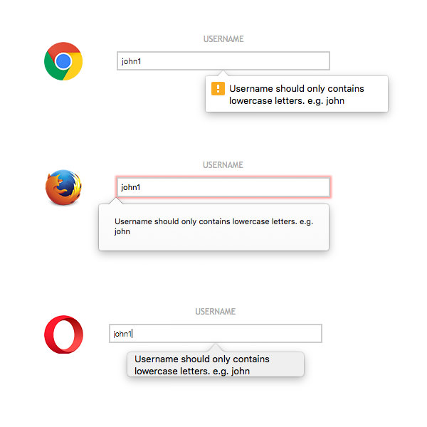
Now, since it only accepts lowercase letters, submitting any other value will throw an error message:
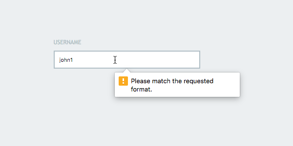
As you can see above, the error message says “Please match the requested format.” So our validation is working, but this message doesn’t help our users understand what the requested format actually is. UX fail.
Customizing the Validation Message
Fortunately, we can customize the message to be more helpful, and we have a couple of ways to do so. The easiest approach is to specify a title attribute within our input element:
<form action="somefile.php">
<input
type="text"
name="username"
placeholder="Username"
pattern="[a-z]{1,15}"
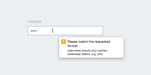
title="Username should only contain lowercase letters. e.g. john">
</form>
Now the title is included along with the default message:
Still, the popup message is inconsistent. If we compare it with the one thrown by the email input type shown earlier, the actual instructions could be more prominent.
The second approach will solve this for us.
Replacing the Default HTML5 Validation Message
Let’s now replace the default “Please match the requested format” with a completely customized message. We’ll use a bit of JavaScript to do this.
Begin by adding an id to the input element, so as to be able to select it conveniently.
<form action="somefile.php">
    <input
        type="text"
        name="username"
        placeholder="Username"
        pattern="[a-z]{1,15}"
        id="username">
</form>
Now, we can select the input element using JavaScript and assign it to a variable (either between <script> tags on our page, in a separate JavaScript file, or in the JS pane on CodePen):
var input = document.getElementById('username');
Lastly, we specify the message used when the input shows its invalid state.
input.oninvalid = function(event) {
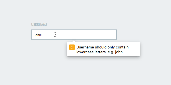
event.target.setCustomValidity('Username should only contain lowercase letters. e.g. john');
}
The oninvalid event inherits an event object which contains a few properties, including the target property (the invalid element) and the validationMessage which contains the error text message. In the example above, we have overriden the text message using the setCustomValidity() method.
We should now find the custom message seamlessly replacing the default.
Styling Our Validation States
To complement the new input types and these methods for setting a custom validation message, the CSS3 spec brings a couple of useful pseudo-classes, :valid and :invalid. These enable us to apply styles depending on the input validity state, for example:
input:invalid {
	border-color: red;
}
input,
input:valid {
	border-color: #ccc;
}
There are several things to keep in mind when using these pseudo-classes:
- First, the
:validis applied by default, even when the input value is empty. Thus, as you can see above, we set theborder-colorto#ccc; the default color given to our input element. The empty value is always considered valid, unless we have added therequiredattribute. In that case, the input is invalid and the red border color is given. - The valid and the invalid styles apply immediately as the user is typing, even when the value is empty. Instant style changes may then throw the users into panic.
A Word on Styling the Popup Message
HTML5 form validation has become a new standard as per the HTML5 specification, yet how the error popup appears is entirely up to the browser vendor. Expect different aesthetics in different browsers, which won’t help the consistency of your UI.
Google Chrome prevented the ability to customize the default popup styles a few years ago. If this is something you want to achieve, the only remaining option is to entirely override the popup message using JavaScript, so let’s see how that works!
Going More Advanced
We are going to create a custom popup which will appear when our input’s value is invalid. To begin with, we need to select a couple of required elements, namely the input and the form elements:
var input = document.getElementById('username');
var form  = document.getElementById('form');
Next, we’ll create a new element which will contain our message:
var	elem               = document.createElement('div');
	elem.id            = 'notify';
	elem.style.display = 'none';
	form.appendChild(elem);
Here we created a new div element. We gave it an id of notify, and hid it by setting the display property to none. Lastly, we appended the new div within the form.
Working with Events
There are two events we need to deal with. First, the invalid event which calls when the value of the input does not match the pattern. We’ll run the following within the invalid event:
input.addEventListener('invalid', function(event){
	event.preventDefault();
	if ( ! event.target.validity.valid ) {
		elem.textContent   = 'Username should only contain lowercase letters e.g. john';
		elem.className     = 'error';
		elem.style.display = 'block';

		input.className    = 'invalid animated shake';
	}
});
Herein, with event.preventDefault();, we prevent the default behavior so that the default browser popup message does not appear. Instead, we are going to show our own through the new div element. We add the text message within the content, add a new class, error and show the message by setting the display to block.
We also add a class, invalid, to the input element, giving it a red border color. We also need to set the style rule in the CSS stylesheet.
input.invalid {
		border-color: #DD2C00;
}
Additionally, you may also add the animated shake classes from Animate.css. This gives it a certain flair by using a shake animation.
The second event is the input event. This event calls when the input value is changed. We’ll use this event to revert the input to its normal state, as well as hide the popup message, as follows.
input.addEventListener('input', function(event){
	if ( 'block' === elem.style.display ) {
		input.className = '';
		elem.style.display = 'none';
	}
});
As you can see above, we are going remove the class names from the input element and hide the popup message.

Now we have a fully customized popup validation message. Give it a go: enter any invalid value:
Note: don’t forget to check out Envato Elements if you’re looking for inspiring form UI design.

Final Thoughts
Using standard input types along with the pattern attribute will give your forms an extra layer of validation, but be aware that you should perform some kind of server side validation too.
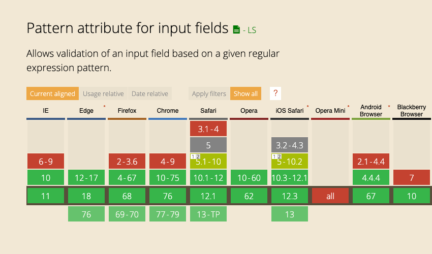
Surprisingly, even when the user has disabled JavaScript in the browser, latest browsers will still show the popup validation and prevent the form submission. In fact, support across all major browsers is very solid nowadays:
I hope you enjoyed the tutorial and keep it as a handy reference for HTML5 form Validation.
Learn JavaScript: The Complete Guide
We’ve built a complete guide to help you learn JavaScript, whether you’re just getting started as a web developer or you want to explore more advanced topics.
