Let’s get into the spirit of St. Valentine’s day, getting all pink and smooshy in the process, and code ourselves a simple beating heart animation with SVG.
Here’s what we’re going to create:
This is a great exercise for familiarizing yourself with SVG syntax and authentic animation. We’re going to take a premade SVG heart, remind ourselves how the viewBox works, then add an animateTransform element to control the beating movement. After an initial “easy” approach, we’ll discuss what’s wrong with it and make some improvements. I’ll also show you some alternative beating heart animations at the end. Let’s begin!


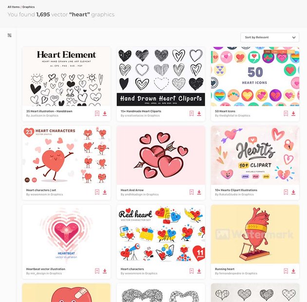
Vector Heart Icons and Valentine’s Graphics on Envato Elements
We’re going to be creating a simple heart icon of our own, but if you want to go one step further why not download one of the hundreds of heart graphics available on Envato Elements? Your monthly subscription gives you unlimited downloads of fonts, UI kits, WordPress themes, and millions of other creative assets. Check it out!


1. Create a Heart Icon
In your vector tool of choice, draw a simple heart icon. It doesn’t need to be perfect, but make it one continuous path for the sake of ease. I created mine on a canvas of 100x100px and filled almost the whole thing.


Download the Illustrator and SVG versions of mine if you want to use those.
Copy and Paste Into a Text Editor
In most vector applications nowadays you can copy objects and paste the resultant SVG code into a text editor. So do that with the heart object. We’ll come back to this SVG snippet in a moment.
2. Start Writing SVG
In Codepen (or a blanco HTML file) begin by writing the bare bones of an SVG element:
<svg width="100" height="100" viewBox="0 0 100 100">

</svg>
Here we’ve given our SVG the same height and width as our original canvas. We’ve also set the viewBox at 0 0 100 100. This means that the window we’re viewing our SVG through begins at the coordinates 0 0 (top left) and measures 100x100px, so it matches our SVG perfectly.
For a reminder of how viewBox works I recommend you take a look at this explainer by Kezz Bracey:
In order to see clearly what you’re dealing with, add a CSS rule to color the SVG background:
svg {
  background: blue;
}
Let’s also center what we’re looking at, using flexbox:
body {
  height: 100vh;
  display: flex;
  align-items: center;
  justify-content: center;
}
3. Add the Heart Path
Now we need to nest a path element in the SVG. Begin with an empty path, with a fill color and an empty d:
<path fill="tomato" d="">
The d defines a drawn path, so let’s add our path coordinates to that. In the SVG snippet you pasted into a text editor, take everything from the d attribute and paste it in our empty one. You should end up with a jumbled string that looks like this:
<path fill="tomato" d="M92.71,7.27L92.71,7.27c-9.71-9.69-25.46-9.69-35.18,0L50,14.79l-7.54-7.52C32.75-2.42,17-2.42,7.29,7.27v0 c-9.71,9.69-9.71,25.41,0,35.1L50,85l42.71-42.63C102.43,32.68,102.43,16.96,92.71,7.27z">
</path>
All that will have created the following:
4. Let Your Heart Grow
I want a bigger heart.
By doubling the SVG width and height attributes to width="200" height="200" we’ll double the size of the whole thing. Or we could scale everything by 150% width="150" height="150". Or something else. We needn’t touch the viewBox values as they’ll stay relative to the Viewport we’ve just changed.
5. Add a Touch of Animation
To animate the beating heart we’re going to use an animateTransform element, nested within our SVG.
Begin by adding the element inside the SVG, as a sibling of the path:
<animateTransform
    attributeName="transform"
    type="scale"
    dur="1s"
    repeatCount="indefinite">
</animateTransform>
This will animate the parent element, ie: the whole <svg>. This won’t be suitable in many situations, and it will be better to animate the elements within the <svg>, but this approach works fine for us. For a refresher on how animateTransform works, Kezz (as usual) has you covered:
The attributes we’ve used are reasonably self-explanatory. We’re creating a scale transform, with a duration of 1s, which will repeat indefinitely.
Add Values to the Transform
Now we need to add a list of values, so it knows by how much to animate:
<animateTransform
      attributeName="transform"
      type="scale"
      dur="1s"
      values="1; 1.5; 1.25; 1.5; 1.5; 1;"
      repeatCount="indefinite">
</animateTransform>
So here the heart begins at normal size (1), then scales to 1.5 normal size, then down a bit to 1.25, then back to 1.5, and so on. These values give us the beating effect.
With a lavender coloured background, we have a beating heart animation!
6. A Better Solution
There are a couple of reasons for changing the way we’ve gone about this, the first (important) reason being: this won’t work on many mobile browsers. iOS Safari and Chrome will just show a motionless heart because they don’t like animateTransform being applied to the <svg> element.
“Be still my beating heart” – Sting
Also, we’re animating the whole SVG; it would be more useful to have the <svg> remain at the same scale whilst its contents are animated. This is possible–we’ll need to play around with the coordinates system a bit–but it’s possible.
Add a Wrapping Element and Zoom Out
Begin by wrapping our <path> and <animateTransform> elements in a group <g> element. This <g> is now what will be animated:
<svg>
    <g>
        <path></path>
        <animateTransform ></animateTransform>
    </g>
</svg>
I’d also like to “zoom out” by increasing the size of the viewBox. This will prevent our heart from scaling beyond the boundaries of the <svg> and thereby masking it.
<svg width="150" height="150" viewBox="0 0 200 200">
At this point it’s a good idea to give the <svg> a background color again, so we can see what’s going on:
Well, it works, we have an SVG heartbeat, but the coordinates are messing with us. The group element is scaling from 0, 0, whereas we need our heart to somehow scale from the center. We can do this by applying a transform to the <path>, moving it half its height up and half its width left:
<path transform="translate(-50 -42.5)"
This is what happens:


To compensate for the <path> moving outside the bounds of the Viewport, let’s now offset the <g> in the other direction. Our viewBox is 200×200, so we need to move the group halfway across it:
<g transform="translate(100 100)">
This is what we’re aiming for (well done if you’re still paying attention!):
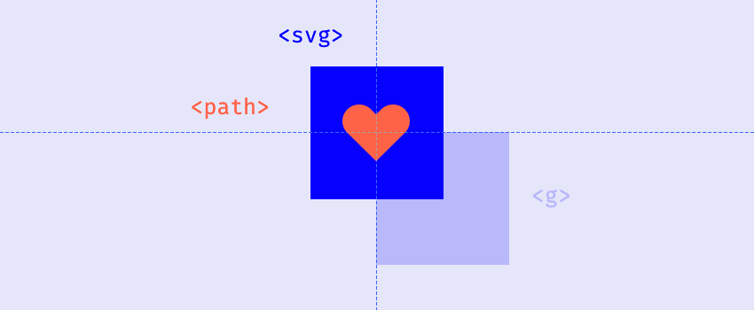


Alternatively, moving the coordinates of the viewBox would have the same effect:
<svg width="150" height="150" viewBox="-100 -100 200 200">
If SVG coordinates have your head spinning, take a look at what Sara Soueidan has written on the subject.
One More Attribute
In order for this to work with transforming the <g>, we need to add one more attribute to the <animateTransform>:
additive="sum"
This effectively adds the transform values within our animation to the transform value declared on the <g> itself, stopping one from overwriting the other. It can be a confusing attribute to understand, and can throw up some unexpected results, but it works perfectly in our case!
“[additive=”sum”] specifies that the animation will add to the underlying value of the attribute and other lower priority animations.” – MDN
Our SVG heartbeat is complete—we’re done!
Conclusion
I have to be honest, I love this end result! It’s a simple but effective beating heart animation, and gives us the perfect opportunity to practice our SVG skills. Here’s what we’ve created (head over to CodePen and give it some hearts!)
Alternative Beating Heart Designs
Earlier I mentioned that you can download hundreds of vector heart graphics from Envato Elements—here’s our heartbeat animation (exactly as we made it) once we’ve switched out the SVG for some of those other graphics!
Cute Panda Hug Love Heart Cartoon
Pride graphic from 50 Heart Icons
15+ Handmade Heart Cliparts
More Lovely SVG on Tuts+ Web Design
SVG is a huge topic to absorb; check out some of our other SVG tutorials and learn with the best!


