Unpredictable text color changes in Outlook for Windows is one of the many mind-boggling issues you’ve no doubt encountered if you’ve ever built an HTML email for Dark Mode.
Outlook brutally inverts colors in Dark Mode, in some cases even turning dark colors into white. Not only can this result in very unsightly parts of your email, it can also result in text that is completely illegible.
This tutorial will show you how to fix some of Outlook’s worst behavior when it comes to text color in Dark Mode.
Coming Up
- In Part 1 of this tutorial, we’ll take a look at color changes for text styled with colors using HTML and CSS only.
- Part 2 will deal with text color changes inside VML (Vector Markup Language) shapes.
1. Color Changes to Simple Colored Text
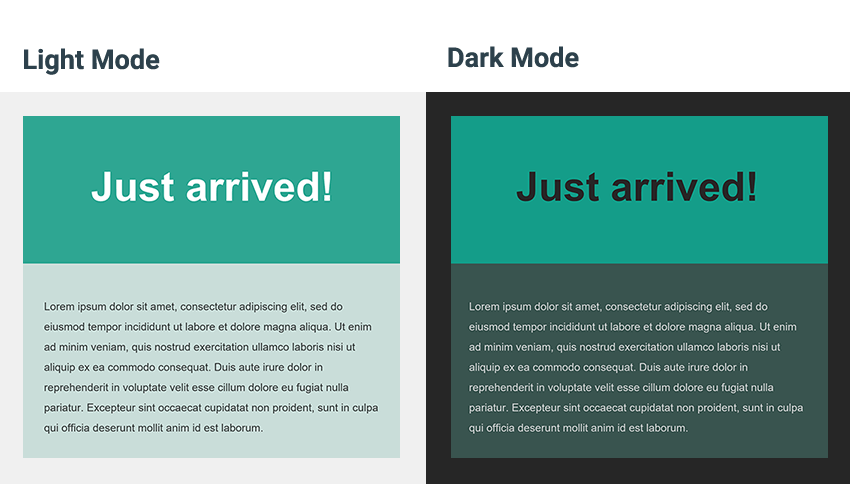
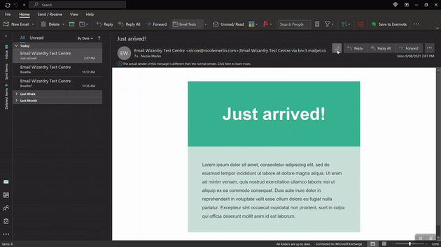
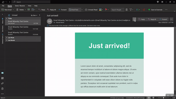
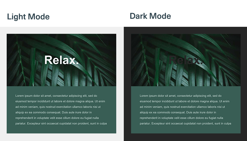
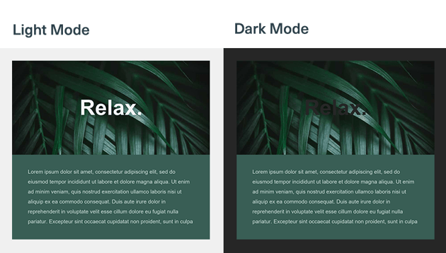
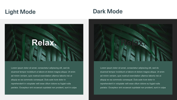
Let’s say you have a medium green area with some large white text on it like this. The body has dark text on much paler green.
However in Outlook Dark Mode, with colors switched, even though the header background is barely being adjusted the text is turning almost black. And whilst most users can still read it, it’s not the effect you’re going for. You want it white.

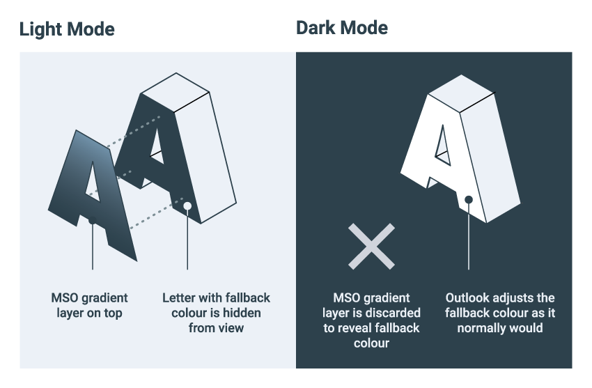
Solution: Apply a Microsoft Text Gradient to Your Text
The Microsoft Word rendering engine is what powers email rendering in Microsoft Outlook. If you’ve used Word, you’ll know you can style your text in lots of different ways, one of which is by adding a gradient.
These gradients also render in Outlook, which is great, but they get stripped away in Dark Mode. This is unfortunate if you want to use an actual gradient of multiple colors, but it’s great news for fixing text problems in Dark Mode since it provides us with a way to control Light Mode and Dark Mode separately.
If we create a “gradient” that is made up of a single color, we can apply that to our text, and it will be displayed in Light Mode.
In Dark Mode, the gradient is stripped away, revealing the fallback color that is set on your text. Outlook will then treat the fallback color according to its Dark Mode algorithm, by darkening or inverting it as it would any normal text color.
This means we do need to get a bit tricky and ensure we choose a fallback color that will turn into the color we want in Outlook Dark Mode. But once we figure that out, we can have complete control over our text’s appearance in both modes.


How to Implement the MSO Gradient Solution
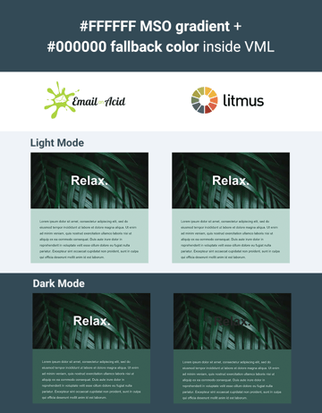
Firstly, identify the code you need to fix. In this case, I’m fixing a paragraph of text that I want to keep white.
Add a class to the code you want to fix. Here I want to make sure my text stays white in Dark Mode, so I’m using .keep-white.
Remember that Outlook won’t respect multiple classes on elements, so make sure it’s the only class on your element. If it already has a class applied, use that, or find some other way to target the element.
<p class="keep-white" style="color:#ffffff;">This text will remain WHITE</p>
Next, go to the head of your file and add this conditional code with a style block inside containing a CSS rule with your new class name.
<!--[if gte mso 16]>
    <style>
        .keep-white {}
    </style>
<![endif]-->
The conditional comment is going to limit this code’s visibility to Microsoft Outlook versions greater than or equal to “mso 16”, which in reality targets Outlook 2016 and newer, which includes the Microsoft 365 version which we are targeting.
Older clients included in this bunch (like Outlook 2016) will still apply the gradient in Light Mode, which looks correct, and they don’t have a Dark Mode, so nothing will happen in that regard. So why not just apply this code to all versions of Outlook? Well, I found that that older versions, like Outlook 2007, don’t apply gradients properly. Instead they display the fallback color, which doesn’t look good if it’s displayed in Light Mode. Limiting it to gte mso 16 neatly sidesteps this problem.
Obtaining the Gradient Code
Now we need the CSS for our Light Mode single-color gradient. If you simply need black and white you can use these snippets.
Black:
mso-style-textfill-type:gradient;
mso-style-textfill-fill-gradientfill-stoplist:"0 #000000 1 100000,99000 #000000 1 100000";
White:
mso-style-textfill-type:gradient;
mso-style-textfill-fill-gradientfill-stoplist:"0 #FFFFFF 0 100000,100000 #FFFFFF 0 100000";
For other colors, you may have some luck just substituting some of the hex values in those. However the structure of the stoplist is a bit arcane, since it is derived from the Open Office XML (OOXML) standard for drawing shapes with a gradient fill. As an example, here’s the CSS for a purple gradient:
mso-style-textfill-type: gradient;
mso-style-textfill-fill-gradientfill-stoplist: "0 #7030A0 -1 100000,99000 #7030A0 -1 100000";
You can check out the specification to understand more, and from that you could work on manually generating your own gradient CSS.
It’s not very intuitive however, and frankly there is an easier way if you have access to Microsoft Word: by getting it to do the hard work for you, and stealing the resulting CSS code. Here’s how:
- Open Microsoft Word
- Type out a few words
- Go to Format > Text effects (Mac) or click on the Text Color icon in the ribbon and then go to Gradient > More Gradients (Mac and Windows)
- There you can set up a gradient with two stops of the same color (here I am going to use white)
- When you’re done, save your file as a “Web Page” (.htm or .html extension)
- Open the HTML file in your code editor and scroll all the way to the bottom to find the words you typed out, which will be wrapped in a
paragraphandspantag containing the CSS code we want.
The CSS will look something like this:
<p class=MsoNormal><b><span lang=EN-GB style='font-size:22.0pt;line-height:120%;mso-style-textfill-type:gradient;mso-style-textfill-fill-gradientfill-shadetype:linear;mso-style-textfill-fill-gradientfill-shade-linearshade-angle:5400000;
mso-style-textfill-fill-gradientfill-shade-linearshade-fscaled:no;mso-style-textfill-fill-gradientfill-stoplist:"0 #FFFFFF 0 100000,100000 #FFFFFF 0 100000"'>Hello, here is some text.<o:p></o:p></span></b></p>
I find that you only need two bits from that, firstly the line that will specify that we want a gradient:
mso-style-textfill-type:gradient;
And the color stoplist:
mso-style-textfill-fill-gradientfill-stoplist:"0 #FFFFFF 0 100000,100000 #FFFFFF 0 100000";
Once you have the first line and your stoplist, add them to your CSS rule so it looks something like this:
<!--[if gte mso 16]>
    <style>
        .keep-white {
            mso-style-textfill-type:gradient;
            mso-style-textfill-fill-gradientfill-stoplist:"0 #FFFFFF 0 100000,100000 #FFFFFF 0 100000";
        }
    </style>
<![endif]-->
We’ve set up our gradient, and this is what’s going to display in Light Mode.
Now it’s time for the bit that actually fixes our problem: adding our fallback color.
As we saw above, in Dark Mode Outlook is going to discard the gradient, read the fallback color, and then adjust or invert it as it normally would. This means we need to choose a color that Outlook is going to turn into the color we want in Dark Mode.
Since I want white, that’s easy: Outlook Dark Mode completely inverts black and white, so I just need to make the fallback black.
I’ll add my fallback color value to the CSS rule, and add !important to ensure it overrides the inline styling I have on my paragraph tag, which is setting the text to white for all other clients. My rule now looks like this:
<!--[if gte mso 16]>
    <style>
        .keep-white {
            mso-style-textfill-type:gradient;
            mso-style-textfill-fill-gradientfill-stoplist:"0 #FFFFFF 0 100000,100000 #FFFFFF 0 100000";
            color:#000000 !important;
        }
    </style>
<![endif]-->
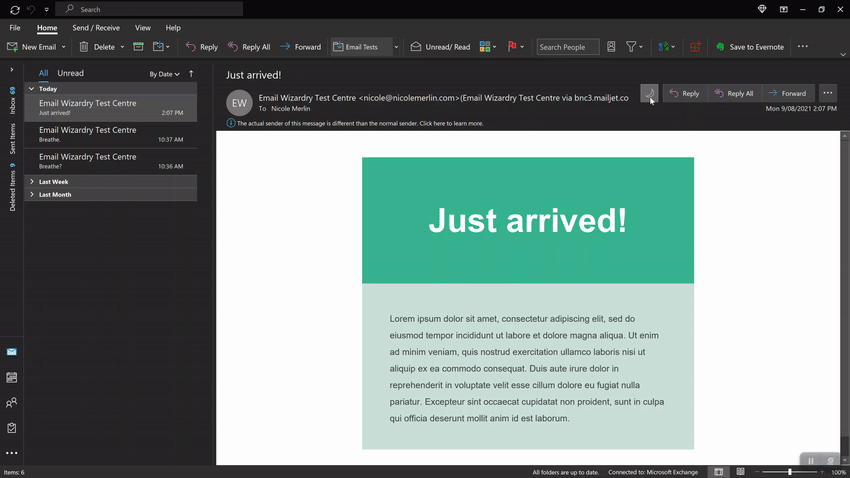
And that’s it! When I send a test, I now see that my text remains white in Microsoft 365 Outlook, no matter whether I am using Light Mode or Dark Mode.
A Note on Working With Colored Text
As you’ve seen in the steps above, generating your gradient for Light Mode in Word is easy. It’s finding the right fallback color that’s tricky, as it can be hard to predict whether Outlook is going to invert a color or just darken in in Dark Mode.
However with a little trial and error, you can get the results you need. It can help to send some color swatches to Outlook, to identify the right shade in Dark Mode. Then you can use whichever hex color resulted in that shade in Dark Mode, and use it as your fallback.
2. Fixing Text Color Changes Inside VML
If you’ve worked with VML and Outlook Dark Mode you’ll be no stranger to the kinds of problems you can end up with. The most annoying issue is the fact that VML fills and images aren’t adjusted in Dark Mode, but text colors are, which can result in completely illegible text like this:
Unfortunately, text inside a block of VML tends to behave differently to normal text when it comes to Dark Mode, so the fix above doesn’t work reliably inside VML.
The main reason for this is something very weird; there seem to be two different Dark Mode algorithms operating across different copies of Outlook 365.
I have observed completely different outcomes between the version of Outlook 365 that Litmus provides, versus the version/s at Email on Acid, Testi and my own Windows 10 PC.
Bizarrely, when you use the gradient trick above, the version at Litmus doesn’t invert the fallback color, it simply displays it as-is.


Since there are clearly different copies of the latest Outlook in circulation that are going to be doing two completely different things, it’s no longer a viable fix for our issue.
The Trouble With Textfills
This discrepancy also seems to explain why another popular trick for trying to fix text in Outlook seems to work for some email developers and not for others.
A popular suggestion is to use, for example, mso-style-textfill-fill-color:#000000; to ensure text remains black in Dark Mode.
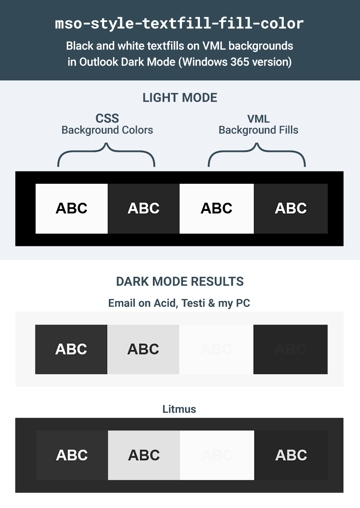
This solid textfill-fill doesn’t get stripped off in Dark Mode like the gradients do, however there is also some major discrepancy between how it is interpreted inside VML across different copies of Outlook.
As you can see below, when a black textfill is applied over a white VML fill, all copies of Outlook display it as a light grey in Dark Mode.
However when you use a white textfill over a black VML shape, in Email on Acid, Testi and on my own PC, it actually shows up as very dark grey, whereas at Litmus is displays as a pale grey.
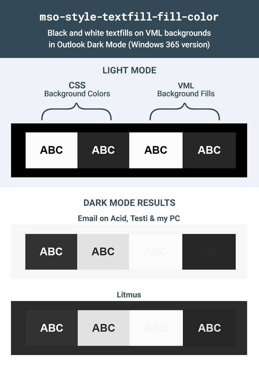
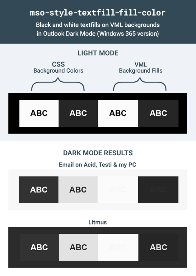
Similarly with colored textfills over VML, Email on Acid, Testi and my machine show a tendency to (mostly) darken the textfills, whereas the version at Litmus tends towards a lightening and desaturation.

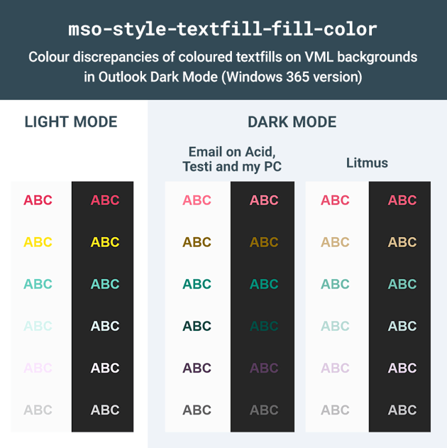
Sadly I have no idea what is actually going on here, but at least we know we can completely rule out both mso-style-textfill-type:gradient and mso-style-textfill-fill-color when it comes to fixing Dark Mode text issues inside VML.
A Way Around it All
One way to avoid this difference in behaviour between text inside and outside VML is to use CSS positioning and z-index to layer your email content over the top of your VML content, keeping your text content separate from your VML. If this is viable for you, then it will mean you avoid the text being treated differently, and the mso-style-textfill-type:gradient trick we looked at in Part 1 will work perfectly for you.
However, that’s not always possible, so what else can be done?
An Experimental Solution for Inside VML: Harnessing the Power of color:auto;
In the course of digging around inside lots of different Word-generated HTML files, I’ve noticed there are a few color values that frequently pop up like color:window;, color:windowText; and color:auto;. After playing around with them I didn’t have much luck with many of the others but, auto does actually seem to have the power of automatic color calculation behind it, and it turns out you can use it inside VML to ensure your text renders as black or white, without changing at all between Dark and Light Modes.
Its calculation seems to be based off a combination of the body background + VML fill color. (Other layout or wrapper elements with their own background colors applied don’t seem to have any further effect on the calculation.) If you have a dark body background and a light VML fill, then color:auto; resolves to black or a very dark grey. If you have a light body background and a dark VML fill, then color:auto; resolves to either white or a very pale grey.
As a general guide, the tipping points for greyscale seem to be as follows.
If You Need White Text
- Body background must be #555555 or lighter
- VML fill must be #333333 or darker


If You Need Black Text
- Body background must be #444444 or darker
- VML fill must be #555555 or lighter


Can You Fix Both in the Same Email?
In a word: no. In most cases you can only solve either the black or white text elements in your layout, not both, since color:auto; is partially calculated off your body background color, which is obviously global. Feel free to experiment, as you might have better luck, but you will mostly likely need to prioritise one category of elements to fix if you have a lot of different-colored VML elements throughout your email.
Colors are harder to pin down and explain, but I found them pretty forgiving–have a play around with them. It seems that you just need to create enough contrast between the elements in order to ensure color:auto; resolves to the same color and doesn’t change whether it’s Dark or Light Mode.
Let’s run through applying both black and white.
How to Keep Text Black Inside VML in Dark Mode
1. Ensure Your Body Background is Dark
Firstly, ensure your body background is dark—#444444 or darker. If you are using colors then a fairly dark shade should work well, but you may need to experiment a little.
<body style="background-color:#444444;">
You may prefer to to apply the background color using some conditional CSS just for Outlook 2016+ in the head–it’s up to you. If you want to do that, then add this to the head of your code:
<!--[if gte mso 16]>
    <style>
        body {
            background-color:#444444 !important;
        }
    </style>
<![endif]-->
2. Ensure Your VML Fill is Light
If you’re hoping for black text, then chances are it’s already light anyway. If you have an image fill, then it won’t make a difference to you since you won’t see the color behind the image.
If you simply have a v:shape like a v:oval or v:rect, then set the fillcolor to be #555555 or lighter:
<v:rect fillcolor="#555555">
Alternatively if you have a v:fill element then set the color to be #555555 or lighter:
<v:fill type="frame" src="http://webdesign.tutsplus.com/image.jpg" color="#555555" />
3. Apply the Auto Color CSS
Rather than using color:auto; I find that the best way to do this is to actually to add mso-color-alt:auto; to your element’s CSS, as this will conveniently override any color you already have set on your element, and it will only work in Outlook, without disrupting any other clients. You can simply add it inline after your text color:
<p style="margin:0;color:#000000;mso-color-alt:auto;">Black text</p>
Alternatively you could add a class to your item like this:
<p class="vml-black" style="margin:0;color:#000000;">Black text</p>
Then add this CSS to the head of your email, limiting to new versions of Outlook just to be safe:
<!--[if gte mso 16]>
    <style>
        .vml-black {
            mso-color-alt: auto;
        }
    </style>
<![endif]-->
And that’s it! Now send a test and you’ll see your text is displaying nice and dark in both Light and Dark Modes.
How to Keep Text White Inside VML in Dark Mode
1. Ensure Your Body Background is Light
Firstly, ensure your body background is light—#555555 or lighter. If you are using colors then a fairly light shade should work well, but you may need to experiment a little.
<body style="background-color:#555555;">
If you’d prefer to do this in conditional Outlook-only CSS then you can do that too:
<!--[if gte mso 16]>
    <style>
        body {
            background-color:#555555 !important;
        }
    </style>
<![endif]-->
2. Ensure Your VML Fill is Dark
If you’re hoping for white text, then chances are it’s already dark anyway. If you have an image fill, then it won’t make a difference to you since you won’t see the color behind the image.
If you just have a v:shape like a v:oval or v:rect, then set the fillcolor to be #333333 or darker:
<v:rect fillcolor="#333333">
Alternatively if you have a v:fill element then set the color to be #333333 or darker:
<v:fill type="frame" src="http://webdesign.tutsplus.com/image.jpg" color="#333333" />
3. Apply the Auto Color CSS
Rather than using color:auto; I find that the best way to do this is to actually to add mso-color-alt:auto; to your element’s CSS, as this will conveniently override any color you already have set on your element, and it will only work in Outlook, without disrupting any other clients. You can simply add it inline after your text color:
<p style="margin:0;color:#ffffff;mso-color-alt:auto;">White text</p>
Alternatively you could add a class to your item like this:
<p class="vml-white" style="margin:0;color:#ffffff;">White text</p>
Then simply add this CSS to the head of your email, limiting to new versions of Outlook just to be safe:
<!--[if gte mso 16]>
    <style>
        .vml-white {
            mso-color-alt: auto;
        }
    </style>
<![endif]-->
And that’s it! Now send a test and you’ll see your text is displaying nice and white in both Light and Dark Modes.
3. Test, Test, Test!
Of course, as with any code solutions for HTML email, when it comes to trying it out in your own projects always be sure to test thoroughly.
As we’ve seen above, it’s also important to test Microsoft 365 Outlook Dark Mode across more than just one testing provider — ideally if you use Litmus then you should also try to get your hands on an account at Email on Acid or Testi, or set up your own Windows 10 testing PC to ensure you’re seeing the full range of possible results in Microsoft 365 Outlook.
Conclusion
The color:auto; trick is definitely experimental but it has been working really well for me. I hope both of these tips can save you some time and stress, and I’d love to hear about your experiments and results implementing any of these tricks in your own emails.
