
The combination of images, graphics and typography create a cohesive design that gets noticed. All of these elements also feature a variety of colors all working together through the design. But how do you know what colors to use? Which colors work together and which ones should you stay away from? What colors set the specific tone you are after in your design?
There are a lot of things to consider when choosing colors for your designs. It’s more than just picking the colors you like and implementing them. Whether you’re a beginner or veteran designer, you can always look to your core images and photos for color inspiration. In this tutorial, I’ll show you some how to use images and photographs as inspiration for colors in your designs. You’ll also learn how to capture colors from these images and create swatches to use in your designs.
Choosing an Image
This tutorial will walk you through choosing colors from one core image. Many strong print designs revolve around one image that stands out, features great color options and has room for additional content such as text.
Tips for Choosing Colors
When you are gathering potential photos and images for your designs, it’s important to choose photos that have many color options. Remember, many color options doesn’t necessarily mean a kaleidoscope of color. It just means that your photographs will offer lots of options and inspiration. So where do you start? We’re going to look at four options that will help you select colors for your designs.
1. Start with One Bold Color
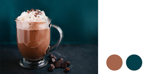
Before opening Photoshop or InDesign, look at your image. You can see from the example above there are several strong colors from the deep teal to the browns. You can use either as a foundation for your design. In this example, you could use the teal for headlines and backgrounds and the brown for paragraph text and highlight such as rectangles, circles and other ornamental designs elements. The cream color for the whipped topping would also make for great text colors on a dark background.
2. Add Complimentary Colors
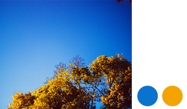
Complimentary colors when placed next to each other create the strongest contrast and reinforce each other. The quickest way to determine whether two colors are complimentary is to look at them on the color wheel. Complimentary colors are directly across from each other such as blue and yellow, red and green and purple and orange. Using complimentary colors in your designs create a vibrant contrast, usually between warm and cool colors. This method will often create a bright design that really pops with color but works well because of the complimentary color choices. The key here is to vary the use of each color and pick one as the dominant color throughout your design. That way your colors don’t compete for attention. From the example above you can see that the cool blue dominates the image and the warm yellow brightens the right corner. If you were to place text on this photo, you’d want to stick with yellows.
3. Use Tints and Shades
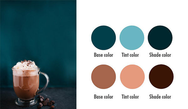
You most likely will use more than two colors in your designs. Instead of adding another color to the mix, we’re going to look at tints and shades of either our complimentary colors or one bold color. For a clean design, keep your color choices to a maximum of 3 but add in a mix of tints and shades of a color you already chose to mix things up. Doing so will greatly increase the color options you have available to use in a design without adding colors that don’t compliment what you already have. Going back to the first example, you can increase your color options by choosing a tint of either the teal or brown. A tint is a mixture of a color with white. This increases the lightness of a color. A shade is a mixture of a color with black. This decreases the lightness of a color. This means that you can add more color options by either increasing the lightness or darkness of your base color. There is a deep range in lightness and darkness, so the options are endless here.
4. Tie it All Together
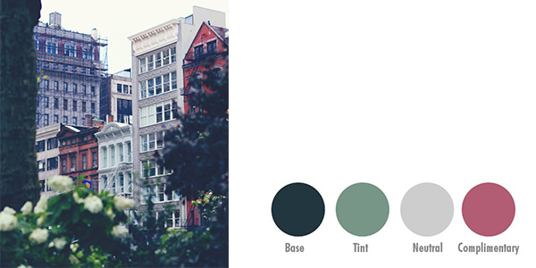
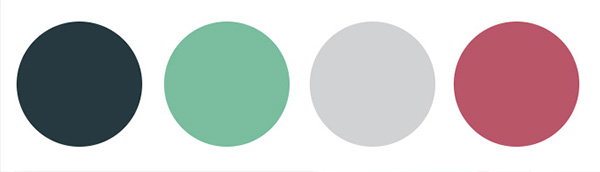
Finish off with a range of choices including a bold color, a tint or shade of that bold color, a neutral color and then a complimentary color for highlight. This will give you the most options for your design regardless of whether you need a light color for a dark background or a dark color for a light background and everything in between. In the below example, you can see the color inspiration and how well they work together. Would you have picked these colors out without the photo for inspiration?
Creating Color Swatches
Step 1
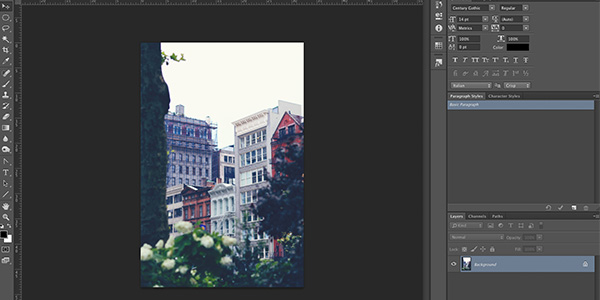
Hit Control-O and navigate to your image on your harddrive and open it in Photoshop.
Step 2
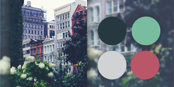
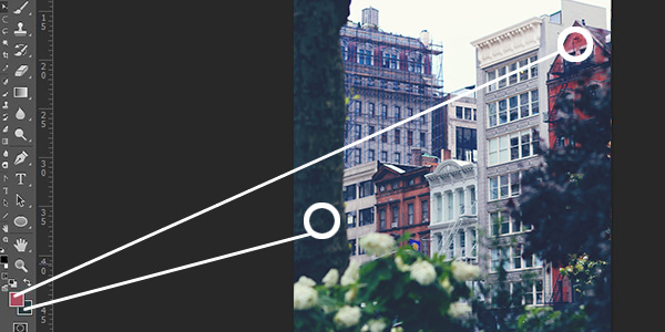
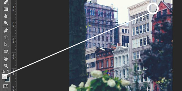
Select the Eyedropper Tool (I) and click an area to select your base color. Hit X and repeat to select your complimentary color. It is easier to select your main color and then immediately look for the complimentary color. In the example image we selected a dark green as the base and can see that the red would be a complimentary color and great highlight. Note that the red doesn’t have to be a perfect red. Here we went with a more muted red with a pink undertone based on the color in the photo.
Step 3
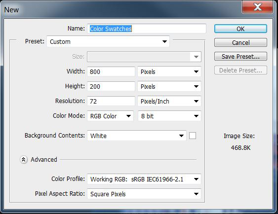
Next we need to create a document for the swatches. This extra step will allow you to easily save the colors for future reference regardless of whether you’ll use Photoshop or InDesign. These swatches also make for awesome inclusions in a creative brief. You would just use the Eye Dropper Tool (I) to select these colors for your designs.
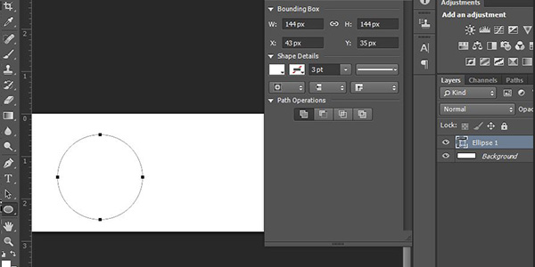
Hit Control-N and create a New Document of 800 x 200 pixels, in RGB Color Mode at 72 Pixels/Inch. Name it Color Swatches.
Step 4
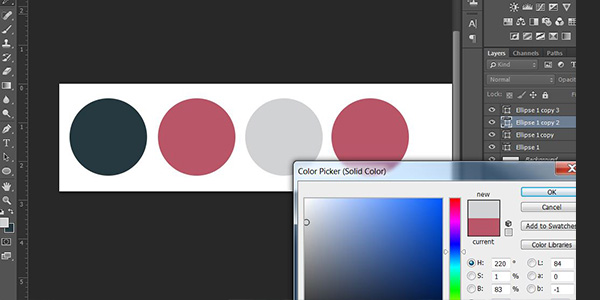
Select the Ellipse Tool (U) and draw out a circle at any size. Here we chose 2 inches. Then double-click the circle in the Layers Palette and you’ll notice the cursor turns to an Eye Dropper and the Color Picker window opens. You can now select your base color from the background/foreground color on the left.
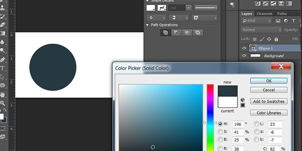
Step 5
Repeat Step 4 for the complimentary color.
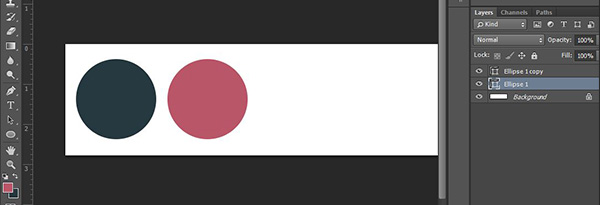
Step 6
Next, with the complimentary color shape layer selected, hold down Alt-Shift and drag a duplicate circle next to the pink circle. Release your mouse when your circle is in position. Repeat this step to create another duplicate circle layer. You should now have 4 circle layers. These last two circles will house your neutral color and tint color.
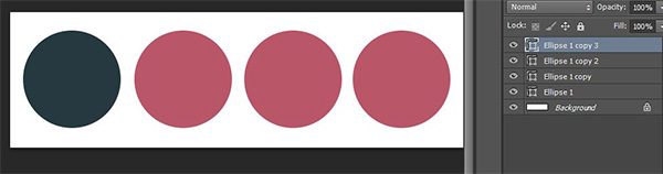
Step 7
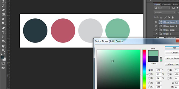
Return to your photograph and repeat Step 2 to select a neutral gray color. Then return to your swatches and double-click the third circle and select the gray color with the Eye Dropper Tool (I).
Step 8
The last color is a tint of the base color. Select the Eye Dropper Tool (I) and click on the dark green circle on the far left. Double-click the circle on the far right (Ellipse 1 copy 3) from the Layers Palette and select the green color with the Eye Dropper (I). Now you want a tint of this color so select a color toward the white end of the Color Picker. We want a nice sea foam green here, not too white, but not too dark either.
Step 9
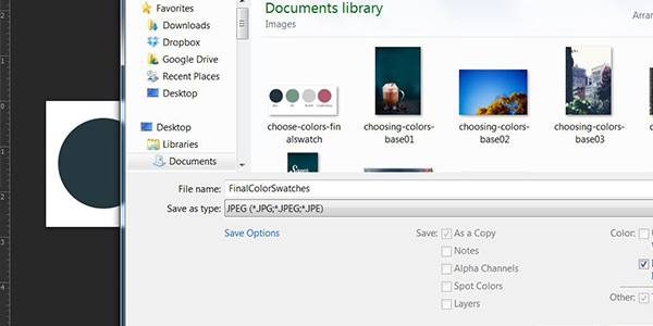
You can reorder the circles by clicking each one in the Layers Palette and moving it in the order you want your swatches to appear. Here, we have the colors going from the base to the complimentary color. To save this as an image, go to File>Save As>JPEG and name it something like FinalColorSwatches. Now you have a color palette ready for your next design!
Ready For More?
Choosing colors is an important step in your design process and you can use the images already available to you as inspiration! You’ll have unique and stand out color combos in no time. Next it’s time to take your designs to the next level and apply what you learned to a real brochure.
Head on over to my Fundamentals of Print Design course for a complete beginners guide to all things print design. From design concept to pre-press, you’ll get started creating your first brochure in InDesign.