Think about your favorite famous brand. The first thing that comes to mind is the logo. Logos play the most important part in establishing a memorable brand, but it’s a tough task to condense all of the admirable aspects of an organization into a single simple symbol. Ask any designer or brand manager, and they’ll reiterate how important it is to get the logo right.
From the designer’s point of view, it should be aesthetically attractive and effectively connote the brand message. When designing a logo, you should give special attention to the typeface, spacing, and symbols, because your logo design could make or break the brand impression.
In this tutorial, we will create a stylish cubist logo with a clean aesthetic. We will use some interesting techniques and blending options to achieve the final outcome. Before we start with the logo, let’s have a look ahead at the final outcome.
(Download the finished, layered Photoshop file.)
Step 1:
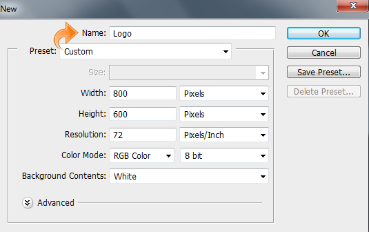
Open Photoshop and create a new file. For the new file, I’m going to set the width to 800px and the height to 600px.
Step 2:
Our logo will have the trendy cubist style while maintaining the intended clean and sharp look. We are going to design the logo of a very famous fictional brand “Adjusted”. So, let’s start with the base. As our company name is “Adjusted”, we will design the logo in the shape of dials or controllers. So, first create a new layer, click on “Layer” > “New Layer” or you can also use the “New layer” option within the layers panel.
Now select the rectangle tool, create a rectangle, and fill it with color #362f2d.

Step 3:
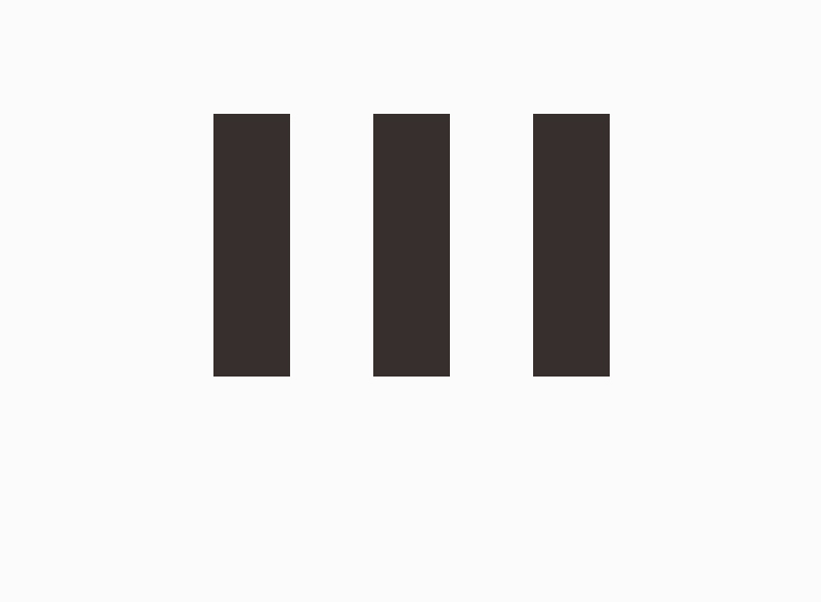
We are going to repeat the same process and create another rectangle and fill it with the same color as before. Move it to the right so that the two rectangles are 75px apart.

Step 4:
Again, repeat the same process, create yet another rectangle and fill it with the same color as the first two. Move the third rectangle to the right same way as before.
Step 5:
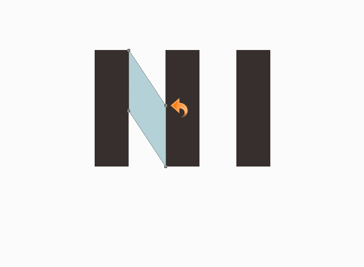
Create a new layer. Select the pen tool to create a shape, fill it with color #b1cfd7, and then place the shape layer under the rectangle layers.
Step 6:
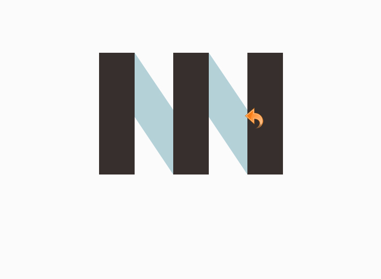
Repeat the same process; create another shape with the pen tool and fill it with color #b1cfd7. Place it under the rectangle layers.
Step 7:
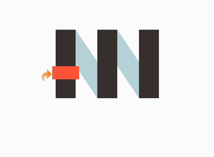
Now for the handles, create a small rectangle using the rectangle tool and fill it with color #ff5337.
Step 8:
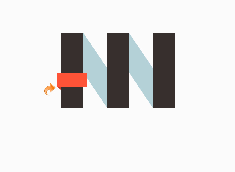
For the folded edges, select the pen tool to create a small triangle on the left side. Select color #ca402a to fill this triangle.
Step 9:
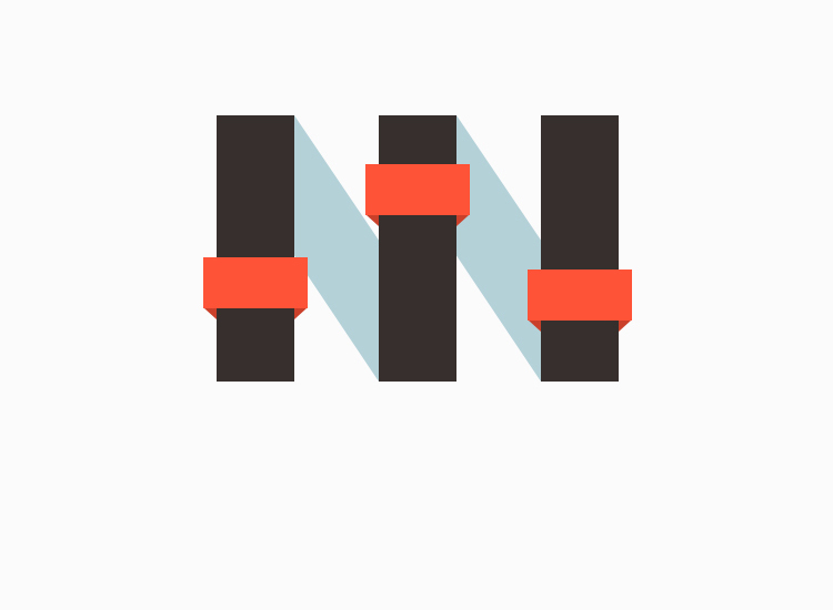
Once again, select the pen tool and create another triangle on the right side, fill it with the same color (#ca402a).

Step 10:
Repeat the same process and create the other two handles with the same colors and folded edges.
Step 11:
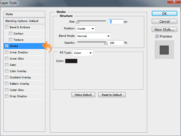
Now, let’s start with the styling. First, we’ll deal with the main rectangles. Click on “Layer” > “Layer style” > “Stroke”. Add a 1px stroke with color #1e1a19 and use the settings shown below.
Step 12:
Now we will add some cubist style to our logo by covering our logo with lots of subtle geometric shapes. First, we will select the rectangle layer and create a clipping mask by pressing down Command-Opt (for Mac) or Ctrl-Alt (for Win) + “G”.
Then, select the pen tool and create a triangle. Fill it with color #362f2d. Then, change the blending mode to “Multiply” and reduce the opacity to 33%.
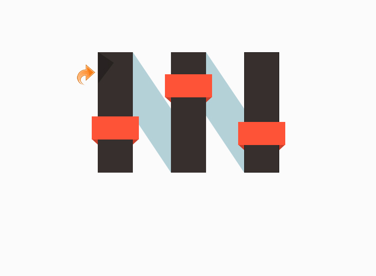
Step 13:
Select the pen tool and create another triangle just like before. Fill it with color #7d7d7d, reduce the opacity to 33%, and change the blending mode to “Multiply”.
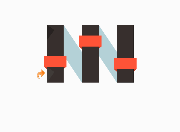
Step 14:
Now, repeat the same process and add the rest of the triangles using the same techniques; don’t forget to change the blending mode to of these triangles to “Multiply” and keep the opacity at 33%.

Step 15:
Now we will add even more triangles on the rest of our rectangles using the pen tool. Use the same colors, opacity and blending mode as before for consistency.
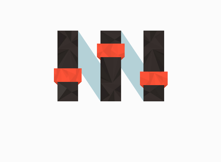
Step 16:
Now, let’s add the brand name or title. Select the type tool and add text using color #ff5337. I’m going to add a 1px “Inner shadow” and add some pattern to our text, but that is optional — if you want you can leave it as it is. Our clean and stylish logo is done.
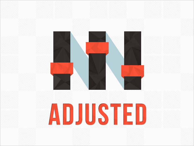
If you are working on a logo of your own, experiment with different approaches, as there are new styles and techniques rising to prominence all the time. You’d be surprised what your clients and customers may like, and you’ll never know unless you step outside of your comfort zone and try an unproven style.
