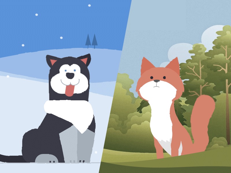
Learn some interesting animation techniques involving Sass and SVG filters for realistic motion effects on the example of animated animals.
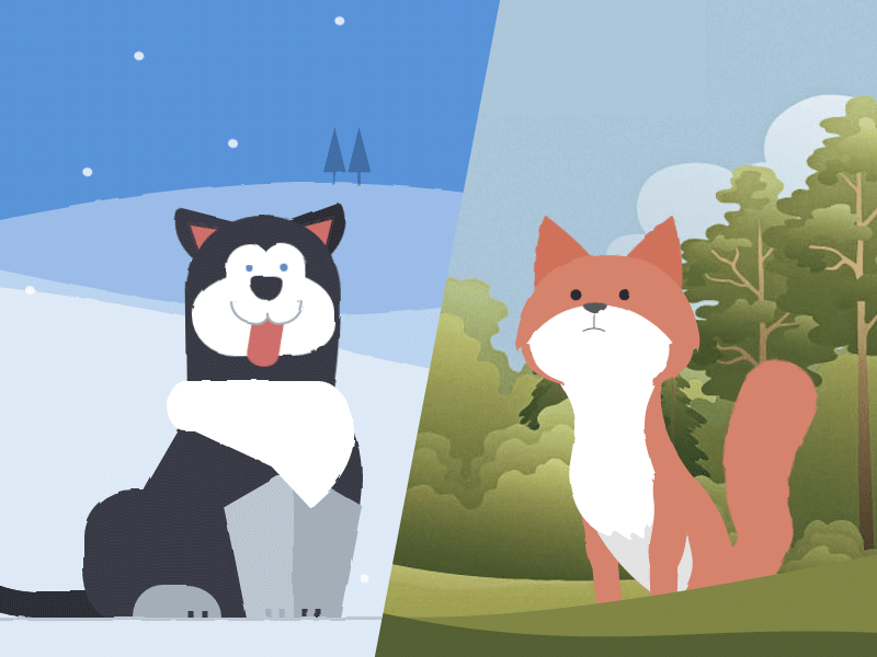
Today we want to show you how the clever use of HTML, CSS sequenced animations, and SVG filters can bring to life one of the most unlikely (yet adorable) things to be seen on a web page – animals. We’ll explore two techniques for drawing the animals: one with plain HTML and CSS, and one with inline SVG background images.
This demo is highly experimental – animated SVG filters are currently only available in Chrome.
The animations involved are also complex, so this tutorial will focus on the different techniques involved in creating each of these creatures and their life-like movements. It’s up to you to let your creative juices flow and create unique and playful animated animals on your own.
With that said, let’s get started!
Shaping the Animals
The demos use two different techniques for creating the shapes of the different body parts of the animals. The husky uses CSS border-radius properties, and the fox uses inline background SVG images, as the shapes are more complex.
The Markup
Both animals use nested HTML divisions to group the body parts. The concept of grouping is important for creating life-like movements — when the head moves, the eyes and ears should always move too, as they are attached to the head.
<!-- Markup for the fox head -->
<div class="fox-head">
<div class="fox-face">
<div class="fox-ears">
<div class="fox-ear"></div>
<div class="fox-ear"></div>
</div>
<div class="fox-skull"></div>
<div class="fox-front"></div>
<div class="fox-eyes"></div>
<div class="fox-nose"></div>
</div>
</div>
<!-- Markup for the husky head -->
<div class="husky-head">
<div class="husky-ear"></div>
<div class="husky-ear"></div>
<div class="husky-face">
<div class="husky-eye"></div>
<div class="husky-eye"></div>
<div class="husky-nose"></div>
<div class="husky-mouth">
<div class="husky-lips"></div>
<div class="husky-tongue"></div>
</div>
</div>
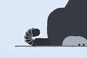
</div>Each part can move independently, and will move with its parent element as it does so, which creates a more realistic effect. You’ll notice that the tail is deeply nested within other tail components. When each tail part is positioned relative to its parent, and then rotated the same amount, it creates the illusion of an even curve.
Shaping with CSS
The border-radius property is used heavily for shaping the husky with CSS. For many elements, individual control of each border radius was needed. For example, here is how the husky’s hind leg was shaped:
.husky-hind-leg {
  // ...
  border-top-left-radius: 35% 100%;
  border-top-right-radius: 40% 100%;
}
The first number indicates how deep the curve starts on the top/bottom edge, and the second indicates how deep the curve starts on the left/right edge.
Other shapes, such as the front legs, could not be shaped with border-radius alone, and needed to be shaped using transform:
.husky-front-legs > .husky-leg:before {
  transform: skewY(-30deg) skewX(10deg);
  transform-origin: top right;
}
Once the shapes are in place, each element is given an absolute, percentage-based position inside its parent. This ensures precise placement of each body part, as well as responsiveness.

Shaping with SVG
For the fox, Sass-SVG was used to create the complex SVG shapes for each body part. SVG images can be used as background images, and even better, they can be written inline as long as they are either base-64 or UTF-8 encoded (for maximum browser support).
Writing them by hand is tricky, though. I used Adobe Illustrator to create the initial shapes:
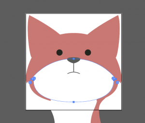
And then I saved each body part as an SVG image. The SVG code was transferred to the SCSS stylesheet via Sass-SVG. For example, this is the fox’s nose:
.fox-nose:before {
  @include svg((viewBox: (0 0 168 168))) {
    // the nose
    @include svg('path', (
      fill: $color-nose,
      d: 'M83.7,86.7c3.3,0,11.6-3.9,11.6-7.1c0-3.2-9.4-3.2-11.6-3.2c-2.2,0-11.6,0-11.6,3.2   C72.1,82.8,80.4,86.7,83.7,86.7z'
    ));

    // the line connecting the nose to the mouth
    @include svg('path', (
      stroke: $color-nose,
      fill: none,
      d: 'M83.7,102.3V86.7'
    ));

    // the mouth
    @include svg('path', (
      stroke: $color-nose,
      fill: none,
      d: 'M94.5,104.9c0,0-5.2-2.7-10.8-2.7c-5.6,0-10.8,2.7-10.8,2.7'
    ));
  }
}
This will generate an encoded, inline SVG string inside of a `url()` that looks something like this:
.fox-nose:before {
  background-image: url("data:image/svg+xml;charset=utf8,%3Csvg...");
}
Since the SVG is a background image, it can be transformed and animated as if it were an HTML element. With Sass-SVG, Sass $variables can be used to have full control of the SVG fill and stroke colors.
Making the fox responsive was straightforward with inline SVG. The viewbox attribute values ((viewBox: (0 0 168 168))) are straight from the SVG file, but as long as the height/width ratio is preserved, the element containing the SVG background image can be any size. All parts of the fox’s head were positioned absolutely, with the same height and width as the .fox-head.
“Squigglevision” with SVG Filters
Squigglevision is an animation technique that simulates hand-drawn animation by wiggling the outlines of a shape. This makes scenes, such as the fox and husky, seem more dynamic and sketched, even when the animals aren’t moving.
SVG has a filter called <feTurbulence> that gives “noise” to whatever it’s applied to. The <feDisplacementMap> filter is combined to specify how far away the pixels should move in each filter.
<svg xmlns="http://www.w3.org/2000/svg" version="1.1">
  <defs>
    <filter id="squiggly-0">
      <feTurbulence id="turbulence" baseFrequency="0.02" numOctaves="3" result="noise" seed="0"/>
      <feDisplacementMap id="displacement" in="SourceGraphic" in2="noise" scale="2" />
    </filter>
    <filter id="squiggly-1">
      <feTurbulence id="turbulence" baseFrequency="0.02" numOctaves="3" result="noise" seed="1"/>
<feDisplacementMap in="SourceGraphic" in2="noise" scale="3" />
    </filter>

    <filter id="squiggly-2">
      <feTurbulence id="turbulence" baseFrequency="0.02" numOctaves="3" result="noise" seed="2"/>
<feDisplacementMap in="SourceGraphic" in2="noise" scale="2" />
    </filter>
    <filter id="squiggly-3">
      <feTurbulence id="turbulence" baseFrequency="0.02" numOctaves="3" result="noise" seed="3"/>
<feDisplacementMap in="SourceGraphic" in2="noise" scale="3" />
    </filter>

    <filter id="squiggly-4">
      <feTurbulence id="turbulence" baseFrequency="0.02" numOctaves="3" result="noise" seed="4"/>
<feDisplacementMap in="SourceGraphic" in2="noise" scale="1" />
    </filter>
  </defs>
</svg>
Each filter has slightly different attributes. These filters can be applied to any element using the CSS filter: url(...); property. To create the “squigglevision” effect, a keyframe animation sets one filter at a time in rapid succession.
@keyframes squigglevision {
  0% {
    -webkit-filter: url('#squiggly-0');
    filter: url('#squiggly-0');
  }
  25% {
    -webkit-filter: url('#squiggly-1');
    filter: url('#squiggly-1');
  }
  50% {
    -webkit-filter: url('#squiggly-2');
    filter: url('#squiggly-2');
  }
  75% {
    -webkit-filter: url('#squiggly-3');
    filter: url('#squiggly-3');
  }
  100% {
    -webkit-filter: url('#squiggly-4');
    filter: url('#squiggly-4');
  }
}
Attention: These SVG filters do not seem to work in Firefox currently, so treat filter animations such as this one as a progressive enhancement.
Animating the Animals
CSS keyframes do not provide us a convenient way of sequencing and composing animations. The best way to approach this problem is to plan (storyboard) your animation as a timeline and use a preprocessor such as Sass to generate the keyframes.
For the fox, transforms and absolute time offsets (seconds) were used to animate each body part after outlining the storyboard for when each animation should occur. Here’s an example of how the fox’s nose was outlined in SCSS:
$animations: (
  // ...

  'nose': (
    // resting position
    (4s, 5s, 7s): rotateY(-4deg),

    // nose down
    4.5s: rotateY(-4deg) rotateX(-3deg),

    // fox looks left
    (7.5s, 9s): rotateX(-3deg) rotateY(-28deg) rotateZ(-11deg),

    // fox looks right
    (9.5s, 12s): rotateY(7deg),

    // fox looks straight ahead
    13s: rotateY(0),
  ),

  // ...
);
Here, $animations is a Sass map where the key is the name of the animation (e.g. 'nose'). The value of each animation name is another map where the key is the offset or list of offsets in seconds (e.g. (7.5s, 9s)), and the value is the transform property for each offset key.
So, how do we turn this map into @keyframe animations? First, a global $duration: 17s variable is set — this will be the total duration for each animation. Then, using nested Sass @each ... in ... loops, we can generate the expected CSS @keyframe declarations for each animation by looping through the $animations map:
@each $animation-name, $animation in $animations {
  // keyframe declaration
  @keyframes #{$animation-name} {
    @each $offsets, $transform in $animation {
      @each $offset in $offsets {
        // offset declaration block
        #{percentage($offset / $duration)} {
          // transform property
          transform: #{$transform};
        }
      }
    }
  }
}
This will generate keyframes that look like this:
@keyframes nose {
  14.70588% {
    transform: rotateY(-4deg); }
  23.52941% {
    transform: rotateY(-4deg); }
  29.41176% {
    transform: rotateY(-4deg); }
  41.17647% {
    transform: rotateY(-4deg); }
  26.47059% {
    transform: rotateY(-4deg) rotateX(-3deg); }
  44.11765% {
    transform: rotateX(-3deg) rotateY(-28deg) rotateZ(-11deg); }
  52.94118% {
    transform: rotateX(-3deg) rotateY(-28deg) rotateZ(-11deg); }
  55.88235% {
    transform: rotateY(7deg); }
  70.58824% {
    transform: rotateY(7deg); }
  76.47059% {
    transform: rotateY(0); } }
These percentages can be very tedious to calculate without the use of SCSS. They represent the percentage offset of each desired time value in each step of our animation, relative to the total $duration.
Animations can then be applied to their respective body parts, e.g. animation: nose $duration none infinite;. It’s important that every animation has the exact same duration, so that they can be looped seamlessly.
Life-like Easing Curves
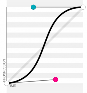
Another important part of making animations seem life-like is carefully choosing (or creating) easing curves for each part of the animation. The best kinds of lively easing curves to use are “sinusoidal” curves — in other words, easing curves that smoothly undulate in and out. Natural movements don’t come to a hard start or stop, so the animation-timing-function should reflect that.
For the fox and husky, I used cubic-bezier(0.645, 0.045, 0.355, 1) (preview here). This curve (seen below) has the qualities of starting slightly quickly but coming to a smooth stop. As always, it’s best to experiment with the curves to find the one that best fits your animation.
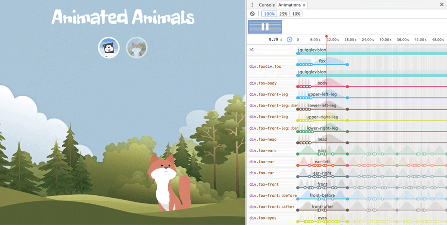
One last thing: in Chrome, you can visually inspect all your sequenced animations to ensure that they occur at the correct times. Just open the console, click the Style tab, and click the play button:
Hopefully this tutorial inspired you to create your own sequenced CSS animations of animals and more!
Browser Support:
- ChromeSupported
- FirefoxSupported
- Internet ExplorerNot supported
- SafariNot supported
- OperaNot supported