This article aims to give you a comprehensive introduction to the deepest of design rabbit holes: color. It will introduce you to the most important lingo and concepts to get you started, helping you make better decisions applying color in your designs.
Topics
As usual for these guides, we’re going to cover a great deal, including:
- Color?
- Hue
- Tint, Shade & Tone
- Value
- Saturation / Chroma
- Color Wheel
- Matching Colors
- Monochromatic
- Types of Color
- Matching Colors
- Emphasis
- Color Consistency
- Color Meanings
- Color Relativity
Color?
Without light there is no color, right? Well, actually without “darkness” there is no color either. Huh? I know, it sounds strange at first, but without darkness colors disappear as well. Do we need to know stuff like this when we pick colors for our web design—choosing their hue, saturation and value? Probably not! Could color theory blow your mind every once in a while and make you a more effective web designer, and therefore a better “communicator”? Absolutely! In terms of colors, we all have a ton of opinions and emotions, but often people lack a clear idea about what they are actually doing. Having a theoretical basis to build upon makes you much more effective as a design person. Art school is not a place where most people spend a significant time of their lives, but you don’t need to spend years to bend colors to your needs. So let’s get you up to speed.
With selecting colors there are a lot of considerations you wouldn’t expect right away. A little bit of a warning, it can be a rabbit hole you never escape from. To compensate for that, I propose that first and foremost, you might focus on making it interesting for your users while making reasonable and effective choices that support your design. This seems like a manageable goal for color newbies. I realize this sounds super puffy, but subjectivity is not something that you can shake off when talking about colors. Let’s just say that we can agree that choosing colors that have meaning and create interest is a good place to start.
Color can be a very powerful “weapon” in your artistic or creative arsenal—if yielded appropriately of course. For our designs on the web, color is often about the emotional and visual impact. If used correctly, colors can guide viewers to what’s important and add emphasis if you don’t overdo it. I guess it’s fair to say that this is probably the most important thing when using color on web projects. A secondary concern is that you can establish a certain mood, an emotional impact that takes branding ideas even further. This whole topic is a huge one—gigantic actually. We will focus on the most important aspects and terms to get you started.
Hue
A hue is any color on the color wheel.
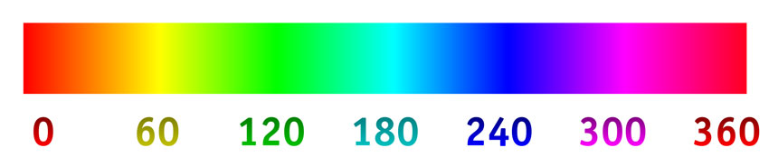
A lot of the time when people talk about colors, they are actually talking about hues—which are the basic, “pure” colors, any color that is within the visible light spectrum. The healthy human eye can see 2.3M hues; tons of variations of reds, blues, greens and so on.
For our work with colors in design, they represent starting points, like raw or the most primitive versions. In our designs, it’s advisable to leave these behind to avoid looking amateurish or childish. Did you ever notice that cartoons for kids like to use these colors for their characters? Not a big surprise I guess. You can make use of this of course if you go for a certain aesthetic, but most of the time, childish is not what works too well on the web.
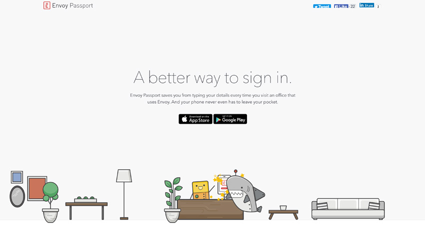
Envoy Passport uses this cartoon-ish, playful style to its advantage here. You can see that the colors are very flat and unsophisticated. But they are using this style here to convey an impression or an idea that would have been harder to depict without imitating artwork for kids.
Tint, Shade & Tone
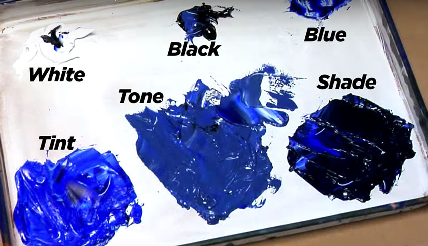
Hues don’t have tint or shade—which means they lack any additions of white or black. That’s why we are talking about tints and shades of particular hues. Tint is about the amount of white in a color. When you mix a color with white you are tinting it. More white leads to increased lightness of the hue. Adding white to the pure hue decreases its saturation, making the hue less intense.
Shade on the other hand is about the amount of black in a color. When you mix a color with black you are shading it. This results in a rich, often darker, more intense color due to the overpowering nature of black pigments. Many blacks change the characteristics of a hue, even through small amounts. Therefore they should be used sparingly.
As you can see in the spectrum below, in the middle you’ll find the pure hue. Towards the left, we add more and more white by tinting it and to the right we are shading the red with black.

We speak of creating tones when we mix a hue with gray, meaning that you effectively tint and shade at the same time. Tones can be lighter or darker than the original hue—depending on the amount of white and black added. They will also appear less saturated and intense than the original hue. Tones can reveal subtle and complex qualities in a hue and are closer representations to the way we see the “real” world.
Value
Value is the lightness or darkness of a hue. Values are very, very crucial for professional results. In a way, they are much more important to get correct than choosing a hue. When we say some color is brighter or darker we are talking about the value of a hue. This tells us how close it is to its lightest or darkest version. A value scale is like a gray scale for a particular hue.

The sections on the scale are called steps. Each one can clearly be distinguished by being significantly lighter or darker than the next. If you apply these values you achieve better tonal contrast by using realistic lights and shades.
A lot of the great paintings we collectively admire in art history were created by artists who were masters at subtle tonal contrast via proper use of value scales. They achieved variations of depth by gradual value changes of a limited number of hues.
This works not only with gray scales, but with monochromatic colors as well (with one hue). Think of it as the lights and shades of a hue.
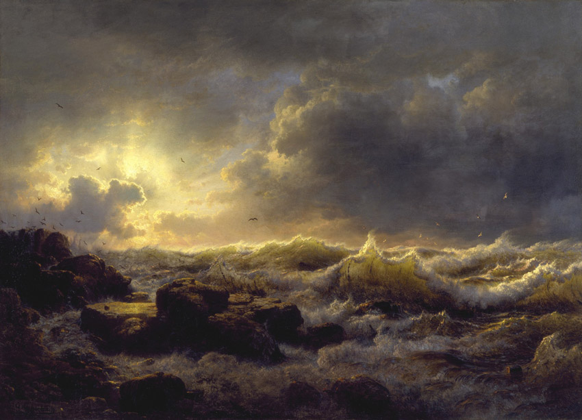
You can see how effective this scale is by desaturating the painting. The values do not change when you gray out the color. The lightest lights and the darkest darks still define an effective range to produce an image that does not loose its artistic qualities.
Or think of iconic black and white photographs of the last fifty years or so. They often have a wide range of steps on the gray-scale and create a stronger, more interesting contrast—ranging from very dark blacks to very bright whites. Amateurs often end up with flat black and white images because they are unaware of the need to make them more vibrant with a broader gray-scale.

Interestingly, every color has its own inherent range of values. Some have a bigger range than others. Red, for example, has a more limited range compared to a blue hue. Red is in the low gray-scale range, the value is very dark. Yellow, on the other hand, is in the high-range. Green, violet and blue have the largest range going from dark to light in a few more steps.

Why do we care? Values are an effective way to render a two-dimensional depiction on any canvas and let it appear three-dimensional using the relative shades of a hue. This is what people call being more alive or vibrant—in contrast to flat colors which fail to achieve this effect. This is why, in general, use more desaturated tones, pure hues are of little help and look immature. A good tip is to start with only one hue and develop a value scale for your website. You can use values for highlighting particular areas and others which recede gently into the background—all whilst staying within the same hue. Simple and classy.
Saturation / Chroma
Saturation, also called chroma, is another concept we shouldn’t overlook. This is the “colorfulness” or purity of a hue. These funky terms really translate down to the intensity or brilliance of a perceived color. The chroma is defining how pure the hue is. When you buy colors for painting, chromas are the colors that you take right off the tube. In contrast to that, desaturated colors are washed out or grayed out and are often used as shadow colors of various degrees. A completely desaturated color appears gray.
We desaturate hues by adding a complementary color. Everything added from the opposite of the color wheel will desaturate the hue effectively. Where both colors meet, you have your neutral color point, brown or gray. It’s important to understand that we are not adding gray for this. In effect you are creating a gray, but not by adding black or white. These grays are used by painters to break up saturated colors.
Why is that a good idea? The answer is actually very practical: you don’t want to bombard viewers with intense color saturations everywhere—quite the contrary. Highly saturated colors can look incredibly fake and cheap. Too much of it gives your eyes little chance to rest, and nothing to really focus on, more visual noise.
Screenshot
When a site like UXDESIGNER.TOP, somehow dedicated to UX, errors in this way, it is doubly sad to see in my opinion. Doesn’t look too good, does it? It has all sorts of issues, but primarily the color mess does not make it easy to establish a hierarchy to guides the viewer. Bad UX!
Take blue and orange for example. Next to each other they behave very intensely. If you mix them you achieve a gray tone which can separate their more saturated variants really well. This new color positions itself between those highly saturated versions and creates a more visually pleasing experience by applying more realistic colors. As fluffy as this sounds, it has more vibrancy, more life. This creates a barrier between the colors that is more mature in technique. When you talk about masters in painting, this is one of the things they had a firm grip on.
In design it’s a good idea to focus on just one or two colors, then create variations from them. This gives you plenty of options within the same color. You vary your color, but stay within the same color hue(s). This then helps anchor your viewer’s attention when only few parts are selectively highly saturated. In the image above, you’ll find your eye drawn to the sen. It really jumps out.
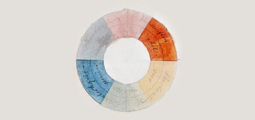
Color Wheel
We get a color wheel by taking the spectrum of light and then connecting both ends to a circle. This is a classically used and helpful tool in showing us the relationships between colors. How so? For starters, the color wheel can tell you how to create the biggest contrast possible for a particular choice.
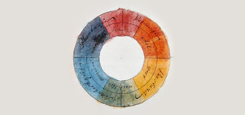
The symmetrical color wheel is not so much a scientific thing but a representation of how our brain works. It points at how we might respond emotionally, in terms of what reactions colors awaken. Scientifically, there are no opposite colors in the color spectrum—that’s an idea in our brains, or in the concepts we put together to organize and distinguish colors. It’s definitely helpful for choosing color though. These perceptions are not only fuelled by our own biology but also very much influenced by centuries of art history and can vary significantly among various cultures.
In these examples we’ll use the traditional “artist’s” color wheel, based on the red-yellow-blue (RYB) color model. This one is derived from how painters created their color mixtures—via subtractive color mixing. It’s mostly used in art and design these days, predating scientific color theory, which refers to cyan, magenta and yellow (CMY) as its primary colors. CMY achieves a bigger subset of colors than the RYB color model.
Primary Colors: Red, Yellow, Blue
Red, yellow, and blue are used to create all other colors, and therefore earn the name primary. You can’t mix any other colors to get them.

This is certainly a good starting point and everything you need to know about primary colors for now. That being said, I also want to mention that this was the assumption of many color theorists in the past. In reality, with paint or ink for example, you can only mix a limited range of colors which does not match the complete range a healthy human eye can perceive. What we’re talking about here is a certain complete subset of colors, also called a gamut. So, a grain of salt is in order here.
Secondary Colors: Green, Orange, Purple
Green, orange, and purple are mixed by combining primary colors.
In Goethe’s color wheel above, green forms the base. It’s the blend of the two primary colors yellow and blue. Orange is a mix of yellow and red, while purple is a mix of red and blue.
Tertiary Colors
We can take this idea further and mix primary with secondary colors—again by blending colors that lie next to each other on the wheel.
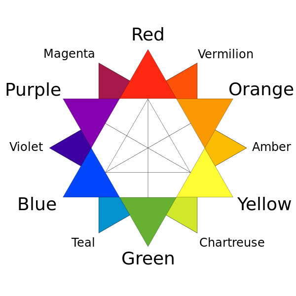
After finishing this declination you get the following:
- Chartreuse: yellow-green
- Amber: yellow-orange
- Vermilion: red-orange
- Magenta: red-purple
- Violet: blue-purple
- Teal: blue-green
Note that the secondary color follows the primary color in this notation.
Analogous Colors
Analogous colors are adjacent on the color wheel, right next to each other.
They form a simple relationship and are usually very easy on the eyes, creating a peaceful, comfortable mood. How so? Most likely because this color combination can often be seen in nature.
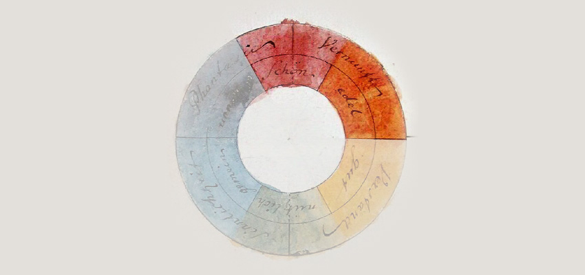
Complementary Colors
On the color wheel, complementary colors oppose each other. Complementary colors are a very popular combination as they please the eyes “naturally”. Red and green are especially popular.
But keep in mind not to use them equally, instead decide on one dominant color. Generally the weaker color should be used more widespread and the stronger one for accentuation. Think of color combinations like matching serif and sans-serif typefaces. A balance is really important here. Complementary colors are also able to create the strongest color contrast for each hue.
Triadic Colors
Triadic colors are placed equidistant on the color wheel. They present a bit more of an advanced combination and using these is difficult for beginners to get right I think—but don’t let me stop you. The more you practice, etc, etc…
They are often good for cartoons and surreal scenes and can imply a certain playfulness.
Types of Color
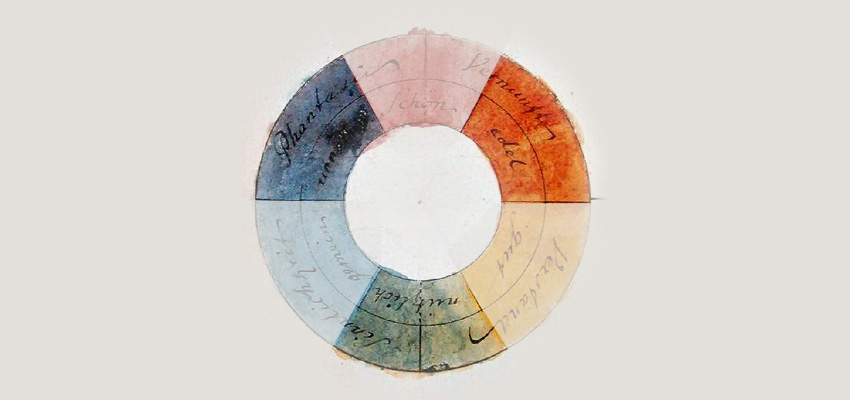
Here’s a newer representation of the RYB color wheel:

Warm Colors
Warm colors are represented by the right side of the color wheel. They tend to be more attention grabbing, energetic, really strong—at least in our usual perception. Don’t forget these are very human attributes that have nothing to do with the phenomenon of light. These colors can grab our attention really fast and are considered very active.

You can make warm colors work effectively, but here’s an example that fails at establishing trust, safety and confidence, by blasting you with a ton of warm colors. On top of that, this design does a bad job at establishing emphasis on their main action. Their email subscribe button has the same color as the background and visually disappears. It could have been much more subtle and effective if only the button was using a warm color to stand out more clearly if the background was not using such an array of active colors.
Cool Colors
The left side, on the other hand, represent cool colors. These are more comforting and stable. They also tend to fade easily to the background of a composition and don’t “jump out” that much. They are considered more passive in nature.
This left side of the color wheel is very popular among popular websites these days. Just take a look at the Facebooks and Twitters out there and you will find a plethora of well-known projects making these colors intrinsic to their color palettes. Why? Because web projects always have to fight their not having a physical location, where a personal and trusting connection can be made more easily. Websites that cater to a gazillion people need to appear stable, trustworthy, relaxing and calm—even comforting. These are all things that the cooler types of color can help you with.
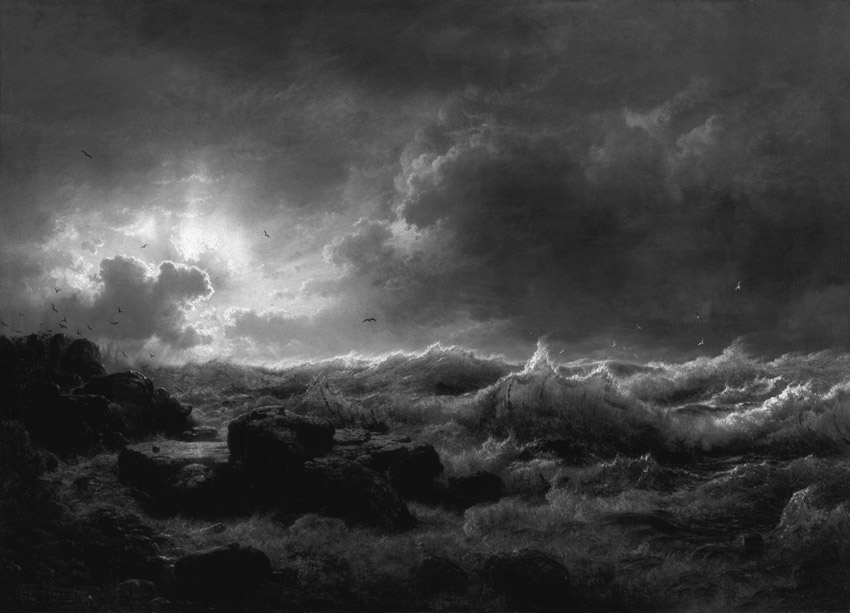
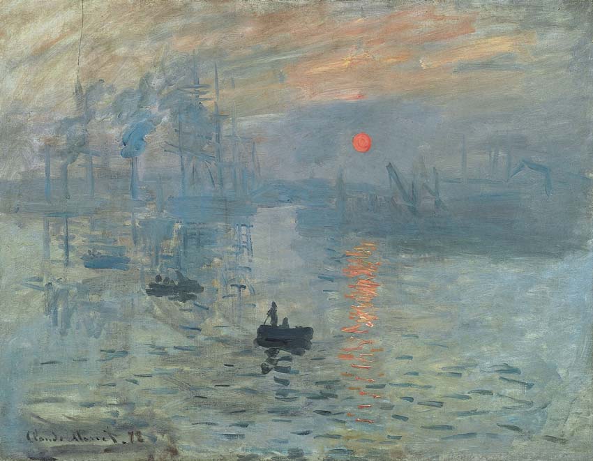
Neutral Colors
Black, white, gray and brown are considered neutral. In that sense, they are supporting “colors”. If applied correctly, these neutrals can bind everything together—like in the Monet painting above. They provide a break from the intensity of the brighter, more intense colors which attract the eye more easily. In that sense, neutrals are the foundation of interest and variation—like your spaghetti with tomato sauce and meatballs. The spaghettis are the neutral binder in all of this.
The neutrals recede to the background when you bring more saturated colors into the mix. In every great color vocabulary, they play an important part because they help you to create a skillful balance in your work. Just imagine if everything is shouting color-wise. That wouldn’t be very effective and we would again end up with color “noise”. Neutrals are your secret weapon to create a sharp focus where needed. In practical terms, this means that you build up your composition with mostly neutral tones and then decide where the focus is and where the eye is supposed to be attracted to. That’s where the saturated tones come into play.
Imagine if we had tons of saturated colors here. It would be much harder for the preorder buttons to stick out. Since they are at the core of this business, they need to be highly accentuated to avoid getting lost. The white and gray areas recede to the background and let the few color accentuations pop right out.
Matching Colors
Before we move on, a word about bringing various colors together. As I indicated, this process really can be similar to choosing typefaces. Try to commit to one, or perhaps two major colors for your design. You have lots of variations to play with by adjusting value, tone, brightness, saturation or use neutral colors, etc… If you don’t go nuts with tons of colors you will achieve a much more coherent result—one which ties the whole piece together meaningfully and elegantly.
Start with one color, bounce other colors off that and see how far you can take it. Even better if you start with a simple gray-scale and wait before you bring color into the equation. Play with light and darkness in your early approaches. For highlighting certain parts use the dominant colors sparingly while letting the supporting colors do the background work.
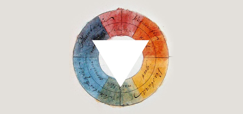
Monochromatic Choices
I should also quickly mention what you need to know about monochromatic color choices. Remember this fellow from above?
This is a monochromatic color scale of a red hue. Below is a great example of using a monochrome approach effectively.

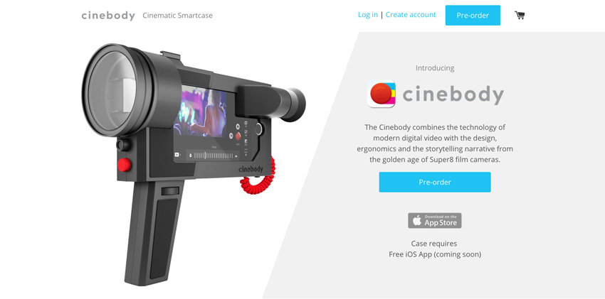
Emphasis
If you use your dominant color sparsely, you can create effective emphasis. Avoid inflating it too much and wasting the opportunity to highlight key design elements with it—save it for for the “cherry on top”. Use it to focus on elements which are really crucial to communicating the most important pieces of information. This “primary” color of your palette usually works well with a gray scale because it fades back easily and supports the main color effectively.
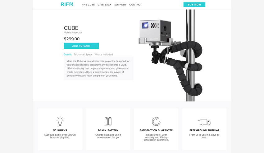
RIF6 only highlights the key items for a successful business transaction. In this example it is hard to not notice the buttons that let you buy this item. Nothing is in the way of guiding the eye quickly to the interface item that facilitates the user’s main action. All while using the main color that the company is identified with as a brand. Simple and effective! And no nonsense in the way.
Color Consistency
Once you establish a mental map of colors for your users, it is important to not break it. If you deliberately choose to break it, do it skilfully and with purpose. For example, Keeping links the same color when they do the same thing is crucial, especially if you have tons of content on a page. Also, keeping header colors consistent gives the user something to anchor their journey.
Keeping background colors similar can be very effective as well. This is not something that does a lot of harm when ignored, but can tie things together nicely when observed. The most important piece in all of this is that you are setting expectations for your users, and that you want to make it easy for users to follow and understand where the journey is going.

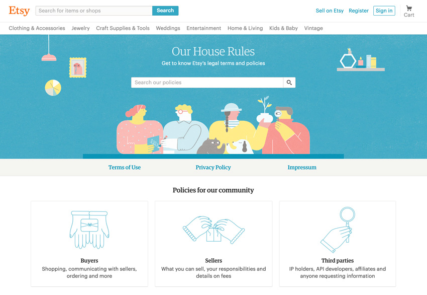
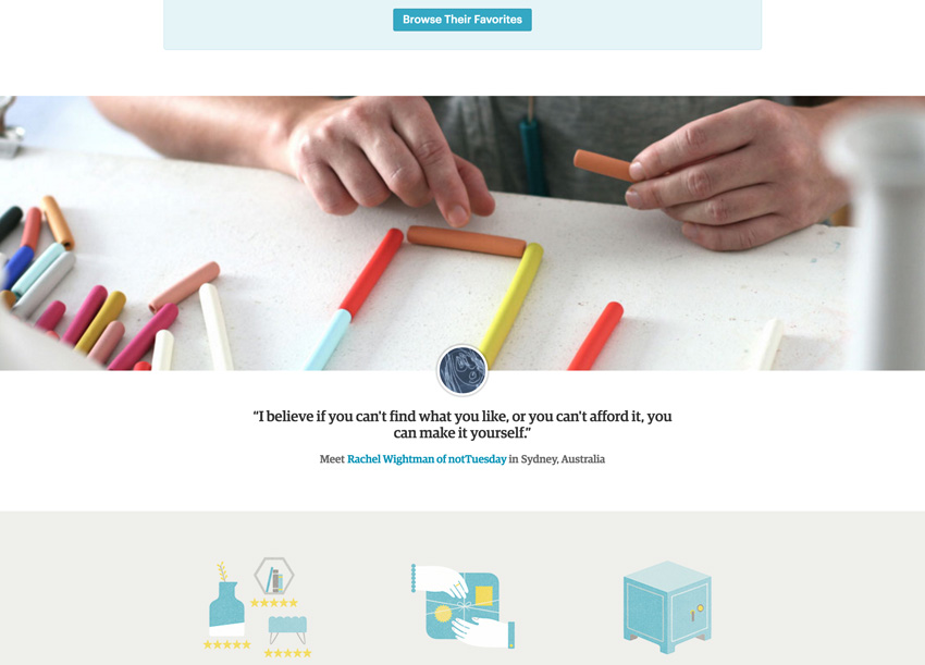
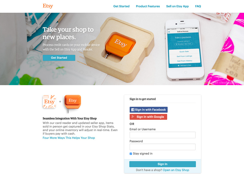
Pattern is a new product by Etsy and it does a great job at using color consistently. Even the image of the desk with the books and stuff expands elegantly on their brand color and stays within this range of fuzzy, warm colors. The gray-ish wall in the background gives a perfect backdrop to bring attention to the site’s main call to action. It clearly speaks “ETSY” without screaming right in your faces. Double thumbs up!
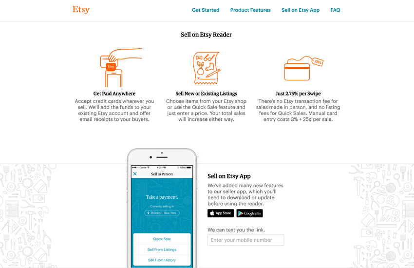
Etsy also do a great job at being consistent with color on their main page, but they also dropped the ball a bit here and there. I think it’s fair to say that there is room to create more cohesion by using color more consistently within their main pages, especially in regards to backgrounds. Take a look for yourself, you be the judge:


Color Meanings
In various cultures, colors can imply different meanings or associations. They evoke different feelings which shouldn’t be underestimated when we work on projects that span cultural zones. For avoiding misunderstandings and for effective communication, we need to take this into consideration.
Below are a few common meanings that colors are recognized as having attached to them. You may find them superficial, but it’s nevertheless good to be aware of these associations and commit them to memory.
Blue
Blue speaks confidence, stability and business like no other color. It also implies trust and professionalism. Honor and being dependable is right up there as well. The (blue) sky is the limit!

Green
Green implies growth, harmony, nature, wealth, optimism and money (of course).
Red
Love is a major association with red, but power, eroticism and strength pair with it as well. What makes it a bit tricky to work with is that it can also imply danger, blood, evil and a state of emergency. Courage is also synonymous. Be careful about the context and meaning with this one since it can evoke very powerful, potentially negative connotations.

The site for the SpeedX Leopard uses red very cleverly. It enhances the color of the bike itself, but only sparingly to highlight the call to action. Plastering red all over the place would not appear nearly as classy.
Yellow
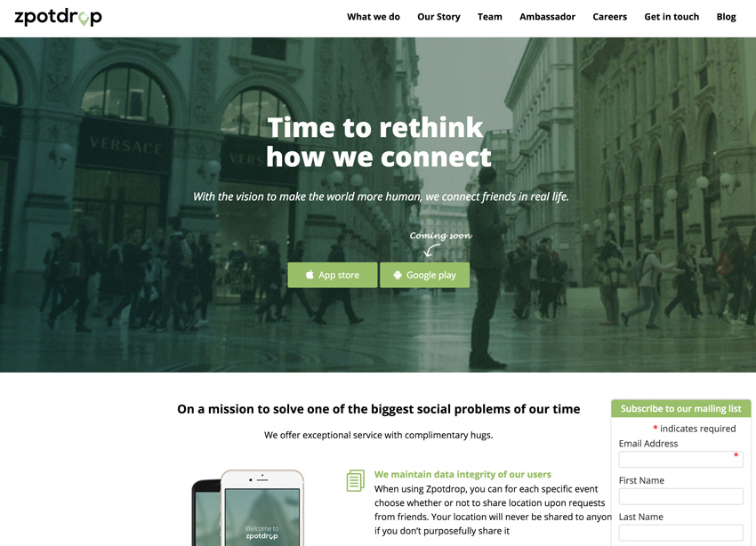
Yellow symbolizes hope, joy, the sun, excitement, but also warnings. As it is so bright, it can “scream” loudly at you. Most of the time, that’s not what we, as users, need. In the example below, less would have been more I think. For a project that has “safe” and “family” in its name, yellow might not have been the best of choices.
Purple
The good ol’ color of royalty. Not my cup of tea, but this color is used to convey the idea of luxury, magic and all that jazz. Interestingly, I feel punk goes with it as well. The association with royalty and luxury probably stems from the expensive nature purple had in the past. It was difficult to produce (some story that involves tons of tiny snails and such) and therefore only those highest in the social food chain were able to afford it. Nowadays, this is not a concern anymore of course.
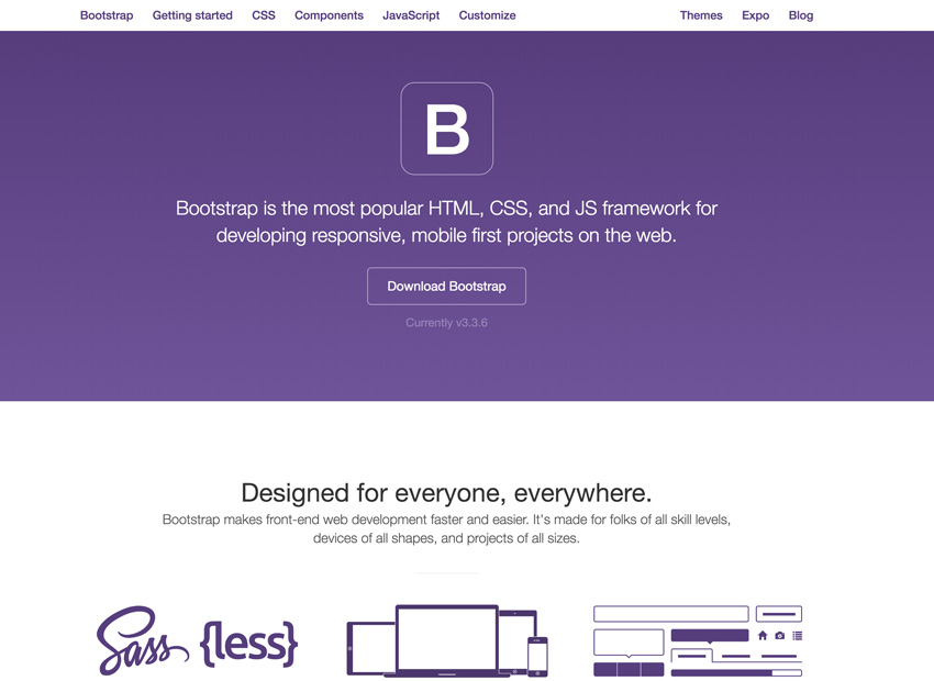
Funny that Bootstrap, a highly popular Open Source project, uses purple in a totally different context very successfully. Perhaps Open Source projects have more wiggle room and adhere to different physics. Awesome!
White
This one is another tricky item in the list. White can convey purity, cleanliness, softness, sophistication, elegance, deity, weddings, royalty and positivity in general. In other cultures it can also be clearly be identified with death and tragedy. White and black can have very different meanings depending where you are. Watch out!

Black
Last, but not least, the good ol’ mysterious, sexy and sophisticated black. Why so serious black? It’s industrial, mechanical, and can also associate with “The End”, death and evil. On top of that, it is rebellious as well.

Personally, I think much of these associations are a bit contrived. But it’s up to you! Do your research when you work on a project, especially if it reaches people outside your cultural comfort zone, but have lots of salt ready to go with it. Most of all, have fun and let your creative juices flow! Designing strictly by the book is dead boring anyway—and one sure way to kill the mood for sure.
Color Relativity
Let me just mention something really quickly before we head out. Color is highly influenced by what’s surrounding it. At some point, we were talking about cooler and warmer colors, but it’s a bit more relative than that. Colors can appear that way in relation to each other. They can look warmer or cooler depending on the environment they are in. Our human eye is a bit foolish that way. See how the colors below influence each other and how the gray border of the inner squares appears differently within each spectrum. That’s what is called color relativity.

In some extreme examples colors can look completely different and totally fool the human eye. Take a look at this classic “checker shadow illusion” by Edward H. Adelson:
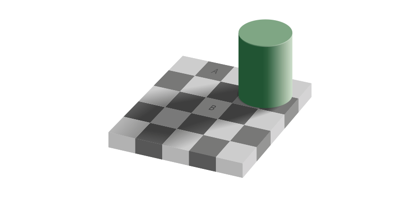
Believe it or not, squares ‘A’ and ‘B’ are actually the same color. Need to see some proof?

Use your favorite color picker to check, if you like. Food for thought on the road.
Final Thoughts
Color can be a powerful mood changer. Use this to your advantage or to your demise. This is really up to you because it is a mighty weapon to wield. Take your time to learn more and don’t get frustrated by the sheer scale in front of you. On the web, you should definitely use color to create a certain mood and also to highlight elements that are of particular importance. As with design principles, less is more. If everything is highlighted via color, nothing sticks out and you will end up with an unfavourable signal-to-noise ratio.
Don’t get lost in all that color theory at once though! You have a lifetime to achieve probably only a fraction of a complete understanding. Take it easy and enjoy the ride! Once you’ve opened your eyes to this whole topic, you will see the world through a different lens.