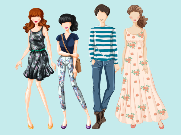
From clothes to accessories, fashion illustrations have a
long history as a visual reference for a designer’s concepts or current
fashion trends.
What makes a good fashion illustration, though? With help from
content from Envato Market, let’s count down 10 top tips for creating great
fashion illustrations to better your own sense of design and improve your
illustrative work!
1. Understand Anatomy
It’s not always apparent if you’re looking at a stylized
fashion figure that the artist is at their best when working from anatomically
correct proportions. Knowing how to correctly draw a body allows for a variety
of freedom when drawing figures and correctly drawing clothing. So whether you’re
drawing from photographic reference or from life, you’ll be prepared with
knowledge of the shape and proportions of what may not be visible when drawing
clothed figures.
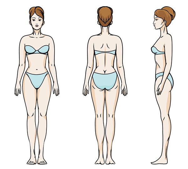
If you are presented with a figure whose body is hidden
underneath a large dress, for instance, knowing the gestural form beneath it
allows you to create poses that may not exist quickly and easily. Being able to
move your figure around without having to directly copy from a photo or ask a
model to make said pose means more flexibility when your client asks for a
specific pose or concept.
2. Stylize to Optimize
When you do stylize your figure, after having learned basic
anatomy, you’ll want to do so in order to bring more focus to a particular
element of design. For instance, fashion figures are often long-legged and much
taller than the average human. In average human proportions, a figure is six to
seven heads tall, whereas a fashion figure is eight or even nine heads tall, with most of that additional length being taken up in the legs. This is often
used to bring the viewer’s attention to the length of a dress or give the
artist more space in which to create folds, movement, or texture within the
fabric itself.
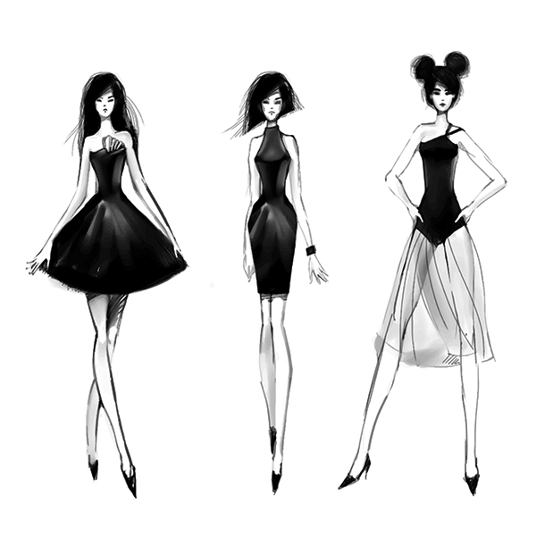
Exaggerate features of the figure or face of the figure in
order to accentuate the designs being displayed. A tiny waist or large hips can
show off the curves within a dress. Few facial features will keep the focus on the clothes or body itself. If the focus is on accessories or hair, make the hair
big or understate the clothing. Much like caricatures or cartoons,
exaggerations within the drawing will diminish some features or make others
more prominent. Use stylization to tell a story with your fashion illustration.
3. Move With Purpose
A static fashion figure can be alright to draw, but you’ll
find that it’s often a boring piece. Unless you’re telling a story about the serenity
of design, you’ll want your figure to move within the space you set it. When
you pose a figure dynamically, you create action for the clothing, hair,
accessories or whatever else you’re drawing. You’ll also instantly aid your
storytelling within your illustration. Is a figure dancing, walking, or flying
through your picture plane? Answer such questions with your drawing.
Illustrations tell stories through imagery.
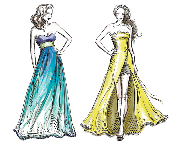
Movement can also help the viewer understand what makes up
the clothing you’re drawing or painting. We’ll discuss texture and
weight within textiles more fully below, but understand that if a fabric is
light and flowy or heavy and stiff, one of the best ways to show that is
through how it moves when placed on a body or when the body itself is in
motion.
A good way to understand how bodies, clothing, and various fabrics move
is to watch models walk down a runway. They’re constantly in motion and often
make a point to really show how their garment moves through exaggerated motions
and turns.
4. Use Your Composition to Tell Your Story
In addition to clothing and movement aiding your
storytelling, composition absolutely matters too. Is the figure frolicking
through an empty white space, or are they in a setting complete with a
background and other figures?
This is where fashion illustration may collide a
bit with editorial illustration. Perhaps you’d like to illustrate the figure
walking down a runway or through a busy city. Allowing a simple background into
your work may help viewers understand the context for where or when a design is
worn. Please note, however, that if a background is busy, it may overwhelm the
fashion design itself.
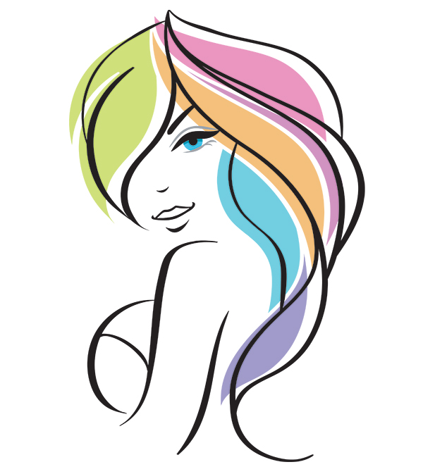
Alternatively, you can eliminate many details if you use
your composition to help fill them in. Perhaps you’ve decided only to create a
line drawing. Allow portions of your figure’s movement, dress, and hair, to
complete an image without having to draw it in. The viewer’s eye will do the
rest of the work.
Take advantage of negative space and you’ll create more
dynamic illustrations without having to create a background. Suddenly the plain
white or solid color used within your piece is a part of the design itself, and
you’re allowing the figure to exist not only within that space but because of
that space.
5. Differentiate Between Fabrics With Texture
In my opinion, one of the most fun parts of fashion
illustration is when an artist can show the weight and texture of a fabric
within their drawing or painting. Whether they’ve taken the time to render corduroy
or are skilled at showing the fabric’s weight through movement, I, as a viewer
and artist, love to revel in these sorts of details. Instantly I understand
the garment I’m seeing, and it’s far more tangible than everything being worn or
shown looking the same.
Sure, it’s a green dress, but is it silk, tulle, or a heavy
woven material? The way it’s drawn, the way it drapes around a figure, and even
the way it’s colored or painted should give the viewer an idea of the sort of
textile being depicted. At the very least, I want to understand what a garment
may feel like when worn. If I’m being sold clothing from an illustration, for
instance, I should be able to figure out if the clothing is warm and cozy or
light and breezy. You’ll want to viewer to understand if the textile is smooth
and soft or stiff and itchy.
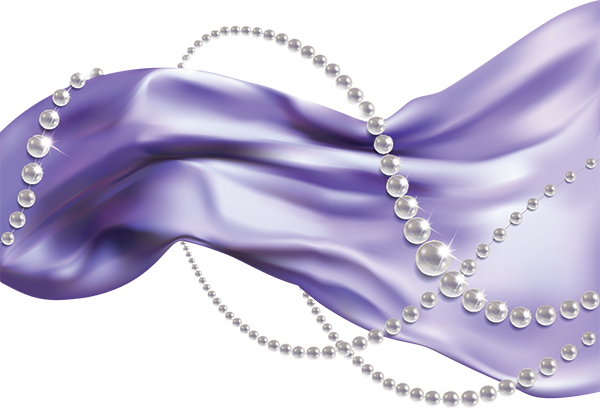
You can show that something is smooth and soft by using
longer, curved lines with illustrating, or show that it’s stiff and itchy with
shorter, more rigid line work. Additionally, drawing in knitted textures would
help the viewer understand that it’s a hand-knitted sweater versus a machine-woven
garment or something made from jersey.
Practice textures within textiles by
drawing swatches of your own clothing or experimenting with different textile
styles you may be viewing in fashion magazines or on fashion-related websites.
6. Make Patterns Aplenty
Surface designs are often a big deal in fashion. They can
make simple pieces more interesting and even be a focal point within an
illustration. There are only so many silky dresses that will go down a runway
before patterns start popping. Being able to really show off a
Moschino show in illustrated form would be nothing without being able to
showcase the patterns created for their garments.
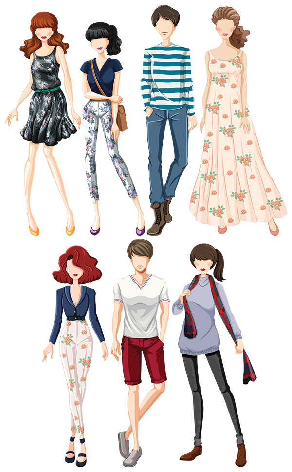
Patterns can also tell stories in their own right. Classic
patterns like houndstooth and chevrons may showcase current fashion trends or
tell the story of clothing from a certain era. Consider the stories to be told
of individuals who wear quiet, understated prints like simple dots or stripes
versus loud, bright florals or paisley designs.
Textile patterns can also help coordinate various pieces
when you match up a color or two from a print within other garments or
accessories in a design. This is especially apparent when you’re illustrating a
line of clothing and begin to notice how various pieces within a set, though
not all worn together or by the same person, may call back to each other with
the use of the same patterns or colors from a pattern.
7. Get Your Hair Done
Hairstyles, color, and textures can do a lot of an overall
design. Different types of hairstyles may be worn by different people for a
variety of reasons. Consider the way in which culture and ethnic heritage may
affect the types of hairstyles a figure could wear. Not only will you be
telling a story about who the person is or where they may be from, but you’ll
also be allowing limits for the hair’s movement and style itself.
For instance,
someone with very thin and straight hair wouldn’t be able to wear their hair in
locs like someone with thick and textured hair. Learning how to illustrate
braided, straight, curly, or other hair styles will also widen your skill set
for every illustration occasion.
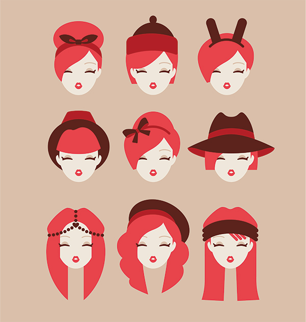
Hair can also help in the composition or be a main focal
point as well. In terms of composition, the movement of the hair can be just as
important as the movement of a garment. You’ll notice in many of the images in
this article that most of the hair depicted is long and often moves with the
dresses drawn in the illustration. You may want to consider hair to be another
piece of the illustrated puzzle when creating fashion illustrations.
Additionally, hair can be a main focal point of a fashion
illustration. If the story of the illustration is to depict a hairstyle or show
off various hair accessories, the hair may be what drives the composition of
the piece or even holds all of the action within it as a dress in a larger,
full-body illustration would. Many of the tips for clothing apply for hair as
well: form, texture, composition, movement, and style are all relevant points
when featuring a hairstyle within your fashion illustration.
8. Focus on Accessories
Sometimes the entire focus may be not on a garment or hair,
but on an accessory. This may mean a portion of the body is the only thing
depicted in a fashion illustration or that there is no figure present at all.
Additionally, you may be creating a full-bodied illustration and accessories
may just feature heavily in your illustration.
Consider, for full-bodied pieces,
what sort of stories can be told with the addition of accessories. Imagine
drawing a beautiful, historical queen. What sort of accessories would she wear?
Crown, jewelry, fancy shoes, and a scepter, perhaps. You can tell a story of
decadence the more accessories you add, or of simplicity by only featuring a small
bracelet or simple necklace within a design.
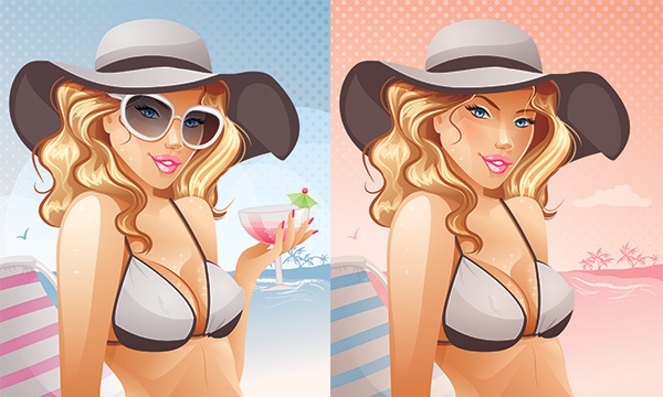
Consider, for accessory-focused pieces, what
you would think about if you were drawing garments on figures: texture,
patterns, composition, stylizations, and more. The same tips that apply to
clothing and hair also apply to accessories. You’re telling stories with
objects placed on or around a figure.
Consider, for accessory-only
pieces, what sort of information you’d like the viewer to understand without
seeing an associated figure. For instance, if you’re only drawing shoes and a
handbag, coordinating the two based on material or design may tell a story of a
well put together person. Or a pair of sneakers and a backpack would tell the
story of a student or young person.
9. Understand Perspective
The topic of accessories brings us to another foundation
skill: perspective. Understanding how objects exist within a space can only
help you illustrate them in an accurate way. While stylization is definitely
welcome within your designs, knowing the rules can help you break them in
interesting and aesthetically pleasing ways.
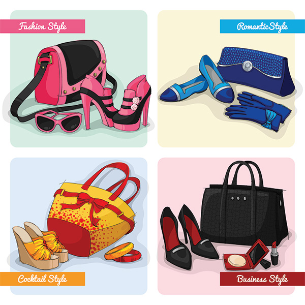
Consider the idea, explored above, of only drawing shoes and
handbags. In order to make those objects seem tangible without having a figure
within your illustration to help, draw them as though they not only exist in
space, but exist on a plane and someone could reach out and touch them. That will
allow the viewer to better connect with the object and understand the size and
shape of the object.
Additionally, if you have two or more objects together in
a small scene or even floating about in space, you’ll likely want to show that
they’re interacting. This means showing they’re on the same plane and subjecting
them to the same style of perspective as well as overlapping objects, using
similar lighting, and using the same design style to illustrate both (unless
you’re making a purposeful statement or telling a story by not doing so).
10. Render
Non-Textile Surfaces Differently
Much like being able to show how an object interacts with
others within the same space, non-textile objects should be rendered so the
viewer understands what is being depicted.
For instance, if you’re illustrating
Cinderella’s glass slipper, you’re going to have to create a transparent,
reflective shoe that the viewer will understand is glass or crystal or
something similar, rather than something that looks exactly like a leather or silk shoe.
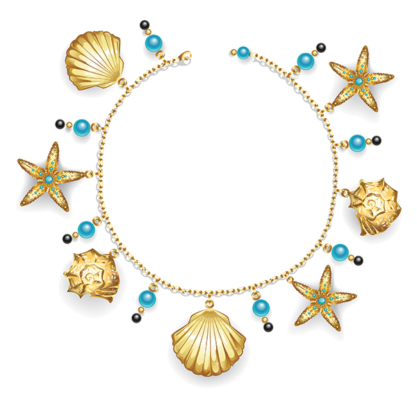
If the artist has created a metallic dress and they mean for
it to be made of metal versus just being gold or silver in color, they’ll need
to really showcase the reflective properties of that material (as well as
construct it within the limits of a metal object) so the viewer understands that
it’s not just paint that’s making something look gold, but rather gold itself
being depicted.
Much like showing the texture, weight, and limits of
movement within a textile, being able to render various objects so the viewer
understands what they’re comprised of not only helps communicate concept design
and storytelling within a fashion illustration, but also allows the viewer
to better connect with what’s been drawn as being analogous to a real-world
object or familiar material.
Let’s Break It Down!
Now that we’ve run through all ten tips for creating
fantastic fashion illustrations, let’s break it down with a handy checklist:
- Understanding anatomy will help you draw fashion
figures in a variety of poses. - Stylize to optimize the garment, accessories, or
design being depicted. - Create figures in motion in order to keep your
figure from looking static and stiff. - Use both positive and negative space in order
get the most out of your composition. - Render textiles and show the weight and movement
limits of them so viewers understand what sort of fabric is being illustrated. - Draw patterns within your textile designs in
order to create more interesting clothing or tell stories within your work. - Don’t forget about how important hair and
hairstyles can be to a design, composition, or your overall illustration. - Don’t forget about accessories: they can
complete an illustration or be one in their own right. - Understanding perspective and how objects
interact with one another or a figure within space will help you draw nearly
anything needed for your illustration. - Render non-textile surfaces accordingly so the
viewer understands the difference between each surface within your
illustration.