I remember a year ago I was having so much trouble vectoring my letterforms. I had a decent understanding of the Pen Tool, but had no idea that learning just a few minor techniques would do wonders for my type and help create those smooth curves I was looking for.
This hand-lettering Illustrator tutorial will hopefully answer all your questions regarding vectoring letterforms—and vectoring nearly anything, for that matter. You can use the same process for any hand lettering you compose in Illustrator. In the case of hand-drawn lettering, the key is to have relatively few anchor points while using proper point placement and a variety of other tricks to perfect those curves, angles, widths, etc.
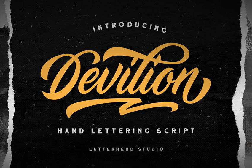
Note: while this handwriting vector tutorial will teach you useful skills, it’s a process. The creative hand-lettering alphabet fonts from Envato Elements are great options for your immediate needs. Find more simple calligraphy hand-lettering fonts like Devilion after the tutorial.
Pre-Tutorial
Three things to note before we get started putting your handwriting in vector form:
First, the hand lettering vector process below uses some work I already created in a previous tutorial. For your practice and experience, I suggest creating/using your own piece of hand-drawn lettering, rather than recreating mine. It’s truly the best way to learn! I want you to take the information below and apply it to your very own lettering, so you’ll have a finished piece that you can truly call yours!
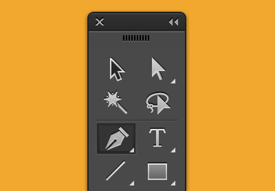
Second, this tutorial isn’t about teaching you how to use/understand the Pen Tool. If you don’t understand how it works or its functionality, I suggest reading up on that before you begin—it’ll only make things easier later on.
Third, I want you all to know that this tutorial might seem a bit jumbled up and all over the place, but I promise it’s for the sake of teaching! I just want to share everything and anything to help your hand-lettering vector process. Long story short, it won’t be a streamlined beginning and end. There will be a beginning, and there will be an end, but it’ll take us some time to get there!
Keep an open mind, and I promise we’ll create great things. Let’s begin!
1. Preparing the Tools You Will Need
- Computer—PC or Mac. Either one will get the job done!
- Adobe Illustrator
- Initial sketch/scan of the hand-drawn lettering you want to vector
- Pen or pencil
For this tutorial, you’re going to use a sketch of some previous lettering you may have done from the previous tutorials. We’re going to focus on taking that sketch and redrawing it in handwriting vector format.
2. Plotting Your Points on the Extrema
Before we begin working on the computer, we’re going to practice vectoring by hand! With paper! Crazy, right? I promise you it’ll give you a much larger understanding and appreciation for the wonderful Pen Tool.
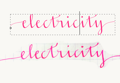
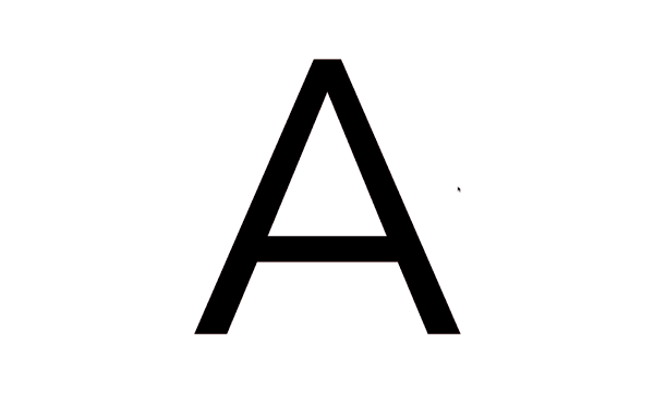
Now, what does “extrema” mean? Firstly, it’s plural for extremum. In mathematics, that generally means the maximum or minimum. In the case of lettering, we’re talking about the extreme opposites of the letter to compose it with bezier handles. For example, the extrema of the letter “O” would be the north and south anchor points that form the curve. The east and west anchor points on the side allow you to distribute the weight and width.
Take a look at this circle below. You can see the shape is being evenly created by four main points. Those are the “extrema” of the letter “O”.
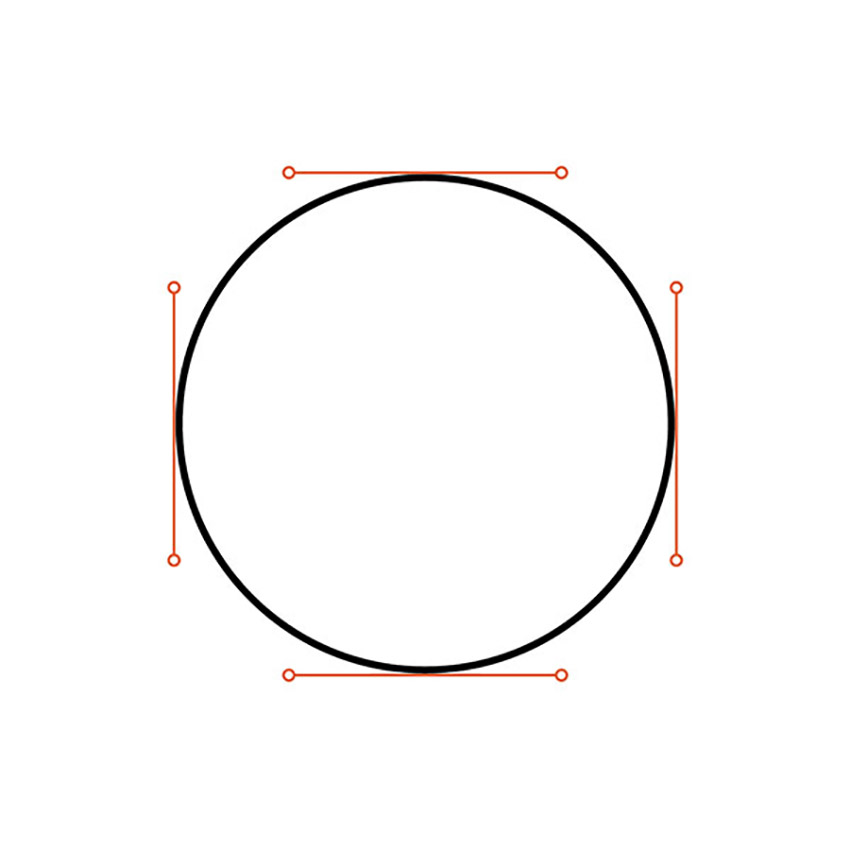
Notice that the handles are evenly balanced and distributed as well. This same technique should be applied to your lettering. Make sure your handles are all balancing the workload and not allowing just one handle to be extremely long and carrying all of the weight.
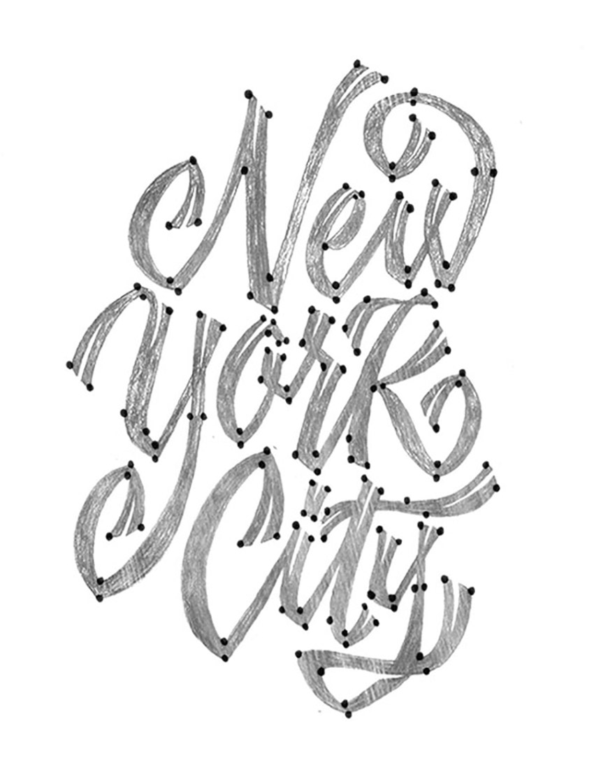
Step 1
Download the attached lettering if you’d like to use mine. If not, feel free to use your own! From here, let’s begin drawing where the anchor points would go. Go ahead and use a pencil or pen and draw circles wherever you think you’d place those anchor points in Adobe Illustrator.
Don’t worry about whether you’re right or wrong—just go for it and see what you think may be right. Later, through this tutorial and further practice, you’ll be amazed at your growth / new knowledge.
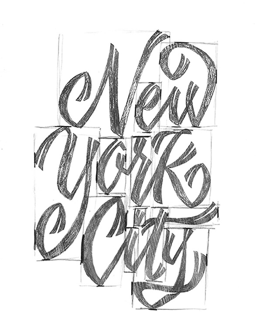
Step 2
Next, take that same piece of hand-drawn lettering and begin to draw rectangles around each letterform. We’re using an easy trick to understand where you’ll plot your points on the “extrema” of your letterforms. Wherever the rectangle touches your letter is where the anchor point should lie. Now, that’s not to say that your letterform should only have four anchor points since there are four sides to a rectangle. This just gives you a great starting point.
Later on, we will begin plotting the extrema in Illustrator, and then adding additional anchor points for particular curves or maybe increasing some weight in your letterform. Every letterform will differ, so this hand-lettering process isn’t set in stone. Ultimately it’ll give you a head start in the right direction, and then it’s up to you to determine what looks “good” or what looks “correct”.
3. 0°, 45°, 90°: Handle Angles
Now, before we get too deep into this section of the tutorial, I want to say that 0°, 45°, and 90° aren’t necessarily the only angles you should place your handles at. Again, it all comes down to what looks good and using your own judgement to determine if it could use a random angle of 15°, for example.
So, what’s so special about horizontal, vertical, and diagonal (45-degree) angles? First, using similar angles keeps things consistent across your lettering. Second, those angles are key to forming the smoothest curves. Ever noticed little points or edges in your lettering that are caused by anchor points? Well, that can easily be fixed with proper anchor point placement and the proper angle of your handles.
Let’s get to work!
Step 1
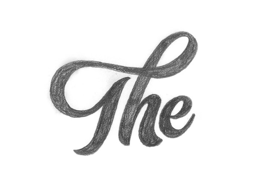
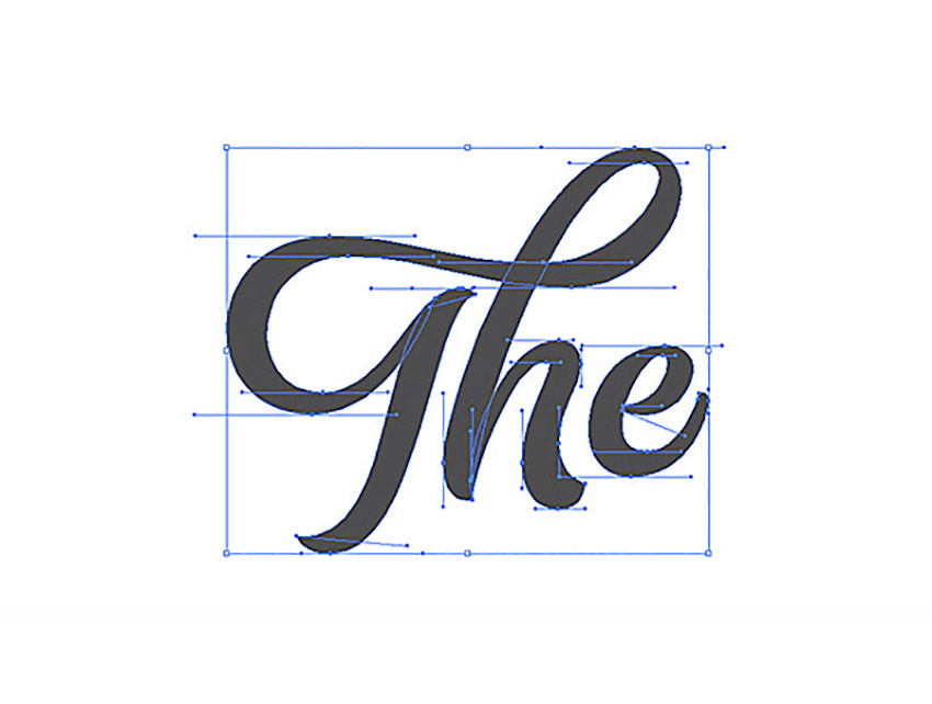
This simple hand lettering vector process below will show the importance of horizontal and vertical anchor point handles. This process should be used for nearly any vectoring project you have from here on out. Let’s start out by vectoring the word “The”. I want to break down the vectoring process so you can see how I would normally go about vectoring a simple word such as this.
If you’d like, you can begin by applying the “rectangle” technique with your hand-drawn lettering before you begin, so you can determine where your extrema should be placed.
Step 2
After drawing out your “The” lettering, we’re now going to begin taking it apart piece by piece for the handwriting vector.
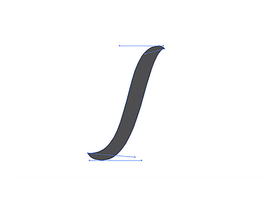
I’m going to start with the stem of the “T”. As you can tell, I’m using those horizontal anchor point handles as well as two not-so-mathematical angles. Remember, not every handle needs to be horizontal. It’s truly what you think may look best. For this stem, I started with all of the handles horizontal, and then tweaked the two to fit my liking.
All in all, this entire stem was created with just four anchor points and a little trial and error.
Step 3
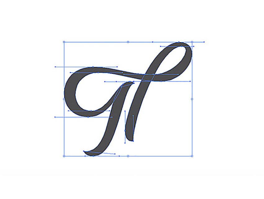
This is where things get a little crazy. For this particular example, I decided to vector the “Th” connection together to create a single shape. Each anchor point is equally balanced and equally distributing the curvature. As for where to begin plotting your anchor points, it’s all a matter of preference. The letterforms generally dictate where to begin. For me, I work left to right, so I began by drawing the loop connection of the “T” and ended at the stem of the “h”.
Let’s keep pushing forward!
Step 4
Next, I formed the shoulder of the “h” (the second stem if you will). Every piece of this lettering is broken down into separate shapes, so you can later make edits to individual pieces rather than the entire piece.
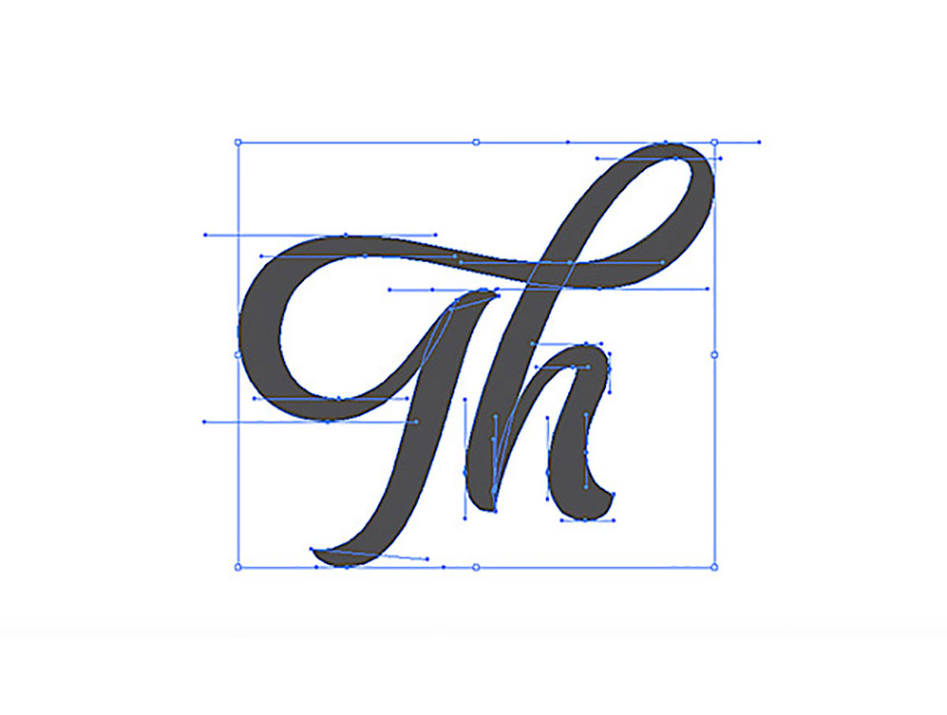
Step 5
The last step is to create the “e”. Using just eight anchor points, I was able to create the right form without adding more points to adjust the width, contrast, etc.
Begin wherever you’d like, but for me personally, I began by forming the crossbar of the “e”, circled that shape around to form the bowl, and finished it off with the tail.
And there we have it! Our finished “The”. Remember to plot those points on the extrema, finesse those handles until perfection, and you’re golden! Patience is key!
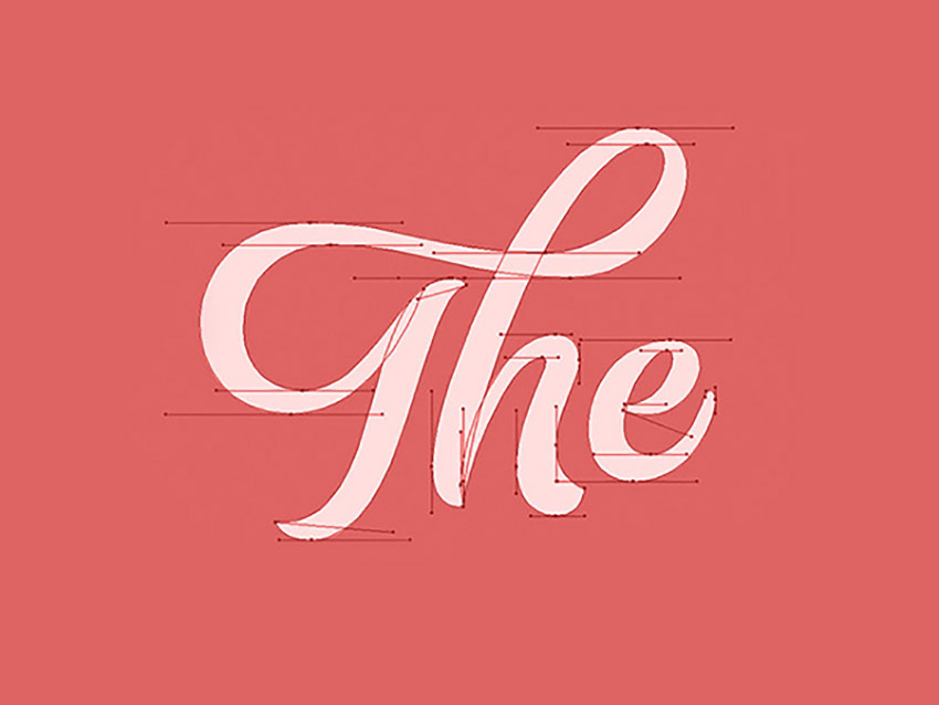
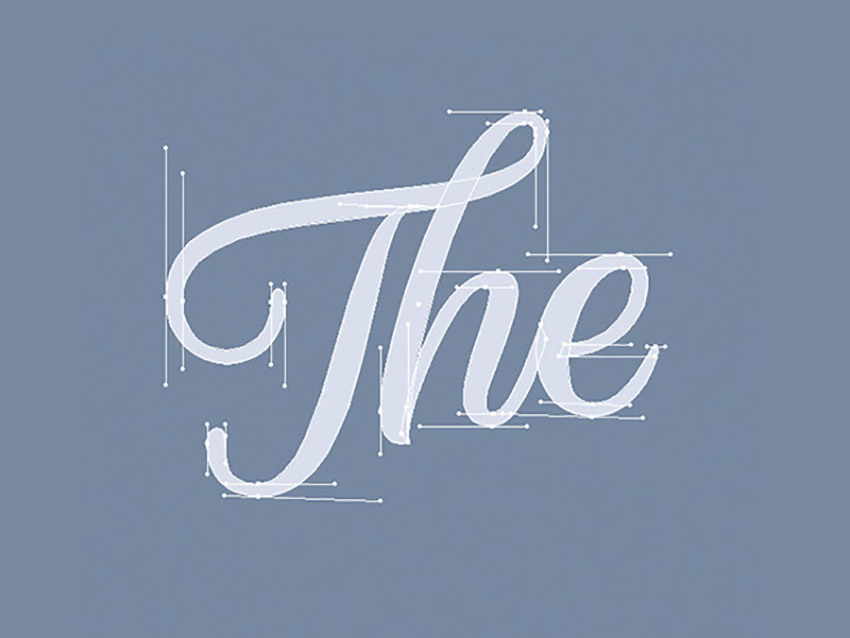
I’ve included the below example as well, so you can see a completely different style of the word “The” while still using similar horizontal and vertical handles.
4. Additional Vectoring Tips & Tricks
Vectoring sure is time-consuming, even for a master. No matter what, it’s a lot of fine-tuning and correcting those curves, anchor points, etc.
In this section of the tutorial, I hope to shed some more wisdom to speed up the process just a bit more. For simplicity, I’m going to be using the letter “O” or a circle shape to demonstrate a lot of these tricks. Even though it’s a simple shape, the methodology and practice can be used for every single letter.
Step 1
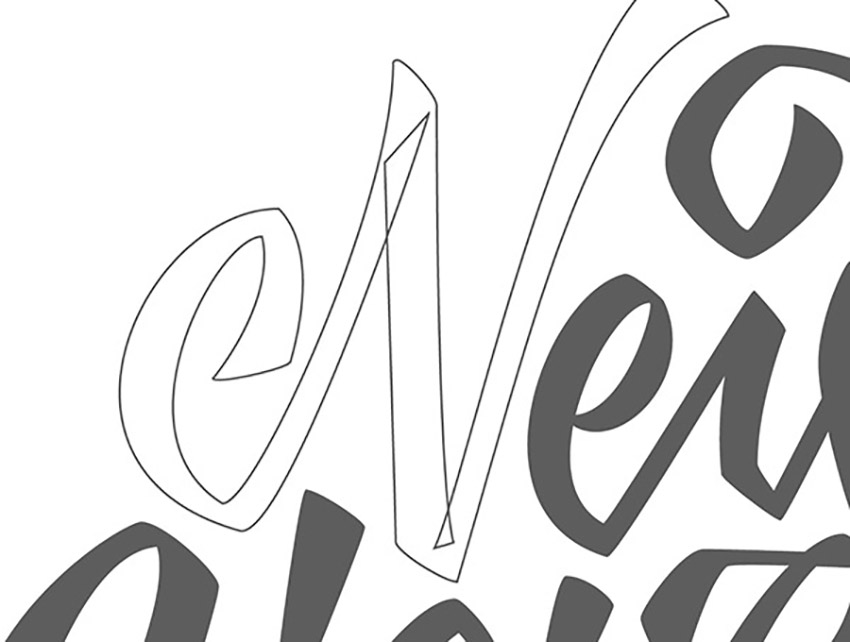
I call this technique the crossover. As you begin to vector your hand-drawn lettering, you may find it easier to apply this crossover technique to control the widths and angles of parts of your letterforms. In the example below, you can see I created an extra anchor point to allow me to control what’s called the “crotch” of the “N”. Essentially, it allows you to move and alter one portion of your letterform without disturbing another.
In the bottom gif example, this shows exactly what I mean by altering one side without disturbing another. Now, this “A” construction definitely isn’t correct by any means. It’s just a perfect way to display what the crossover technique can accomplish.
Step 2
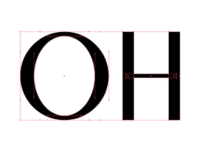
The Ellipse Tool and Rectangle Tool within Illustrator can become your best friends if you just think about what shapes are composing each letterform. For example, the letter “O” has two ellipses: one for the width and another ellipse on the inside to form the weight. So, if you just create two ellipses stacked on top of each other, you can form the letter “O” within seconds.
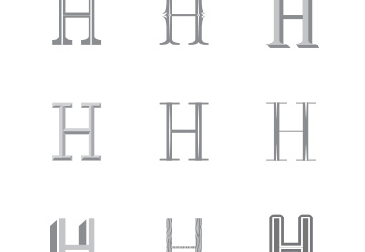
Additionally, if you wanted to continue and create another letter such as an “H”, you can use the Rectangle Tool. Each stem and the crossbar of the below “H” was formed with three separate rectangles. You can later expand and merge them if you’d like one complete shape.
Hopefully the sped-up gif process below shows exactly what I mean. I’m just using simple shapes to form these letters.

Step 3
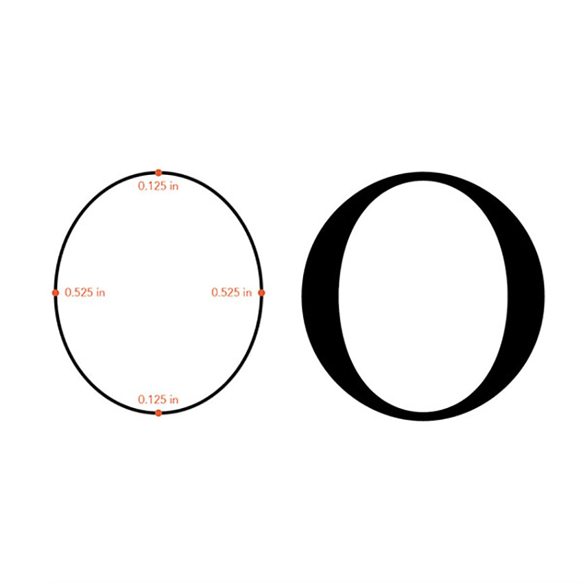
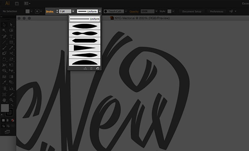
In the below example, I used the Width Tool in Illustrator. It definitely can come in handy at times. With this tool, you’re essentially plotting where you want your width to be distributed. In this example, I wanted the left and right sides of the stroke to be .525 in, while the top and bottom remained .125in. This distributed the weight evenly and formed a nice high, contrasted letter “O”.
As you can see from the example, the left is just a stroke—that was before I applied the Width Tool—while the right is after the Width Tool has been applied.
This tool can definitely help speed up vectoring certain letterforms, especially script. Just remember to draw with “strokes” and add the contrast to your letterforms with the Width Tool after.
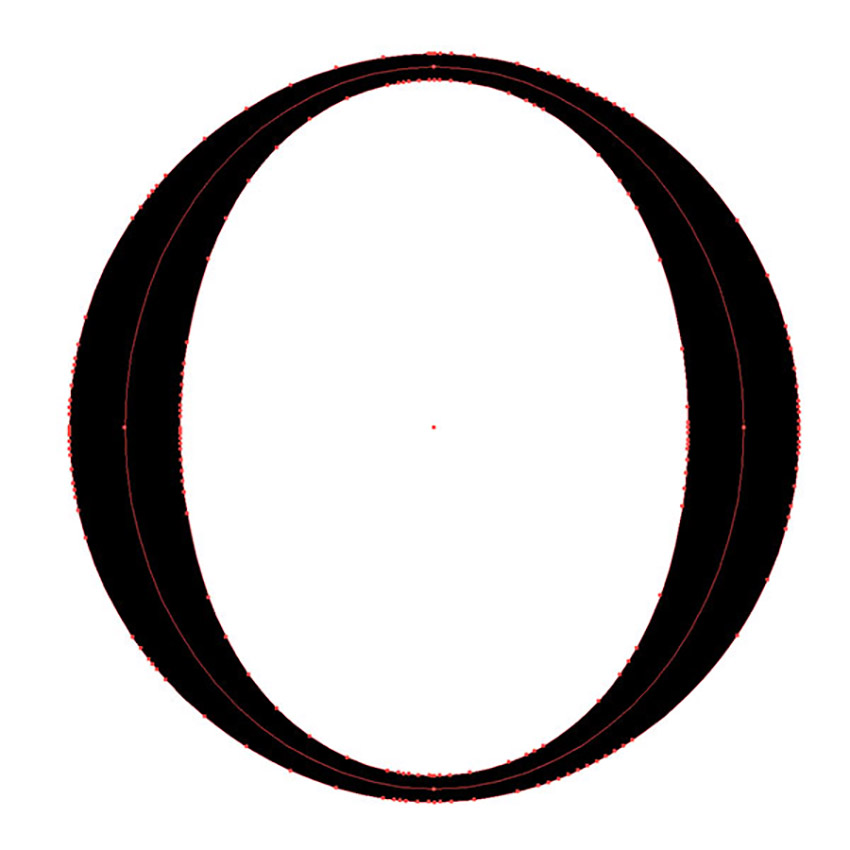
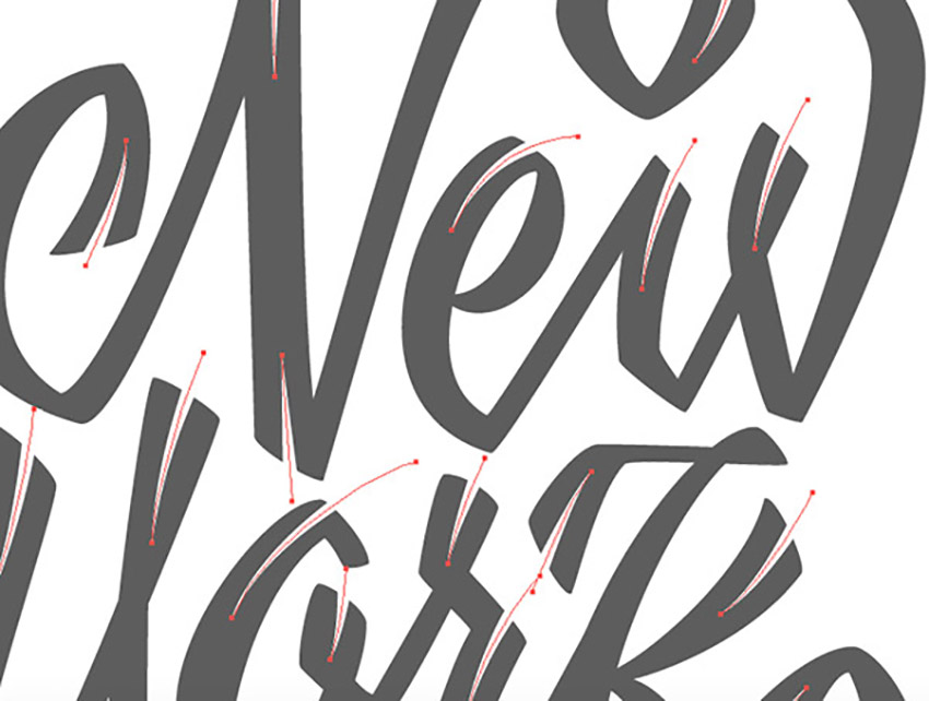
The downside to the Width Tool is that when you go to expand your stroke, it forms a massive amount of extra anchor points that you don’t need. You can see what I mean in the image below. All those tiny red dots are anchor points!
So if you wanted to make edits after it was expanded, it would be rather difficult if you didn’t have the original stroke to edit.
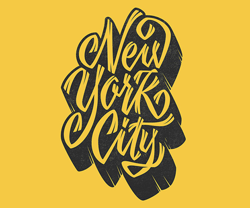
5. Final Vector Piece
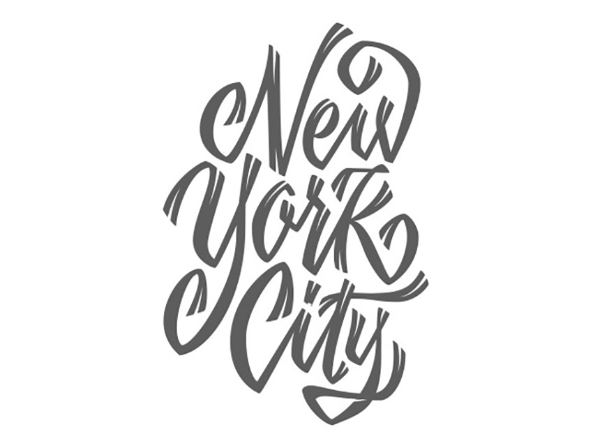
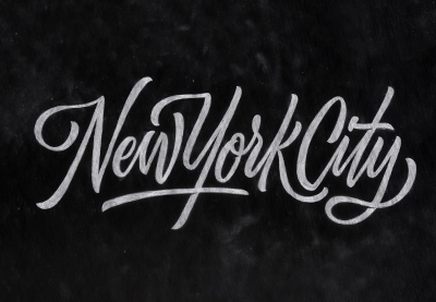
Alright, it’s time to knock out the final vectoring project since we just learned all about how to make hand letter vectors in Illustrator! We’re going to begin where we left off earlier in the tutorial and take this New York City piece to completion.
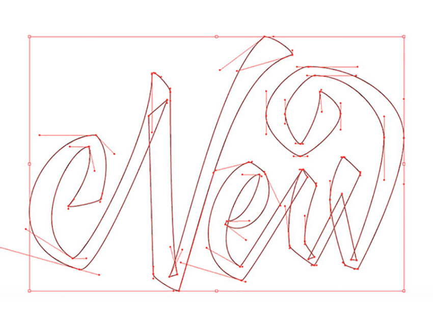
Step 1
Taking this piece by piece, begin vectoring your letterforms one at a time. Use the crossover technique so that you can adjust an area of your lettering without disturbing another part of it. For this particular piece of hand-drawn lettering, I had very few vertical and horizontal handles. But I still plotted my points on the extrema, which allowed me to create the shapes you see.
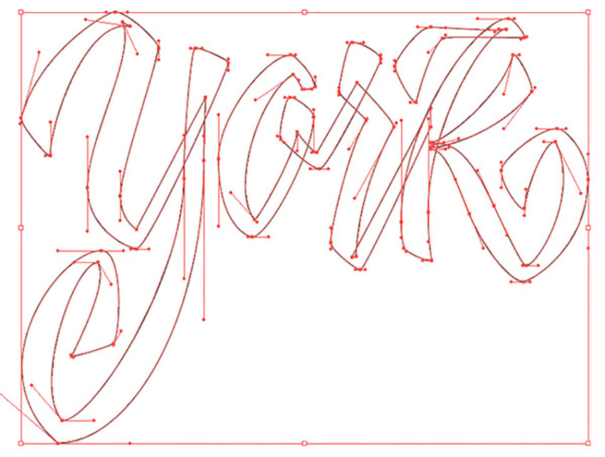
Step 2
After vectoring the “New”, let’s start the next word: “York”. Use the same process, and vector each piece by piece. You can probably see the collection of anchor points within the “K”. That’s because I drew each part of the “K” as separate shapes to edit later if need be. So the stem and the two legs are all individually drawn, creating a total of three shapes to form the “K”.
Note that it’s okay if everything overlaps, since we’ll be filling these shapes later on.
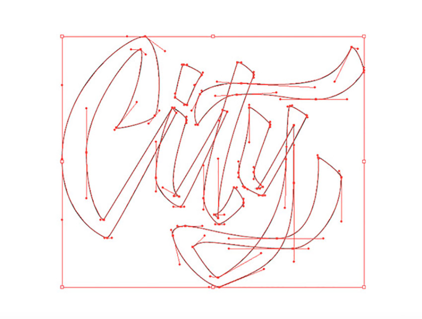
Step 3
The last word for the handwriting vector, “City”. You know what to do: begin plotting those points, and carefully finesse your handles to your liking. Draw each letter separately, as you can see below—it’ll help the editing process later on.
Step 4
There we have it! After you’ve completed vectoring the whole piece, you can give the hand-drawn lettering a fill instead of a stroke so you can see how the positive and negative space are interacting.
Step 5
Even after you think you’re done vectoring, you’re probably not!
There’s tons of editing to do after you “fill” the shapes because you can then see what needs more contrast, more kerning, etc. In this instance, I made lots of minor edits to help the overall color. Additionally, I altered the shape of the “Y” to extend into the negative space of the “N”.

Step 6
The last step! For this piece, I added little “notches” to the enter and exit strokes of the letterforms. How would one vector something like this? Just remember to break things down into simple shapes or strokes again. For me, I knew it would be perfect to use some simple strokes created with the Pen Tool, but I changed the “Variable Width Profile” of the stroke to create the triangular shape. You can see what I mean in the process below.
The Final Product
I took the liberty of filming a very sped-up video of the whole hand-lettering process. It took me a good two hours to complete this piece. Again, patience is key if you want your vector lettering to look exactly how you sketched it out! Feel free to watch the hand-lettering process below and see the extra step I took to take the vectored lettering to the next level.
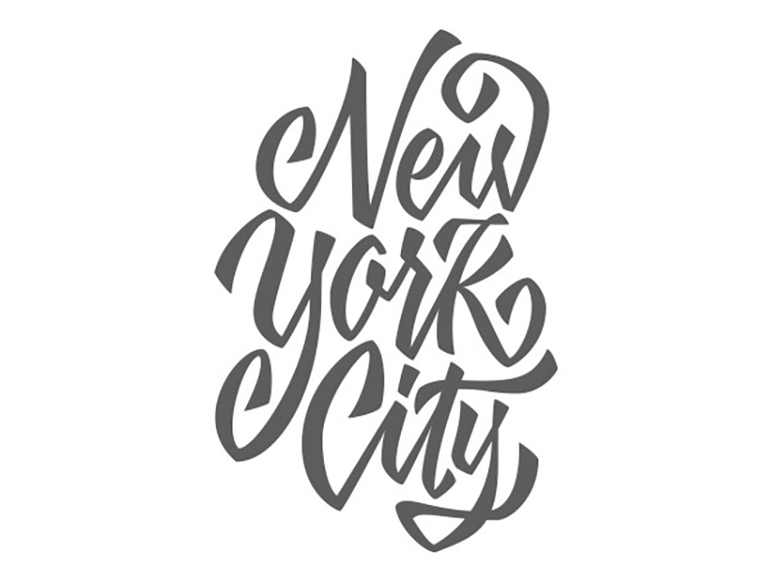
The below New York City piece is the finished handwriting vector after adding lots of extra details. If you’re curious as to how to create depth, texture, color combinations, etc., then my next tutorial will be perfect for you! Stay tuned for that in the next month or two.

Awesome Hand-Lettering Calligraphy Fonts From Envato Elements
Nailing your hand-drawn letters is a great feeling. But if you want to turn them into fonts, you have to keep in mind it’s a long process. If you have projects to finish that need calligraphy hand-lettering alphabet fonts, save some time. Check out these professional and creative options from Envato Elements:
1. Ilana Bloom Hand-Drawn Letters (OTF, TTF)
Have you been hunting for hand-lettering alphabet fonts with character? Then have a look at Ilana Bloom. It features hand-drawn letters in three unique styles. Choose from regular glyphs, swashes, and swirls to complete your latest design. It’s a stylish and quick alternative to hand lettering in Illustrator.
2. Ghaniyun Monoline Font (OTF, TTF)
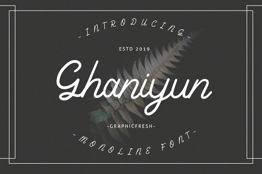
The simple Ghaniyun hand-lettering font is built on flowing ligatures. This monoline typeface includes both cases of letters, along with numbers and punctuation. Ghaniyun also has multilingual support so you can use this download to reach an international audience.
3. Devilion: Hand Lettering Script (OTF)
I’ve featured Devilion here for good reason. It’s one of the top simple hand-lettering fonts available on Envato Elements. Devilion provides beautiful ligatures and swashes along with multilingual characters. The hand-drawn letters also come in an alternate stamp form, letting you experiment with multiple feels.
4. Makayla: Beautiful Script Font (OTF, TTF, WOFF)
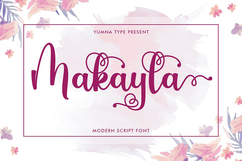
Curly tails and long swashes can add some much-needed flair to hand-drawn lettering. Makayla is a shining example of this look in practice. On top of a full character set, it features ten alternates and 52 swashes. It’s almost like having multiple hand-lettering calligraphy fonts in just one download. Try out Makayla if you don’t have time to follow the above tutorial on hand-lettering vectors in Illustrator.
5. Sengkaling Script (OTF, TTF)
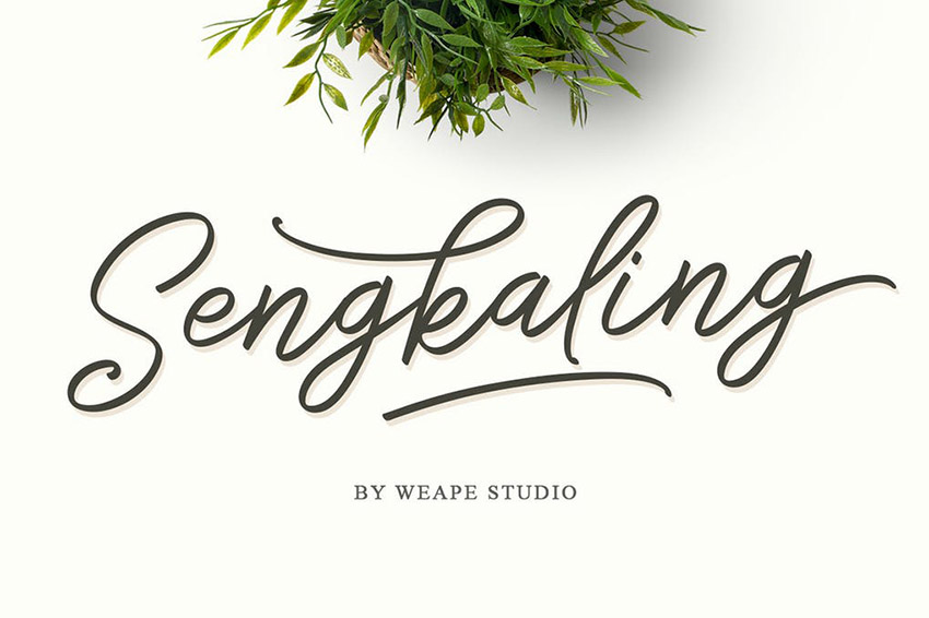
Let’s close out our list with one of the top cursive hand-lettering fonts available. Sengkaling is filled with creative style, yet it’s understated and professional. Each of the hand-drawn letters comes with alternates, so you can try different looks of the font. You can also experiment with the different ligatures and swashes included in the download.
Conclusion
I’m sure at this point you’ve practiced a good amount to hopefully become even more comfortable with vectoring than you already were. We’ve covered a lot of material, and now it’s time for you to put this knowledge to the test. Now that you know how to make hand letter vectors in Illustrator, keep practicing what you’ve learned because it only gets better with time, I promise! Keep it up!
As always, if you have any issues or questions, feel free to leave a comment below and I’ll be able to help you out. Good luck!
Extra Resources
If you’re interested in getting some help with your lettering, Envato Studio has a great collection of Lettering & Calligraphy Specialists that you might like to explore. You can also check out the rest of the tutorials in the Hand Lettering series below.
 Hand LetteringHand Lettering: Letterforms at Their Core
-
Hand LetteringHand Lettering: Understanding Types of Type
-
Hand LetteringHand Lettering: Scripts, Swirls, & Flourishes
-
Hand LetteringHand Lettering: Mastering Brush Script
-
Hand LetteringHand Lettering: How to Stylize Your Letters
-
Hand LetteringHand Lettering: A Project From Start to Finish
Looking for even more resources and downloads of simple cursive hand-lettering fonts for your projects? Look through these helpful articles:
-
Fonts35 Best Calligraphy Fonts
-
Fonts25+ Best Free Hand-Lettering Style Fonts (Designs for 2021)
-
Fonts25+ Best Free Calligraphy Fonts (Free Downloads)
-
Fonts40+ Best Swash Fonts and Fonts With Tails (Download Now!)
-
TypographyHow to Design and Construct a Functional Cursive Font
-
Fonts30+ Beautiful Modern Script Fonts (Typefaces for 2021)
-
CricutHow to Connect Letters in Cricut
-
CricutHow to Upload Fonts to Cricut Design Space