
We’ve come a long way since Times New Roman was the norm. Now the Internet is populated by a diverse collection of fonts. Fonts which catch the eye and, most importantly, make it effortless to read a website’s content. Yet not all fonts cover those bases – something which plenty of aspiring web designers fail to understand.
After all, settling on a font design seems insignificant when plotting the grand vision of a website’s design. First there’s the colour scheme, the logo, graphics… The text on a page is often judged as an afterthought. Yet this is the aspect that ties everything together. It’s the part which establishes a connection with your audience and helps retain their attention (combined with engaging content, of course).
“Web design is 95% typography.”
That above quote should put it in perspective. It takes up so much of the design landscape that, if you use poor typography, your content might as well say ‘Goodbye’ to visitors. So before going with your standard text choices or those pre-selected fonts you get as part of a theme package, read on to see how you can better serve your website – and users – by optimising the typography.

First of all, don’t go crazy
Open up a Microsoft Word document and scroll through those font choices. Browse an online archive such as DaFont.com. Or input the word ‘typography’ into a Google search. There are, without exaggeration, thousands of different fonts available. Some are within their own extensive font family and provide only minor alterations. Others are on the Wingdings spectrum for being ‘out there’ in style.
With so many choices at hand, there is a temptation to turn your website into the font equivalent of a scrapbook. However, it’s a road you want to avoid traversing. In fact, you’re best served by stripping everything back and going with only a minimum number of fonts.
Why’s this? Well a muddled collection of fonts – and this can be simply more than three different options – gives a website an unprofessional, unstructured appearance. Not only this, but too many styles and type sizes can assist in laying waste to any layout.
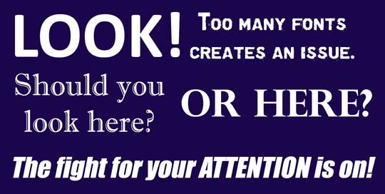
Look at the above. Look at how the different fonts grab your eyes and take them on an uncomfortable ride. To avoid this, settle on only one or two font families, and stick with these fonts throughout the entire design of the website. And if you decide to utilise two fonts, it is vital each font family complements the other. Everything has to blend seamlessly and sing from the same hymn sheet.
Keep it simple
Along with not going crazy in terms of picking multiple fonts, the same philosophy stands when narrowing down on a font style. A fanciful font may have enticed you with its flicks and swooshes, yet it won’t appeal to everyone. This is why the suggestion is to go with a safe bet – aka a standard font like Calibri or Arial. As users are familiar with such fonts, they can process them faster and without issue.
Remember the typography is only the gateway to the content; people are not being drawn into the type itself.
Big or small, it needs to work
Mobile. Optimisation.
If you’ve browsed any web design or marketing guides over the last few years, the same advice crops up: your website needs to be designed in such a way it works perfectly on mobile devices. And this is for good reason. It’s becoming standard for users to browse the Internet from their phones or tablets.
With this in mind, and armed with the knowledge that people will access your website from various devices with various screen sizes and resolutions, it’s imperative you select a typeface which works in multiple sizes, and retains readability on every platform.
Pimp those headlines and headings
If there’s one place where creativity can swoop in and sprinkle influence on web typography, it’s with the headlines and headings. Think about it: these facets are meant to stand out from the rest of the content. Their job is to instantly grab the attention of the reader. And the more flamboyant and original they are, the more they will do just that.

Of course, this isn’t a signal to go completely overboard. The design of the headline and/or headings should remain in line with the general design on the website and fonts. Plus there’s nothing wrong with taking your standard font, going up a few sizes and bolding the text. That works too.
Colouring, caps and distinguishable letters
Finally, and before nailing down your flag on a particular font hill, there are a few other minor – yet still important – components to consider.
One of these is the colour of the font. Although it should go without saying, the colour of the font shouldn’t be similar to the website’s background style. There should be a distinguishable contrast between the two colours. The more visible the text, the quicker readers can scan what you have to say.
Some fonts on the market are only equipped with the dreaded all-caps option. This is fine if creating, say, an infographic, logo or t-shirt design. But when every letter is capitalised as part of a text block meant for reading, it becomes a problem. The reason for this is all-caps print proves to be a serious detriment to both reading speed and comfort. Seriously, type up a paragraph and see for yourself – it’s far from a pleasant experience.
The last bit of advice as part of this guide is to use fonts which contain distinguishable letters. What does this mean exactly? Well with some typefaces, you find certain letterforms that look similar to others. The biggest culprit for this is usually when an “i” has the same appearance as an “L”. Another offender is when “r” and “n” are placed together and seemingly create an “m”. It’s minor concern, but remember: you want to ensure there are no reading issues for your users.
To sum it up, be smart with your font choices. As a web design London agency, we pay extra attention to the types of fonts that are suitable for creating the best UX for the users. If you are having trouble picking the right fonts, contact us today.