Do you always follow your gut when making decisions for
your website?
Designing your website often starts with what you feel will
make a website look good.
However, you’ll most likely be changing your plans when the
results of your efforts come in.
But this is okay because tracking and measuring your site’s
performance from a design standpoint is important.
At the end of the data, you’ll rely on data on how to
In this post, you will learn how to gather data about your target audience and design your website accordingly.
Two types of data to gather
There are two
types of data you want to analyze: quantitative
and qualitative.
To put it simply, quantitative data answer the who, when,
what, and where questions you have about your audience.
On the other hand, qualitative data is quite harder to
extract.
If you already have quantitative data, the next thing you
want to do is know what they feel while
browsing your website.
Basically, qualitative data answers the “why” question.
This will help you create more engaging experiences which
will, in turn, increase the value that you bring to your users.
How to design with data
Make sure that you have the tools to properly
measure these two types of data.

Here are some tools to use if you want to dig
deep into what your users tell you.
All of these tools have their benefits and serve their
purpose if you need to track your user behavior, what keywords they use, or
what buttons they click on your website.
- Google Analytics
- Google Search Console
- SEMrush
- Ahrefs
- Hotjar
- Google Tag Manager
Ask the right questions
Designing with
data is an overwhelming task.
There are a lot
of measurements to analyze and results to keep track.
Getting
sidetracked happens especially if you aren’t sure about the purpose of your
data collection.
So focus on a
specific goal so you don’t end up collecting data that won’t be useful on how to know your audience better.
Here are a few
questions you can start with:
- What challenges do our visitors
face when visiting our site? - What do my users expect to see on
my site? - What functions should we consider
to improve their experience? - Did my design experiments affect
our engagement rate?
After listing
down your questions, begin to look for answers from the tools that we listed or
other resources that you can find online.
These answers
will lead you to a clearer path and help you determine your next steps.

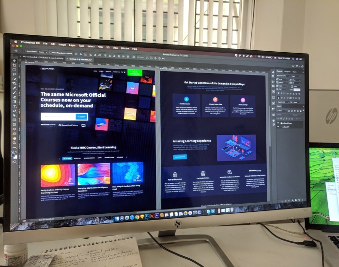
Use information to create a mockup
Once you find out
the answers to your questions, apply the information you learned to your design
decisions by creating a mockup.
Designing with data simply means that your designs should
be based on what the users do on your website and how you can increase their
engagement with it.
A wild guess on what they feel about your blog is one
thing. But your website’s data provides concrete evidence about their overall
experience with your website.
So use the gathered information before creating your
mockup.
If you notice that they immediately leave your site, check
your site speed.
If they only reach the top fold of your site, review the
quality and the design you use.
Believe what the data tells you and create various mockups
that you can use for our next step below.
Test results
Make sure to test the results!
A/B testing is a simple process that you really need to do
regularly.
Try to run some experiments when you create multiple
mockups.
Do users stay longer when the theme is yellow rather than
orange?
Are bigger buttons getting more clicks than the smaller
ones?
A/B testing is where you do one thing and then another with
only a slight change in an element.
Then, you’ll be able to know which is more effective in
converting to your set of goals.
Remember to rely on the actual data that your A/B tests say
rather than just making assumptions.
Get the opinion of your audience
Try to do a semantic differential survey on your website.
The goal is to
present your users a few options and ask them to give their rating on a sliding
scale that consists of opposite adjectives on each end.
Done correctly, the insights you’ll get are valuable and
can be critical to the success of your future designs.
It’s the perfect way to resolve any of your customer misconceptions and make changes as
quickly as you can.
Conclusion
Backing all your future actions and design ideas with data can yield you better results. Try to do the things we stated above and make sure to take a good look at what the data tells you.
Related posts:
Designing Websites Around Colorblind Users
Dos and Don’ts of Designing the Perfect Website Form
Author: Christopher Jan Benitez
Content marketer during the day. Heavy sleeper at night. Dreams of non-existent brass rings. Freelance writer for hire. Pro wrestling fan by choice (It’s still real to me, damnit!). Family man all the time.