As a freelance web designer/dev, one of the most common projects is a website redesign. Clients want their existing site (or specific pages) transformed into something superior. But this often comes with a price where SEO is concerned.
Massive changes to site structure, architecture, and page elements can negatively impact their search engine optimization.
And the last thing you need is a bad review, being on the hook for their SEO decline.
Here are four key mistakes to avoid when doing a site redesign to ensure your clients SEO stays intact.
1. Neglecting Site Speed
Site speed is no longer a secondary ranking factor. Especially when it comes to mobile:
When developing and designing a new site for clients, they often want a few things.
But the most important to them is usually sprucing the site up. And this almost always involves new, exciting page elements.
Related: Common UX Mistakes and How to Avoid (or Fix) Them
Elements like sliders, carousels, animations, transitions, and everything in between.
These are fantastic tools to create a beautiful website, and if the client wants them, you really have no choice.
The problem occurs when too many are used and you fail to minify your coding.
Too many page elements = heavy page weights = slow site speeds = worse SEO.
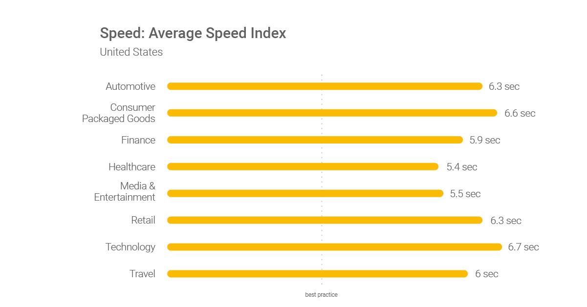
According to Google, the best practice for site speed is just three seconds, and most sites fail to come close:
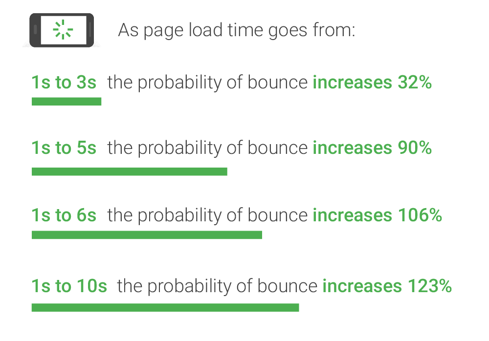
As you can imagine, this poorly impacts the user experience, generating higher bounce rates and worse rankings:
When adding new page elements, be sure to minify or even remove unused or overdone CSS.
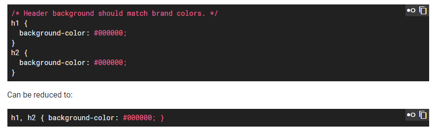
Google provides a perfect example of this:
Amongst this, be sure to nail the following development factors when adding in new page elements to account for site speed SEO:
2. Treating Mobile as Secondary
Mobile is no longer a secondary thought.
If you are redesigning and developing a site with mobile as an afterthought, your clients SEO will suffer.
The mobile index is already rolling out. Mobile-speed is a ranking factor. Mobile versions of your website are first to show in SERPs. To top it off, the majority of traffic is mobile, too.
No longer are the days of developing a site and “just making sure it looks good on mobile.”
Mobile is a fundamentally different environment than desktop. People browse in different ways on mobile.
Speed matters more.
Information architecture matters more (more on this later).
Content delivery matters more.
Even fonts matter more.
Web design expert Nick Schäferhoff says this about mobile website design:
“Starting with mobile forces you to concentrate on the essentials and think through the purpose of your design. You can then further unfold and add elements as the screen size grows bigger.”
– Nick Schäferhoff, Website Setup
Nick hits the proverbial nail on the head with this.
When it comes to mobile, it forces you to focus on the biggest impacts and think greater about the exact purpose and flow of your design.
Rather than adding elements for the sake of more elements, you are now adding them because they serve specific purposes for a mobile browser and how they interact.
One great example of mobile-first design and development is from Freshdesk:
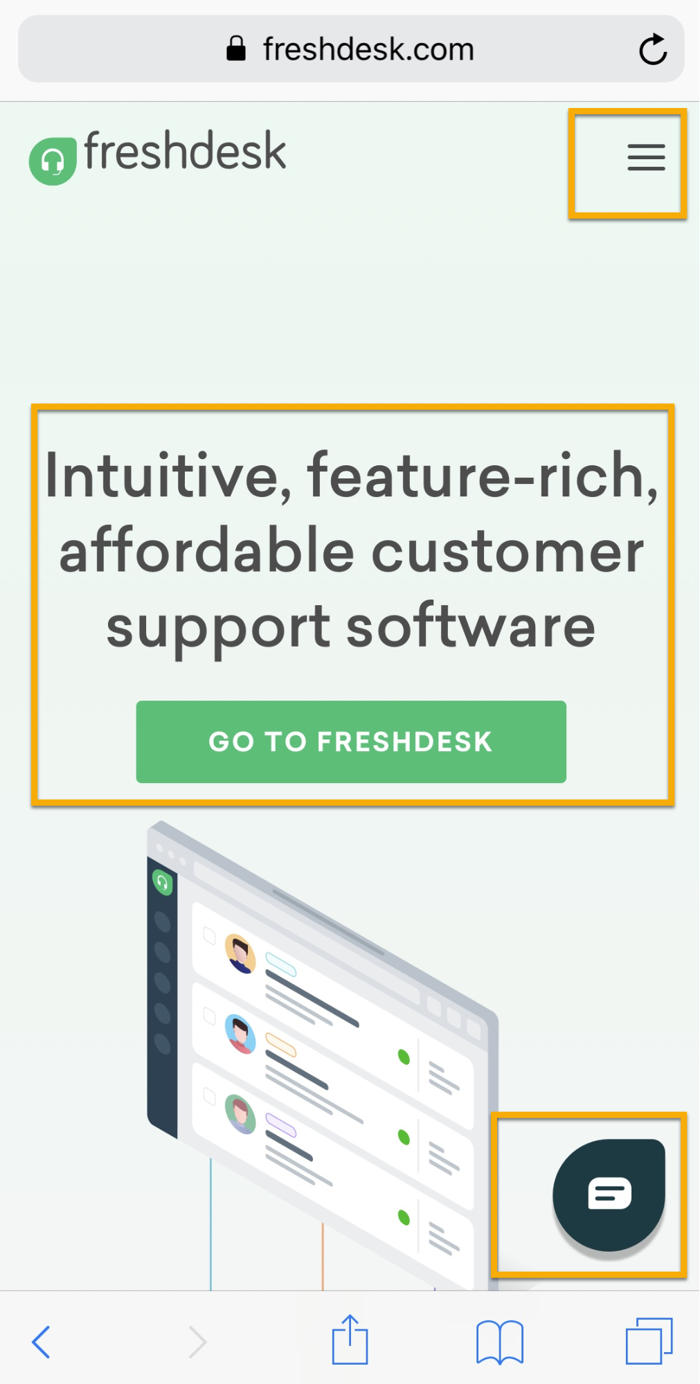
Freshdesk’s site design is the epitome of mobile-first thinking.
First, the usability is unrivaled. Want to find something fast? A retractable menu sticks to the top right corner, giving you access anytime.
Next, the greeting of the homepage is simple, yet informative, without overdoing page elements that slow the site speed.
Then, live-chat is directly available on mobile, tapping into the “on-the-go” aspect of mobile users looking for information fast.
And keep in mind, this is all above the fold.
Next time a project comes in, think mobile before desktop in the development stages. Your client’s SEO results will thank you later.
3. Overcomplicating Information Architecture
Information architecture is simply the way you organize information on a website.
When developing new pages, it’s critical that you don’t overcomplicate it.
On new projects, clients can often be demanding for countless new pages for their site.
Keeping track can be a nightmare, let alone finding a way to organize them on an entire domain.
Good information architecture allows users to find the content they need fast.
HubSpot is a great example of this, creating “buckets” of pages based on categories:
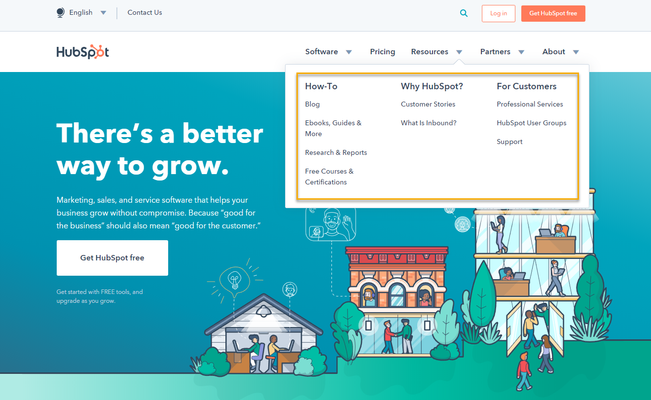
For instance, how-to is a bucket for their blog, ebooks, reports, and more.
When it comes to IA, keep it simple. You’ve done the heavy lifting with your page revamps, now it’s time to organize them in a simple yet effective way for search engines and users.
4. Simplifying Too Much, Impacting Content Delivery
Like we discussed in the site speed section, it makes sense to reduce page bloat wherever possible.
To minify your coding, condense elements (or remove them entirely), and compress heavy visuals.
But doing this too much leads to a boring, bland, oversimplified website.
And this often results in reduced content, especially on homepages. Let me show you an example.
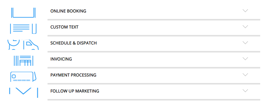
Check out how Housecall Pro structures their site elements on a given page:
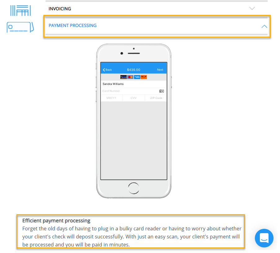
This page element is designed to expand when clicked upon, working to showcase additional text covering directly related keywords they are targeting.
Without this page element, the content on here would be out of place (forcing users to scroll endlessly), and likely would need to be removed, negatively impacting SEO in the process.
Instead, expanding elements allow them to pack in tons of content without forcing users to read all of it or scroll past thousands of words:
Instead, they can pick and choose subjects they are interested in.
Now that’s powerful design and development that both looks good and functions well for search engines and users alike.
While simplifying is a great step, that doesn’t mean your pages need to be text and a few small images.
It just means you have to get more creative, eliminating page weight wherever possible without sacrificing content delivery.
Wrapping Up
When a new redesign project comes up, it’s more than just design and development.
It’s also going to heavily impact your clients potential SEO and ranking ability.
And the last thing you want is a negative review.
With these four mistakes in mind and how to counteract them, you’ll be armed and ready to deliver a final product both you and your client will be proud of.
What are some common redesign mistakes you have seen before?
Related: 35 WordPress Themes For Achieving Higher Search Engine Rankings
Featured Image Credits: Pixabay
Author Bio:
Addison Burke is a freelance marketer, writer, and developer that teaches businesses how to grow through better digital marketing and expanding their web presence. Connect with her on Linkedin.
Author: Spyrestudios