For many dark days, properly aligning objects on a webpage with CSS alone was close to impossible. With mostly-functional semi-hacks like float, positioning and in-like block, we could make it work, but it was far from perfect. When vexed by a particularly troublesome layout quirk, some event lamented the loss of <table> as a structural element. Darkness lay upon the world. And lo, CSS Grid arrived in our hour of greatest need, to render salvation unto developers from the grim despair of fixed layouts.
CSS Grid is the most powerful tool for organizing page content since tables. As a two-dimensional system, it can handle both columns and rows, unlike its predecessor flexbox, which could only handle a single dimension of organization. It also does away with some of the wonky flexbox stuff, like auto-stretching content to fit the layout’s width if you’re not careful about counting your cells. But considering all the positional system we’ve used over the years, it’s easy to get hung up on some common issues.
Draw your grid first

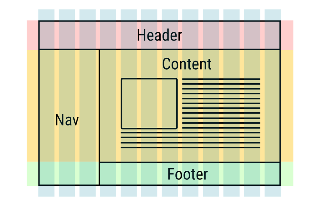
If you remember the time when tables were used for layouts, you might remember using a lot of graph paper to design sites. Grid-based layouts require the same careful preparation. Working out a grid in the vague space of fractions, percentages, pixel widths and auto spacing alone is challenging. It’s hard to visualize the space from numbers alone. While the CSS Grid syntax is reasonably clear, it’s no substitute for a good visual. Put your wireframing skills to work and sketch your layout before you start coding. Figure out how you’ll organize the grid, what the various widths will be, and how to snap things together. Then, turn that visual design into code.
Name things logically
CSS Grid provides a multitude of ways to specify tracks. You can give your columns and rows specific names, refer to them by number or anything else you’d like. Use the same care you would exercise when naming variables in a program. Either choose obvious, descriptive names, or use a numbering system that follows a clear convention. While it should seem that descriptive names are the better choice, they aren’t always possible. Set up a system, follow it, and explain it in the comments.
Use fractions with care

One of the more useful features of CSS Grid is the power to set track widths as fractions of the available space. Specify four fractions with the fr property, and you’ll see four even tracks appear before you. Of course, this works best when you’ve specified the maximum available space your container can occupy, but that’s not the issue. It’s when fractions are calculated that can throw newer designers a curve ball. Fractions are calculated after any non-flexible spacing. If you mix together fractions and pixel widths, for example, the fractions will be calculated based upon the space remaining after the fixed width tracks are accounted for. This can lead to some wonky columns that make sense in your head but don’t work out on screen. Depending on whether or not you expect this behavior, it can be either exceptionally useful or exceptionally confusing.
Whitespace counts too
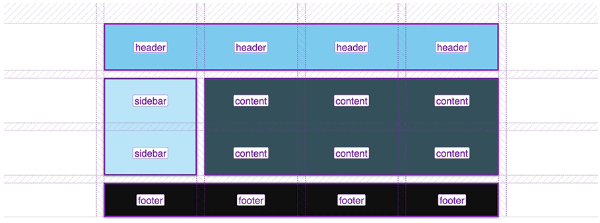
When you’re first laying you your grid based on your wireframe, you’ll need to get a sense of how many columns and rows a given item occupies. Keep in mind that the space between elements, either horizontally or vertically, also counts as a row. This whitespace might be empty of content, but it’s a crucial organizational tool for laying out content with CSS Grid. Make sure you’re accounting for the space between objects, as well as the objects themselves, when you start to code your grid.
Start with a simple grid

Creating a perfectly even grid template is often the best choice for a basic design. By using the fewest number of columns and keeping things evenly organized, you can easily create symmetrical designs without too much frustration. Applying a balanced grid, by keeping your rows and columns even simplifies the design process. It reduces the number of ways you can mess up. Unfortunately, it also reduces your creative options. For your first projects with CSS Grid, working with a simple grid is perfectly fine. As you get a better handle on how the system operates, you can start experimenting with unbalanced and asymmetrical grid designs.
Understanding explicit and implicit grids
Explicit grids are made from the parameters defined directly by the designer. But because CSS Grid is also a little smart, it will automatically apply some grid plans in order to implement your rules. For example, if you have ten divs in a row, and specify a grid with three columns, you’ll find you get four row automatically. The three columns were explicitly defined. The four rows appeared as a consequence of the columns and the number of elements. The rows are the implicit grid. Make sure you understanding the distinction between these ideas so you can exploit them properly.
Grid are great, just like practice
Learning a new skill always takes time. Take advantage of the many excellent resources for learning CSS Grid online. This CSS-Tricks post is an excellent functional introduction, and Google even has a good CSS grid guide.
You might also like the following posts: