Gradients are on-trend for 2017, and they’are a good way to make your design look a little more up to date. They also provide a pleasing illusion of depth and distance, which can add some volume to one-dimensional layouts. Check out these tips for using gradients in web design to get acquainted.
Put Gradients in the Right Place
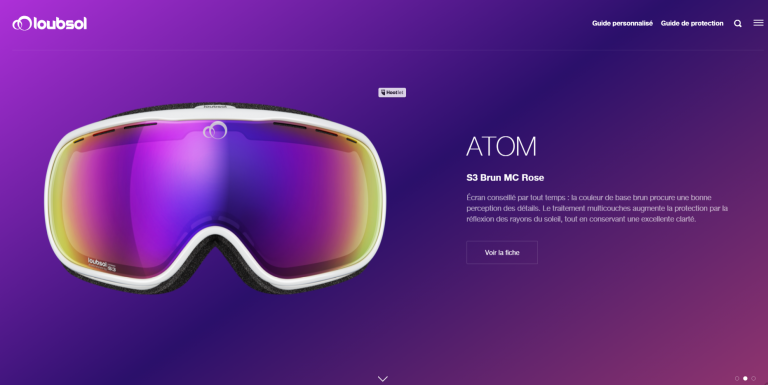
Gradients are best used as background elements. This is probably pretty obvious, considering they’re often used as a fill element. But they’re visually noisy, so they need to be isolated from content that requires focused user attention. For example, they should not be used underneath detailed content, like body copy. Using a subtle gradient as a background is great, but you need to put any detailed content on a flat, neutral background for legibility. You can make great use of a gradient in the sides of a centered page, which are normally rendered default-white. Header backgrounds, hero images and splash pages are also perfect spots. We’ve also been seeing gradients used a overlays, which is especially modern looking.
Use Effective Color Pairs

The best gradients fade between two colors that already go well together. Orange fading into red, for example, is natural and sensible. Purple fading into blue does well too. But green into red just feels strange. Make sure you’re choosing colors that comfortably fade into one another. Not every color combination will work. Even color combinations that exist harmoniously in other designs might produce awful gradients: the transition requires certain colors to work best.
Use Similar Colors
If you want to create a subtle gradient, it’s completely acceptable to use the same hue with the saturation or value tweaked. You can fade a light blue into a dark blue, for example. You don’t always need to use a color with a different hue. The illusion of depth provided by a gentle gradient can be pleasing, so don’t rush to chose different colors if you don’t need to. If you want colors to look similar, pick colors within 10 degrees of each other in hue.
Fade Slowly
Even when the colors in your gradient are similar, don’t fade between colors too quickly. The transition should feel smooth and natural, not abrupt or jarring. Centering your gradients transition on screen also helps. For very basic gradients, it might not even draw the viewer’s attention directly. This is especially challenging on smaller screens, which have less physical space for a slow fade. You might be forced into a more abrupt fade for an app icon, for example. In the case, you’d do well to keep the colors as similar as you can to reduce the gradient’s abruptness.
Use Colors of Different Values
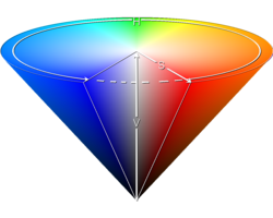
If you’re not up on your color theory, you might not be familiar with value. It’s a technical aspect of color describing how bright or dark a color is, and it’s a measure of how much light a color reflects. If you’re familiar with the HSV (aka HSB) color scale, the V stands for value. Importantly, value is color-agnostic: it doesn’t describe redness or blueness, as hue does. That means that two visually separate colors can have the same value, or level of brightness.
In generally, avoid using colors with the same value. If you have two or more colors that are equally saturated, you’re likely to get an unpleasant and unsophisticated-looking effect. This is most problematic on small screens, where the fade between colors might be abrupt and abbreviated compared to the large monitor you design on. Similar values also ruin any illusion of depth or distance, producing a flat sameness that can weary viewers over time.
Put Darker Colors Lower
If a gradient fades downward in any way, put the darker, lower-value color on the bottom. This anchors the design to the bottom of the page or design element visually, providing weight and stability. It also keeps bright colors up top, where they’ll be more eye-catching.
Use CSS
There is basically no reason to use JavaScript or a tiled image (*shudder*) to render a gradient. CSS3 has an awesome built-in declaration called linear-gradient that can render linear gradients with a huge array of options. That is what you should be using, and it’s compatible with pretty much every browser. linear-gradient is part of the background-image property, so you’ll declare it under that, like so:
.gradient {
background-image:
linear-gradient(
red, #f06d06
);
}
For an awesome explanation of CSS gradients, check out the CSS-Tricks post on the topic.
…Or Don’t
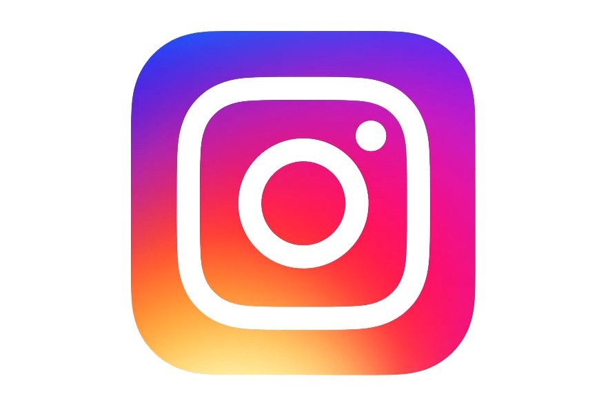
Of course, as in all artistic disciplines, breaking the rules can be very successful. You just need to know when and how to break the rules for maximum positive effect. As proof, a number of large brands have used gradients that totally shatter the rules above. Take Instagram’s recent update to their app’s icon. The new icon has been unfavorably compared to the default Photoshop “rainbow” gradient, and the resemblance is striking. Yet after some harsh initial feedback, it has generally been accepted. It uses clashing colors of similar value, with a sorta-disorienting 45 degree tilt.
You can break the rules if you know what you’re doing. But if you don’t, you might be better off following some simple guidelines to avoid making rainbow-banded puke gradients.
You might also like:
14 Flat Design UI Packs for Your Next Project
5 Web Design Trends for 2017 and 2018
7 Essential Graphic Design Tools For Great Visual Content