 Hey kids, you ready for me to tell you all about this newfangled thing called Bootstrap? Well get un-ready, ‘cause I’d never do that to you. It’s not that Bootstrap isn’t great, it’s just that if you work in web design, and you’ve been paying any attention at all, you already know about it.
And if you don’t… well… welcome to the industry! We have some articles you may want to check out.
For everyone else, I went searching for the new(ish), the exciting, and perhaps even the fun. God bless GitHub’s advanced search functionality, because I found CSS libraries that do all kinds of stuff. Even if you don’t end up using them, you can absolutely learn from them. Have a look:
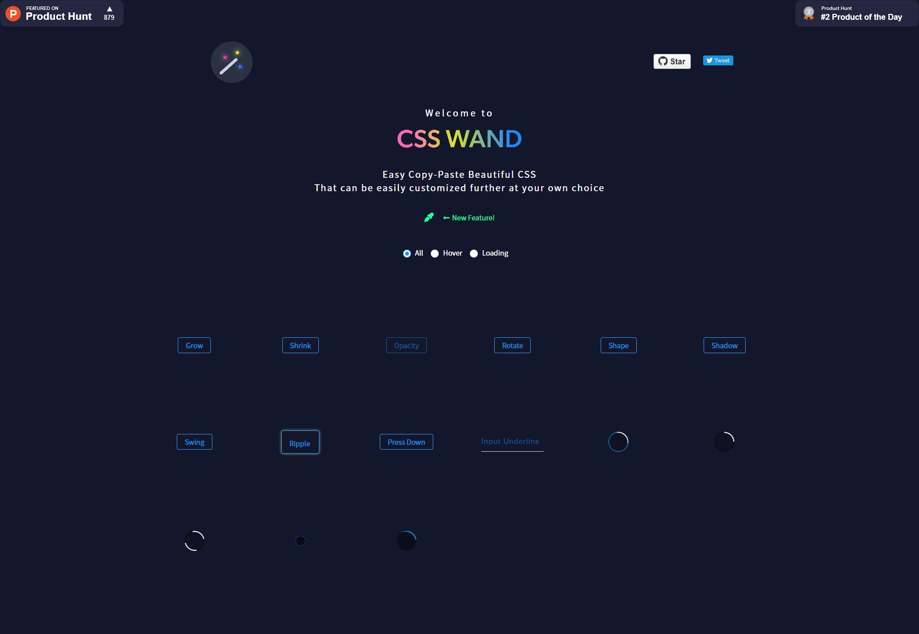
CSS Wand
CSS Wand is one of the simpler and smaller libraries on this list; it’s really just a handful of simple, pure CSS-based animations that you can copy-paste into your site, and customize at will. If you need to make your buttons, inputs, or loading animations feel fancy, you could try these out.
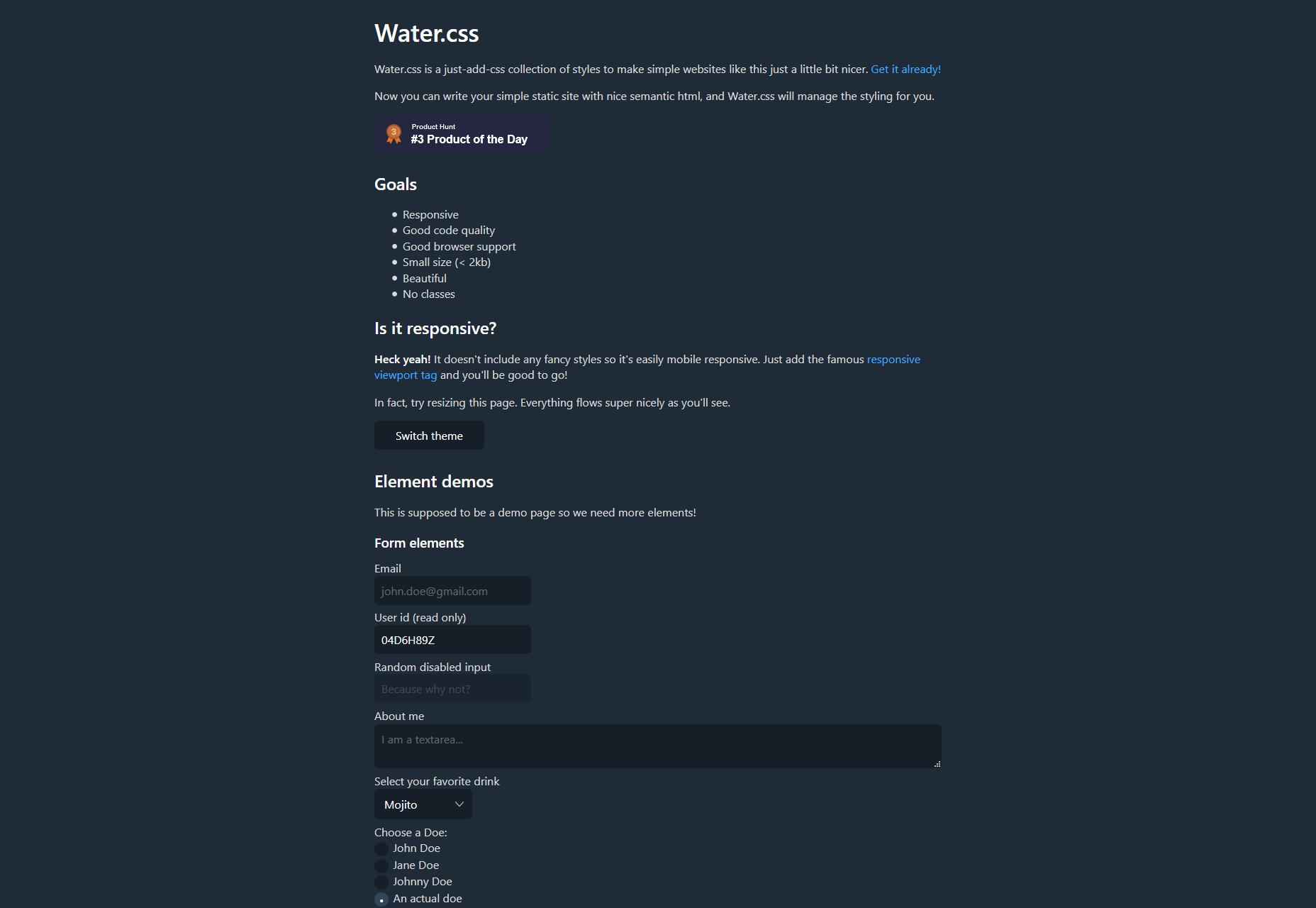
Water.css
Yeah, that’s Water.css, as in “just add water”. It’s a set of default styles that, while it falls short of being a full CSS framework, can get you started if you don’t feeling bothering to come up with your own type or form styles. It weighs in at less than 2kb, and uses no classes. That’s my kind of starter framework, to be honest.
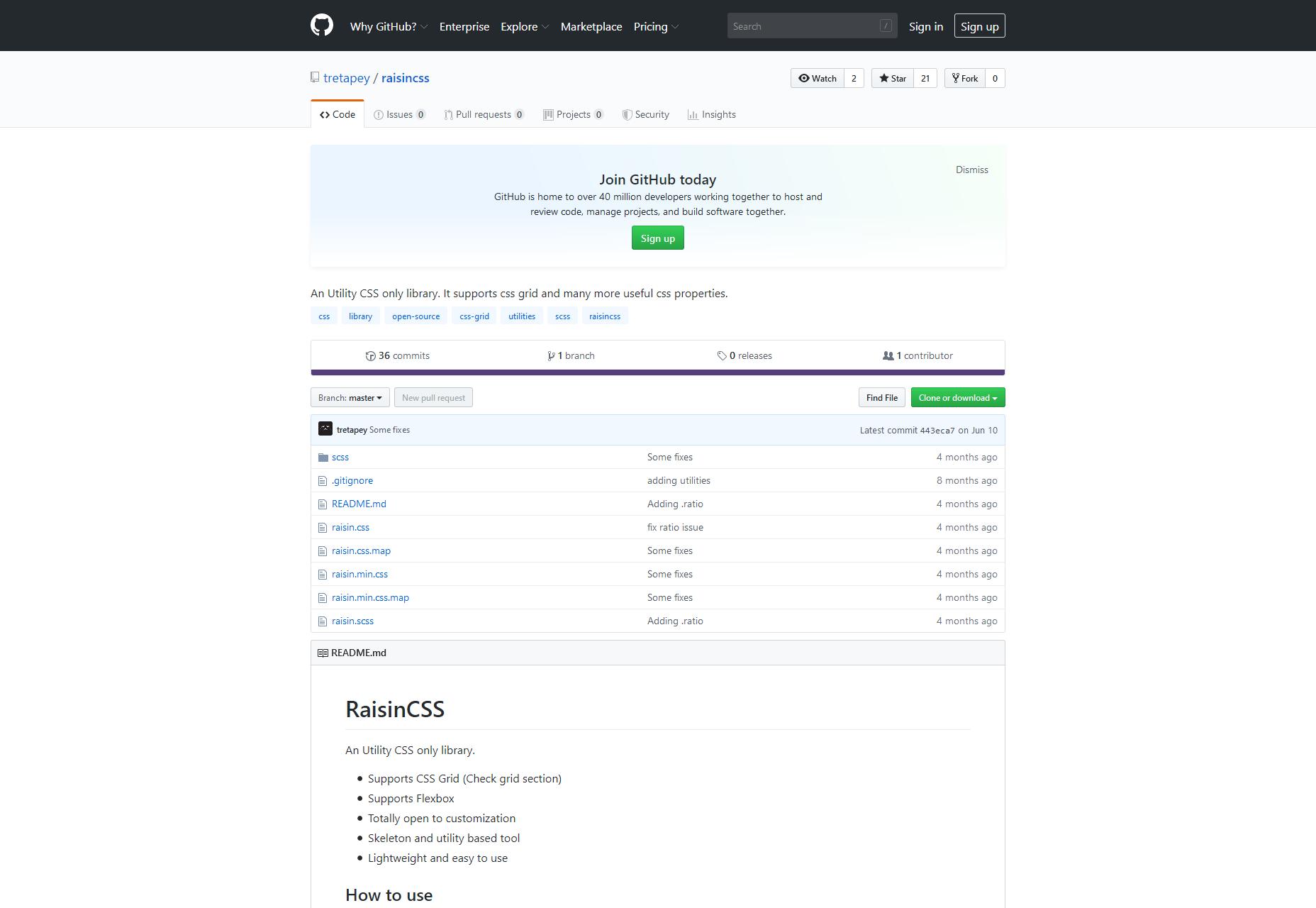
Raisin CSS
Raisin CSS describes itself as a utility CSS library, which means (you guessed it) a whole lot of classes. They’ve got pre-built modules for CSS Grid, FlexBox, breakpoints, the Display property, overflow, positioning, and more. I’d personally use a library like this if I was going to be use JS to alter the appearance of a lot of different elements on the fly.
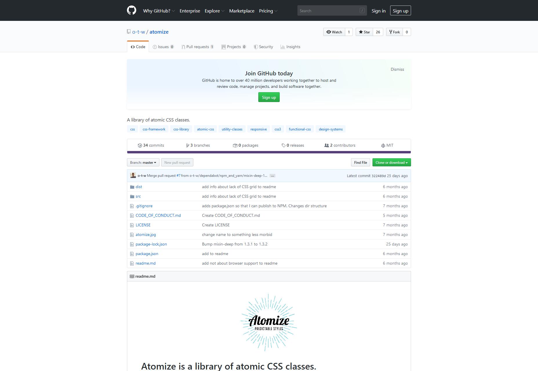
Atomize
Atomize takes things a little further than Raisin CSS, creating something more like a full framework based on Atomic CSS, and the theory of separation of concerns. It aims to be style-neutral, let you define your own breakpoints, and you can use it with NPM, or just download the source for use with any other dev pipeline.
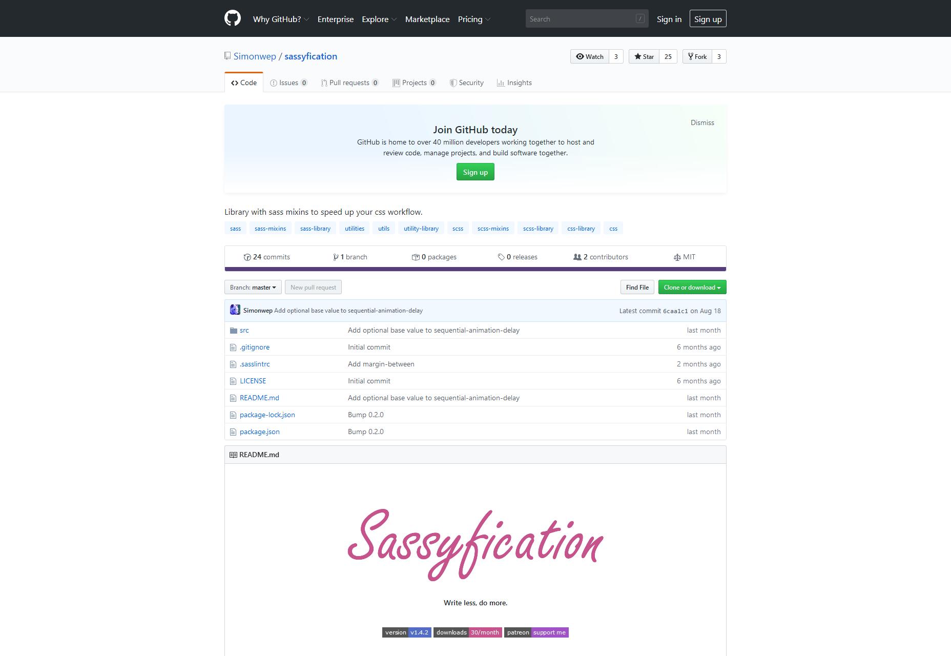
Sassyfication
Sassyfication has a couple of things going for it, starting with its name. It just makes me want to snap my fingers in a “Z” shape, and tell people they just can’t handle me. It also has a collection of commonly-used variables and mixins for SASS. Think of the previously-mentioned utility libraries, but for SASS.
Man, I love SASS, but I still miss LESS. Anybody else miss LESS?
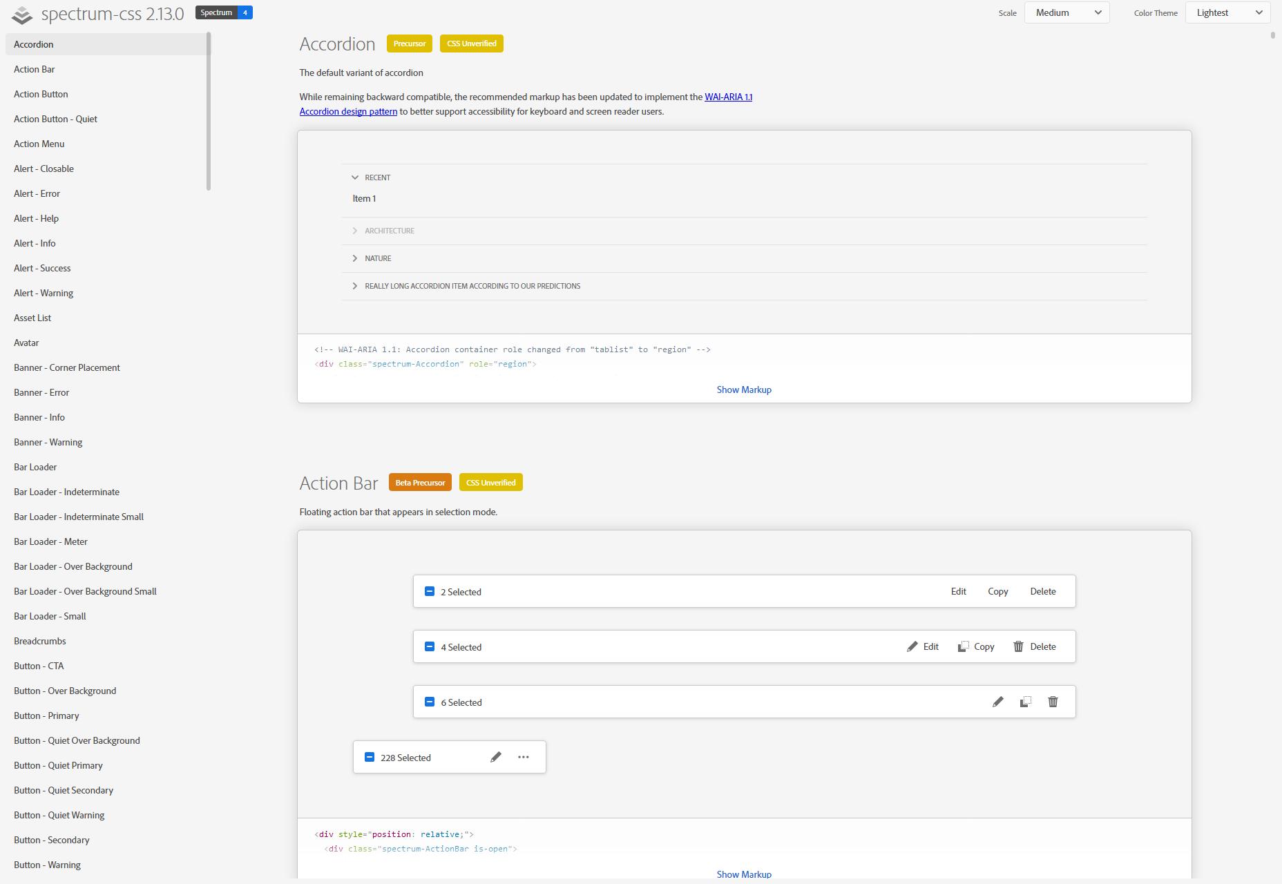
Spectrum CSS
It should be no surprise that Adobe has its own design system, or “design language” as they sometimes call it. Well, it’s called Spectrum, and Spectrum CSS is what you might use to make your site look a lot like an Adobe project. Or, you know, you could just see how they do things, for fun.
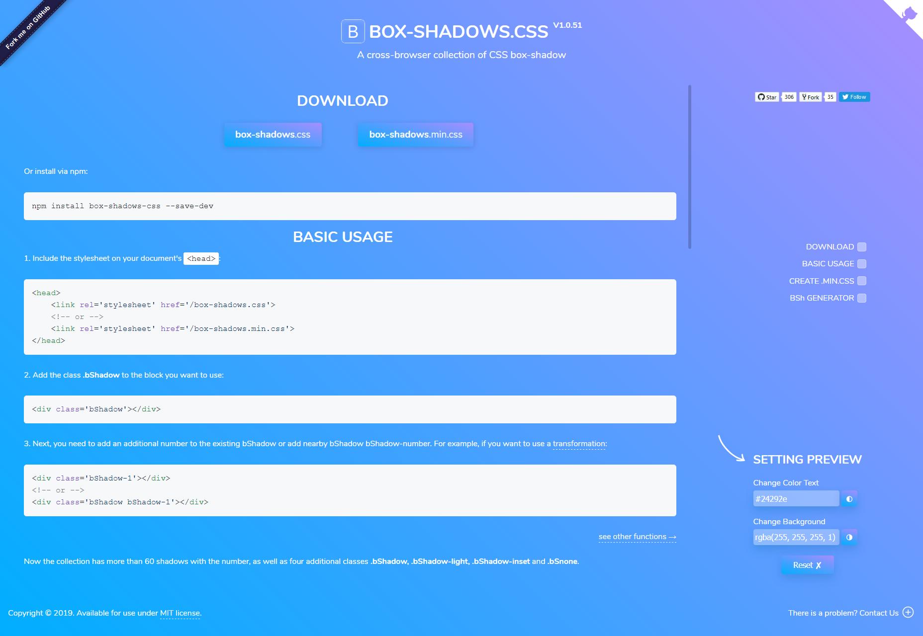
Box-shadows.css
Okay… just how much do you love drop-shadows, and the box-shadow property? Probably not as much as the people who made Box-shadows.css, a whole library dedicated to one thing: rounded corners.
I’m kidding. I think you can guess what this does. If you need more shadows in your life and your UI, look no further.
Flix Carousel
Flix Carousel is, as the name suggests, a carousel based on Netflix’s preview carousels. It’s pure CSS, which I love, and seems to work pretty well. The only hiccup is that the preview on the repository page isn’t working. For a visual example, you’ll have to head to the author’s portfolio.
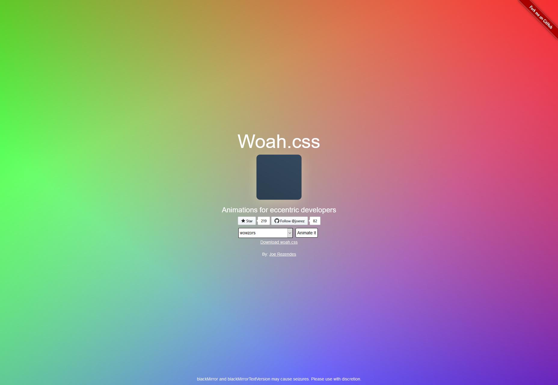
Woah.css
Woah.css is billed as a CSS Animation Library for eccentric web developers, and it lives up to that promise. The animated elements remind me a lot of the old video transitions on TV in the ‘90s, and the video transitions in every “consumer-grade” video editor. It’s cheesy as heck, and a lot of fun to play with.
Animation Library
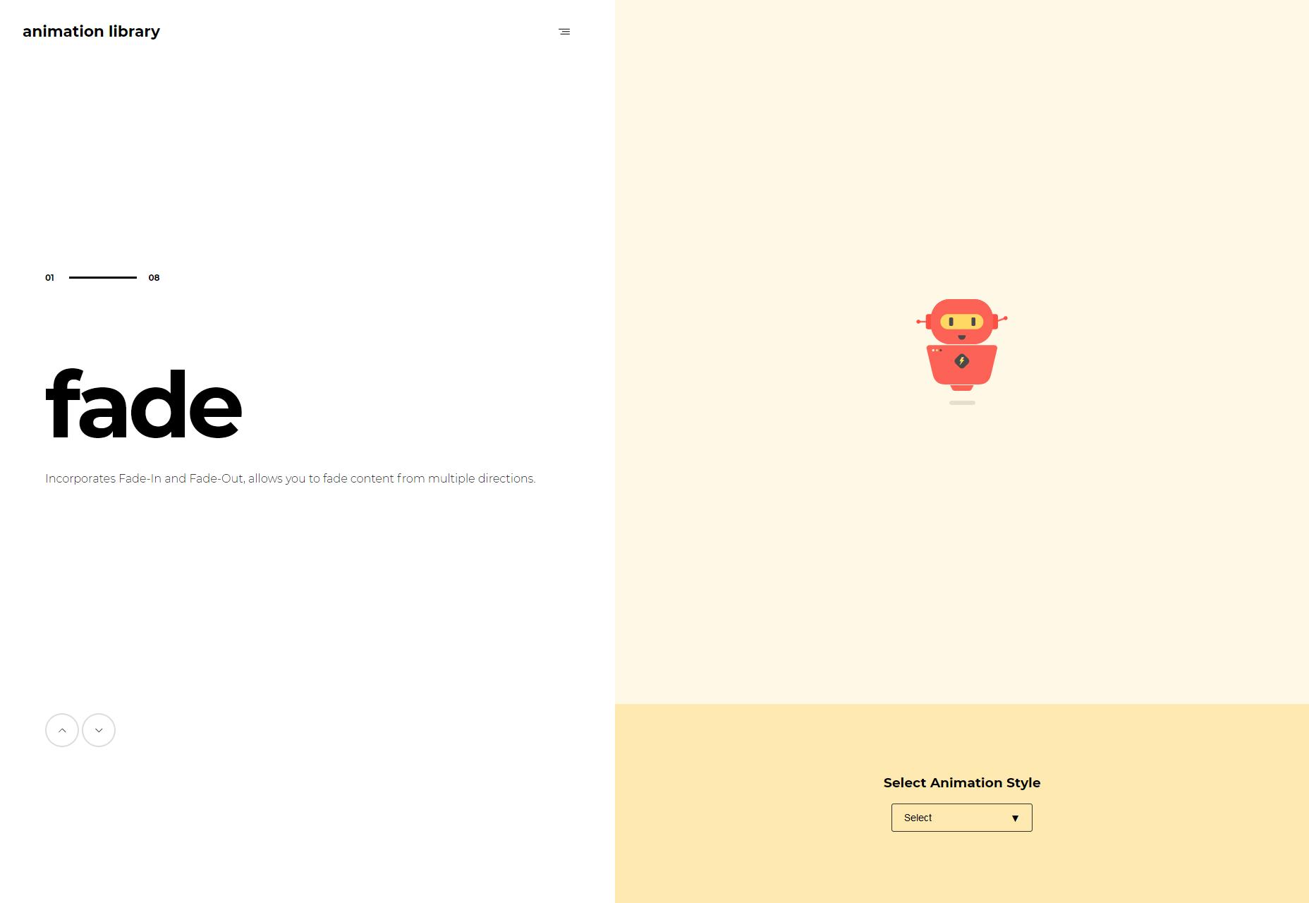
It’s called “Animation Library”, and the animations are about as sedate as the name. This is not a bad thing, as a corporate site probably doesn’t need or want ‘90s video transitions for their animated buttons. It’s pure CSS, so just add the classes you want, and go from there.
Wipe.css
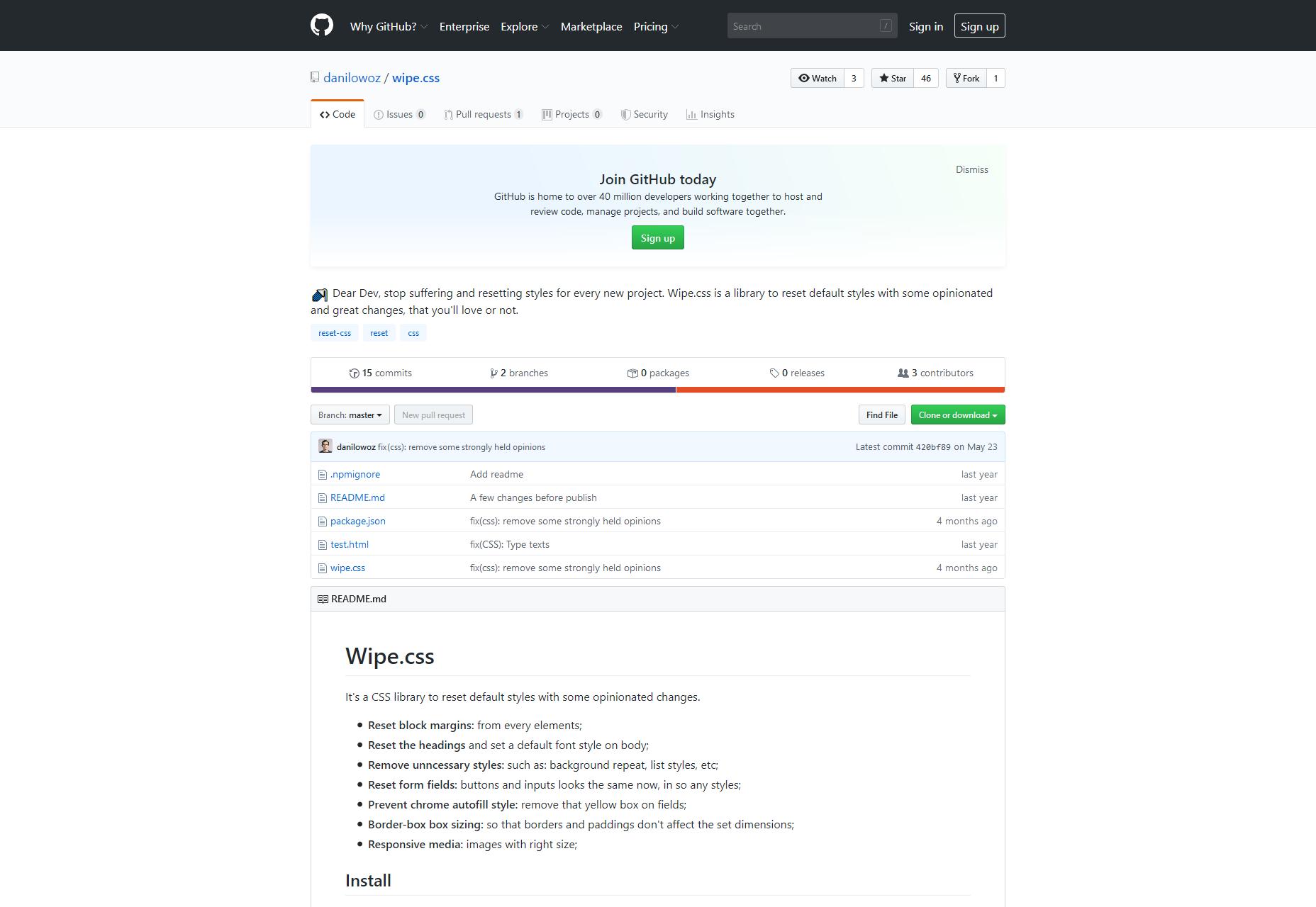
Wipe.css is basically a brand new CSS reset, based on libraries like sanitize.css and normalize.css. It doesn’t reinvent the wheel, nor should it. It has sensible defaults that make a lot of sense to me, and I might well be using it myself in the near-ish future.
Denali CSS Library
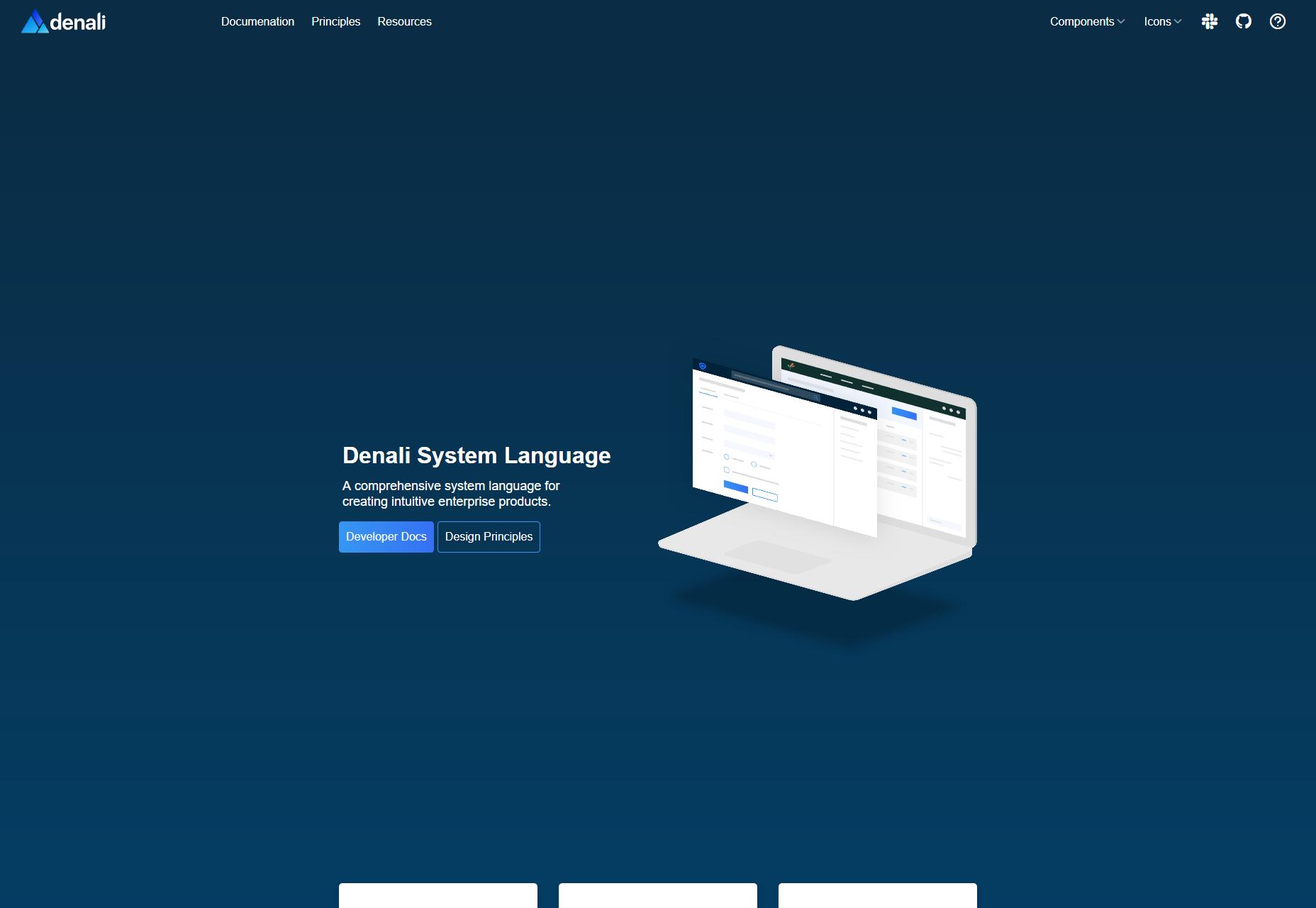
Denali CSS Library is another one based on a design system, specifically the (you guessed it) Denali design system. It features a sleek, modern, and highly sans-serif sort of look that’s perfect for business sites. It’s also got some fairly detailed documentation to get you started.
nova-skeletons
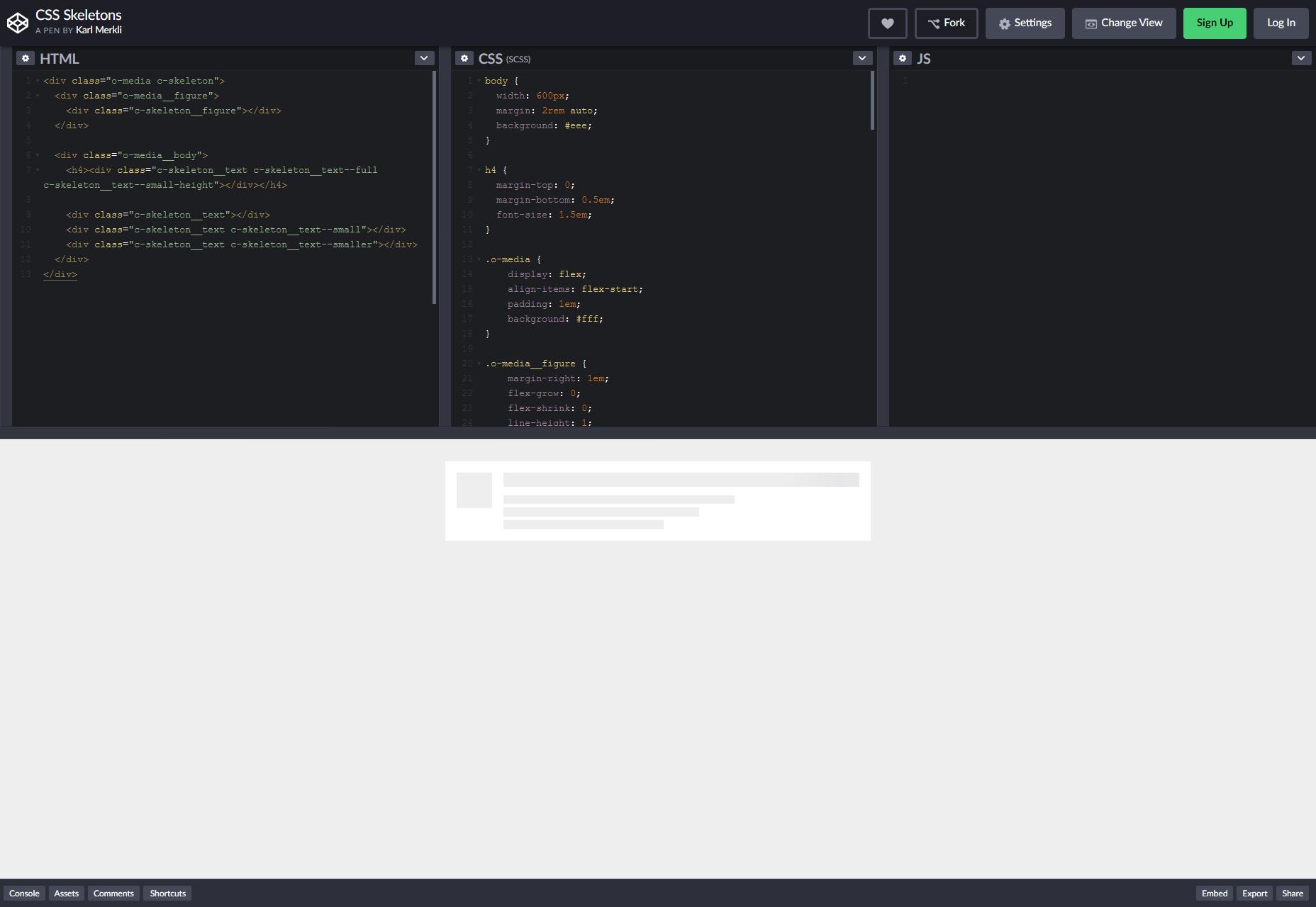
nova-skeletons is an interesting one in that it should definitely never be used for production. It’s basically used to create grey blocks for dummy content in prototypes, as seen in this screenshot. Now dummy content is never completely ideal, but for very early prototypes, this might actually be better than Lorem Ipsum.
vov.css
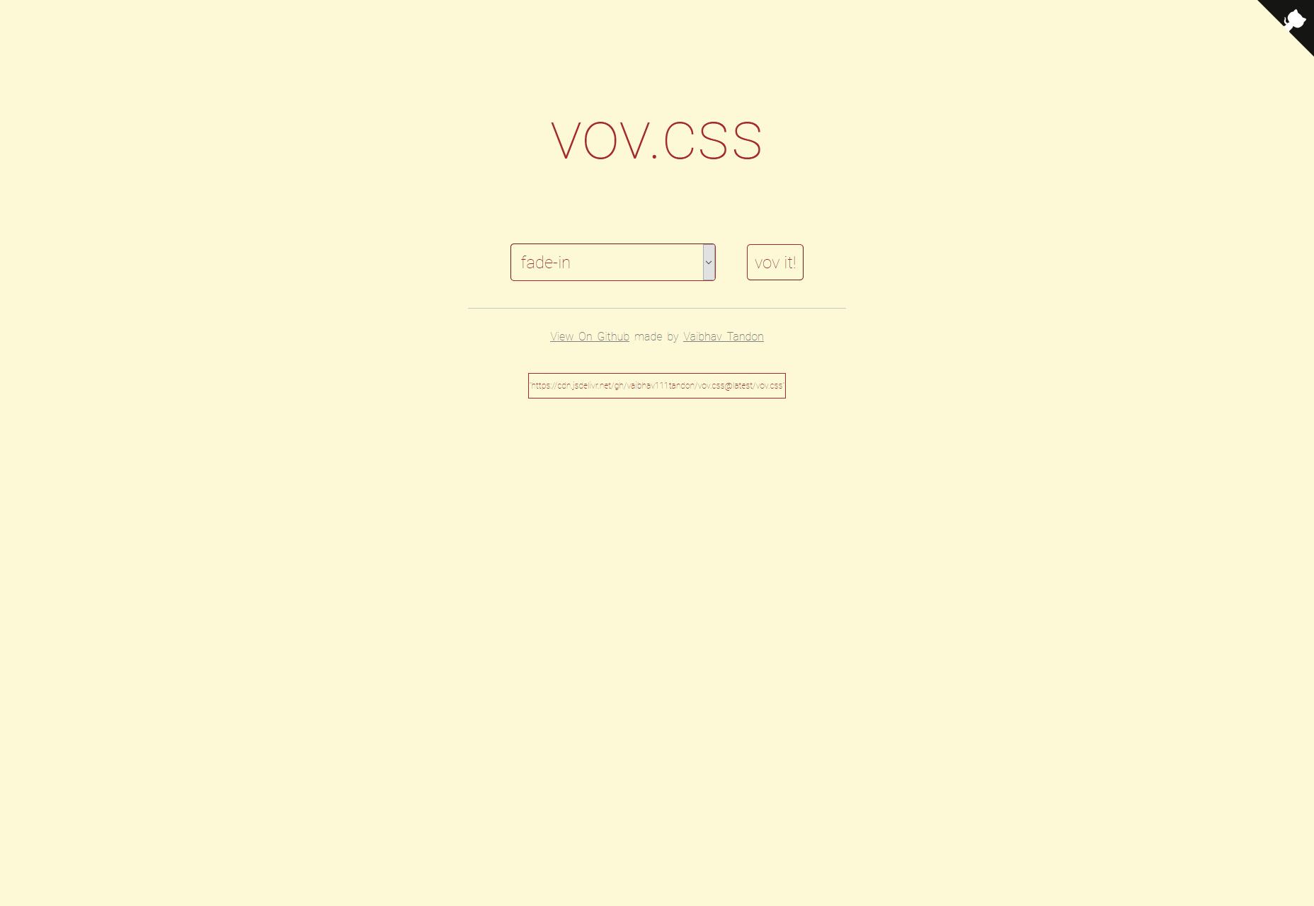
vov.css is a lovely set of pure CSS animations that covers basically every (basic) animation you might want. Just add a class and go. One thing I do like is that they include an extra set of classes for adding delay to the animation.
relaxCSS
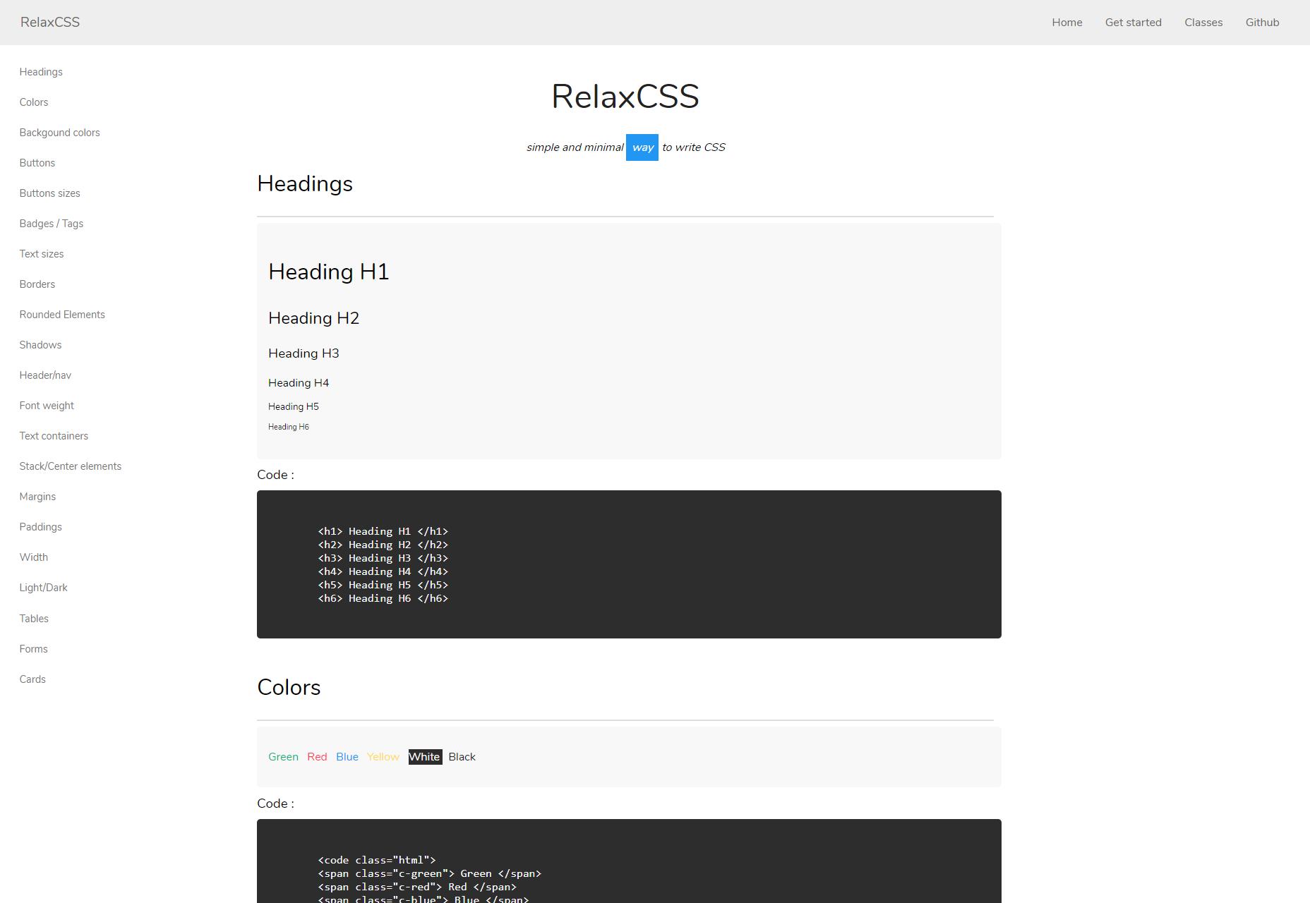
relaxCSS is a full (but small) framework that styles most of the things you might want in a basic web page or app, with extra components for navigation, tags, and things like that. It also features a dark theme. What I like most is that there’s no layout framework, so you can just add these styles into a site with a Grid or Flexbox layout and get on with your day.
Featured image via DepositPhotos.
p img {display:inline-block; margin-right:10px;}
.alignleft {float:left;}
p.showcase {clear:both;}
body#browserfriendly p, body#podcast p, div#emailbody p{margin:0;}
