2020 was a hard year. It drove home something I’ve always known but had been taking for granted: good UX Design relies on an environment, process and team that support good UX Design. If the environment, process and team aren’t quite in place, I would argue that it’s the job of the UX Designer to speak up and take part in shaping them.
This is a big and challenging task. Especially if you’re an introvert and a maker rather than a manager at heart. I recently stumbled across this quote in an article about Eddie van Halen:
“If it’s your passion and it’s from the heart, you just keep playing, playing, and playing and eventually somebody’s gonna notice.”
Not true in UX Design and probably not even true in the music industry. Eventually, someone might not notice and you would have played your heart out to an empty stage or an audience who just doesn’t get it. You need to be in the right place, playing the right tune, and you need the right band members.
I would like to share my 2020 experience as the sole UX Designer in an Agile Product Team. I’ll share some of the blunders I made and some of the opportunities I missed, and add some thoughts on a more productive way to go about doing UX Design in a business that’s flourishing and no longer a startup, and together with that success rapidly outgrowing a startup way of working.
Towards the end of 2019, I joined a locally successful startup building a solution for field sales teams — a very special crowd of people, believe me. I was so excited. I dreamed of being part of a Product Team that would blow minds with its understanding of the behaviour and needs of our target audience. We would follow field salespeople around and observe them in their natural habitat. We would build and test crazy prototypes and argue energetically about them. We would come up with extraordinarily usable designs that fit seamlessly into our customers’ world and make their lives so much easier. The product would start selling itself and becomes an exponential disruptor (Dah Dah Dummmm). We would speak at conferences about how designing for real human beings makes business sense. About how becoming a customer-centric business had not only made us an outperformer in terms of revenue but had saved lives by eliminating lifetimes wasted on unnecessary admin. We would speak about how all of our customers had watched their sales soar.
It didn’t quite pan out that way.
2020 was friggin’ hard. Mistakes were made. I underestimated many of the challenges that come when a business is scaling up and also kinda scaling sideways into new economies and cultures. Covid-19 hit us — and with it, the killer Zoom-Slack-Email Combo of Distraction. Deadlines whooshed by. Projects were descoped. Communication and cohesion suffered. Team members lost touch with each other, emotionally and professionally. Embarrassing user experiences were shipped. People resigned. I cried, a lot.
One morning my 4-year-old daughter stood in front of me, looked up, and said (quote-unquote): “Mama is complicated.”
And that’s the moment I realised that I had pretty much reached a low point in my work and personal life: questioning my methods and abilities, my purpose, my skills as a parent and a designer, floundering between old and new tools, trying to herd cats in big ideation workshops delivering stupendous ideas with zero budget for any of them, unsuccessfully advocating for the establishment of a design system, and seeing months of team effort go to waste.
But as Buster Moon said to Eddie Noodleman (in Sing, which all parents of 4-year-olds will know):
You know what’s great about hitting rock bottom? There’s only one way left to go, and that’s up!
So let’s do this thing and move onwards and upwards in 2021. And for me (and for the sake of my family’s sanity) an important first step is to find some clarity on this question:
What is the role of a UX Designer in an Agile Product Team? (And what is a Product Team, anyway? For the purposes of this post, the Product team is a team made up of a PO, PM, UX Designer, Dev Team leads and Developers.)
So, what exactly is the role of a UX Designer in a Product Team?
Where do the UX Designer’s responsibilities begin and end? I used to be very sure about this. As the UX Designer, my job is to do customer research (and empathise), share insights from that research with the Product Team, identify customer needs and pain points, ideate to find solutions with the Product Team, prototype ideas, test them with real users, learn from mistakes, and then ship a product or a solution and keep on improving.
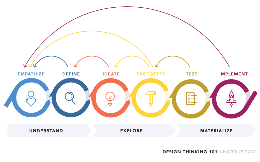
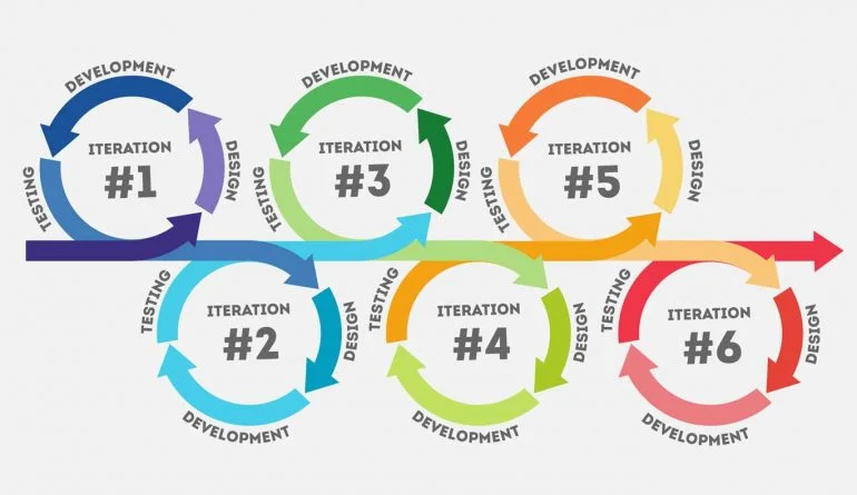
This is not a process I dreamed up. I wish it was because it’s pretty darn powerful. It’s good old Design Thinking. It’s been around for a very long time — since 1978 — and it’s been tweaked and adapted for different kinds of problems. It just makes sense. It’s iterative so it’s meant to be put on repeat, in cycles of learning and improving until your product is as extraordinary as you need it to be. I trust the process, as do some of the most successful tech companies in the world: think Apple, Uber, Airbnb, Google and IBM. It’s a good process and looks a bit like this (thanks, NN Group):

From IDEO:
“Design thinking uses creative activities to foster collaboration and solve problems in human-centered ways.”
As a team, we did a fair bit of this in 2020. We spent time talking to customers and observing them, and thinking together about our customers and what they need. We came up with some very creative solutions. We made prototypes and usability tested them. We learned from mistakes in our prototypes, ditched a lot of ideas and refined them.
And then things fizzled out. What we built was not what we designed.
So what went wrong? How might we do better? How might I do better?
At our business, the Product Team process has been split into two stages:
- Discovery, and
- Delivery
In the Design Thinking visual at the top, the Discovery stage includes the first 5 activities (Empathise, Define, Ideate, Prototype and Test) and the Delivery stage is the last one. The purple rocket labelled “Implement”.
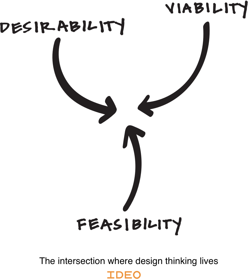
When our process switched from Discovery to Delivery, concepts were scoped down to such a tiny subset of features that the delivered solution bore little resemblance to the design. Compromise between design, tech and business is normal and healthy. This pic, right? (Thanks IDEO):

Any designer with a few years of experience will know that what can be imagined, can’t be built if you have limited time and resources. I know this and I welcome the compromises because it means that something real is happening. There are few things sadder than a solution designed in all of its adorable, pixel-perfect glory, the result of weeks of a talented designer burning the midnight oil a corner somewhere, that never gets built because it isn’t viable or feasible. This is why I welcome collaboration and compromise.
This quote from Milton Glaser says it well:
There’s no such thing as a creative type. As if creativity is a verb, a very time-consuming verb. It’s about taking an idea in your head, and transforming that idea into something real. And that’s always going to be a long and difficult process. If you’re doing it right, it’s going to feel like work.
But what we delivered, was functional at best and confusing or distracting to end-users, at worst. Usability testing the shipped features was an exercise in futility (and an expensive one, at that) because the team had moved on to the next feature. Any findings that came out of usability testing were interesting but nodded at politely.
The train had left the station.
The truth is: if we want to follow an iterative process of failing fast, learning and improving, then our process needs to allow people to fail fast, learn and improve. We made no room for failure in 2020. A feature was specified, built and shipped. We skipped two pretty important steps: learning and improving. The first live version of a solution is guaranteed to have problems. This is the way experience design (and life) works. No first solution is perfect. Even if a few versions of a prototype have been usability tested, testing can only be qualitative and not done with a statistically significant number of people. Add to this an interesting quirk of our particular field sales solution: it is aimed at a very broadly defined user base, using the solutions in all sorts of unique ways and with highly variable levels of comfort with tech.
Unknown usability and technical issues will arise after go-live and the process must plan for it, and plan for people and time to fix those issues. Our business would ship code and leave the Customer Support team to deal with issues — usability and otherwise. The thinking went: the User Experience might be a little bad, but a new feature is live and somewhere on a feature list, a checkmark can be made and a few prospects can be re-introduced to the solution. I would argue that this is not the noblest way of building a product. It certainly doesn’t get you to extraordinary.
Our process was also too choppy. It went from Discovery (by the UX Designer, with a bit of input from the rest of the team), followed by Delivery (hypothetically by developers working from spec docs that the UX Designer had produced).
The UX Designer can’t necessarily code and Developers can’t necessarily facilitate unbiased interviews and user tests with customers. Both roles must remain engaged during Delivery and Discovery, and add their voices.
7 challenges we faced and some thoughts on each
There are a few things that I want to highlight and address in the story I just told — 7, to be precise. Here they are with some ideas on how you (if you find yourself to be the sole UX Designer on an Agile Product Team) might do better than I did.
- There was an expectation that the UX Designer (that’s me) would be delivering a blueprint of what needs to be built and hand this over to the team. I’m sorry to say that I utterly failed to deliver on this expectation, to the great frustration of many team members! You see: experience has taught me that this is a risky and inefficient way of working. Risky because the UX Designer doesn’t understand the technical implications of a solution, especially an original/conceptual solution, and inefficient because detailed specification documents take a lot of time to produce and are guaranteed to change once development begins. In my experience, it’s best for a team to have a prototype and style guide to refer to, with detail specifications added into tickets by the team, as part of individual user story descriptions. If necessary, the content of user stories can be saved to serve as documentation for reference purposes. As the UX Designer, I should have spoken up early in the process and pointed out that experimentation and figuring out the details need to be a part of our team’s activities.
- The Product Team wasn’t sufficiently involved in customer research and conceptual design. This means that there is a lack of buy-in from the team, which leads to projects being brutally de-scoped. If a Product Team isn’t convinced that the value of the solution matches the effort involved in building it, they will try to get the minimum requirements met, so they can move on to something they feel is more valuable (or less challenging). The entire team needs to meet or at least observe the people they are building things for. The developers can’t be left to feel that they’re in a world of ones and zeroes when they are the architects of thousands of people’s lives. As the UX Designer, I should have pulled them into research more often.
3. The process didn’t plan for failure (and improvement). It planned for features to be shipped and assumed that they will be successful by some measure (other than customer happiness), and for the Product Team to move on to the next feature, rather than learning and improving. This mindset is problematic. “Shipped is better than perfect” is a wonderful motto to have. Seth Godin (gotta love the man) is famous for it, even though he said it a little differently. He said:
“Step by step, page by page, interaction by interaction. As you start moving, you can’t help but improve, can’t help but incrementally find yourself getting back toward your north star. You might not end up with perfect, but it’s significantly more valuable than being stuck. Don’t just start. Continue. Ship. Repeat.”
Continue. Ship. Repeat.
If you’re shipping without repeating, you’re shipping incomplete things. Your Product Team (and your UX Designer) will become progressively more unhappy. People want to ship things that they’re proud of. The process must make room for testing and improvement.
4. Usability testing was a checkbox exercise to be nodded at and findings noted in a list, somewhere. Usability testing is a Product Team’s friend. Done right, it is the entire business’s friend. But it needs to be paid attention to. Done on prototypes, it saves the business massive amounts of money by showing what not to build. Done on shipped code, it helps the Product Team focus on what needs to be fixed before customers start calling the Support Team. However, if there is no time made to respond to the findings of usability testing, it’s wasted effort. If your UX Designer tests a piece of your product with 5 randomly chosen customers and every one of them gets stuck, your product has a problem. Usability testing doesn’t need to be performed on statistically significant numbers of people to be valid. Pay attention to the findings. Fix things.
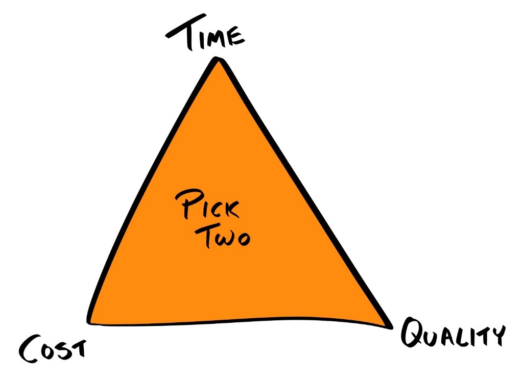
5. Timelines were too stringent. My father-in-law was an eccentric and mildly successful businessman and used to say: “In business, there are three variables: time, cost and quality. You can own two of those, but not all three.” He seems to have bastardised a thing called the Project Management Triangle, which is totally something that he would do. In the world of a Product Team, you can also only own two of those. If you have a fixed number of people with a certain skill set (your cost) and you give them a fixed time to get a piece of work done, the only variable left to play with is quality (I admit this needs a post on its own). If timelines are too stringent for the team assigned to the work, the quality of the outcome will suffer. If you want to own quality, team members and timelines need to bend.
Closely related to this is that UX Designers need to get better at building business cases for their work. I need to get better at this. I tend to believe that good UX Design means happier customers, which I correlate with more sales and less churn. It’s an easy conclusion to jump to, but we need to be very careful as Designers that we quantify “more sales” and “less churn” into a Dollar amount. This is hard to do, but it needs to be done if you want to have a sensible conversation with the team about scope.

6. There were too many balls in the air. There are at least three streams of work happening at any one time in Product Development: building new features, improving or maintaining existing features and designing the future. One Product Team can conceivably work on all three simultaneously. But it’s not a wholesome or efficient process. Shifting focus requires effort. If the Product Team has never been involved in the design process, they will gravitate towards the thing they feel most comfortable doing — which is coding. Or they will gravitate to whatever seems most urgent, which is usually fixing bugs for grumpy customers or customer support folk. The same goes for the UX Designer on the team. Doing customer research, prototyping and testing new ideas, specifying new features and improving existing features all at the same time, is bound to lead to some balls being dropped and in my case, a bit of burn-out. I believe that a clear plan, keeping these three streams of work in mind, will result in fewer balls being dropped, a happier team and a more extraordinary outcome. It’s tricky, but not impossible.

7. We didn’t have a design system. A good design system makes rolling out new features faster, makes for a more consistent experience and should save the team masses of time that would otherwise be spent on reinventing interaction and visual design details. A startup can get away with not having a design system. A growing business that has developers working from home and living in different countries and timezones needs a living design system. Consistency and standards, allowing for recognition over recall and aesthetic and minimalist design are all key heuristics of usability. A Product Team, especially a dispersed one, needs a design system to have a fighting chance at getting this right. The UX Designer needs to get this in place.
Daniel Kahneman would probably say that 2021 will be better, simply because 2020 was a heartbreaking year for many of us and natural regression says it must get better. He wrote:
“We are far too willing to reject the belief that much of what we see in life is random.”
Human beings need to explain things. We are wired to try and make sense of our experiences, both good and bad, and to create a coherent story with causes and effects.
This is me, being true to that humanness, and trying to pick up the pieces of 2020 to put them together in a story that makes sense. I’m not sure that I’ve succeeded, but I’ve certainly had a moment to pause and think about things. And as I wrote this piece, I realised a few things that surprised me. I hope you enjoyed reading this and that it helps you and your Product Team, whatever your role is. Oh, and let me know your thoughts. I would love to hear from all you talented people out there, trying to make the world an easier place to live in.

The role of the UX designer in an Agile product team was originally published in UX Collective on Medium, where people are continuing the conversation by highlighting and responding to this story.
