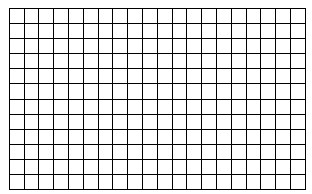
What is a grid system?
The vertical and horizontal axes are divided in proportion to the coordinate system. In graphic design, the grid is used to control the font and image position layout design matrix, which has an important role in Mesh design, in different periods and geographical, people have different titles, and it is called, standard size systems, program layout, scale layout design, or layout, Switzerland. Grid design is on the page grid distribution in accordance with preselected text and images in a layout design.
Basic grid:
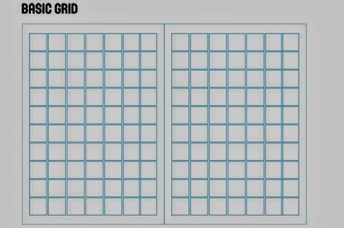
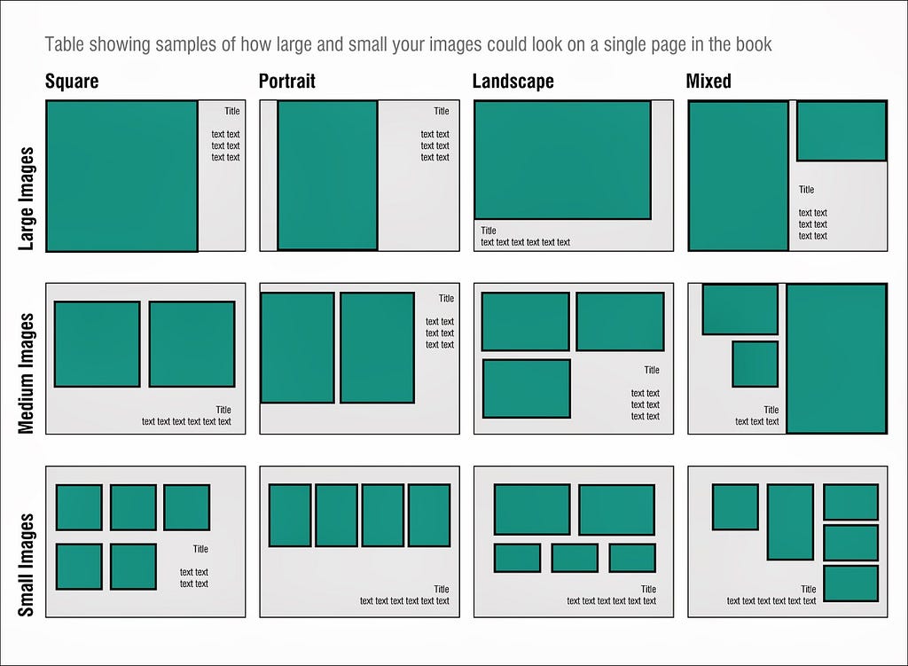
Layout: Comprehensive plan of things and arrangements.
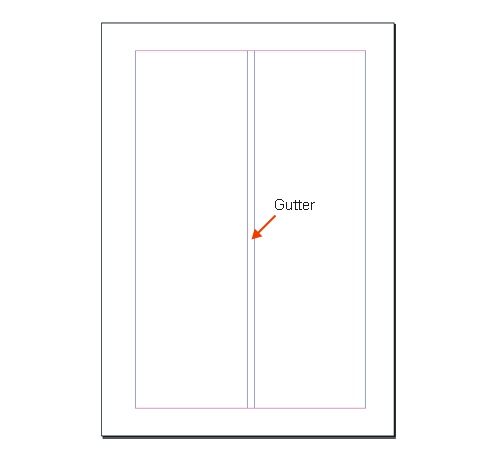
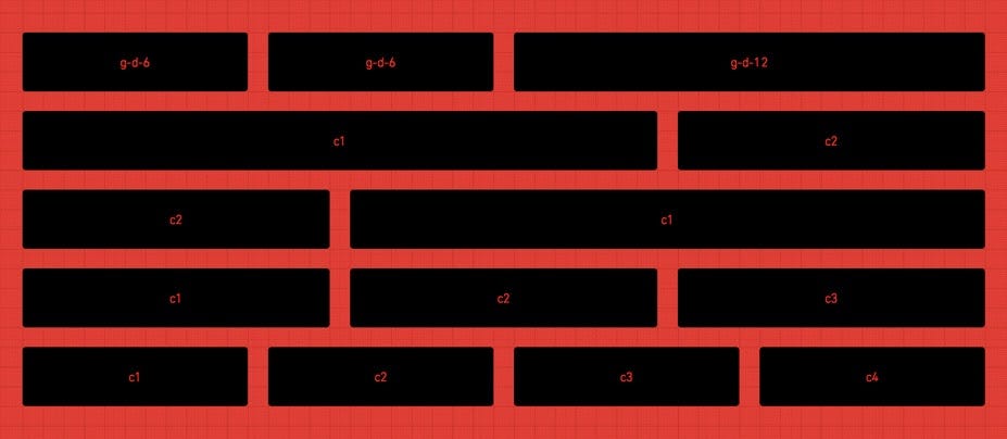
Gutter: The space between columns of text.
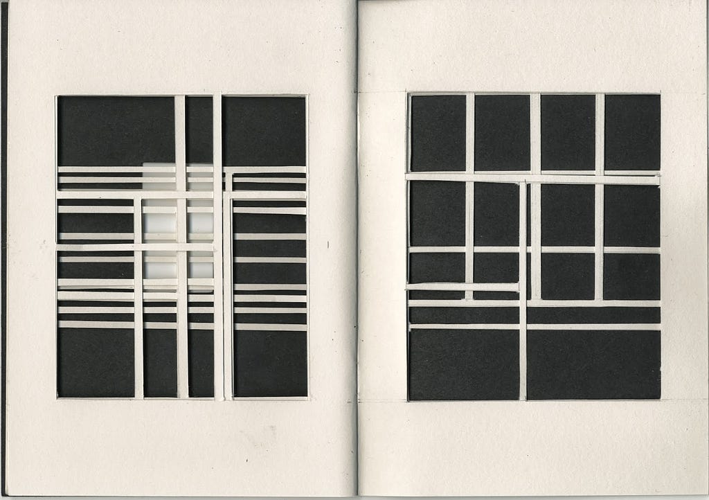
Column Inch: A column inch is a measurement of the amount of content in published works that use multiple columns per page.
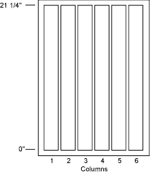
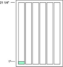
Single column grid:
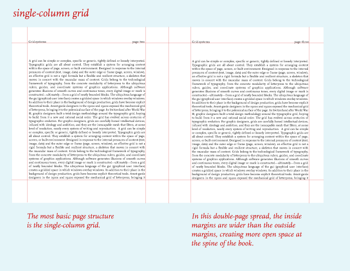
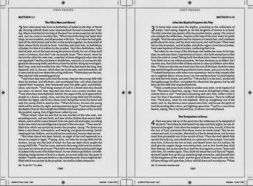
Multi column grid:

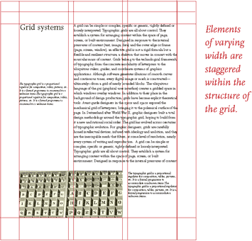
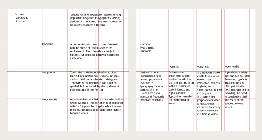
Modular grid:
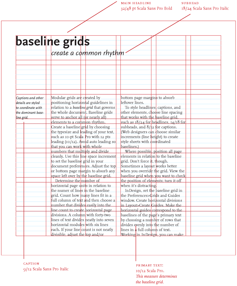
Baseline grid:
Mueller grid: MUELLER is a modular grid system for responsive/adaptive and non–responsive layouts, based on Compass. You have full control over column width, gutter width, baseline grid, and media–queries.
Baseline: The line upon which most letters “sit” and below which descenders extend.
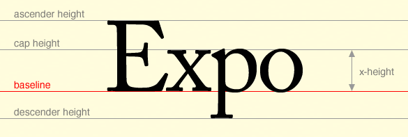
Midline: The mean line (or midline) is half the distance from the baseline to the cap height. This may or may not be the x-height, depending on the design of the lowercase letters. A very high or very low x-height may mean that the midline is above or below the x-height.

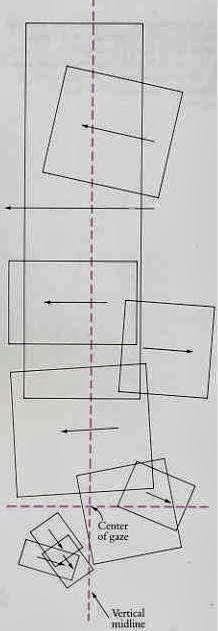
Jump: The continuation of a flow of text from the bottom of one column to the top of another, or onto another page
Rail: A thinner column (typically about half the width of the other columns) at the far left or far right of a page, typically providing directory information for, say, a newspaper.
Hang line: Like a horizontal rail, this is a line that separates information at the top of a page (such as an image, for example), from the text below, which seems to “hang” from the line.
Flow. Margins. Text Columns. Column Interval.
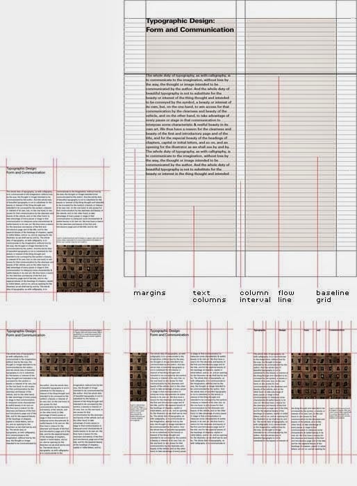
Grid system in live:
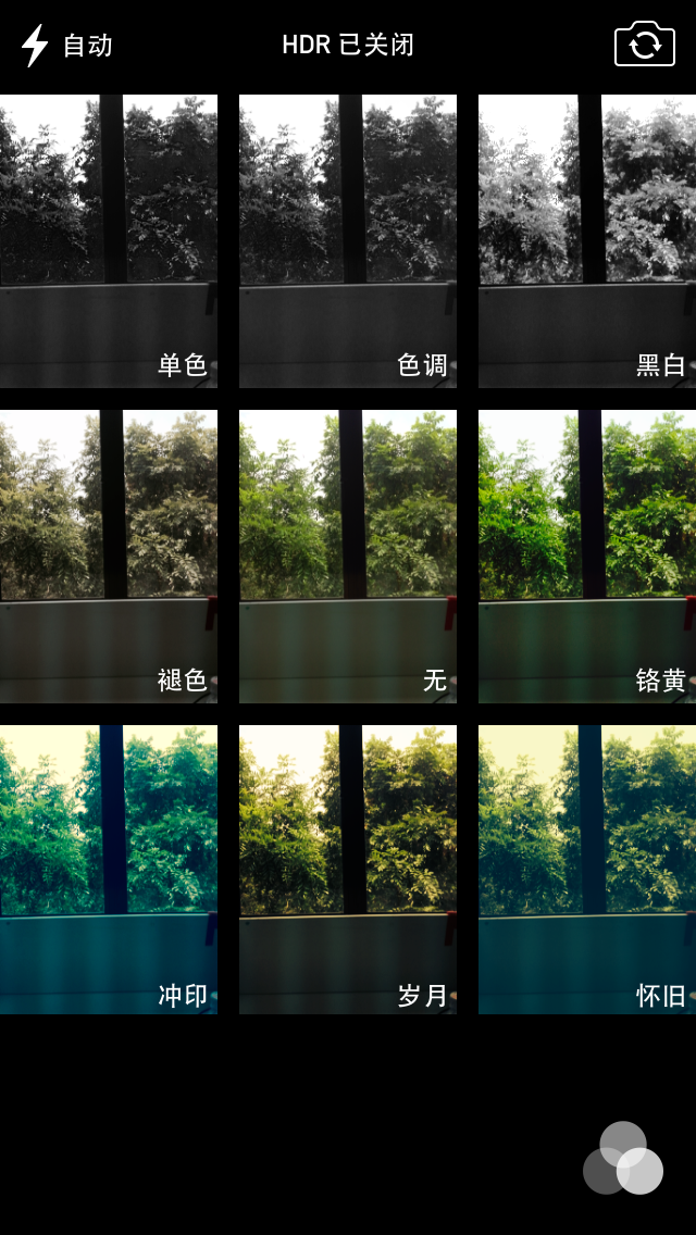
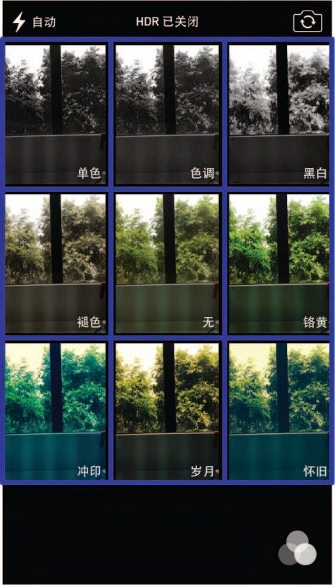
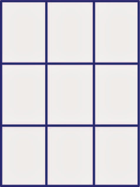

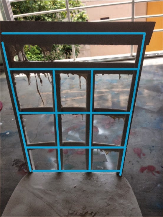
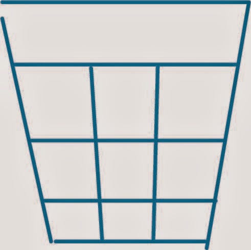
Why design grid system: After the second world war, many graphic designers, influenced by modernist thought, began to question the relevance of the conventional page layout of the time. They began to devise a flexible system able to help designers achieve coherency in organizing the page. The result was the modern typographic grid that became associated with the International Typographic Style.
For web design, the use of a grid system, not only can make web pages of information appear more beautiful and easy to read the more availability. Also, for the front-end development, the website will be more flexible with the specification.
Grid provides all the design elements with a structure, it makes the design to create more relaxed, and flexible, and also let the designer’s decision-making process easier. When arranging the page elements, the use of a grid can improve the accuracy and consistency, to provide a higher degree of creating a framework. A grid where designers can make reliable decisions, and effectively use their own time. They can design and arrangement of the injection energy — which looks quite small and unrelated elements, such as page Numbers — can have a dramatic impact on the page, through print making people feel the trend of design.
The stylist is in using the grid design at the same time, and also can break the grid-appropriate constraints to make a vivid picture.
Grids system in web design:
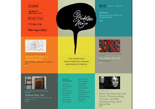


The grid design ensures clear organizational structure and structural clarity. We can build better grid system-level design information so that the design is easier to read with a sense of rhythm. Like just coding, coding requires organic organizational structures, and a web design grid system is the same effect.
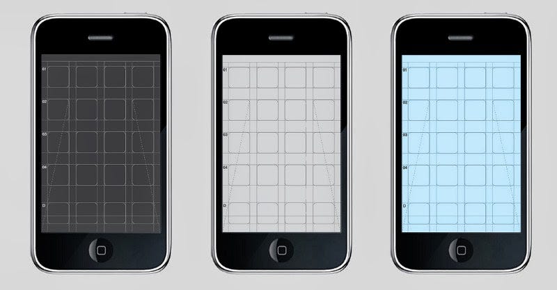
Screen Based Grid:
Grid system in art:
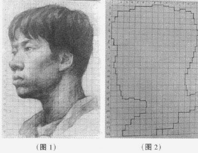

Grid system in Interior designing:
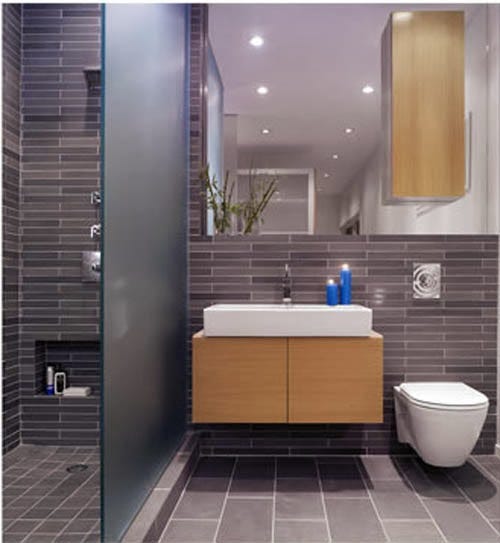
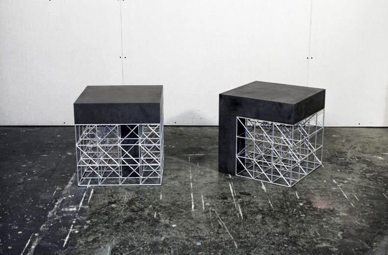

Grid system in Building:
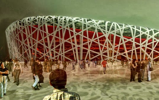
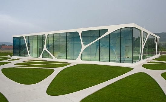

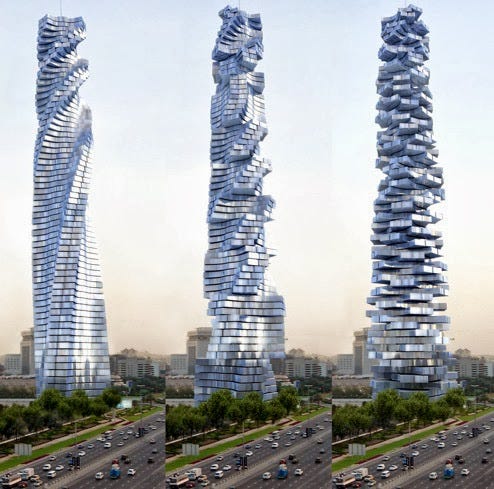
Grid system in architecture:

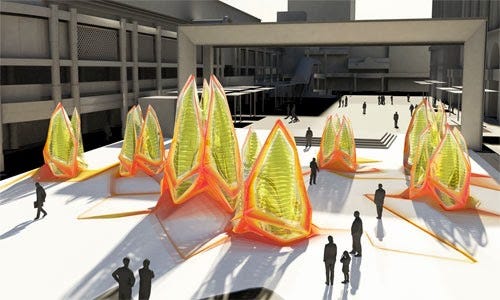

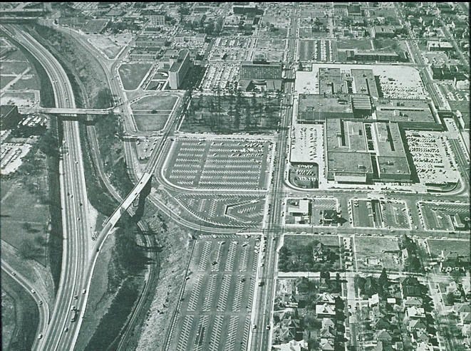
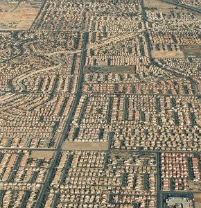
Grid system in city:
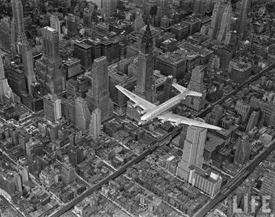
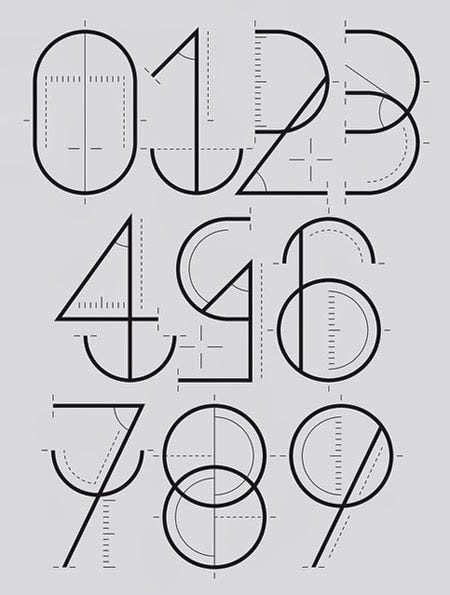
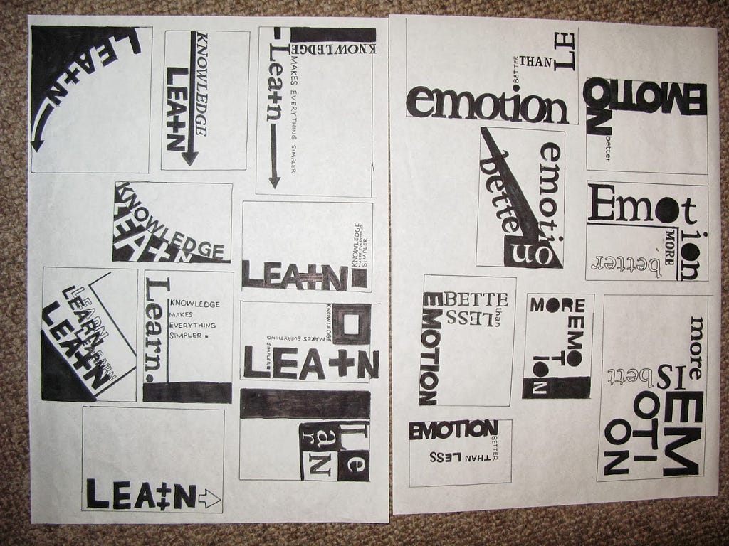
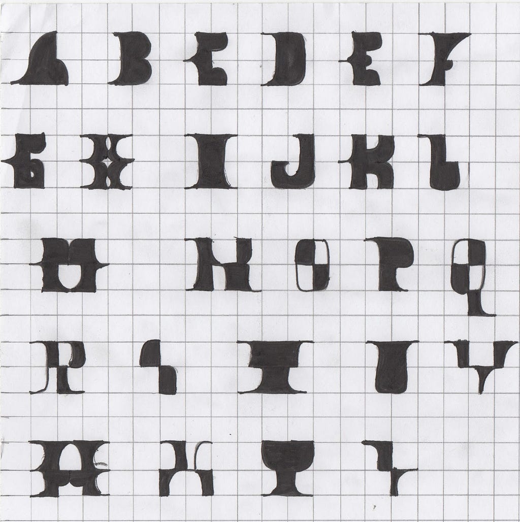
Grid system in typography:
Grid system in game:
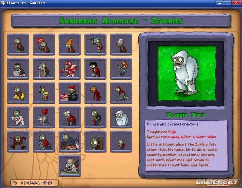
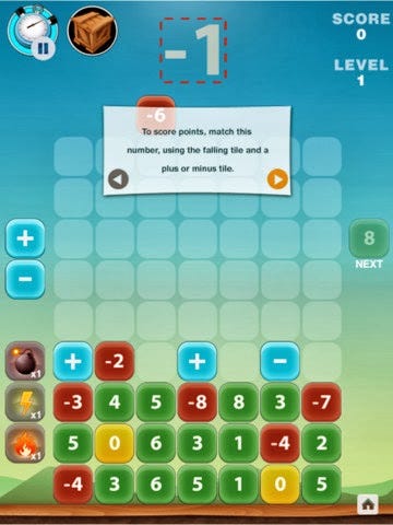
Grid design is a modern design idea reflected in graphic design, with modern typesetting software, designers can freely Workgroup Edition. It focuses on a sense of proportion, sense of order, a sense of continuity, and a clear sense of modernity and, correctness, is based on rationality, it to perceptual-based American-style layout freedom in stark contrast. One major advantage of the grid design is that it imposes less experienced designers to the rules and limitations, when he divided the space to be processed, you will get a tight coherent, well-structured program. In addition, when we put skill, feeling, and mesh together to design these three, there will be a beautiful and elegant, impressive page, in the overall design gives a fresh feeling and sense of continuity, and there is a distinctive uniform effect.
All the credits and rights reverse to the real owner of the images used in this article.
Thank You.
The role of grid systems in graphic design was originally published in UX Collective on Medium, where people are continuing the conversation by highlighting and responding to this story.