In 13 years working in UX, I have joined a considerable number of meetings where UX Designers present their work to the rest of the team. More than I can remember, to be brutally honest. Consumer journeys, sitemaps, wireframes, benchmark audits, personas, user research reports — the list of deliverables designers are creating is huge.
Presenting work sounds simple in theory.
After all, you have done all the work: you have spent countless hours exploring all possible design solutions, you have captured all your ideas on paper and have discussed them exhaustively with other designers, strategists and developers to vet feasibility and business sense.
Now all you have to do is get in front of everyone and share your thinking.
No big deal, right?
“A good UX deliverable clearly communicates its purpose and what it’s trying to achieve. It anticipates any questions and scenarios which may be posed.” — Nick Haley, Head of UX at Guardian Media
But what seems like a simple step in the process can be decisive for your ideas to be accepted, built and implemented. You can come up with the most brilliant design solution in the world; if it is not clearly communicated to your team and/or clients, a lot of the effort and value you added to the project can disappear in thin air.
If your team does not understand your solution, you have a problem.
If they understand, but do not agree with it, you still have a problem.
If they agree with the solution, but are not delighted/excited about it, you can still have a problem later on.
A developer won’t be happy to build a solution they disagree with. Actually, there’s a chance they will make even the smallest problems seem like a big roadblock to keep pushing that solution forward.
You are dealing with humans, not machines.
Recently I have started looking closer to that specific moment of the design process — sharing your work — and often times I find myself paying more attention to how the designer is presenting it than what they are saying.
So, like everything in my life, I’ve decided to take notes, organize my thoughts and break down the topic into more digestible pieces.
Let’s get started.

The introvert-extrovert spectrum
It’s not uncommon that creative environments (like design studios or design teams within larger companies) create the expectation that everyone in the team will be inherently an extrovert. The design world celebrates extroversion way more than introversion, feeding the stereotype that designers have to be talkative, expansive, fun and incredibly good communicators all the time.
Such qualities do have an impact on the work itself, that’s for sure.
Extroverts tend to have a more collaborative mindset, shop their work around more often, and sometimes are thrown under the bus to present work without having time to prepare. Most of them don’t even need to prepare.
But the reality is: most of the UX designers I know live right on the other side of that spectrum.
I remember reading an article from Smashing Magazine a few years ago that talked about how important it is to value and leverage introverts’ abilities within a design team. It is a pretty thorough article that gives some good advice for introverts on how to max their strengths (instead of trying to force themselves to becoming extroverts):
- Finding some quiet time to recharge their “introspective battery”
- Blocking time in the calendar after meetings and brainstorms to be able to sit down and get work done
- Preparing before meetings and presentations to make sure they are able to get the right feedback from the right people in the room
But I have also noticed that there is a direct relationship between where a designer sits in the introvert-extrovert spectrum, and how much they rely on whatever they are showing on the screen when presenting work.
There is a direct relationship between where a designer sits in the introvert-extrovert spectrum, and how much they rely on whatever they are showing on the screen when presenting work.
The level of detail of a design deliverable is inversely proportional to the presenter’s storytelling skills.
UX deliverables tend to be content-heavy by nature. Sitemaps, flows, user journeys — all the systematic thinking the UX designer puts into the work, if not properly explained, can end up generating documents that are just too dense to be digested in the 20 or 30 minutes people are able to maintain their focus out of a one-hour meeting.


The deliverable that speaks for itself
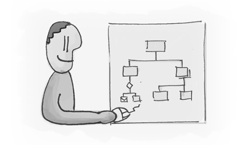
Introverts end up compensating their discomfort with verbal communication through more polished, more detailed and more thorough design deliverables — covering all imaginable use cases and variations. Super detailed user journeys, impeccable wireframes, and sitemaps that would make Garrett very proud.
- The upside: the thoroughness of the deliverable will hardly leave any technical questions unanswered.
- The downside: slides tend to be heavier on content, which can make each person in the room focus on a different part of what’s shown.
- The watchout: not letting the presenter’s introspection leave too many things unspoken or not discussed.
- The good practice: make sure you are gradually revealing information in your document, and pay attention to good visual hierarchy to balance out the amount of information you are trying to show.


The designer that tells a story
Designers with stronger verbal communication skills are able to capture people’s attention and focus it on the story being told in the meeting. When designers are aware of such superpowers, they know they can produce simpler deliverables and rely more on their voice-over for the details. Slides tend to be sharper, more focused, and work more as a reminder for the designer of chapters of the story they are trying to tell.
- The upside: extrovert storytellers know how to humanize the story to make sure people in the room can relate to the problem and the solution.
- The downside: to avoid breaking the rhythm, the presenter won’t dive too deep into the details — and people can leave the room with ambiguous interpretations of how certain functionality will work.
- The watchout: don’t let the confidence in your presentation skills steer you away from doing all the thinking and hard work upfront.
- The good practice: balancing out the tone of voice to punctuate emotional and rational moments of the presentation, so your audience know which hat to wear when judging each part of your presentation.

The million-dollar question: how to balance these two skills?
In an ideal world, designers are not only great presenters and storytellers, but they can also create clear, simple and organized documents that go deep into the details when needed. If you know anyone like this, let me know — because I would love to hire that person.
A more realistic scenario is to try to balance your team to have professionals that sit in different places of the introvert-extrovert spectrum. I have seen a lot of design pairs that seem to complement each other just perfectly: one is more of a systematic thinker that can easily deal with all the complexity of building a digital product, while the other knows how to package up the story to make it compelling and relatable when selling the idea internally or with clients.
But it’s not easy to have these two people always allocated to the same project, or always have them in the room at the same time.
Another solution is to create mechanisms that allow a designer to flex more often between the two ends of the spectrum. Make sure you are not forcing the designer to act against their own nature and personality — which can make people really uncomfortable.
- The best professionals I know can wear different hats depending on the situation they’re in. They end up adding more value to the company and to others around them.
- The good professionals I know are on the edges. They can talk a lot, but can’t deliver real work. Or they can deliver brilliant work, but can’t sell it through.
- The worst professionals I know are stuck right in the middle, and can’t over-index on any side. They are not good presenters and are not thorough systematic thinkers — which can quickly turn empathy into apathy to the other people sitting in the room.

How to avoid being stuck in the middle?
A few pieces of advice:
- Create two versions of your document — the pitch version and the documentation version. Let one focus on the emotional side of the story, and the other one on the details.
- Bring prototypes instead of static boards. Bring videos instead of photos. Bring mockups instead of grayscale wireframes. Make the work shine. Polish can help reduce a lot of cognitive friction for the people in the room.
- Avoid defensive tone when answering questions from your peers in the room. If they have questions, it is because you left a few holes when explaining your document. Be respectful, listen to the question carefully, confirm what the question is before answering, and be soft on our tone. 99% of questions are simply focused on making the work stronger.
- Put yourself in the user’s shoes when telling a story. Instead of “this is how I imagine the homepage will work”, focus more on “this is what our persona John is going to see when he lands on the homepage”. This little trick helps others put themselves into the user’s shoes when judging the work — and keeping the user’s interests in mind when providing feedback on the design.
- Deliver the story in small beats. You have spent days — sometimes weeks — thinking about that problem, but others in the room are seeing and thinking about it for the first time. Be fair with them.
- Don’t dive right in. Use the first 3 minutes of a meeting to recap the context, explain what you have been working on since the last time you met, and how you ended up with that end result you are trying to show.
Hope this helps.
