How letting go of the familiar can help product designers become more creative.

Kids are more imaginative than adults. Not only is this pretty commonly observed, but it’s scientifically proven too. In 1968, George Land conducted a longitudinal study where he tested 1600 children’s ability to come up with new and innovative ideas. He initially tested four to five-year-olds and retested them at ten and fifteen years. Results showed that this ability dwindled from a staggering 98% at four to five years to 12% at fifteen years. The same study in adults showed a mere 2%.
Why? Well, as we grow, we become experts in convergent thinking.
Researchers widely debate creativity, but they often recognise originality or novelty as one of its key elements. And this originality is a product designer’s super-weapon. A weapon that’s powerful yet elusive. Similar to Land, there has been other research that shows creativity reduces as we go through life. We fixate on finding ‘the right’ answer (a.k.a convergent thinking) and cling to it rather than exploring possibilities. While this doesn’t kill our creativity, it certainly suppresses it.
As product designers, we engage with three elements frequently— standards, patterns, and people.
And for the sake of efficiency, we tend to prescribe to standards, stick to patterns and make generalisations about people.
However, in our pursuit of innovation, these usually beneficial thought styles could be subtle barriers to our creativity. And hence, unlearning becomes an invaluable skill for designers.
Unlearning is not about forgetting. It’s about the ability to choose an alternative mental model or paradigm. When we learn, we add new skills or knowledge to what we already know. When we unlearn, we step outside the mental model in order to choose a different one.
Unlearning standards
Dogmatic vs Agnostic
Product design blends the arts and the sciences. Digital experiences and user behaviour can be predictable yet vary across contexts and change along with people, their needs, and technology. While fields like medicine and engineering consider rules and principles to be universally true, they aren’t necessarily prescriptive here. Sure, there are broad rules of thumb and areas such as accessibility and security where designers must adhere to rules, but it’s important to recognise that context is everything. That means considering how a rule was formed and where it’s applied.

UX has adopted several concepts from scientific work and they often suffer from oversimplification and a ‘lost in translation’ problem. For example, George Miller (of the popular Miller’s Law) theorised that the average person can only hold 7±2 items in their working memory. However, this is often used to argue that navigation items should be less than seven — an interaction where working memory is not involved. A deeper dive into his paper will reveal other nuances and conditions, such as single and multi-dimensionality and chunking. Ones that are harder to simplify and capture a common reader’s interest or understanding.
Similarly, methodologies and processes exemplify our obsession with prescription. For example, Design Thinking has become such a buzzword that it’s often used interchangeably with UX itself. IDEO, who popularised the concept, notes,
It’s an idea, a strategy, a method, and a way of seeing the world.
In essence, it’s an approach. A problem-solving approach that focuses on users and designs for current and immediate future needs. More importantly, it popularised design as a profitable practice in the software industry. But as the field matures, we need to pursue strategies that help unlock additional values. Like life-centred design that embraces sustainability. Or futures-thinking that plans for the far future. Perhaps it isn’t about being dogmatic OR agnostic about standards. Creativity could lie in their balance. A delicate balance between holding onto them firm enough to ensure quality yet loose enough to innovate.
Unlearning design patterns
Certainty vs Curiosity
Consistency in design makes interfaces predictable. And predictability makes for confident and efficient users who feel in control. That’s why design patterns are a great tool — they allow product teams to make quick, scalable and low-risk decisions. But here’s the catch. They can also ‘narrow’ the fun ‘diverge’ phase of the design process, and this is where we let our creativity run wild.
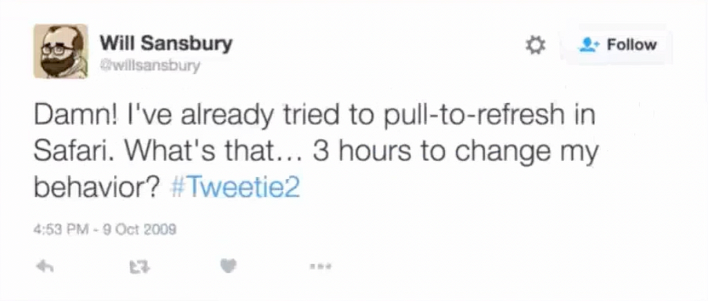
Looking beyond known patterns to solve interaction problems can create fresh experiences and address obscure and habituated issues. Before the pull-to-refresh gesture, a refresh button on the navigation bar was the conventional mobile pattern. I bet you’re asking, ‘This is crazy, why does something as mundane as this get such important space?”. Well, so did Loren Brichter. And that’s how the pull-to-refresh came into existence. His bold thinking created a far more intuitive and exciting solution. It took up lesser space on mobile, moved the paradigm from touch to gesture and rethought a refresh button’s importance. Here’s what an early adopter had to say:

Some of these brave attempts are a hit, while others aren’t. And that’s okay too. In 2022, when Instagram recalled its TikTok-style feed, its head, Adam Mosseri noted,
I’m glad we took a risk — if we’re not failing every once in a while, we’re not thinking big enough or bold enough
These failures are invaluable to gaining a deeper understanding of our users. Yes, tried and tested solutions work, but they aren’t foolproof. So, when confronted with a design challenge, take a step back to see if there’s a better way of solving it. Try new ideas. Weigh the risks. And test early to give your product that edge.
Unlearning people
They are not they and then is not now.
People present complex challenges to designers — they’re neither all the same nor is their behaviour consistent. What we know about one group may not fit others and what we know about them today may not hold in the future; making certainty around people’s behaviour incredibly elusive.

Simplicity is a common North Star in UI design, but it isn’t a universal preference. For example, Japanese users seem to favour detailed icon styles that explicitly convey meaning and information-rich websites that often seem cluttered with no obvious focal points. Designers tend to recognise cultural idiosyncrasies more, but often overlook nuances among seemingly similar groups. While simple and clean interfaces benefit consumer-facing products, with enterprise users, it’s critical to remember the complexities of their tasks. The goal of a clean UI could hinder their ability to complete these tasks efficiently.
People also change over time as technology, and their surrounding systems change. A few years ago, many businesses assumed that employees would only use their mobile devices for personal purposes, such as making calls, texting, or browsing social media. However, 75% of people recently say their smartphones help them to be more productive. And what’s more illustrative of this flux is the fact that this current attachment to our constant companions has also triggered a detachment movement. Ha! Could we maybe witness the rise of mobile sceptic workers? And could the future of work embrace them? Well, only time can tell. All we can do is to be receptive to that possibility. Be receptive to reevaluating people and rewriting the playbook. Repeatedly.
If this has left you feeling, ‘Well, do I know anything for sure?’, remember this. The wise Socrates famously (but supposedly) said,
For I was conscious that I knew practically nothing…
And the less famous, but exquisitely eloquent Shashi Tharoor said,
All knowledge is transient, linked to the world around it and subject to change as the world changes.
That’s why I call it the art of unlearning. Recognising that knowledge is short-lived is the first skill. The next is discerning what and when knowledge has to be unlearned—and then learning to do it over and over until it becomes deliberate practice. Or even a lifestyle choice. Although we’re born creative, as we get ‘good at life’, our brains become wired for efficiency. Yes, internalising standards sets quality, reusing patterns orders chaos and generalising people drives quicker decisions. But the practice of unlearning could take us along the path of the unknown and the wondrous; to the world of our untapped creative potential.
The art of unlearning was originally published in UX Collective on Medium, where people are continuing the conversation by highlighting and responding to this story.