An article about the psychology of waiting and how you can make this a positive user experience.
Waiting. It’s something we all do every day. Waiting for a response to that message you sent, our food to be delivered, the traffic lights to turn green, and our computers to start at the beginning of the day. This can be extremely frustrating depending on the context but the design has a huge influence here.

When computers were invented and became more and more popular, users had a perception of it being slow even though they were using the fastest one available. The design of loading icons was the problem here. Every time you saw a spinner or a watch, you knew you had to wait but didn’t know for how long. This made users feel powerless and frustrated. So to show more information about how long the user had to wait, loading bars were introduced. This way users knew how long they needed to wait for an action to be finished. At least they thought they knew but then this scenario often occurred: the bar froze at 99%…
It’s all about our expectations.
“This is true on our computers and it’s true at lines at Disneyland. You look at it and it tells you how long it’s going to take and you set an expectation. When you get to the front of the line faster than you thought you were going to (or when that particular piece of software loads faster than you thought it was going to), you leave the encounter feeling positive.” Jason Farman explains in his book Delayed Response.
This is why those loading bars were designed to go slow in the beginning so the user would think it'd take a long time, and then go faster over time so they’re feeling positive about finishing earlier than expected. But those loading bars had their cons as we discussed before.
If we learn from these things the conclusion is: show people what’s taking so long and they’ll be more satisfied. Sometimes they even prefer a longer waiting time with information over a bland progress bar that is twice as fast because they know what to expect.
Designing for loading
We’ve learned that users prefer knowing what’s going on while waiting. So let’s not do this:

There needs to be an indicator that something is happening that’s also explaining why. A lot of people are saying: “With the current technology, users don’t have to wait that long anymore.” I think this is true but only in most cases. It’s an assumption every user of your product has the fastest technology so let’s also create designs for those other people.
Skeleton screens
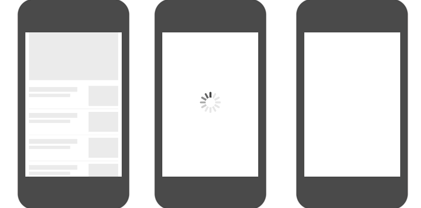
For page loading, skeleton screens are a great solution. It indicates to users that something is happening in the background and that it won’t take long. This way the user gets visual clues about how long they have to wait. In the GIF below you can see that the left screen, with the skeleton view, gives way more information while loading than the others.
Skeleton view — Spinner — Nothing at all
So should you use skeleton screens everywhere?
No, skeleton screens are for short-loading processes. When users see a skeleton screen, they should immediately know this is a short waiting time.
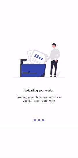
Large actions with longer loading times require more information. This concludes things like file conversions, uploads/downloads, or data importing. In this case, you want to design a loading screen where you describe what’s going on. Make sure to include a short title so users can scan the page and know what’s happening. You can add some more explanation preferably showing the different stages of the process.
Example of a more detailed loading screen:
It makes sense you don’t want to overshare about what’s going on while loading. But users appreciate getting some information and it may make them more understanding and more willing to wait.
A great source to learn more: Wait Wait… Tell Me by 99% Invisible.
![]()
Loading UX: make users not care about having to wait was originally published in UX Collective on Medium, where people are continuing the conversation by highlighting and responding to this story.