What trading software can teach us about harnessing ‘complicated’ design.
Those that have read my previous several articles are probably seeing this headline and wondering when exactly between now and then I had gone crazy.
Please, bear with me.
I think we can all agree that it has become generally impossible to traverse the world of either business or leisure without intuitively understanding the sea of digital apps that underpin their foundations. As a result, I usually tend to speak at length about the dire need to simplify the multitudes of technologies and digital systems that help us navigate our modern lives.
Considering how many different apps we’re forced to interact with on a daily basis, the general rule of thumb that I apply to all but a select handful of product development situations is simplify, simplify, simplify.
Google’s latest ad for the new Chromebook model says it all:
“Who says you can’t have everything, with the ‘everything’ button.”
https://medium.com/media/58e93753cd13de030a3b8c652633070a/href
(A few weeks before this ad was aired, I wrote an article on enterprise product consumerization in which I mention the “Magic Button” conceptual exercise. To no surprise, Google embraces only the best of product development methodologies.)
But, as most of us are very well aware, product development rules exist to be broken.
The trick is being able to identify the small fraction of instances in which strategic deviation from the core principles actually makes sense. (Hint: In the vast majority of situations, it is better to keep most new applications looking and feeling familiar to existing ones unless you have an excellent reason not to.)
Today, I want to showcase a critical, real-world example of an instance where product and interface simplicity is not only counterintuitive, but for reasons of user safety and financial well-being, should not even be attempted in most contexts.
I am of course talking about the world of financial trading software.
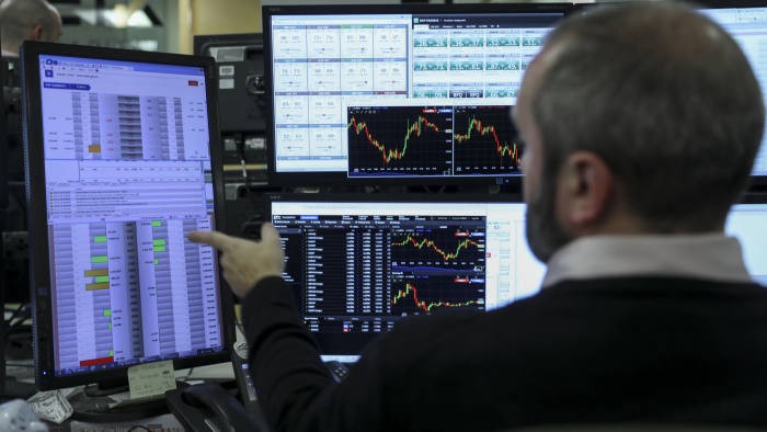
The individual ‘applications’ that fall under the trading software umbrella come in a wide variety, ranging from the institutionally-favored Bloomberg Terminal (pictured above), down to less premium but still effective Interactive Brokers, TradeStation, thinkorswim, and others.
These software (and the broker-dealers they are electronically linked to) facilitate the daily exchange of trillions of dollars of stocks, bonds, futures, options, commodities, and currencies for both institutional and retail clients.
They service insurance companies, mutual funds, banks, and hedge funds looking to buy and sell billions of dollars of financial securities, as well as individual investors actively trading their own, often much smaller piles of personal capital out of a retail account.
Does any of the above sound somewhat confusing?
Well, unless you (1) have experience in the financial services industry or in a financial corporate role, (2) have spent a number of years researching, observing, and participating in the capital markets, or (3) have spent time as a business or finance student, then of course it’s going to sound confusing!
The ethical danger in this instance — ironically — lies in attempting to mask the inherent complexity of a powerful financial application by injecting it with friendly, minimal interfaces. This type of design can often mislead users into believing that what they’re doing is much simpler and less financially risky than it really is.
From this standpoint, we can view the complexity of the aforementioned tools as a critical barrier to entry to those potential users that, with their lack of financial market knowledge or experience, could potentially screw themselves over irreparably without so much as the slightest clue as to what just happened.
Given the extended period of quarantine currently experienced in the United States, it feels like just about everyone with a pulse and a WiFi connection has begun to dabble in the stock market.
Following the first wave of federal stay-at-home orders in the US at the end of March 2020, Robinhood, the popular (and often vilified) stock trading app had announced a gain of 3 million users over the quarter, boosting their valuation into the tens of billions of dollars.
If you are an active consumer of the financial news then you will no doubt have heard many times that this influx of new, inexperienced traders flocking to platforms such as Robinhood and WeBull have changed the very nature of financial markets as we know them.
As of 2020, it has been estimated that approximately 30% of all volume in public equities trading activity is being driven by retail investors, a previously unimaginable percentage.
So what gives? How exactly did this wave of new users come to be attracted to the complicated and often precarious publicly-traded financial markets anyway?
The answer lies in the user interface and experience designs of Robinhood and its numerous imitators.
The relatively new financial trading application (founded in 2013) makes opening a brokerage account seem as simple as signing up for a new social media platform. Just input your name and social security number, swipe through a few screens, enter your bank information, and boom, you are ready to take on Wall Street.
The problem — once again, quite ironically — is that the oversimplification of inherently complicated financial software conceals the infinite number of ways in which it can inadvertently be misused by the customer to great harm.
Part of Robinhood’s appeal is the aforementioned lighting-fast account creation process. New users eagerly zip through this stage in under 5 minutes, excited to begin their journey to riches untold.
How can this possibly be, one might wonder when it takes anywhere from a few hours to several business days to get set up with other financial brokerage platforms such as Bloomberg or TradeStation?
Upon closer inspection, we come to understand exactly how Robinhood and friends were able to structure such seamless onboarding processes:
All of the pesky disclaimers, documents, and legal materials that are prominently presented to users signing up to more premium brokerage platforms are conspicuously absent from the sign-up processes of these applications, allowing new and inexperienced participants to the financial markets to live in a world of unprecedented ignorance.
To Generations Y & Z who have grown up with a mobile phone fused to their hand, it becomes second nature to download and subscribe to these apps like they would any other and subsequently dive right it, clicking around willy-nilly until they figure it out.
What they don’t realize, is that this instinctive log-in-and-click-around technique that has been absolutely crucial to their understanding of other systems and digital tools, can have disastrous consequences in an app that visually appears as harmless as any other, but is in-fact deeply intertwined with the user’s very financial livelihood.
What we have as a result is the philosophical equivalent of a firearms manufacturer creating a neon-colored, easy to use handgun, and refusing to acknowledge the fact that to younger individuals, it may appear to be just a harmless toy devoid of the danger that’s naturally inherent to the real thing.
This is one of the reasons that, despite the financial success Robinhood and others have achieved as corporate entities, I argue additional product complexity is required.
A critical component of a commercially successful and ethical digital product is that it communicates its status, as well as the consequence of each user action, back to the user in a continuous and visually/audibly obvious feedback loop.
Professional financial softwares such as those mentioned earlier do a phenomenal job of this using a variety of alerts, pop-ups, texts, emails, flashing lights, ringing bells, and more, constantly reminding the user of the focus the task they are engaged in requires.
Robinhood and its imitators, regardless of how innovative they may appear, fail terribly at this, considering their interfaces have been created predominantly with the goal of maximizing friendly, minimalist aesthetics, as opposed to truly rendering an informative environment for their users.
Worse than the existence of the problem itself, is the fact that this hazardous simplicity was purposefully built into these apps as a growth tactic to attract as many users as possible in the shortest period of time, to the disregard of customer well-being.
If we take the moral concern of actively omitting critical information from users out of the equation, then this new breed of trading application is by all measures an astounding success.
If we add these ethical concerns back into the conversation, however, the verdict becomes questionable.
The other side of the ‘complexity-as-an-asset’ coin relates to the day-to-day use of the applications themselves. For anyone that has been involved in the trading of financial securities either for an employer or actively managing a personal retail account, it is likely that you’ve familiarized yourself with one of the professional tools mentioned earlier or another comparable platform.
For those unfamiliar with the world of financial services or asset trading, it is important to understand that the software inherent to these disciplines are not comparable to your email reader of choice or preferred personal accounting application.
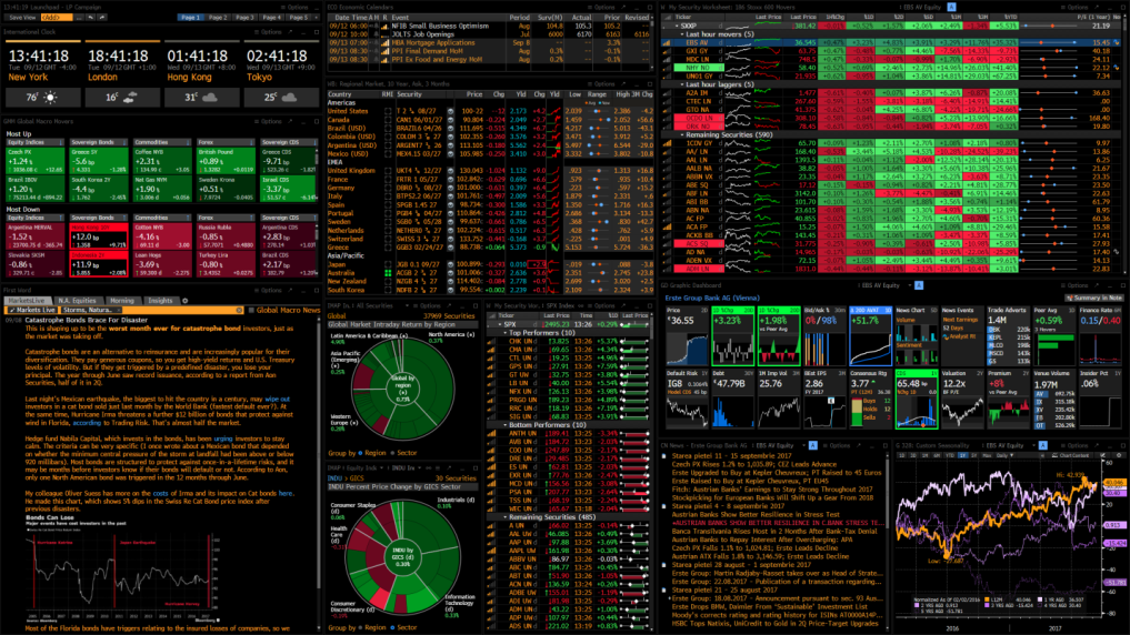
A cursory glance at one of these tools is enough to make a newly-minted Robinhood trader run for the hills and consider never involving themselves in the financial markets ever again. A seemingly haphazard collection of tables, charts, menus, buttons, and icons clutter the screen, and one wonders how they will ever be able to interpret this hodgepodge of information, much less make a data-based, transactional decision with it.
It’s entirely unknown to a large amount of iPhone-only stock app users that this is what real financial trading technology has looked like ever since the mid-1980’s when electronic systems began to replace ticker tape and in-person/telephoned order placement on Wall Street.
These systems were designed by professionals, for professionals, and similar to an airman inside the cockpit of an F-16 fighter jet, the person utilizing the software knows exactly where everything is, what everything is, and the exact consequence that is to be anticipated as a result of interacting with a particular button or switch.
To trained and experienced users, these tools are super software that is able to take the inherent complexity of financial trading and present it in an intelligently structured format that automates many of the tedious and repetitive tasks necessary to analyze and purchase securities.
The key difference between this ‘intelligently structured complexity’ approach and the naïve oversimplification that newer trading apps seek to achieve, is that the established financial trading platforms aim to organize, visualize, and neatly present said complexity, instead of attempting to sweep it under the rug and pretend that it’s not a critical component of the work sought to be done.
As previously mentioned, one of the ways in which these systems aid the user in understanding and navigating its busy interface is through the use of various colors, pop-ups, alarms, and other visual and auditory cues.
While the hundreds of elements onscreen may appear to be placed haphazardly, they typically tend to be clustered together by these cues, indicating related data types, related functionality, or another unifying element.
The layout of widgets and tools in the interface can typically be configured by the user in near-endless permutations based on either personal preference or the requirements of the situation at hand. Hovering over something with your mouse will more often than not reveal an information window giving the name and sometimes even the functionality of an element, which the customer can use to determine whether it is relevant to them or not.
The result of such an industry-specific interface design naturally does not leave much negative space (or “breathing room” as designers colloquially like to call it) in the application.
While the amount of negative space present in a virtual product has been a barometer for product strategists for as long as Google’s homepage has been around, I believe it is the wrong measurement to apply in a situation such as this.
The trading of financial securities is by its very nature, one of the most cognitively and technically complicated endeavors that any human being can hope to undertake. The reason that said complexity exists in such volume in this discipline is largely because of the infinitely expanding trove of data associated with each asset, as well as the sheer amount of assets that are available on the market to be traded.
An effective and ethical trading technology will seek to take this complexity and visually structure it in such a manner that the whole becomes greater than the sum of its parts, and each element on the screen facilitates greater understanding of an asset or investment strategy, or aids in the execution thereof.
In one of our recent conversations, my CEO hit upon a prescient but little regarded fact that underpins our modern tech-enabled economy:
“You know, the thing to really remember is that so much of our business world today runs on software. If you have mastered the software that allows a company to operate, then by virtue of knowing how to use it, you cannot help but have developed some domain expertise inherent to that industry.”
– Sean Black
It is true that technology has embedded itself into the world of business and finance in an intractable way, and in order to truly understand what’s going on and effectively execute on objectives, one cannot afford to understand just half of the equation.
The complexity present in an industry or business segment will naturally result in software complexity present in the virtual tools that have been designed to digitally augment it.
As a result, all product leaders eventually have to face the problem of what to do with that complexity.
Do we seek to eliminate any and all forms of it in order to maximize growth at all costs? Or do we strategically structure it in order to provide the most data and information context to our customers, allowing them to make more intelligent decisions?
The answers are variable and have far-reaching consequences, but my general rule of thumb is to never make things more simple than they absolutely have to be.
In an environment where a bit of added strategic complexity can prevent a user from metaphorically driving themselves off a cliff, it is critical that said complexity not be omitted in service of a cleaner and more minimal UI.
After all, some things in this world are just objectively harder to do than others. Masking the true difficulty or scope of activity in the name of a seamless user experience does not do anyone any favors, especially in disciplines where specialized knowledge can make or break a situation.

![]()
Can product complexity be turned into an asset? was originally published in UX Collective on Medium, where people are continuing the conversation by highlighting and responding to this story.