Over the past several years event apps have been soaring in popularity, and it’s easy to understand why.
The event details you need are accessible on the go and not reliant on a WiFi connection. Plus, these apps make event organizers’ lives easier by making it easy to manage event logistics and monitor and report on actual activity in real time.
They also save time and money by eliminating the need for an expensive box office or point of sale equipment, and they save trees because you don’t have to print out so many event packets.
There’s a lot to love, but why are event apps so boring? Conferences are usually enjoyable get-togethers (most of the time, anyway), while event apps are often dull and unmemorable collections of bland grids and lists.
So how do you design a meaningful and fun event app that people will remember long after the event is over? The web design agency I work for, Saforian, used DrupalCon Portland, an event we were attending and interested in, as a test bed for developing an event app.
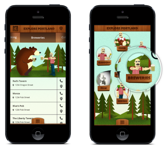
We wanted to understand how people respond to event apps and how to make them better in the future. When we were planning our AtDrupalCon app, we looked at apps for past DrupalCons and other technology conferences and couldn’t stop yawning. Our goal was to develop an app with playfulness and great UX that provided real, useful information in a timely fashion. We created an all-in-one immersive app to make it easy for conference goers to see the schedule, find fun things to do in Portland using location-based services, and connect with others via Twitter.
Our app was experimental because it was only used by a small group of people (DrupalCon attendees), in a certain place (Portland), and at a certain time (May 20-24, 2013). Here are some insights we learned along the way.
Standing Out From The Crowd
Event apps naturally have a limited lifespan. So how do you make an app memorable so people are still talking about it after the event is over?
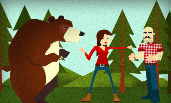
Portland has a vibrant culture built around a renowned culinary scene, hordes of breweries, and oodles of outdoorsy activities. Inspired by the quirky Portland brand (after all, one of their slogans is “keep Portland weird”) we created an app that catered to the Portland culture by telling a creative story about a rivalry between a grizzly bear, Remington, and a lumberjack, Clyde. To bring the app’s characters to life, we paired vivacious illustrations with an original backstory to give them personality and flair.
By now you may be wondering—why is a lumberjack punching a bear?
With the influx of mobile apps, app markets, and online stores, users are inundated with an ever-growing number of choices, with almost infinite purposes and capabilities. There are hundreds of thousands of apps available, and it can be almost impossible to stand out in the crowd. So how do you distinguish your app? Don’t be afraid of coloring outside the lines. For our app, we created a quirky, eye-catching logo of a lumberjack punching a bear.

By now you may be wondering—why is a lumberjack punching a bear? Here’s the scoop. Clyde is a socially awkward lumberjack who has been living alone in the Oregon mountains ever since he was abandoned on a school field trip at age 10. His ex BFF Remington, also known as Remy, is a womanizing grizzly bear who loves gourmet cooking. One day, while canoeing down Little Crater Lake they spotted Emma, a beautiful Drupal wiz who invited them to join her at DrupalCon. Now, the fight for Emma is on as Clyde and Remy venture out of the woods for the first time to compete for her affections.
On the app’s support site you can make Remy and Clyde fight using keystrokes SDC and KJN.
Creating Great UX For The Target Audience
In the early stages of developing this app, we brainstormed the top reasons why someone at DrupalCon would want to use an app. For example, we determined they would need a schedule of the sessions with room numbers, conference speakers, and the level of difficulty associated with individual courses. They would also want to maximize their time in Portland and find fun things to do without going through the hassle of researching. Finally, they would want an easy way to connect with other attendees, so we incorporated a Twitter feed.

One of the advantages to developing an event app for DrupalCon was that the target audience for the app was Drupal developers who are tech-savvy and likely to report with feedback and bug alerts. We got some great feedback to incorporate for our next Drupalcon app, like providing the ability for users to personalize their schedules, improving accessibility for deaf and blind users, and developing an Android version in addition to an iPhone version.
Pushing The Envelope With UX
We thought that our target audience would appreciate a fun user interface that motivated users to move through the app. Apps that perform poorly or don’t offer real value to users won’t create any buzz. Our engineers focused on functionality, user input, content, and layout when designing and developing the app to ensure performance reliability. One of our goals was to give users an easy-to-navigate schedule. To simplify the lengthy schedule to conference goers, we color-coded the nine session tracks.
Another concern was users getting stuck on intuitive actions, so we carefully considered touch and native interactions like tapping, sliding, and turning.

Incorporating interactive elements, like gesture controls, is a great way to give liven up an unexciting app. We chose to use a native environment to make this possible instead of doing it as a web app, which would have resulted in a slow and clunky UX.
More than anything, we wanted our app to be memorable. We didn’t want to create another boring app listing the DrupalCon schedule. We wanted our app to be interactive and engaging. Gesture-based animations are seeded throughout the AtDrupalCon app, including that fistfight between a man and a grizzly bear, and a spinning session track wheel.
Another concern was ensuring that all of the conference information was up to date so people didn’t have to download any annoying updates. We were able to accomplish this by configuring the app to pull data from the DrupalCon Portland site to access conference info like speakers, room numbers, and levels of course difficulty. The app also pulled data from Twitter to give users up-to-the-minute DrupalCon updates.
Conclusion
More than half of a person’s mobile phone usage is spent on apps, and organizations are increasingly recognizing the power of event apps to streamline the event experience. According to Omnipress’ 2012 Mobile Event App Survey, 80% of organizations plan to provide a mobile event app within the next two years. In addition to making it easier for organizers to manage their events and provide better experiences for attendees, event apps are excellent marketing and social networking tools.
There’s no question about it: event apps are here to stay. So why be a bore?
