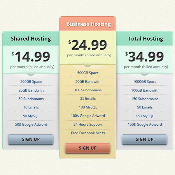
Photoshop is often used to create graphics and layouts for web designs. In this tutorial, we will explain how to create a pricing table for a hosting company using a combination of vector shapes and layer styles. Let’s get started!
Tutorial Assets
The following assets were used during the production of this tutorial.
Step 1: Preparation
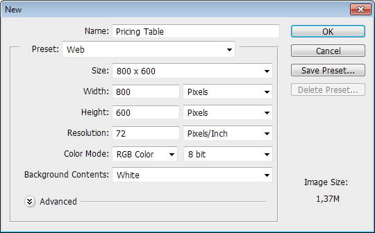
Let’s start by making a new file (Command/Ctrl + N) with size 800 pixels × 600 pixels.
Step 2
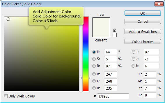
Add Adjustment Layer Solid Color to be used as background. Select #f7f8eb for its color.
Step 3
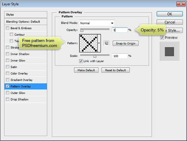
Grab free pixel pattern from PSDfreemium. Double click Adjustment Layer to add Pattern Overlay using this pattern.
Step 4
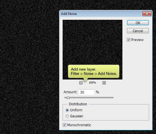
Add new layer and fill it with black. Click Filter > Noise > Add Noise.
Step 5
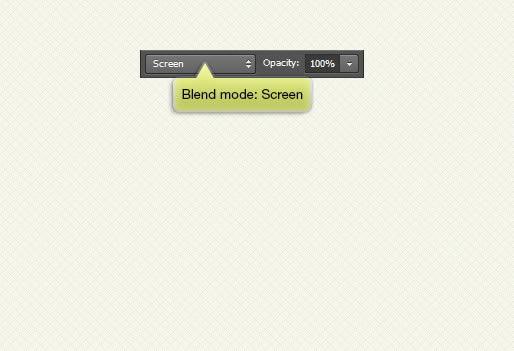
From Layers panel, set its blend mode to Screen.
Step 6: Base
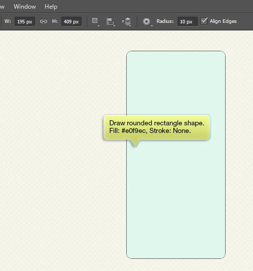
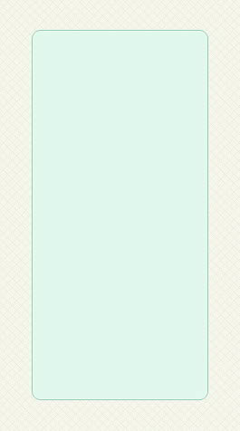
We’ll start by drawing the base. Draw a rounded rectangle shape with radius of 10 px. Set its fill to very light blue with no Stroke.
Step 7
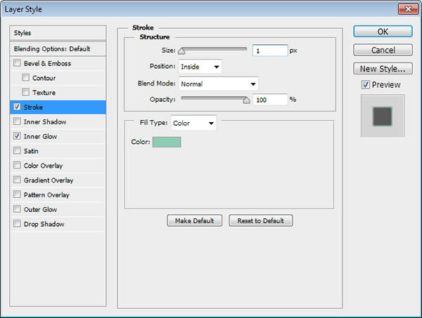
Double click the layer to add Layer Style. Apply Stroke and Inner Shadow using following settings.

Step 8: Title Bar
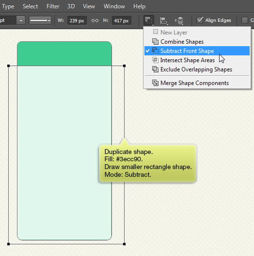
Duplicate the shape and change its color. Add rectangle shape on its lower part and set its mode to Subtract. Now, we have a title bar.
Step 9
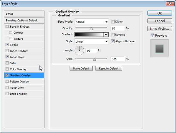
Add Stroke, Inner Glow, and Gradient Overlay using following settings.
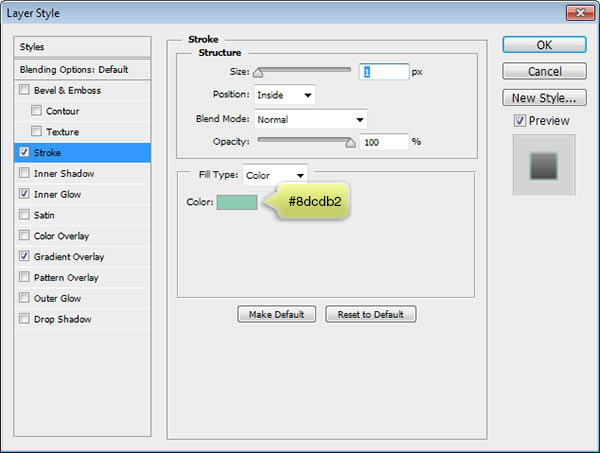
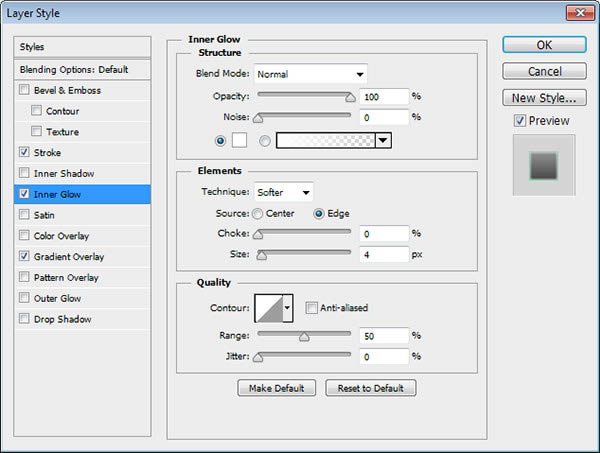
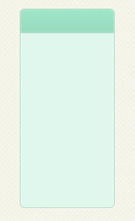
Below you can see result of the Layer Style onto the title bar.
Step 10
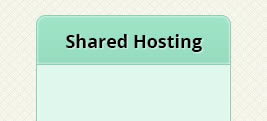
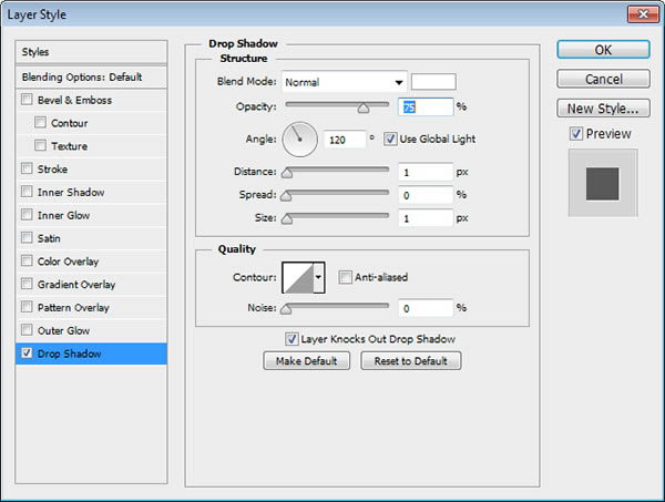
Add table title. Add letterpress effect onto the text by applying Drop Shadow.
Step 11: Price Info
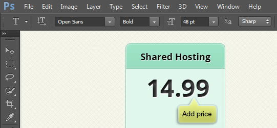
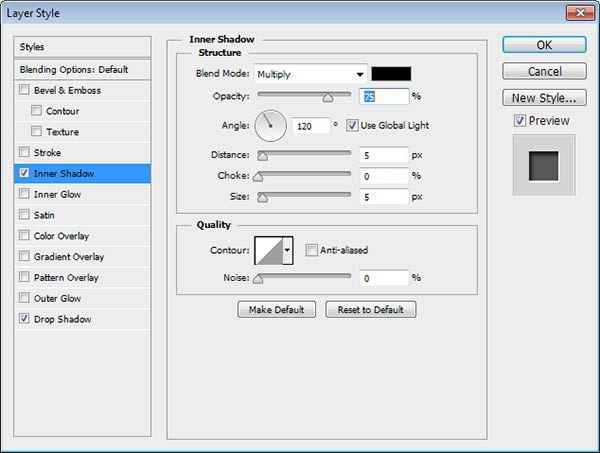
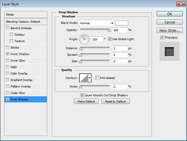
Add bigger text for its price. Use medium gray as its color. Apply Inner Shadow and Drop Shadow to add Emboss effect.
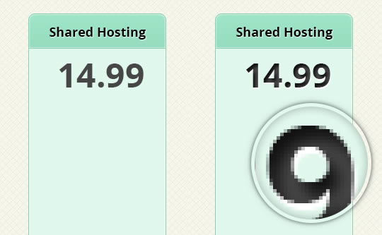
Below you can see difference before and after adding Layer Styles.
Step 12
Add another detail inside the price info, such as currency sign and its billing information.
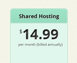
Step 13: Item Lists
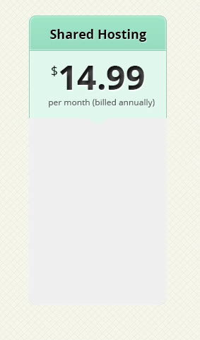
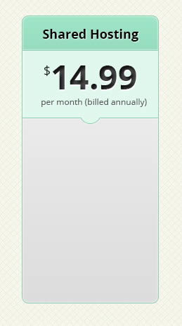
Duplicate table base and set its color to #f0f0f0. Add circle and rectangle on top. Set their mode to Subtract.
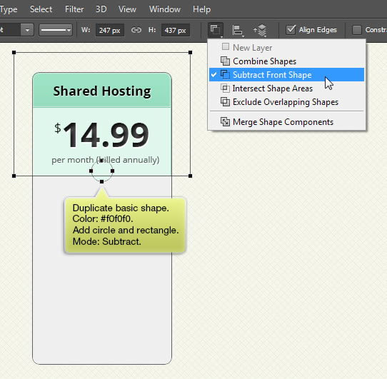
Step 14
Add Layer Styles Stroke, Inner Glow, and Gradient Overlay.
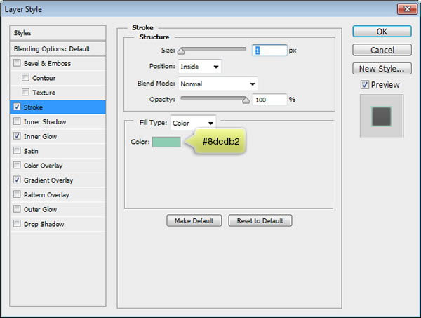


Step 15
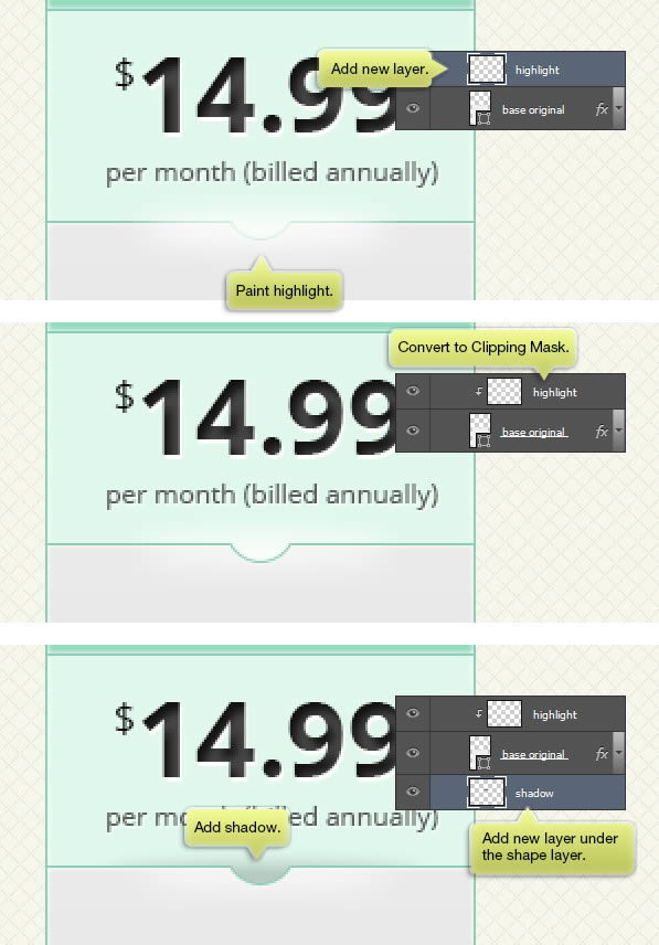
Add new layer on top of the shape. Paint white on its top side. Hit Command/Ctrl + Alt + G to convert the layer to Clipping Mask. Make new layer underneath the shape and then paint black for its shadow.
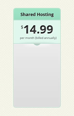
Here’s the result in 100% view.
Step 16
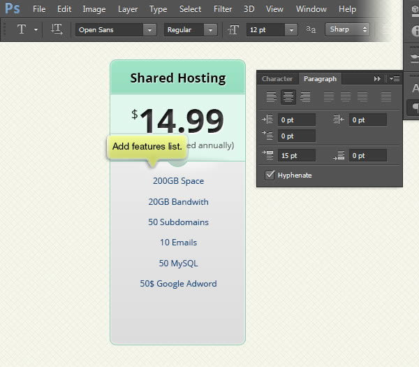
Add features list items using Type tool.
Step 17
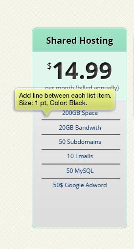
Add 1 px line shape between each list item. Use black for its color.
Step 18
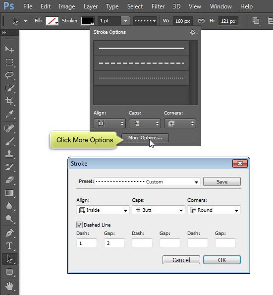
Make sure the lines are still selected. Click More Options and then change Stroke option to dotted line.
Step 19
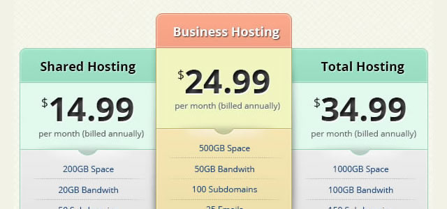
Add layer mask onto the lines layer and the paint its left and right edges with black.
Step 20: Button
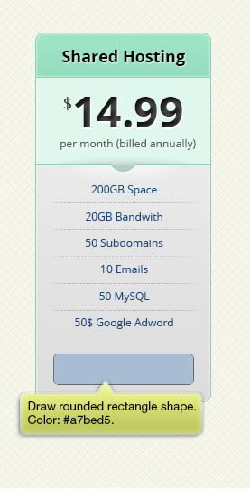
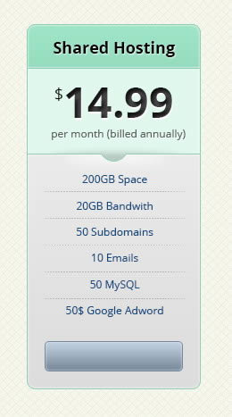
Draw rounded rectangle shape with color #a7bed5.
Step 21
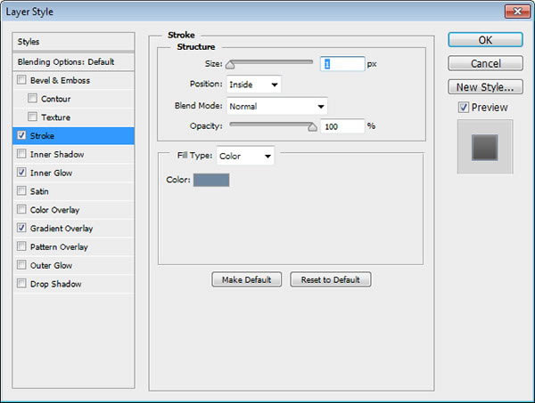
Add Layer Styles Stroke, Inner Glow, and Gradient Overlay.


Step 22
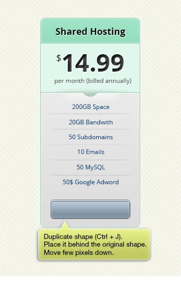
Duplicate the button and place it behind the original. Move it a few pixels down.
Step 23
Use same Layer Styles but this time increase the Gradient Overlay Opacity to make it darker.
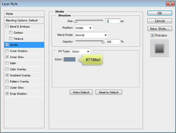
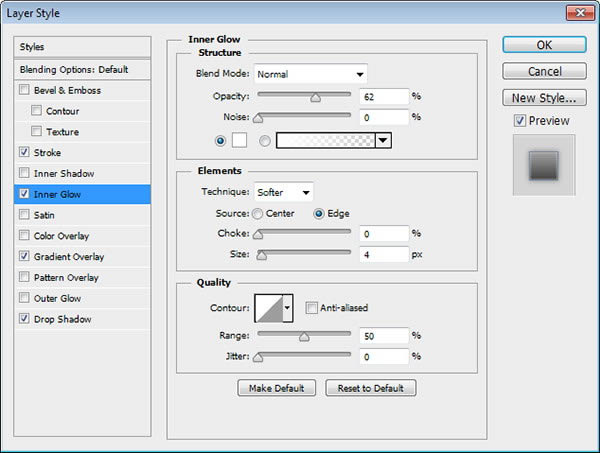

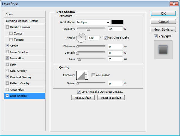
We also add Drop Shadow to add soft shadow around the button.
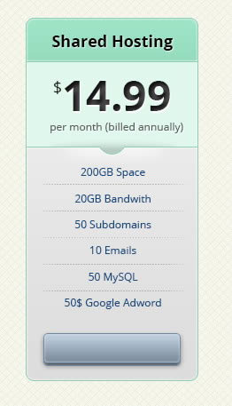
This is the button appearance.
Step 24
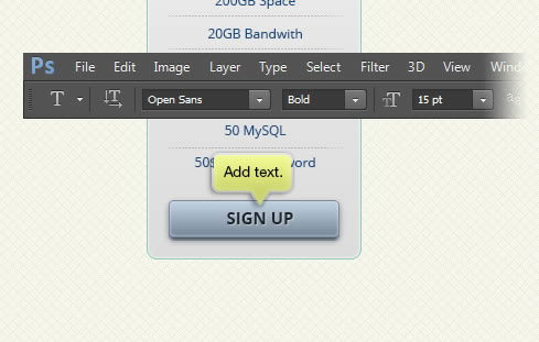
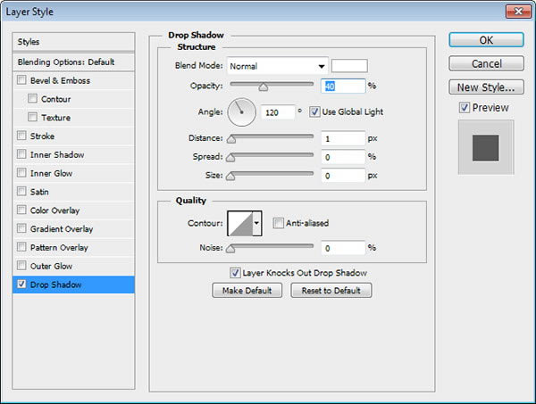
Add text. Apply white Drop Shadow to add letterpress effect onto the text.
Step 25: Duplication
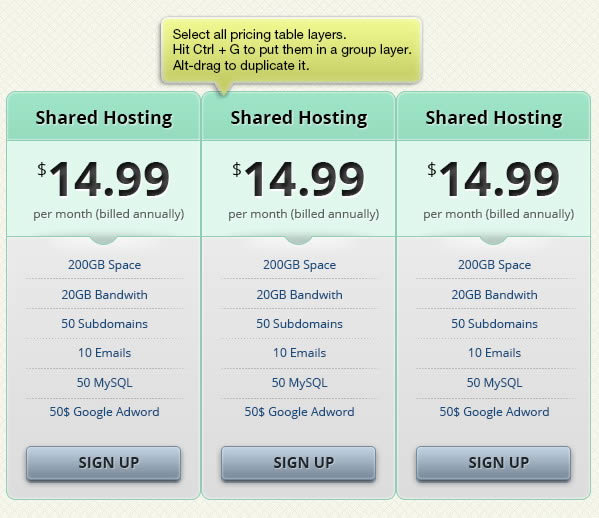
Select all pricing table layers and hit Command/Ctrl + G to put them in a group layer. Alt-drag the group layer to duplicate it. Make three tables.
Step 26
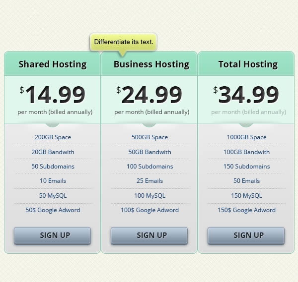
Off course, we don’t want it to be identical. So, change its text.
Step 27: Featured Plan
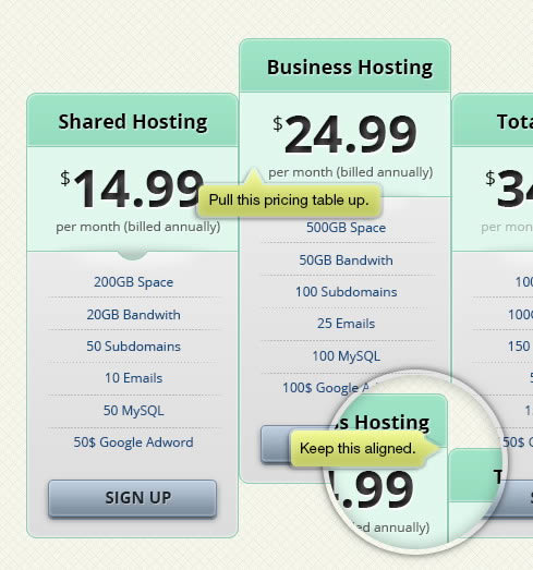
We want to feature one of the pricing plan by differentiating it. Pull second pricing table up. Make sure to keep the title bar aligned.
Step 28
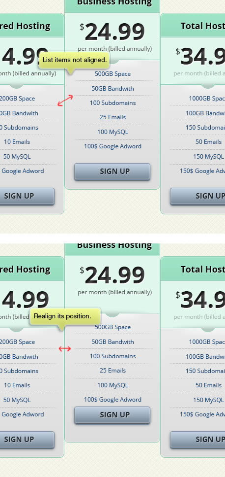
We also want to make sure the list items are all aligned. Select the text and its line underneath it, rearrange its position. Make sure to leave some more room because we want to add more list items.
Step 29
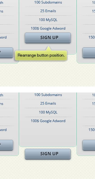
Rearrange button position to match the table size.
Step 30
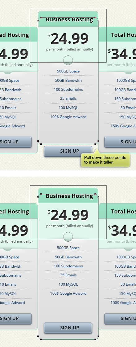
Modify the base shape to make it taller.
Step 31
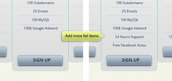
Add more list items.
Step 32
Place second pricing table and pull right side of the first pricing table.
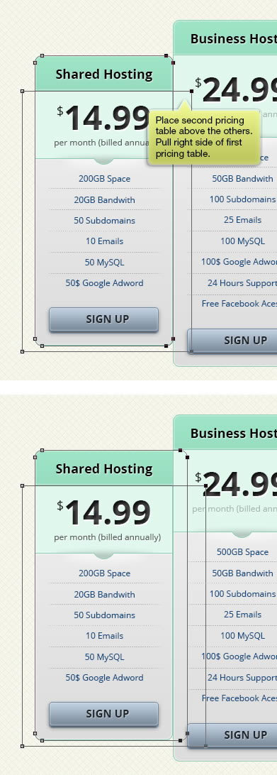
Step 33
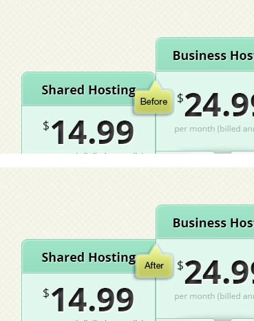
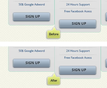
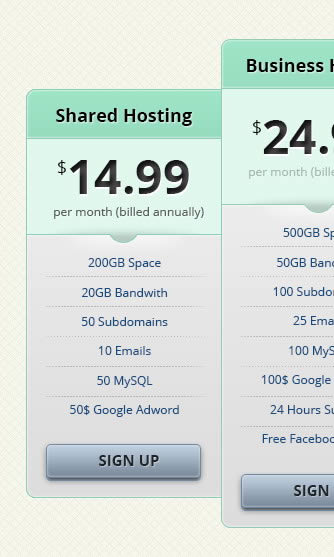
Below, you can see the result before and after editing the shape.
Step 34
We want to lift the featured plan and make it seems taller by adding shadow. First, Command/Ctrl-click the featured base to make a selection based on its shape.
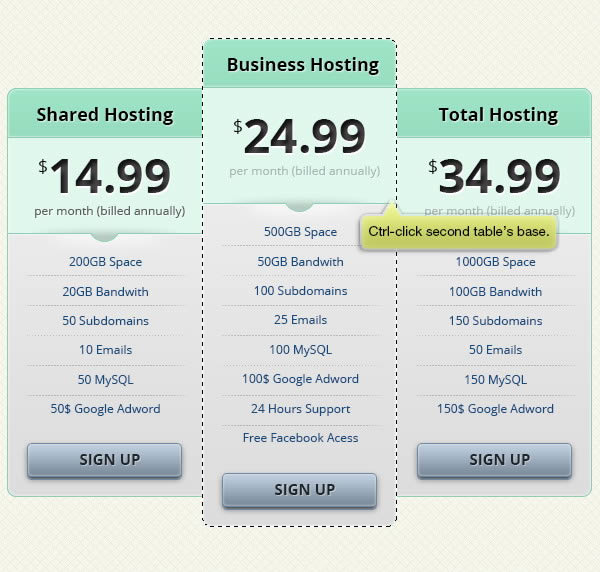
Step 35
Make new layer and fill selection with black. Soften it by adding Gaussian Blur.
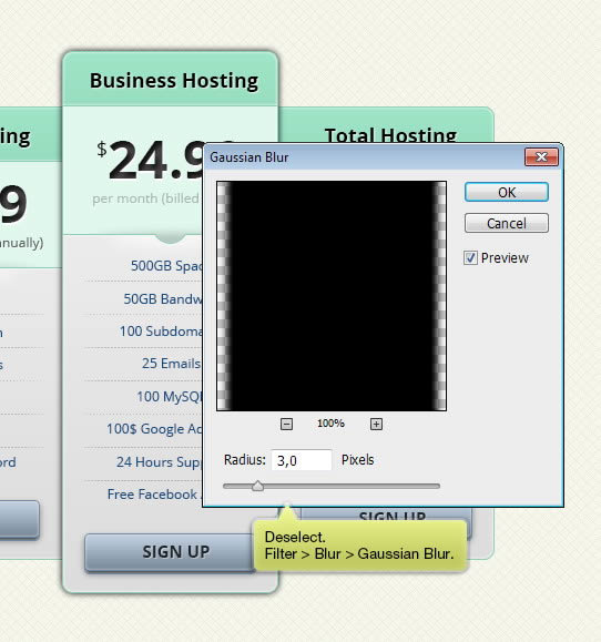
Step 36
Reduce its layer Opacity.
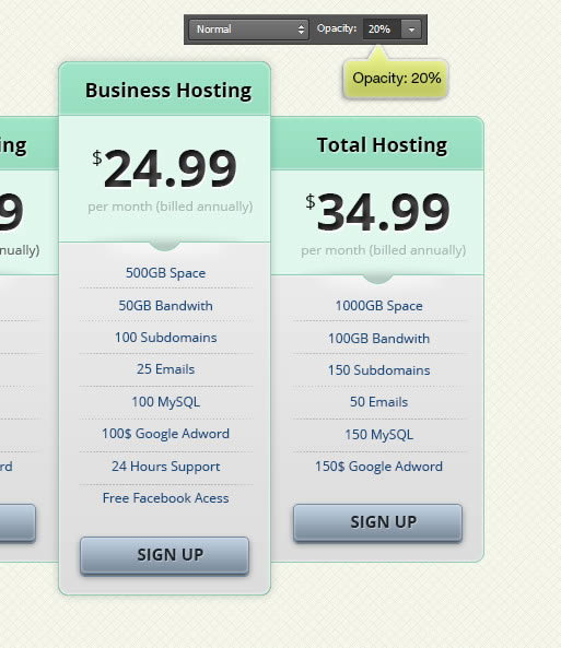
Step 37
Make new layer and draw a black soft line using brush tool.

Step 38
Hit Command/Ctrl + T and then click Warp button. Select Arch for its mode.
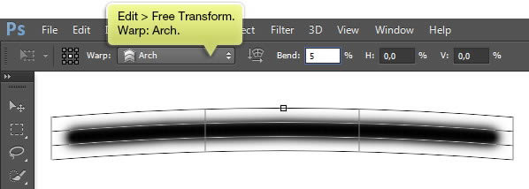
Step 39
Rotate the warped line and place it behind the featured plan.
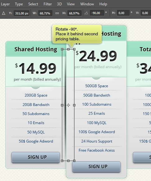
Step 40
Reduce its Opacity.
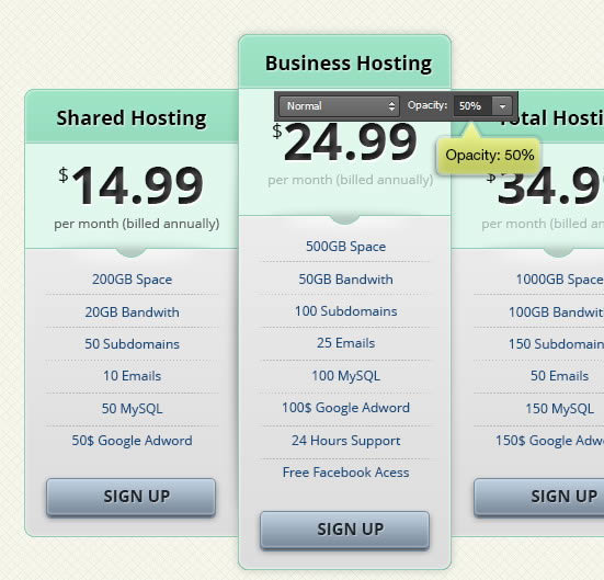
Step 41
Add another shadow on its other side.
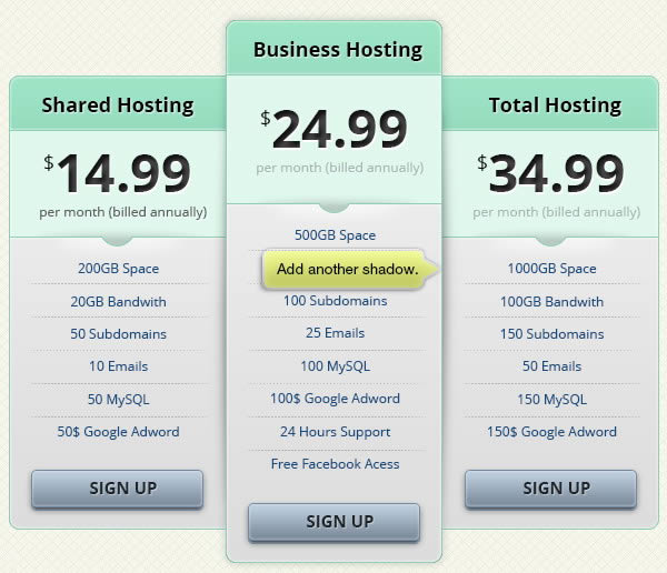
Step 42
Command/Ctrl-click both regular tables. Place the shadows layers into a group layer. Click Add Layer Mask to add layer mask onto the group layer.
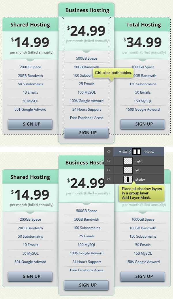
Step 43
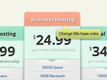
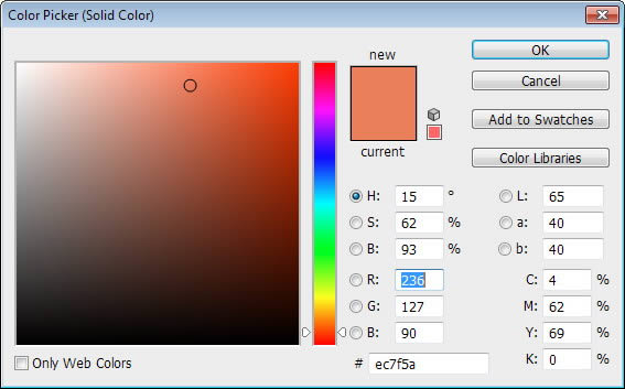
To add mode contrast onto the featured plan, we also want to edit its color. Change title base color to orange. To match its color, we also need to modify its Layer Styles option.

Step 44
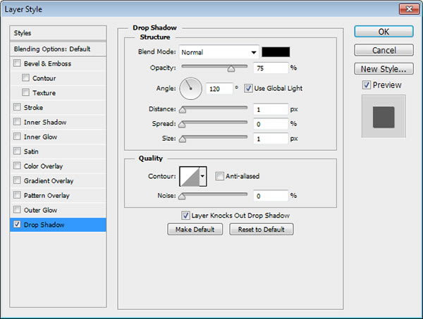
Edit title bar text color to white and its Drop Shadow to black.
Final Image
