The longer you can keep a visitor tuned into your website the better. But the time needed to fully engage a visitor is quite short.
If your website UX isn’t up to snuff, you’ll be fortunate if a visitor sticks around more than 5 seconds. That isn’t much time to sell a product or service, or even get your message across.
You might have the skills and tools to create a UX you can be proud of. Yet, your efforts can come to naught if you make any of the 5 mistakes described in this article.
Avoid them at all costs.
For Continued Success in 2018, Avoid These 5 UX Mistakes Like the Plague
UX Mistake #1 – Practicing Diversity in Your Online Presence Rather than Consistency
Do not show your visitors all the different styles you can use when you design web pages. Web users prefer consistency. They like to know that page 4 belongs to the same website as does page 1.
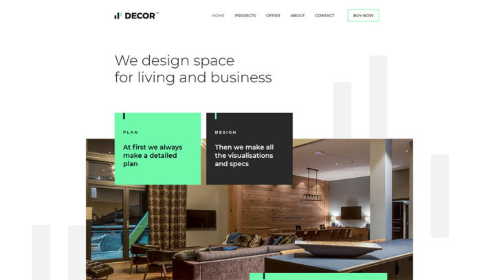
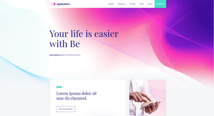
Stick to the same color scheme throughout your web, mobile, social media presence. The same applies to fonts. Keep the number and sizes of fonts to 2 or less and 4 or less, respectively; as shown in this BeDecor example.
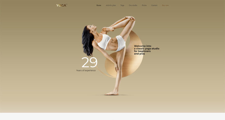
You should also avoid using unnecessary or superfluous font weights. They contribute little if anything and can slow page loading down. As illustrated in BeYoga2, readability is best when the line height is the same. The good use of white space is also important.
UX Mistake #2 – Giving Speed a Higher Priority than UX
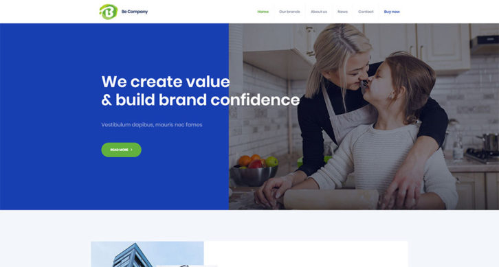
Your typical user generally has a quite short attention span. That’s one reason to avoid slow loading pages. But, it’s more important for a site to feature a UX that attracts and engages visitors and keeps them engaged. BeCompany is an excellent example of such a website.
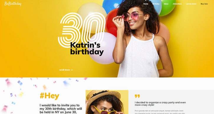
Speed won’t help much either if a website is cluttered. This tends to distract a visitor or make the experience downright unpleasant. You might be uncertain as for how best to balance speed with UX. In this case, start your project with a pre-built website like BeBirthday. It’s already optimized for speed and UX, so you won’t have to worry about the issue.
UX Mistake #3 – Not Paying Heed to Industry Standards
Industry standards currently encourage customization. This is not to be confused with diversification; a poor design approach.
Customization is based on the need to satisfy customer expectations. You can insist on using a universal design approach rather than focusing on user needs. Then, you do so at your own peril.
It’s important to research the niche or business you are working with up front. The BeApp3 pre-build website provides an example of UX best practices. They are the top in terms of customization for a given niche or business.
Is your business or client’s business happens to be a law firm? Then, sticking with the BeApp3 design structure simply won’t work. A visitor, not knowing quite what to expect, would probably exit the site rather quickly. BeLawyer offers the perfect design approach in this case.

UX Mistake #4 Improperly Prioritizing Elements
The Laboratory for Information Technology Evaluation recently released a study. The research revealed some interesting and important facts about website user behavior.
Once a user brings up a website, he or she will spend an average of 2.6 seconds staring at what is presented. This is before moving on to a specific area or section. Also, he or she will spend about 180 milliseconds before moving on to the next area.
The logo, the navigation menu, and the search box received the most attention. They are followed by social media links, the main image, and the written content. The content at the bottom of the page came the last.
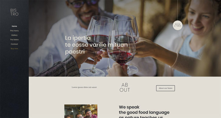
Getting the priorities right is important in keeping a user engaged. BePersonalTrainer and BeBistro show how proper prioritization will work for you.

Make it a point to always research user goals and expectations when you first get a project underway. Only then can you get a good grasp on how to prioritize and present design elements to satisfy their needs.
UX Mistake #5 – Working Toward Multiple Goals
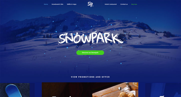
Working to satisfy multiple goals is seldom a good approach to getting an optimum result. Your single goal should be to lead a visitor toward their desired outcome. It also typically coincides with yours. If you present a visitor with multiple paths to follow, you only complicate his or her journey. Take a look at BeSnowpark and BeEBook pre-built websites. They are examples designed to keep you on the path of pursuing a single goal.
You need to:
- Build your design around an understanding of the user’s goal
- Choose a navigation pattern that best guides the user toward that goal
- Create a smooth, linear, step by step process for the user to follow
- Avoid creating distractions as the user proceeds along his or her path
- Make sure the CTA element stands out—contrasting colors work best

Be Theme’s the Solution
Writing the 5 mistakes on sticky notes and pasting them on your monitor is one possible approach. However, Be Theme has a better one.
It’s in your best interest to keep these recommendations in mind. But each of Be Theme’s 310 and counting pre-built websites has already taken them into account. You won’t need to worry about keeping up with the latest design trends and best practices.
It does not matter which industry or niche is in question. These pre-built website designs align with user expectations and favored navigation patterns.
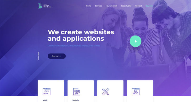
BeWebDeveloper is a good example.
Summarizing
- Your goal should be consistency; not diversification
- In terms of priority, UX is more important than speed
- Understand user expectations and their preferred navigation patterns before starting your design
- Prioritize design elements in accordance with user viewing habits
- Establish a SINGLE goal, and design around it
- Use pre-built websites. They make UX design easy.
These UX rules and standards apply to websites of all types and for all niches.
0 Comments