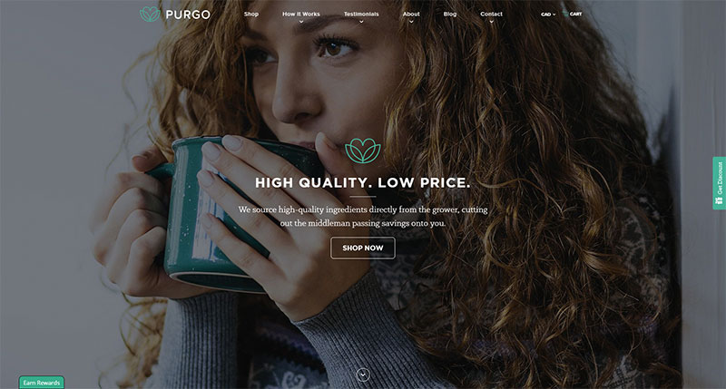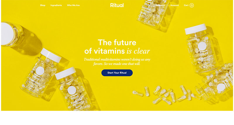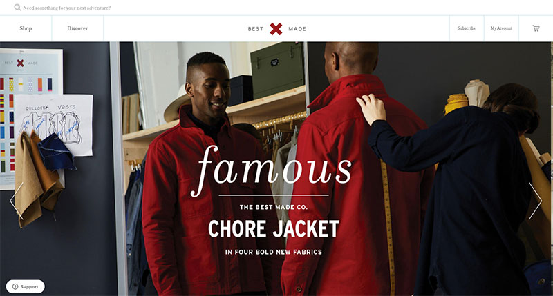
If you’ve ever spent time buying from an online store, you know that a pleasurable experience would motivate you to return. Customer satisfaction is key to designing an effective E-commerce site.
An effective E-commerce site allows the products to shine and then allows you to carry out purchases quickly and efficiently.
When designing an E-commerce site, the design should be so flawless that it becomes invisible. A fluid, well-designed site should work so well that users obtain results naturally. Badly designed E-commerce sites are frustrating. They result in customers abandoning the site before making a purchase or placing their products in a cart.
What do you consider when designing an E-commerce website?
Allow customers to refine their options
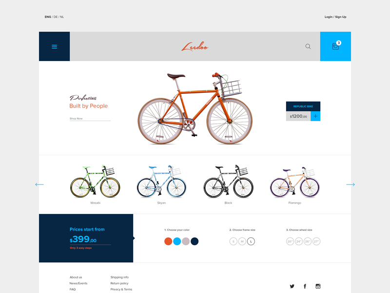
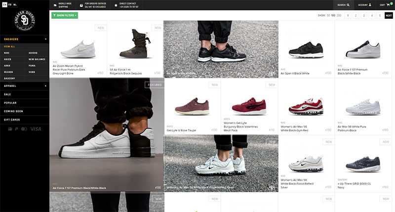
Create features which allow customers to refine their selection. If you have a T-shirt design website, and a client can hone in on navy blue shift or shirt dresses in her size, for example, this will assist her in finding what she needs easily.
Customers often get frustrated when finding perfect products which are not available. Refining their options is therefore helpful.
Let the customer undo options too
If a customer has refined their choices, but then finds that the options given are too narrow, allow them to increase options once again, without having to use a ‘back’ button which takes the customer back to the beginning again.
Make the search option visible
E-commerce sites offer so many different choices that a customer may not want or need. As a result, many customers who want a quick result will look up the item they do want and see if it is available on the site.
The search bar is therefore used an awful lot on E-commerce sites. By ensuring it is easily accessible, the search button assists with making sales.
Let customers know when a product is out of stock
It is often easier for an E-commerce site to keep products online even while temporarily out of stock.
This way, search engines know what products are generally available and will link clients to the store.
However, if it is not clear that these items are currently out of stock, clients will attempt to make purchases and will become angry and frustrated when they find out products are unavailable.
Make products look appealing
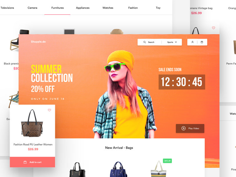
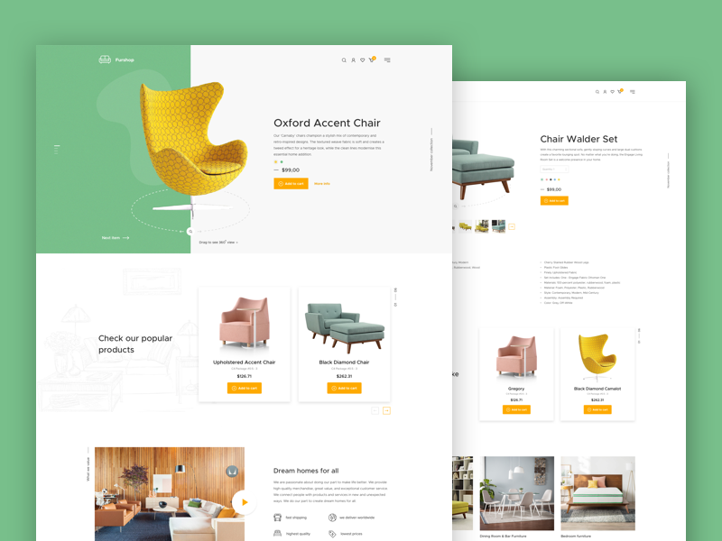
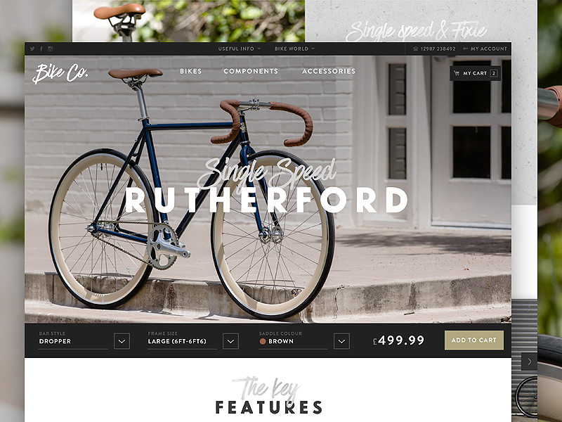
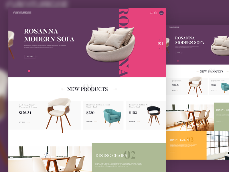
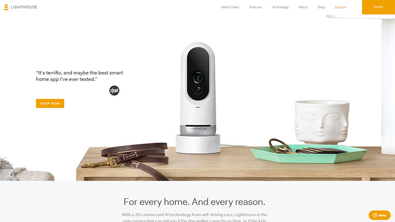
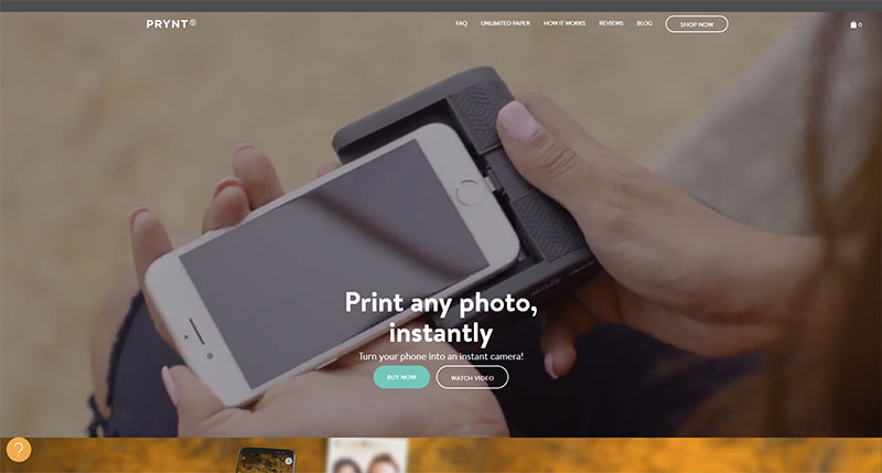
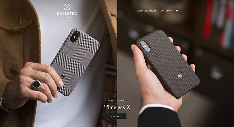
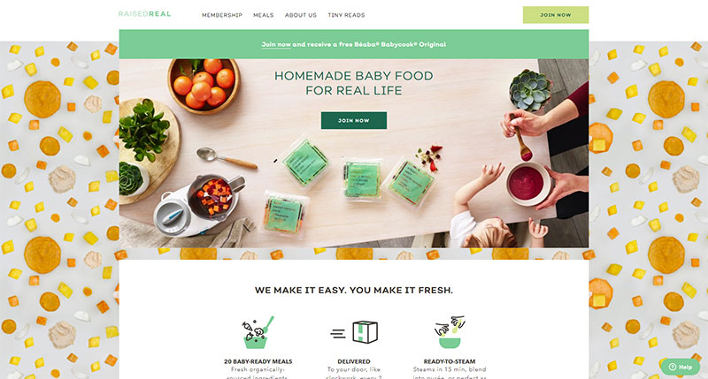
E-commerce is based on the visual appeal of a product. A client cannot touch a product. It is therefore important to make use of high-quality photographs to display products at their best.
Make use of attractive lighting to ensure your product is shown at its best. Use as many photos as you can and design the page around these images. You could also incorporate a slideshow into your design.
When showing off items, use photos which offer the option for clients to zoom in, adding texture to an item. Show your product from a number of different angles so that clients can get a clearer sense of what is on offer.
Make the shopping cart visible
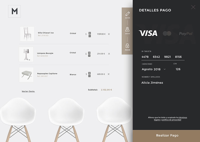
Shoppers who are purchasing a lot of items will not want to go straight to payout counters if they find a single item. Having a shopping basket on each page, so that customers can add more items to their cart will assist with making the site shopper friendly.
As a designer, you choose how to display your basket, but doing it in a way which will not clutter up the page is key. You could also introduce images of what has been included in the basket so that clients are not limited to simply a number when it comes to checking out.
Buying without registering
Customers often abandon a shopping cart if they are forced to register information. Instead of asking customers to register before a sale, it is helpful to allow the sale to proceed first.
Encourage clients to sign up after a sale has taken place by offering a discount on the next purchase. This method is known to increase sales.
Suggest related items
When customers express interest in a particular product, it can be helpful to recommend a different one. This often encourages clients to buy.
If a client is looking for a blue dress, recommend sandals or ballet shoes to go with it. A laptop might need a cover, a spare charger or batteries. This assists revenue and encourages customers to remain.
No added charges
Hidden charges change the price of the products a customer has bought. This often results in abandoned purchases. Instead, add all shipping costs, taxes and discounts so that clients are aware of the final product before making a purchase. This maintains customer trust.
Customers who are faced with hidden charges at the end of a purchase often abandon their purchases and lose trust in the site. Hidden costs at the end of a purchase are one of the easiest ways to send customers to the competition.
Offer the opportunity to reverse choices
If a customer decides to make a purchase, but then changes his mind, ensure that there is the opportunity to make changes or de-select an item. This will keep the client invested in the rest of his purchases without having to abandon the site or start all over again.
This way, customers who select an item but would prefer a different choice, or mistakenly select too many items, can quite simply edit their shopping carts without having to start over.
Make the final payment process easy
Final purchases are the goal of any site. It is also the time that customers are most at risk of abandoning their carts. Customers are often reluctant to fill in pages of information.
Keeping information to a minimum encourages users to trust your site. When clients are forced to fill in unnecessary information, this often results in feelings of uncertainty and mistrust. Clients may worry that their information is not secure. Only request what you need.
The shorter the process until final payment, the more likely a client is to pay for goods. This reduces time to experience buyers’ remorse, where customers leave purchases in the shopping carts. The easier it is to make payment, the more likely a customer will purchase a product. A happy customer is also more likely to return to your site.
Use SEO
Using SEO on your Ecommerce site encourages websites to drive traffic to the site. Use keywords for products that will ensure your website ranks highly with Google.
By optimizing your website, you will be able to increase sales as customers are aware of the products you are offering.
Summary
E-commerce is highly competitive. With rivals only a click away, ensuring an enjoyable customer experience is vital.
Ensure that your website showcases products, runs efficiently and keeps client experience in mind. This will ensure a successful shopping experience and returning customers.
