These days, the bulk of the traffic to websites originates from devices other than desktops. A small portion of it is from laptops but the major portion is from mobile devices of various screen sizes.
Gone are the days when businesses used to create separate desktop and mobile versions. In addition to being cost inefficient, maintaining two versions is a recipe for disaster. This is an important reason why frontend frameworks have become an essential part of the web developer toolkit.
Bootstrap is an open-source framework that uses HTML, CSS, and JavaScript to enable developers build awesome web applications. Bootstrap can be used to build applications for both desktop and mobile platforms. Bootstrap is particularly popular for building app frontend that scale to fit all screen sizes. With Bootstrap, developers ( and designers) could easily change all aspects of the frontend to fit the design and the UX requirements. For this reason, Bootstrap enabled themes have become mainstream in the recent years.
Login/signups are an essential component of all applications. In many cases, these forms are often the first thing a user encounters. If the design of these forms is inadequate or inconsistent with the UI design of the rest of the app, the user will have a hard time using the app.
In this short tutorial, I will demonstrate how to create a Bootstrap based component for the app UI. I will start with the signup form because it is the first form a new user sees. I will then show the code for the login form for the app.
Why Use Bootstrap?
A simple reason behind the Bootstrap’s popularity is the fact that it offers simple solutions for the common issues faced by the web developers. In many cases, Bootstrap is the ideal tool for creating headers and footers, responsive navbars, glyphicons and fonts, jumbotrons (banners), galleries, slideshows and other dynamic components.
Developers could use Bootstrap without worrying about integrating components into pre-existing frontend. The developers could build the components using the framework and then style them through custom CSS that confirms to the existing design requirements of the app. In many real world projects, developers often plugin pre-written snippets to add desired functionality in minimum time
Several common use cases of using Bootstrap in frontend projects include building complex layouts on a 12-column grid, creating device-specific layouts (that focus on responsive design) and ensure cross-browser compatibility (testing to check if the code works in popular browsers including Chrome, Firefox and Edge).
Prerequisites
For the purpose of this tutorial, I assume that you have PHP powered stack (a LAMP stack would do)on your web server.
To make sure that I don’t get sidetracked by server level issues, I decided to host my app on Cloudways PHP 7 hosting because it takes care of server and app setup and offers a powerful dev stack right out of the box.
Include Bootstrap Files via CDN
Content delivery networks (CDN) are files hosted on the web that you can include in your project. Using a CDN is the fastest way to setup Bootstrap within your project.
MaxCDN hosts the latest version that you could include in your code by using the following lines:
<!– Latest compiled and minified CSS –>
<link rel=”stylesheet” href=”https://maxcdn.bootstrapcdn.com/bootstrap/3.3.7/css/bootstrap.min.css“>
Later, I will implement Bootstrap features that depend on Bootstrap JavaScript as well as jQuery, so add them to the head element now. Add two script tags below the link tag:
<script src=”https://code.jquery.com/jquery-3.1.0.min.js”></script>
<script src=”bootstrap-3.3.7-dist/js/bootstrap.min.js”></script>
<!– Latest compiled and minified JavaScript –>
<script src=”https://maxcdn.bootstrapcdn.com/bootstrap/3.3.7/js/bootstrap.min.js”></script>
Setup Bootstrap
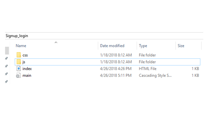
First, download Bootstrap Framework and then exact the folder by using command line or file manager. Next, copy the newly unzipped bootstrap-3.3.7-dist folder to the project’s root folder. Once done, you will see the following folder structure:
Create Signup Form View
The following code will create the view for the signup form:
<!DOCTYPE html>
<html>
<head>
<meta name=”viewport” content=”width=device-width, initial-scale=1″>
<link rel=”stylesheet” href=”https://maxcdn.bootstrapcdn.com/bootstrap/3.3.7/css/bootstrap.min.css”>
<link rel=”stylesheet” href=”main.css”>
<script src=”https://maxcdn.bootstrapcdn.com/bootstrap/3.3.7/js/bootstrap.min.js”></script>
</head>
<body>
<div class=”container”>
<div class=”row”>
<div class=”col-md-3″></div>
<div class=”col-md-5″>
<div style=”background: #00cb82;color:white; text-align:center”>
<h3><i>Sign Up</i></h3>
<p>Please fill in this form to create an account.</p>
</div>
<hr>
<form>
<div class=”form-group”>
<label for=”inputName”>FirstName</label>
<input type=”text” class=”form-control” id=”inputName” placeholder=”Name”>
</div>
<div class=”form-group”>
<label for=”inputLastName”>LastName</label>
<input type=”text” class=”form-control” id=”inputLastName” placeholder=”LastName”>
</div>
<div class=”form-group”>
<label for=”inputEmail”>Email</label>
<input type=”email” class=”form-control” id=”inputEmail” placeholder=”Email”>
</div>
<div class=”form-group”>
<label for=”inputPassword”>Password</label>
<input type=”password” class=”form-control” id=”inputPassword” placeholder=”Password”>
</div>
<div class=”form-group”>
<label for=”inputrePassword”>Retype Password</label>
<input type=”password” class=”form-control” id=”inputrePassword” placeholder=”Retype Password”>
</div>
<div class=”checkbox”>
<label><input type=”checkbox”> Remember me</label>
</div>
<button type=”submit” class=”btn btn-primary” style=”width:100%”>Register</button>
</form>
<div class=”hint-text”>Already have an account? <a href=”index.html”>Login here</a></div>
</div>
</div>
</body>
</html>
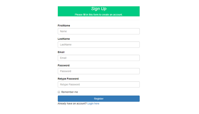
The following screenshot shows how the above code would look in action. As you can see the form is very simple. The good thing is the easy extension of this form by adding/removing fields. For this, you could simply modify the HTML template.
Create Login Form View
Bootstrap offers several classes to create beautiful and creative looking forms, button, and other UI elements.
Create a file named index.html file and paste the following code in it:
<!DOCTYPE html>
<html lang=”en”>
<head>
<meta charset=”utf-8″>
<meta http-equiv=”X-UA-Compatible” content=”IE=edge”>
<meta name=”viewport” content=”width=device-width, initial-scale=1, shrink-to-fit=no”>
<link rel=”stylesheet” href=”https://maxcdn.bootstrapcdn.com/bootstrap/3.3.7/css/bootstrap.min.css”>
<link rel=”stylesheet” href=”main.css”>
<script src=”https://maxcdn.bootstrapcdn.com/bootstrap/3.3.7/js/bootstrap.min.js”></script>
</head>
<body>
<div class=”container”>
<div class=”row”>
<div class=”col-sm-6 col-md-4 col-md-offset-4″>
<h1 class=”text-center title-log”>Sign in to your Application Portal</h1>
<div class=”account-wall”>
<img class=”pro-image” src=”photo.jpg” width=”120″
alt=””>
<form class=”signin-fo”>
<input type=”text” class=”form-control” placeholder=”Email” required autofocus> <br>
<input type=”password” class=”form-control” placeholder=”Password” required>
<button class=”btn btn-lg btn-primary btn-block” type=”submit”>
Sign in</button>
<label class=”checkbox pull-left”>
<input type=”checkbox” value=”remember-me”>
Remember me
</label>
<a href=”#” class=”pull-right need-help”>Need help? </a><span class=”clearfix”></span>
</form>
</div>
<a href=”#” class=”text-center new-account”>Create an account </a>
</div>
</div>
</div>
</body>
</html>
Styling the Login Form
The above code creates a blad looking form. Next, I will use custom CSS to style the form. For this, create a file named main.css and paste the following code in it:
.signin-fo
{
max-width: 330px;
padding: 15px;
margin: 0 auto;
}
.signin-fo .signin-fo-heading, .signin-fo .checkbox
{
margin-bottom: 10px;
}
.signin-fo .checkbox
{
font-weight: normal;
}
.signin-fo .form-control
{
position: relative;
font-size: 16px;
height: auto;
padding: 10px;
-webkit-box-sizing: border-box;
-moz-box-sizing: border-box;
box-sizing: border-box;
}
.signin-fo .form-control:focus
{
z-index: 2;
}
.signin-fo input[type=”text”]
{
margin-bottom: -1px;
border-bottom-left-radius: 0;
border-bottom-right-radius: 0;
}
.signin-fo input[type=”password”]
{
margin-bottom: 10px;
border-top-left-radius: 0;
border-top-right-radius: 0;
}
.account-wall
{
margin-top: 20px;
padding: 40px 0px 20px 0px;
background-color: #f7f7f7;
-moz-box-shadow: 0px 2px 2px rgba(0, 0, 0, 0.3);
-webkit-box-shadow: 0px 2px 2px rgba(0, 0, 0, 0.3);
box-shadow: 0px 2px 2px rgba(0, 0, 0, 0.3);
}
.title-log
{
color: #555;
font-size: 18px;
font-weight: 400;
display: block;
}
.pro-image
{
width: 96px;
height: 96px;
margin: 0 auto 10px;
display: block;
-moz-border-radius: 50%;
-webkit-border-radius: 50%;
border-radius: 50%;
}
.need-help
{
margin-top: 10px;
}
.new-account
{
display: block;
margin-top: 10px;
}
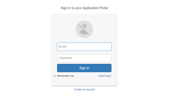
Here is how the signup form looks like after the custom CSS is applied. If your forms are part of a larger project, I recommend using the CSS for other screens of the app as the guideline for the custom CSS used with the form.
Wrapping Up
This short Bootstrap tutorial was about creating a simple signup/login form component. As you can see, Bootstrap makes it increadly easy to develop forms that easily fit the project’s requirements. To give finishing touches, I used custom CSS for styling the form. If you need help in understanding the code, do drop a comment below.
Author bio
Pardeep is a PHP Community Manager at Cloudways – A Managed PHP Hosting Platform. He loves to work on Open source platform, Frameworks and working on new ideas. You can email him at [email protected]. Follow him on Twitter and LinkedIn.


