For the uninitiated: variable fonts are basically special fonts with animatable properties like width, weight and slant. They can open up some very effective animation possibilities, and with the wave of stretched text appearing in Motion Design; variable fonts are very much on-trend.
First, a little terminology
A new word you’ll come across while working with variable fonts is Axis (or Axes). These are the variable properties attached to the font you are using. Depending on the font you use, there is usually 2-6 Axis built into it.
What we’re working towards
Here’s the effect we’re going to create:

1. Get some variable fonts
We’ll need to install some variable fonts. These are available from multiple different vendors and some may be included in your Adobe subscription. Envato has a fantastic array of variable fonts, so I’m going to choose a couple of those:


For this example, I’m going to start with the font Griggs from Envato, then later I’ll be using Manufaktur, but you can use any variable fonts available to you.
Install as you would standard fonts. The file will be a .ttf, .otf or .otvf format.
A small portion of variable fonts we installed did not appear to be compatible with After Effects.
2. After Effects setup
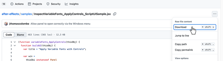
After Effects does not currently support variable fonts straight out of the box, but Adobe has released a special script which we just need to install. Head over to the Adobe Github and download the script by clicking the “…” button and selecting Download:

Once you have the .jsx file; open up After Effects. Under the File menu; click Scripts > Install script file… and navigate to the file on your computer. Click Select and you should get the following confirmation:
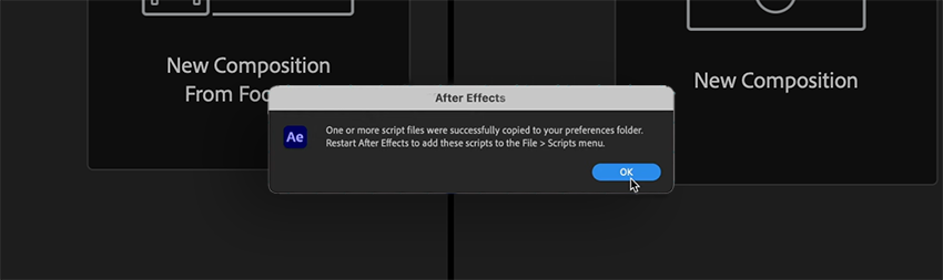

We then need to restart After Effects for the installation to take effect.
3. Getting familiar with variable fonts
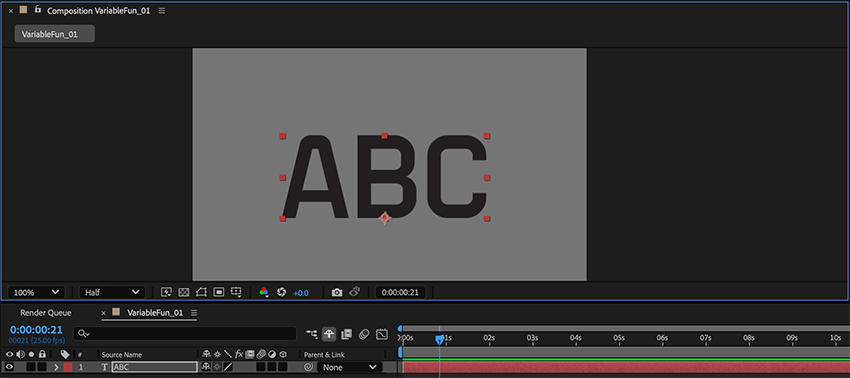
Reopen After Effects and start a new project (File > New Project). Create a new composition (Composition > New composition). I’m going to make mine 15 secs long and a square ratio of 1080x1080px. The rest of the settings won’t matter for this project.
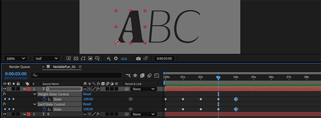
Create a new type layer by clicking the T icon in the top menu or T on your keyboard and click anywhere in the comp viewer panel to start typing. Type “ABC” and, in the Properties panel, scale up the font size to fill about a 6th of the comp. The font used at this point doesn’t matter at all.

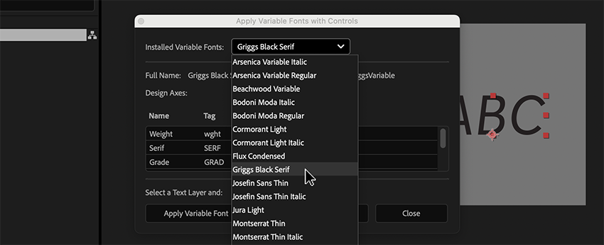
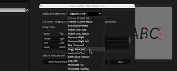
Next, in the File Menu Click on Scripts > InspectVariableFonts_ApplyControls_ScriptUISample.jsx. This should open a panel named Apply Variable Fonts With Controls.
Drop down the Installed Variable Fonts menu and you should see any variable fonts you have installed. Choose the font you wish to use (I’m choosing Griggs).

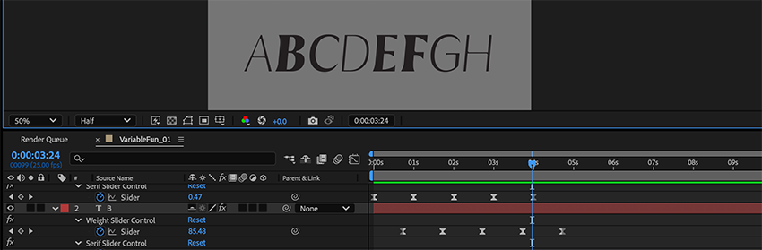
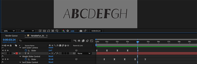
Select your text layer and, back in this window, click Apply Variable Font. You should see it change to the font. Then click Apply Controls for Axes. You should now see effects applied to the layer, giving control of the parameters included for that font.
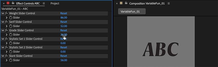
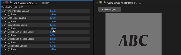
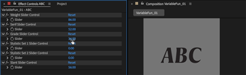
Have a play around with the sliders and you’ll see that you can now keyframe parameters like Width, Weight and Slant, depending on the font. Cool Right!?
4. Separate letters
Now that you’ve experimented with the controls, you might notice that something is missing. We are not able to control seperate letters within a text layer, the way we can with the per-character 3D text animators on regular AE text layers.
If you’re anything like me, you’ll want that capability, and the next steps will give you that control.
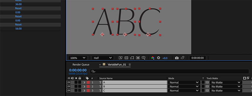
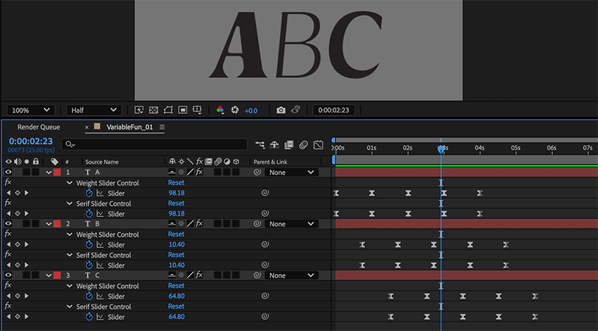
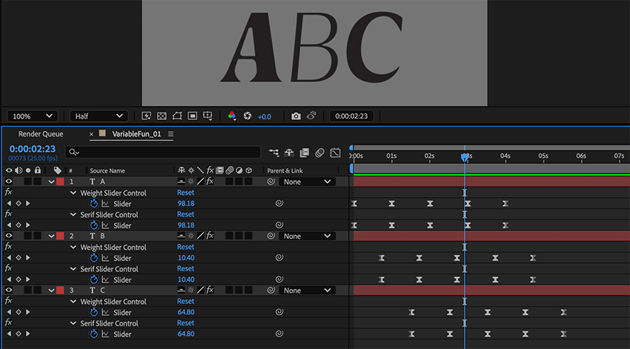
With our Variable Font Text Layer selected, we are going to duplicate it twice so we have three layers. Edit the text on each layer to have one letter only. move the letters along the x-space so the they are back in line in the correct order again (does not need to be perfect spacing).

5. Scripting time!
At this point we have three letters in a row, all with their own animatable type qualities. But when we animate the variable type sliders on a letter, the letters themselves will stay in one place, and the spaces between them will grow and shrink unnaturally. Letters may even overlap, and we do not want that.
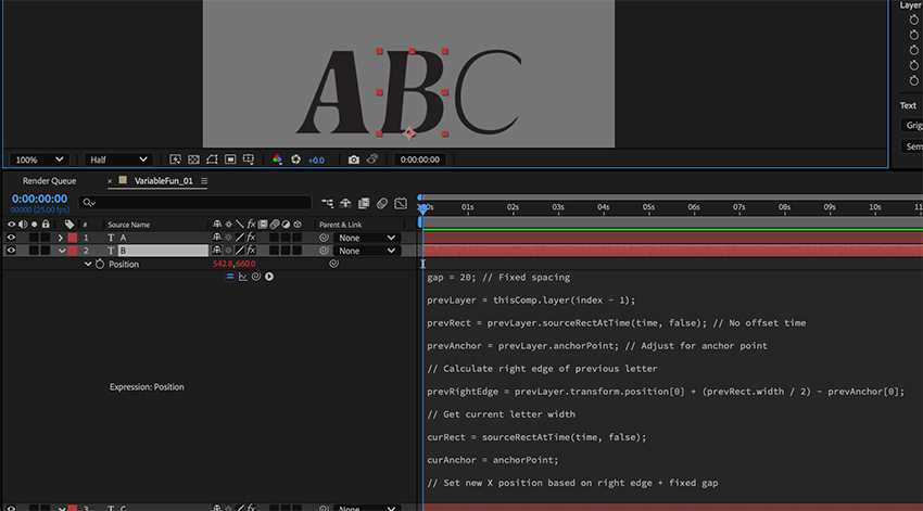
We need to create a script that looks at the letters, and positions them with correct spacing, animating as the letters themselves change.
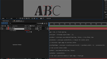
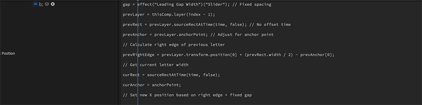
Twirl down the position property on the second and third layers (not Layer 1). Holding ALT (PC) or Option (MAC); click on the stopwatch icon next to the word Position. This will create an expression for the position of that layer. We will copy and paste the following text into the expression:
1 |
gap = 20; // Fixed spacing |
2 |
|
3 |
prevLayer = thisComp.layer(index - 1); |
4 |
|
5 |
prevRect = prevLayer.sourceRectAtTime(time, false); // No offset time |
6 |
|
7 |
prevAnchor = prevLayer.anchorPoint; // Adjust for anchor point |
8 |
|
9 |
// Calculate right edge of previous letter |
10 |
|
11 |
prevRightEdge = prevLayer.transform.position[0] + (prevRect.width / 2) - prevAnchor[0]; |
12 |
|
13 |
// Get current letter width |
14 |
|
15 |
curRect = sourceRectAtTime(time, false); |
16 |
|
17 |
curAnchor = anchorPoint; |
18 |
|
19 |
// Set new X position based on right edge + fixed gap |
20 |
|
21 |
newX = prevRightEdge + gap + (curRect.width / 2) - curAnchor[0]; |
22 |
|
23 |
// Maintain Y position |
24 |
|
25 |
[newX, transform.position[1]]; |
Each layer should reposition itself with a more natural spacing.
If you now adjust axis sliders on the A and/or B layer, the following letter(s) should shift to accommodate the change.

What is this code doing?
As you can see, we have included some comments inside the code to help you understand what each line is doing:
- Firstly we define a space size. In this case it is 20px
- Second, we are adjusting for anchor point changes. This means: if we change a letter, i.e. from ‘W’ to ‘I’, and its size therefore changes; the anchor point will automatically adjust to locate itself in the center-bottom of the letter.
- The Third command is assessing the layer’s own current width.
- Fourth; we are defining the right position based on the above factors.
- The last part just keeps the Y position consistent.
6. Add space/kerning control
This is looking great! You are going to notice as we build on the effect though, that the default gap between letters might not be exactly what you want. To remedy this, we are going to add a control on each letter to adjust its kerning and/or add a space between words. Again, we are not adding this to the first letter, but will need to repeat the following for each other letter in the line (in my case B & C).
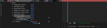
With the second layer selected (B, in my case), click on the Effect menu from the top of the screen and find Expression Controls > Slider Control. A new effect will be added to the layer called “Slider Control”. Right-click on the name of the effect and select rename. We will rename this slider control effect to: “Leading Gap Width”.
Set this new slider’s value to 20.
With the layer still selected, hit P on your keyboard to reveal the position property if it is not currently visible, and click the > icon next to the word Position to twirl down and reveal the expression text.
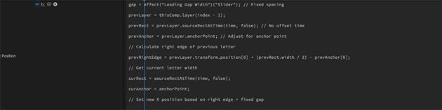
Click on the expression text to enter editing mode and highlight the number “20” in the first line of the code.
Then, with the number 20 highlighted, click and drag the pickwhip to link it to the value of the “Leading Gap Width” slider (pictured)
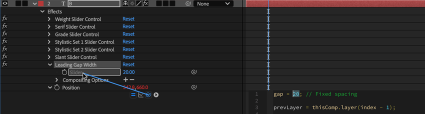
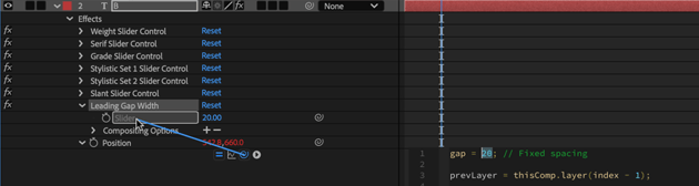
Your code should now look something like this:
If you now adjust the “Leading Gap Width” slider, you will notice that it gives us the control we need over kerning, and if we set it to around 50 or 60, it feels more like a space between words. Repeat this step for the “C” layer.
7. Create an animated loop
It’s time to test our creation, and put it in motion!
Select your first layer and press E on your keyboard to reveal all effects. With the Timecode set to 00:00:00, set one or more of the variable font properties’ values to 0. Set a keyframe for the value(s) by clicking the stopwatch icon for that value.
Move the Timeline to about 00:01:00 (one second) and set the value to the maximum for that property (i.e. Weight usually goes up to 100, so we’ll set weight to 100). Set a keyframe for the value(s).
Move the Timeline to about 00:02:00 (two seconds) and set the value back to 0. Set a keyframe for the value(s).
Copy these two keyframes by clicking + dragging in the timeline to select them and using CTRL/CMD + C. Move the timeline marker to 00:03:00 (three seconds) and paste them CTRL/CMD + V.
Finish this animated loop by moving to 00:06:00 on the timeline, and setting a keyframe with value of 0. You now have 5 keyframes on Layer 1.
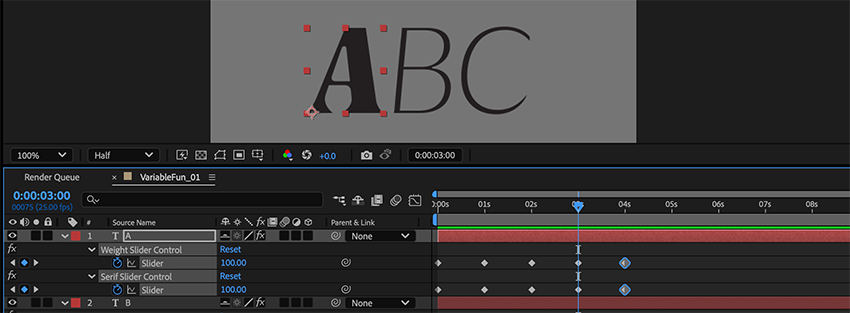

Click + drag to select all keyframes and paste them into the matching effect’s slider on your remaining 2 layers.
Select all keyframes and hit F9 on your keyboard to make all the keyframes ease in and out.
Offset the layers’ animations a little by dragging the keyframes left and right in the timeline and see what sort of effect this creates.
8. Change anchor point for layer 1
If you prefer the left side of your first letter to stay static, rather than scaling up and down from its center, do this extra optional step:
Select Layer 1 (A) and hit Y on your keyboard to enter Pan Behind tool (Anchor Point).
While holding CMD(Mac) or CTRL(PC), click and drag the anchor point of Layer 1 to its bottom left corner. It should snap into place.
You will need to update the anchor point again if you change the letter in this layer.


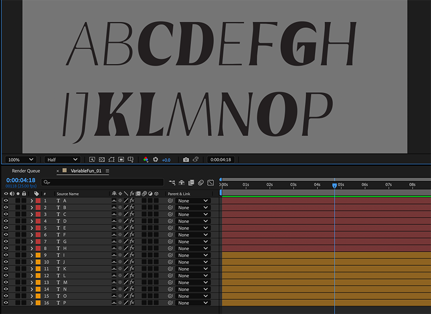
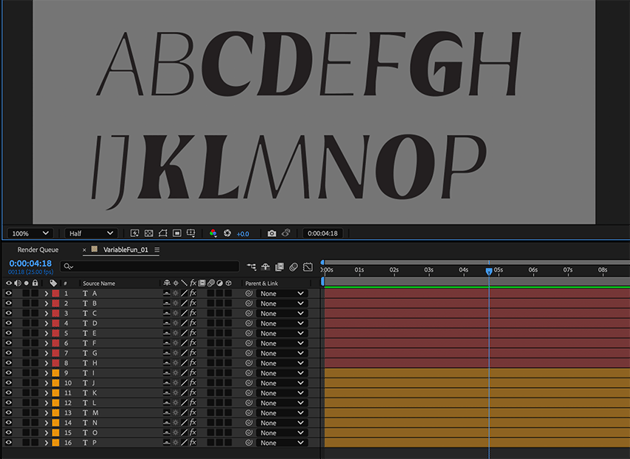
9. Make some more text!
Good news! The hard bit is done! You now have a fully-functional template to create any piece of text you need, with individually animated per-character variable text.
Let’s expand our canvas a bit by pressing shift+K and in Composition Settings change the width to 1920.
Try duplicating the last letter in your line and moving it to the bottom of the layer stack. If everything is correctly set up, the letter should automatically be added to the end of the word. You can also switch to the type tool (CTRL/CMD + T) and change the letter to anything you want it to be. You can do this as many times as you want, to spell the text you need.
To reposition the line of type; select all the layers and click + drag it up, down, left and/or right. Hold Shift while dragging for precise horizontal or vertical control.

To create a new line of type, simply duplicate all layers of your first line, move them all to the bottom of the layer stack (but keep them in the same order), and, in the comp viewer; Shift+Click & drag them vertically to position them below the first line.
I like to change the layer color for the new line just for ease of use. You can do this by clicking the colored square on the layers and selecting a new color from the pop-up menu.

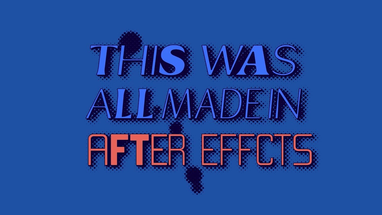
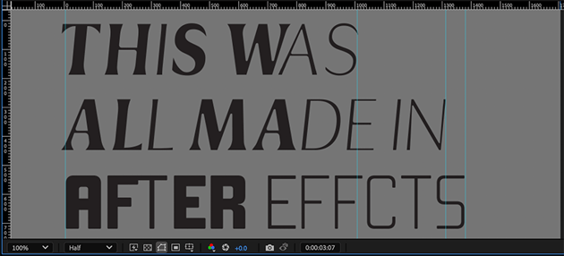
10. Create a slogan
I want to create a slogan to really test out our creation.
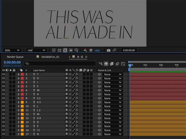
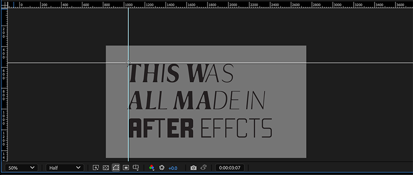
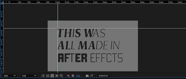
Let’s say I want to create the phrase: “THIS WAS ALL MADE IN AFTER EFFECTS”.
I can fit “THIS WAS ALL MADE IN” in the two lines we have created, providing I duplicate the last two letters as we did in step 6.


To add another line, we’ll want to shrink the type down a bit. If we select all layers and reduce the font size, it should maintain all the spacing proportionally.
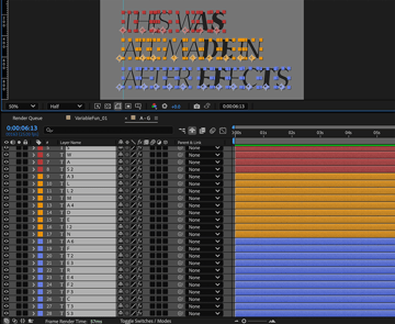
Duplicate the second line (layers 9-17, in my case) as we did in step 6, and remember to change the layer color.
Edit the new line of text to read “AFTER EFFECTS”. Remember to use the “Leading Gap Width” sliders we set up to edit spaces and kerning.


11. Add more fonts
Now is a good time to demonstrate using multiple fonts!
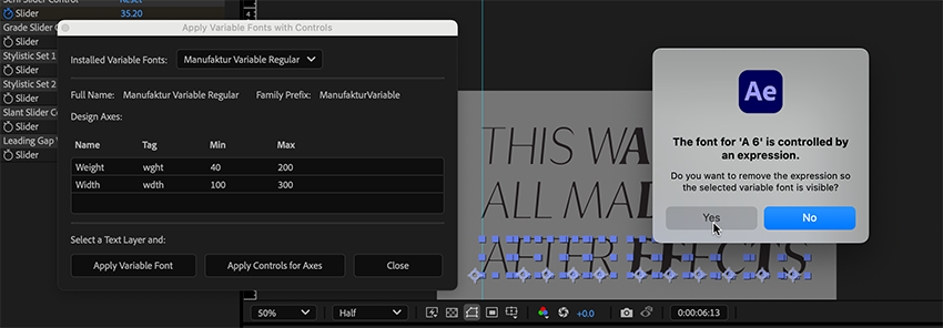
Select all the letters in your last line of text, and again, from the File menu, open Scripts > InspectVariableFonts_ApplyControls_ScriptUISample.jsx.
In the Installed Variable Fonts dropdown, select another variable font. I’m going to select Manufaktur Variable Regular, another font I downloaded from Envato. Nothing will happen just yet.
With the letters of your last line of text still selected, click Apply Variable Font in the variable fonts window.
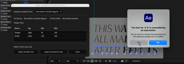
A pop up will appear asking if you want to remove the existing expression. click Yes. And don’t panic. These will be restored shortly. It will ask you the same thing for each layer selected so keep clicking Yes.
Keep the Apply Variable Fonts With Controls window open.

Now with all the letters still selected; click Apply Controls for Axes. If the new font shares the axes you animated on the other font, its animation should be restored.
I.e; I animated the Weight and Serif sliders when using Griggs, and when I changed those layers to Manufactur, it retained the Weight animation, but not the Serif animation, because Manufactur does not have that Axis. It does retain those keyframes though, in case I change again to a font with a Serif axis.
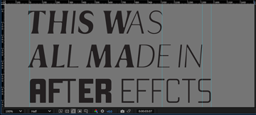
12. Consistent line width
This is looking great! But a possible client feedback might go something like:
“I don’t love how the overall length of the lines keeps moving”
This last step will solve that issue for you!! It’s a bit manual, but its pretty quick and works well.
Start by measuring each line. We can do this by pressing CMD+R (MAC) / CTRL (PC) to bring up the rulers in your viewer. Click and drag from the top-left corner to reposition the top rulers starting point (0) to be in line with the start of your text lines.
Now (with your timeline set at a point where there’s an even spread of bold and light letters), look at the top ruler and jot down a width measurement for each line (doesn’t need to be exact). Dragging guides out from the ruler areas can help with this.
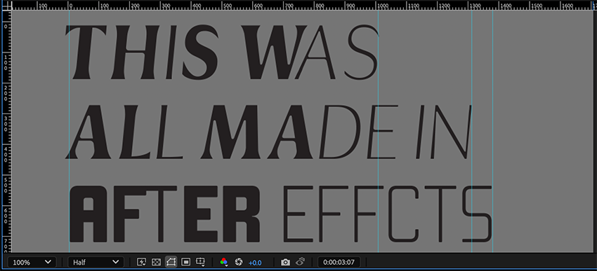
My measurements are:
- Line 1: 1010
- Line 2: 1310
- Line 3: 1380
Keep these handy.
Now create three Nulls, one for each of the layers (Layer > New > Null Object). Color code the nulls to match your text lines, and position them at the left-hand edge of the first letter of each. Name them Scaler 01, 02, & 03. The vertical placement of these nulls doesn’t matter.


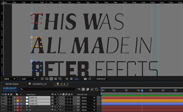
At this point we need to precompose our lines. Select all the red layers (including the Scaler) and Right-click > Pre-Compose. Name the new Composition “This Was”.
Repeat precomping for the orange layers (“Made In”) and blue layers (”After Effects”).
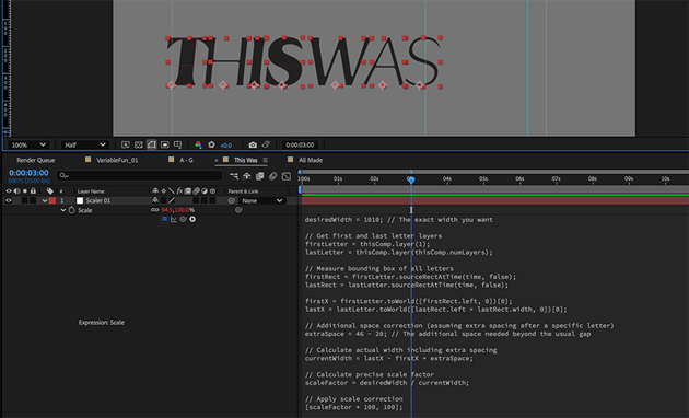
Now, in the “This Was” Precomp, create an expression for the null’s scale property. With the null selected, hit S to show the scale property. Hold down OPT (MAC) / ALT (PC), and click on the stopwatch icon next to the word Scale.Click in the expression text to edit it. Replace the existing text with the following script:
1 |
desiredWidth = 800; // The exact width you want |
2 |
|
3 |
// Get first and last letter layers |
4 |
|
5 |
firstLetter = thisComp.layer(1); |
6 |
|
7 |
lastLetter = thisComp.layer(thisComp.numLayers); |
8 |
|
9 |
// Measure bounding box of all letters |
10 |
|
11 |
firstRect = firstLetter.sourceRectAtTime(time, false); |
12 |
|
13 |
lastRect = lastLetter.sourceRectAtTime(time, false); |
14 |
|
15 |
firstX = firstLetter.toWorld([firstRect.left, 0])[0]; |
16 |
|
17 |
lastX = lastLetter.toWorld([lastRect.left + lastRect.width, 0])[0]; |
18 |
|
19 |
// Additional space correction (assuming extra spacing after a specific letter) |
20 |
|
21 |
extraSpace = 46 - 20; // The additional space needed beyond the usual gap |
22 |
|
23 |
// Calculate actual width including extra spacing |
24 |
|
25 |
currentWidth = lastX - firstX + extraSpace; |
26 |
|
27 |
// Calculate precise scale factor
|
28 |
|
29 |
scaleFactor = desiredWidth / currentWidth; |
30 |
|
31 |
// Apply scale correction |
32 |
|
33 |
[scaleFactor * 100, 100]; |
Once pasted in, You’ll need to change the “desired width” on line 2 from 800 to the length you measured for the current line of text, i.e. for me, my first line measured 1010px, so I’ll replace 600 with 1010.
After editing the desired length in the expression, select all the letters for this line of text (line 1 letters are T,H,I,S,W,A & S) and parent them to the scaler null.
You will still be able to tweak this result after parenting the letters, by adjusting the desiredWidth value inside the scaler script, and/or adjusting the Leading Gap Width sliders on your letters.


What is this script doing?
This “scaler script” measures the total width of all animated letters, including any extra spaces, and calculates how much they need to be scaled to always fit within a set width. It then applies this scaling only to the X-axis to keep the text looking natural, ensuring the spacing stays consistent without (too much) stretching or squishing. Repeat the Scaler script application for your other two comps (All Made In, and After Effects)
13. Final touch
All done! The last final touch is to go back into the VariableFun_01 comp and adjust your layers to a centered alignment. Change colors and add any effects you please to make it pop!