In the age of instant gratification, attention spans are shorter than a tweet on a Tuesday. That’s why your website, the digital doorknob to your business, needs to make a stellar first impression.
Studies show that a whopping 95% of a visitor’s initial judgment is based on design alone. Now, that’s a statistic that could send shivers down the spine of even the most seasoned entrepreneur.
But, don’t worry!
Because just like a fresh coat of paint can revitalize your home, modern website features can breathe new life into your online presence, potentially boosting those ever-important sales numbers.
So, the question remains: what cutting-edge design trends are poised to dominate the web landscape in 2025 and beyond? And more importantly, how can you leverage these trends to transform your website?
This blog aims to decipher these questions and be your guide to unlocking better responses and increased sales, one feature at a time!
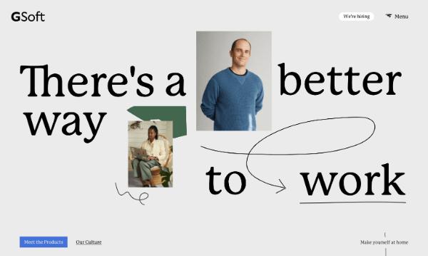
Custom Illustrations
Let’s face it, the internet is drowning in a sea of generic stock photos. Remember that blurry handshake or the woman pointing enthusiastically at…well, something? Yawn.
In this digital era, a modern website feature that encourages response is taking a cue from the elegance and artistry of print publishing, with custom illustrations leading the charge.
Custom illustrations breathe life into your brand, fostering a deeper connection with your target audience. They serve as a visual language, meticulously crafted to resonate with your brand’s core values and aesthetic. Unlike cookie-cutter stock imagery, custom illustrations offer the distinct advantage of absolute ownership. They become an intrinsic part of your brand identity, instantly recognizable and difficult to replicate.
Case Study – A prime example of this trend comes from the work of renowned illustrator Alice Lee. Lee’s captivating custom illustrations, designed for brands like Macy’s and The Washington Post, often evoke a storybook aesthetic. Her website exemplifies the power of illustrations. The header transforms with your cursor movement, drawing you deeper into her artistic world. Lee’s work highlights the growing desire for brand illustrations that feel handcrafted and narrative-driven.
The Rise of Interactive Design
With advancements in coding capabilities, illustrations are no longer confined to the flat, two-dimensional. The new website features list is all about interactive elements that enhance user engagement. Here are some exciting possibilities:
- Gradient Shading: Subtle transitions between colors create a dynamic and visually captivating experience.
- Digital Cut-Out Styles: These illustrations mimic layered paper textures, adding a touch of whimsy and visual depth.
- 3D Cursor Interaction: Interactive elements that respond to user movement create a playful and immersive website experience.
These advancements blur the lines between static images and dynamic experiences, keeping your users engaged and leaving a lasting impression.
White Space
Modern website features are experiencing a resurgence of minimalism, with a renewed focus on the purposeful use of white space, mirroring the clean layouts found in high-quality print magazines. This seemingly empty space plays a critical role in user experience (UX) by guiding visitors through your website, enhancing comprehension, and ultimately driving conversions.
Studies have shown that increasing white space can significantly improve readability and 20% increase in user engagement. A website overloaded with text and visuals can be overwhelming and deter visitors from delving deeper into your content.
White space separates elements, creating a visual hierarchy where no single element dominates, ensuring a balanced and cohesive experience. This breathing room allows viewers’ eyes to rest comfortably as they navigate the page, naturally drawn from one element to the next.
Furthermore, white space plays a crucial role in establishing relationships between different website components. When elements are positioned close together with minimal white space separating them, the human eye perceives them as a unified whole. Conversely, elements positioned with ample white space appear distinct and independent. This ability to control visual relationships allows you to guide users’ attention toward specific areas, such as calls to action (CTAs), key information, or captivating visuals.
Case Study – A great illustration of the power of white space is Myles Nguyen’s digital portfolio as a web and interaction designer. By incorporating ample white space around his work samples and concise bio, Myles creates a clean and polished website that allows his work to take center stage, fostering a positive user experience.
Incorporating these insights into white space will equip you to design user-centric website features that encourage responses and guide visitors toward the desired actions, ultimately boosting your website’s success.
Increased Focus on UX/UI
Remember that awkward website you visited in 2010, the one with flashing banners, a dozen fonts fighting for attention, and information buried under a sea of text? Yeah, those days are over. In this digital age, web design is all about creating a conversation, and that conversation starts with prioritizing UX/UI. It’s all about making your visitor feel comfortable and welcome. This means:
- Lightning speed: No one wants to wait for an internet page to load any more than they want to wait in line at the DMV.
- Declutter your website: White space is the trend! It allows users to breathe and focus on your message.
- Content that flows: SEO is still king, but make sure your content is scannable, relevant, and keeps users engaged.
- A multimedia masterpiece: Make it interesting with images, videos, and other interactive elements.
But UX isn’t a party of one. It goes hand-in-hand with UI (user interface), which is basically the conversation itself. Here’s how to make sure you’re having a good one:
- Speak their language: Voice-enabled interfaces are the future, so make sure your website can understand and respond to voice commands.
- A picture is worth a thousand words (but captions help): Not everyone can hear videos, so include captions for accessibility and SEO and the same goes for video transcriptions.
- Keep it clean: Flashy elements might look cool at first, but they can be distracting and hinder the user experience.
- Motion with a purpose: Motion design can be a great tool, but use it thoughtfully to guide users, not overwhelm them.
- Be mobile friendly because the world runs on smartphones (Literally) – Over half of all internet traffic comes from smartphones, and that number is only going to climb. So, if your website doesn’t translate flawlessly to mobile screens, you’re missing out on a huge chunk of potential visitors.
Case Study – Check out the Greek yogurt brand – Chobani. Their computer and mobile website features are a masterclass in clean design, with ample white space and easy-to-scan content. Mouthwatering product photos take center stage, and a clear call-to-action banner at the bottom makes signing up for exclusive yogurt offers a no-brainer. See? Good design is all about making things easy and visually appealing for your audience.
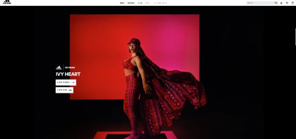
Image Headers
Let’s face it, first impressions matter. In the digital age, that first impression often comes in the form of a website’s header. Modern designers are ditching the text-heavy approach and opting for a bolder option: full-image headers. But this isn’t just a fleeting trend – it’s a strategic move to grab your audience’s attention and keep them glued to the screen.
Here’s why this approach is so powerful:
- Instant Engagement: People are visual creatures. A well-chosen image can capture a visitor’s attention in a split second, sparking their curiosity and encouraging them to explore further. Text takes time to read and process, but an image speaks a thousand words (literally, with the right context!).
- Emotional Connection: Images have the uncanny ability to evoke emotions. A powerful landscape shot can inspire awe, a close-up of a delicious dish can make your stomach rumble, and a heartwarming family photo can tug at your heartstrings. Use this power to create an emotional connection with your audience and build a stronger brand identity.
- Setting the Stage: The right image sets the tone for your entire website. A minimalist black-and-white photo conveys a sense of sophistication, while a burst of color injects energy and fun. Think of your image header as the opening act at a concert – it primes the audience for what’s to come.
Case Study – Adidas, for instance, uses a bold image of none other than Beyoncé to instantly draw users in. Why is this website feature so effective? First, Beyoncé is a cultural icon, but more importantly, her confident stance and dynamic energy perfectly embody the brand’s message of empowerment. It’s a visual representation of what Adidas stands for, without needing a single word.
Parallax Scrolling
Websites are ditching their flat, static look and embracing a more dynamic experience.
Parallax scrolling is a modern website feature trend that’s poised to take the upcoming digital age by storm. But what exactly is it, and why should you care?
With parallax scrolling, different elements on the page move at varying speeds as you scroll, creating a captivating illusion of depth and dimension. Think of it like looking out of a moving car window – the closer objects whiz by quickly, while distant landscapes seem to glide past smoothly. This creates a sense of immersion, drawing users deeper into your website’s narrative.
Here are a few ways it can be used to create truly unforgettable experiences:
- Unveiling the Story One Scroll at a Time: Parallax scrolling can take storytelling on websites to a whole new level. By revealing content progressively as you scroll, it lets you build anticipation and guide users through a narrative journey.
- Bringing Images to Life with a Touch of Scroll: Static images are great, but what if they could come alive with a scroll? Parallax scrolling lets you do just that. By triggering animations as users scroll, you can transform ordinary images into interactive experiences.
- The Power of Background Videos: Sometimes videos can slow down a website’s loading time. Parallax scrolling only plays the background video when users scroll down to that section. This way, you get the impact of a video without sacrificing website performance.
Case Study – Phyll, a smoothie brand known for its fresh and vibrant concoctions, uses parallax scrolling to perfection. As you scroll down their website, plump berries seem to float effortlessly, while leafy greens gently hover in the background. These elements move at a slower pace than the foreground content, creating a subtle parallax effect. It’s like a playful invitation to explore the natural ingredients that go into each delicious Phyll smoothie.
Conclusion
Do you feel like you’ve only scratched the surface of what a modern website features list can be? Don’t worry, that hunger for innovation is a good sign!
Here’s the thing: modern web design isn’t just about aesthetics (although a stunning site never hurts!). It’s about crafting an interactive, user-friendly experience that keeps visitors engaged and wanting more.
But where do you go from here?
As a website designing company, we get it – revamping a website can feel daunting. That’s why our team of passionate designers and developers is here to help you transform your digital presence while keeping its authenticity intact.
Don’t settle for a website that’s past its prime. Contact us today and let’s discuss how we can craft a website that’s not only modern but also speaks directly to your target audience.
The post 5 Website Features to Help Your Business Thrive in the Digital Age first appeared on Designbeep.