Our generation has witnessed the evolution of website design in a major way. If you have been the child of the 1990s, you have experienced websites which were mostly text based. Based on the path of the table based sites and online page builders, flash designing, PHP and CSS, Java Scripts and Semantics, Web 2.0 and the mobile website, the website designers have always taken center stage for representing the World Wide Web to us. 2010s have just started and the role of website designers is far from over.
The phenomenon of Parallax scrolling has become quite a roar in the recent times. Those of you who are not familiar with Parallax design can have some amount of enlightenment through the following lines.
The Parallax Design is a scrolling technique which helps in conjuring the illusion of the depth of field to the user. The technique uses a combination of multiple layers of information presented through graphics and texts. These clusters of information are sped up to create the effect of movement, depth and 3 dimensional illusions. With one flip of the scrolling wheel, the user can get hold of this illusion. This illusion can be used to immerse the website visitor into absolute interactivity of the website. But how far parallax can be used to generate business and what makes a particular website parallax? These are few of the questions which would be dealt through the blog post.
History of Parallax
Don’t get the name confused with the arch nemesis of the DC superhero Green Lantern, the history of Parallax scrolling concept dates back to the time of 8 bit video games in the 1980s.
The Greeks used the word Parallax is as a synonym for alteration. It is alteration is what you get on the screen with a click of the button or scrolling. The scrolling method alters the perspective of seeing of the user. The used of this method was prevalent as online, but it was never used for the sake of website design. The process can showcase several dimensions and perspective of an object through scrolling.
Once in a while in our childhood days, we definitely had a brush with 8 bit console games such as Moon Patrol, Super Mario Bros or Contra in the 80s. All these video games follow the ideology of Parallax scrolling. The game developers at that time used 2 dimensional images in a way that the player used to perceive the game as 3 dimensions.
Technology is a subject which goes through continuous change. With the introduction and applications of the latest technology like CSS3 and HTML5, website designers are adapting this age old technology, to open a new horizon to the subject of website designing. So here comes the first big question:
What Are The Best Usages Of Parallax Website To Do Online Business?
Presenting a Product
One of the biggest dilemmas, the business owners go through while doing online marketing is that how optimally he can display his product to the right target audience. Whenever you involve standard web design techniques the only option which is left to you is by embedding flash videos. But with the help of parallax scrolling you can engage your target audience to interact with the product the way they want on your site. This is the magic of Parallax Website design.
a) The 3D Way to Go
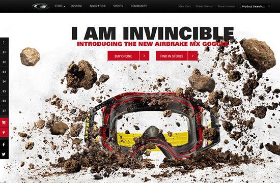
When the famous eye wear maker, Oakley came up with Airbrake MX Goggles, they introduced the model through a parallax website. It was one of the first instances when a product was displayed in 3D format through Parallax Design. The scrolling action absolutely manipulates the behavior of the images, providing the variable perspective of the single the way the user wants. The simplicity of design and extensive amount of white spaces makes the image of the product more prominent to the user. The scrolling has also helped in defining the product in a major manner.
b) Displaying Benefits and Practices
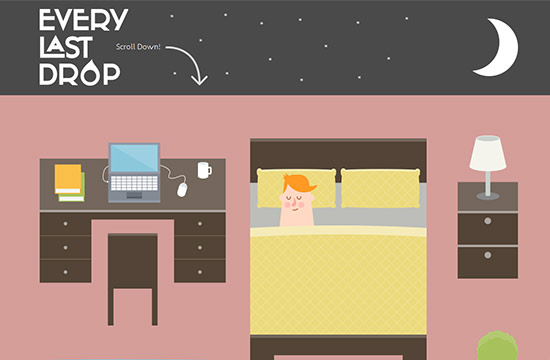
Whenever it comes to displaying benefit and practices of certain things parallax website design can be a great teacher. Nice& Serious, an animation studio has come up with a website ‘Every last Drop’ which shows the problem of water conversion through the power of parallax website design. ‘Every last Drop’ portrays a character in our daily banal life who going through his daily task, unaware of the fact how much he is wasting in the process.
c) Introduce your products to your client
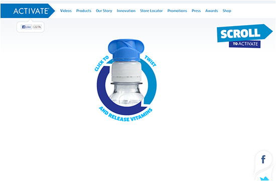
Activate Drink; a soft drink company has taken parallax designing to the next level by introducing the drink to the visitor. Starting from the loading section activate drink has been seen in the act of engaging the audience. The brand value of the drink is presented through the fluid animation on the website. Once you scroll down the website, you would get mesmerized by the sheer variety of colors and animations. The whole website tells about Activate Drinks in every possible way and that too in the best of your imagination.
Let the Design Tell the Story
When the aspect of narrative comes into play, there is no other tool like parallax website design. Parallax scrolling creates the ideal setting to tell a story in the most vivid but subtle manner. It helps in engaging the user in a much interactive way. The visitor can take control of the story and drive it according to his own way. Not only Parallax help in multiple storyline to merge into one, every story goes synchronized with the scrolling behavior of the visitor.
a) Parallax Scrolling: Your Virtual Time Machine
Smart Power Generation is one of the best examples of a parallax website which can tell a great story. The site through scrolling images and animation discusses that how smart power would become the essential part of the tomorrows power system. The site is a journal of all kinds of cause and effects which elucidates on electricity can be produced for tomorrow reducing its effect on the atmosphere and the weather. So the whole site is a narrative of this cause and effect as well as the future of the power industry. Parallax Scrolling can be used as one of the basic tools through which you can have your narrative juices flow.

b) Pictorial Narrative in action
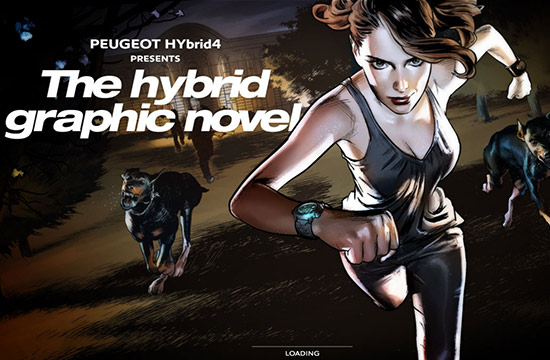
If you are an avid comic book collector, you should be well acquainted with what graphic novels are. While introducing a new technology called the Hybrid4, world renowned Peugeot came up with graphic novel which portrays the car engine in the most vivid manner. The 4 modes of the engines have been depicted through a female character who embarks on a secret mission to get hold of certain confidential data and get away from her captors to safety. Visitors would be enthralled by the beautiful illustrations which give a feel of a scene from a spy movie, just by the movement of the scroll button. The most fascinating aspect of the story is that it is accompanied by sound effects and music to make it more cinematic. The Hybrid4 technology is being introduced as the sideline of the story.
There are instances that even the comic industry is taking parallax scrolling to be an innovative tool for their business. Soul Reaper is a digital comic book which has taken the help of HTM5 to take comic book reading to a different plane altogether. As a viewer you won’t have to flip the pages or go to a next one. You can scroll down for the whole story which is accompanied by music and sound.
A Perfect Tool to Engage and Enthrall
When it comes to engaging visitors, Parallax does its job well. As a website designer you put the visitor in charge. It is these visitors who take an active role in interacting with the site.
a) Make Your Website Fun
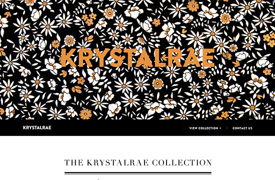
Krystal Rae’s online designer clothes featured a parallax website where same clothes are applied to a single model. With the website design absolutely minimal the whole focus is on the model placed on the center of the website. When the visitor scroll downs the page, everything remains the same except the outfits, which can be manipulated by the user himself.
Triggering Action
Parallax scrolling can be considered as one of the best tools to drive online business. Till now the concept of above the fold has been taken as one of the most important elements of internet as visitors get introduced to the part first. But parallax is absolutely breaking this rule. It becomes an obligation for the visitor to go through the whole site. Every section of the website holds the promise that something more is there to the page when you scroll down. By the telling an impressive story it is much easier for you to drive your visitor to your actual call to action. And more call to action is equivalent to more customers.
Apart from the business perspective, no one parallax site is similar to each other. Only through the scrolling action you can give your site the absolute unique look and feel. So enough discussion about the varying ways parallax site is going to affect your business. Now the blog post would help you with a recipe of a parallax website design.
A Basic to Parallax Website Design
Parallax scrolling as explained earlier in this blog post, has been seen extensively in the 80s 8 bit video games. It borrowed majorly from the multi plane camera techniques which were used traditionally in cell animation since the 1940s.
But when it comes to modern day parallax design, the website designers take the help of 4 methods which were used in 8 bit and 16 bit console games namely- The Layered Method, The Sprite Method, The Repeating Pattern or Animation method and the Raster Method.
- Through the layer method various background layers which can be scrolled both horizontally and vertically can be composited or combined with one another which lead to a simulation of multiple cameras. Through this compositing technique any object can produce parallax by simply changing the position of each layer. The layer which is closer to the virtual area seems to move more quickly.
- In the context of sprite method pseudo layers might be constructed by the programmers. The sprite helps in the creation of the controllable moving objects which is present in the top or the back of the layers.
- The Repeating Pattern Method or animation method involves scrolling displays to be built on individual tiles. These scrolling displays can float over a repeating background layer with the help of animating individual tiles which leads to the portrayal of the parallax effect. The color cycle helps in animation of the whole screen.
- The Raster method involves the lines of the pixel to be composited and refreshed from the top to the bottom of the screen. There is an interval between drawings from one line to the other. This helps in the creation of the illusion.
The modern day developers have evolved from these methods, but the theory they apply is still the same. Here is one small recipe to create your own parallax website.
Step 1: Marking it up
The main motive of the technique is to control the background speed of the image. So bring out your HTML editor and start with the process of HTML markup. The two main attributes which are to be created is the “data type” and the “data speed”.
 <section id="home" data-type="background" data-speed="10">
  </section>
 <section id="about" data-type="background" data-speed="10"> </section>
The <section> tags should be inserted with the attributes of data. The <section> tags with this kind of attributes were introduced in HTML5. The main advantage of this tag is to increase the clarity in reading for the readers.
As far as the specifications of the custom data attribute of the HTML 5 goes, any of the attribute which start with data- is treated as the storage area for private data. This won’t be affecting the layout and presentation anyhow, anyway.
The main focus of the parallax website design is to control the background image. So the main attributes to be used in HTML 5 as the necessary parameters namely data-type="background" and data-speed="10".
The next step to be followed by the website designer is to include the content within the <article> tag inside each <section>.
 <section id="home" data-type="background" data-speed="10" class="pages">
	<article>I am absolute positioned</article> </section>
 <section id="about" data-type="background" data-speed="10" class="pages">
<article>Simple Parallax Scroll</article> </section>
The main objective in this case is to make the <section> background scroll slower than the content represented by <article>. This is a major step which initiates the Parallax illusion. The next step is to add the background images in the CSS for each <section>:
#home { background: url(home-bg.jpg) 50% 0 repeat fixed; min-height: 1000px; } #about { background: url(about-bg.jpg) 50% 0 no-repeat min-height: 1000px; }
Add some CSS style which can make the page more appealing:
#home {
	background:url(home-bg.jpg) 50% 0 repeat fixed;
	min-height:1000px;
	height:1000px;
	margin:0 auto;
	width:100%;
	max-width:1920px;
	position:relative;
}
#home article {
	height:458px;
	position:absolute;
	text-align:center;
	top:150px;
	width:100%;
}
#about {
	background:url(about-bg.jpg) 50% 0 repeat fixed;
	min-height:1000px;
	height:1000px;
	margin:0 auto;
	width:100%;
	max-width:1920px;
	position:relative;
	-webkit-box-shadow:0 0 50px rgba(0,0,0,0.8);
	box-shadow:0 0 50px rgba(0,0,0,0.8);
}
#about article {
	height:458px;
	position:absolute;
	text-align:center;
	top:150px;
	width: 100%;
}
Step 2: Putting the Wonder Code
The tool of JQuery is a necessity in this area. Use the JQuery to begin the standard document.ready () method. Through this method you can ensure that the page is loaded and absolutely ready to get manipulated.
$ (document).ready(function(){ });
At this stage iteration over each <section> is required on every page with the attribute of data-type="background":
$  (document).ready(function(){
	$  ('section[data-type="background"]').each(function(){
		var $  bgobj = $  (this); // assigning the object
	});
});
The function of scrolling is to be added through the implication of .scroll() inside .each() which initiates the effect process when the user start scrolling. :
$ (window).scroll(function() { });
This is the point where you have to determine how much the user scrolled and then divide it by the value of the data-speed which is mentioned in the markup.
var yPos = -($ window.scrollTop() / $ bgobj.data('speed'));
$ window.scrollTop(): Now you would be able to get the value from the top. In determining how much the user has scrolled up, $ window.scrollTop()/ $ bgobj.data('speed') refers to the data speed assigned in the markup. You would be coming up with the yPOS value which you need to apply for scrolling. The value you get would be negative, as you have to move the background in the opposite direction the user scroll.
Here are some examples:
// Put together the final background position var coords = '50% '+ yPos + 'px';   // Move the background $  bgobj.css({
	backgroundPosition: coords
});
We have reached to the final few directives about parallax scrolling. After you have completed with the above steps, you have to put together the final background position into a variable. In order to keep the horizontal position of the background as static you have to assign 50% as it xPosition. Then you have to add yPos as the yPosition. The background coordinates can be assigned to <section> background: $ bgobj.css({backgroundPosition: coords}
And Voila! The magic code you come with would look like these:
$  (document).ready(function(){
	$  ('section[data-type="background"]').each(function(){
		var $  bgobj = $  (this); // assigning the object               $  (window).scroll(function() {
			var yPos = -($  window.scrollTop() / $  bgobj.data('speed'));                            // Put together the final background position             var coords = '50% '+ yPos + 'px';               // Move the background             $  bgobj.css({
				backgroundPosition: coords
			});
		});
	});
});
And you have come with your own parallax website.
But before you launch your website you have to tweak and tune the CSS reset file in order to make the browser run smoothly. Applications like HTML5 Boiler Plate help you with the problems of cross browser normalization.
So here you are with your own website where you can promote call to action for your business, include a historical timeline, tell a story and make it acclimatized to the mobile devices. So come up with a design which can accentuate the depth and layering in the best possible way, because these two elements defines the art of Parallax scrolling.
InstantShift

