As we enter further into 2014 a few things are becoming more apparent than ever before. The world of marketing is moving so much faster and has become viral on digital and interactive levels.
The social media boom and the internet has truly changed the face of the world, so much so that if any kind of company or individual organization is without the slightest bit of web presence – they are non-existent in a competitive marketplace.
A website is quintessential to the modern day marketing experience and having a shop which exists purely in the physical world does no longer cut it. The importance of having a website with an e-commerce channel is vitally important to thrive in modern day business. But having a website alone will not just drive in new traffic and conversions, the way your website is set up, the way your website is designed and the way your website is optimized online and offline are all important factors when looking to engage well with your online community and move higher onto the next level.
You should always think about the little things and where they appear on a page when it comes to engagement and web design. For example, you may not that linking all your social networks to one another will have a huge impact on your website but they will; small clickable social media icons at eye level have a direct effect on user engagement.
Communication is everything, online offline and at every stage of a lifecycle. As the internet matures and your community matures you should mature with your design and services to develop alongside with them and keep engaging with them at every level. It is very important to build up a conversation in the modern world with users and this is where your content is crucial to engagement; having the right type of content and the most shareable content. So in order to develop your website going forwards and engage better first start a plan of action and start with visual awareness.
Why Web Design Is Important For Visual Awareness
The thing to remember when thinking about community engagement is web design is all about first impressions. An internet user who happens to land on your page may have never interacted with your brand previously and some businesses forget this one important thing. It is of up-most importance that you remember that some people are viewing your brand for the first time so provide them with a good and valued first experience. If that person feels misled or unhappy with the experience they have received, you can bet there will be hundreds (if not thousands) of other unhappy web users out there too who felt the same.
So, what can you do?
1. Visualise
Your first step is to get the visual of your web pages right. Engage immediately on your “About Us” page. Out yourself in the viewer’s shoes – what do they want to know about you personally and what your aims are and how you can help them. Do not think corporate speeches think human and design this in a human way. Why not talk about your passions and create visuals of your business your life or your team, showing how you interact on a daily basis.
A site which is appealing will undoubtedly attract and influence the online community. A website which has been well designed will spark curiosity in the online consumer’s mind, attracting them into sticking around longer (about three times as long according to research). When it comes to bad web design, it is known that around 32% of web users will give a website which is running slowly around five seconds before abandoning it; truly revealing that a well oiled website in all areas is vital.
It takes a consumer only a few moments to work out if they have come to the right place through visual signals presented on the page, so do account for this.
2. White Space
White space (or negative space) pushes the consumers focus to certain points on the page, whilst also making the page feel complete rather than a jumbled mix of information. The key to getting the design strategy right for engagement is to remember that the design must be readable, understandable, and easy to like. Think simple and not outrageous; less is more. Your strategy should still think about color, text and images but in an organized and simple format; draw attention to the most important message on your page through white space.
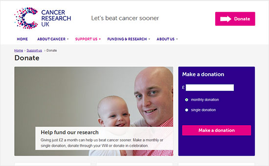
One good example of this is on the Cancer Research charity donate webpage. The call to action and awareness is surrounded by white-space and the text is short, simple, colored in places and stands out across the web page. This is what engages well with a community and keep them focused on the page; spreading a brand message and raising donations for a worthy cause.
When a person lands on your web page they will be able to recognize visual factors of corporate identity pretty much instantly; from type, color, logos and general branding.
3. Stay Connected
If you need to know what staying connected through web design is then head over to the TESCO website, you will recognize that the famous blue and red that is so prevalent in all their marketing, from their logo, store card and even the letters that they send out to their customers are all in line with their brand colors online. Currently on the Tesco homepage you will even see a large slideshow around white-space of the value being offered to customers to keep them connected – “The Big Sale Now On “, “New Year New You” and “Clubcard Boost”.
All of this information subconsciously relaxes the consumer, because they are used to this information on a regular basis in their daily lives but are finding all the information and benefits for them all in one place that keeps them connected online.
The same analysis can be applied to Cancer Research UK’s website. Essentially for a charity, trust must be established visually even quicker than usual. People have an instant inherent distrust for charitable organizations at the thought of where is their money really going? However, if you build your brand and awareness the right way you can build trust easily. Cancer Research like TESCO uses their traditional logo type and color to reassure the web user they are who they are across all media platforms. In web design, staying connected through pictures can mean far more than words – which Cancer Research also implement well with the bulk of their page being taken up by captivating images accompanied by a few words of text from survivors of Cancer which is what the charity is about.
4. Add Personality
The key thing for successful engagement is that you are able to make a visitor feel welcome and can show you are authentic. You can do this by simply having a mascot to represent your brand; this adds personality and makes you unique.
Have a look at the thinkgeek.com website, you will find Timmy the Think Geek monkey designed on every page. Timmy is used to represent the brand image and is even active in attending marketing conferences and the San Diego Comic Con. How Timmy the monkey is used and promoted through design is what brings success to thinkgeek.com. Timmy’s imaging is used across all social media networks, on Facebook he is the cover shot and profile picture because he represents the brand and engages with the community; 667,843 likes and 145,400 people talking about this brand. On Twitter, again Timmy is the focus of imaging on tweets and is remembered by followers; 771K Twitter followers.
By knowing your brand and understanding your audience, only then can you implement effective visuals on your website to attract and engage an online community. A mixture of creativity, content and branding will only catch the fancy of a web user if you have spent time drawing out a strategy which puts their needs and wants first. The importance of web design should never be underestimated, so push forward into 2014 with a well thought out design that works for you and if you are a charitable organization looking for further inspiration on web design then click here for our 10 commandments for designing websites.
Engaging Website Inspirations
Here are a couple websites that engage well through web design – look, analyze their tactics and learn from these inspirations:
Adidas
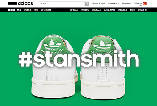
Upon landing on this page the visual is spot on with images scrolling across the screen. The first image to appear is of trainers with the hash tag #stansmith – this encourages engagement through a social media platform. One of the little things that this site should have done was move the social media share icons to above the fold as you have to scroll down on their current design to access the ability to like, tweet, g+ or share the page.
Starbucks
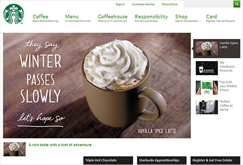
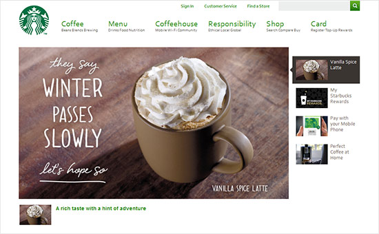
Upon landing on this page the white space takes effect and attention is drawn to a number of benefits, for example – Starbuck Rewards, a breakfast treat and brighten your Monday. The top navigation bar provides a clear message of services delivered – a coffeehouse with mobile Wi-Fi community and ethical local and global responsibility. Their social media share icons are well placed above the fold and at eye level; no need to scroll down.

