
When creating a website or any other type of application, you must be aware that the colors used in it are vital for the overall user experience. If the viewer find it difficult to use the application because of its colors, then you have a big problem. In order to avoid this situation, you should check out these five guidelines below.
1. Separate the colors by saturation, brightness and hue
You need to avoid subtle color difference and you must be sure that the contrast between colors is high, but before doing this, check out the last guideline and also make sure that they are complementary. In order to test is the colors are different enough you can use the grayscale: if you can’t distinguish the colors which are rendered in grays, then they are not different enough.
2. Use colors which are distinctive
First of all, remember this: our visual system is using the signals from retinal cone cell in order to create three color opponent channels: red-green, yellow-blue and black-white. This is the reason why the colors that people can distinguish more easily are those that create a strong signal on one of the three channels, and neutral signals on the other channels.

With this in mind, we can say that the best colors for creating websites or web applications must are red, green, yellow, blue, black and white. All other colors are causing signals on more than one color channel so we can’t differentiate them easily.


3. Avoid colors that color-blind people cannot distinguish
If you create a website or any other public application you need to think that there are users with color deficiency. If you use some colors which they can’t distinguish, your website will fail big at the usability test.
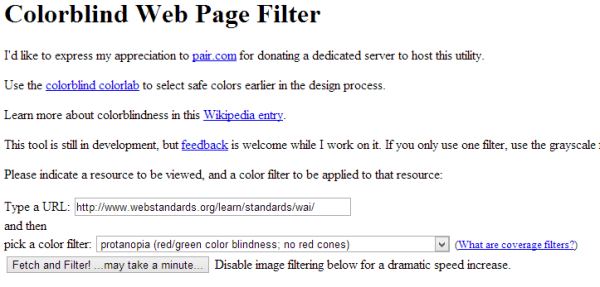
So, avoid pairs such as dark red versus black, dark red versus dark green, blue versus purple, light green versus white. Also, you should not use dark reds, blues or violets against any dark color, but rather against light yellows or greens. A great way to see if your website passed the color-blind test is to check it on colorfilter.com.


4. User color redundantly with other cues
You should not rely on only one color, so if for example you use color to mark something, mark it another way as well. A good example is how Apple is using colors and symbols to differentiate a “smart” photo album in iPhoto.


5. Don’t use strong opponent colors together
Placing strong opponent colors together is the biggest mistake that you can ever make because they create a very disturbing sensation to the eyes. Creating this extreme color combination will only make the viewer annoyed and not being able to easily read the information.

Do you know any website with a strong color palette? If so, don’t hesitate to leave it in the comment section.
As a conclusion, whenever you are trying to create a brand new website or a face-lift to an existing one, you must take care of the colors that you are going to use because they can make the difference between a good design and a filed project.