Since its development, halftone printing has revolutionized the way we reproduce images. It became a staple in newspapers, zines, advertising, and magazines, evolving into the bold design styles seen in comic books, vintage posters, and even pop art.
In this tutorial, we’ll recreate the halftone effect using Adobe Photoshop and Adobe Illustrator, and we’ll go through some history of why and how this essential printing technique came to be. Let’s get started!
1. How to make a rosette effect in Adobe Photoshop
Step 1
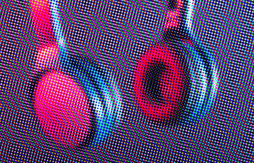
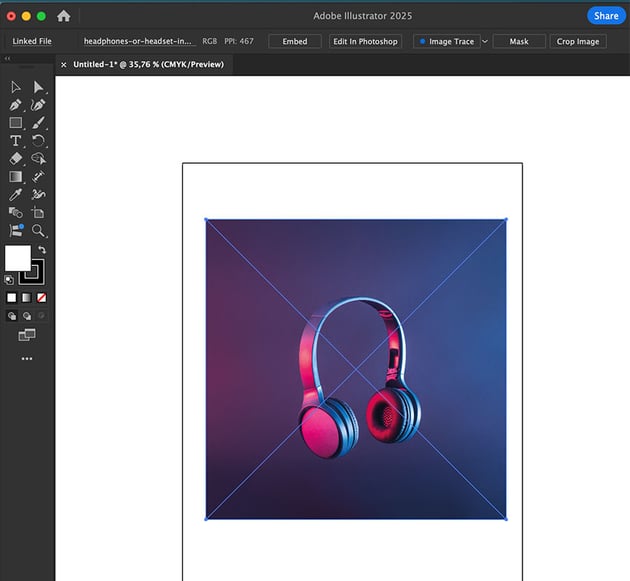
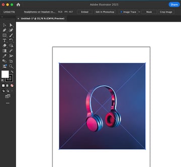
I’ll be using this headphones image for the tutorial—feel free either to download it or to use an image of your own.
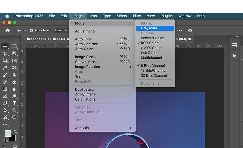
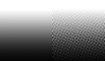
Whichever option you choose, open the image in Photoshop. If you want a classic black and white effect, go to Image > Mode > Grayscale.


Step 2
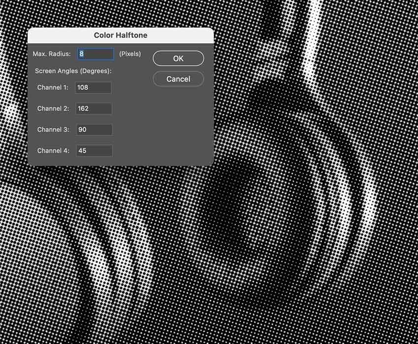
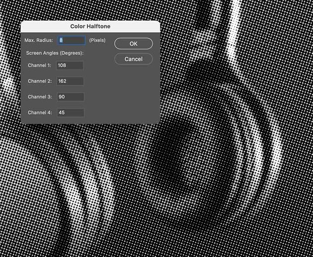
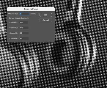
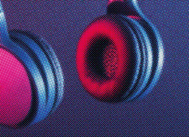
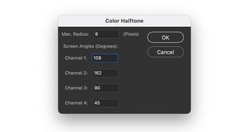
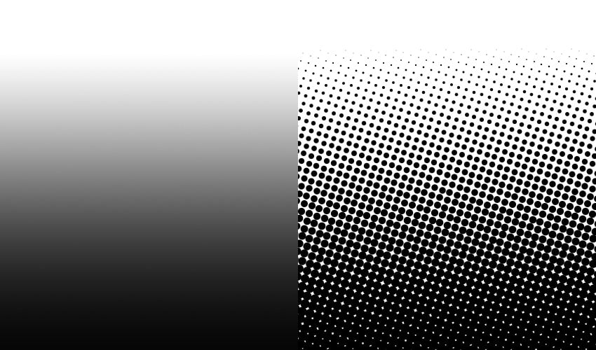
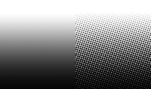
Go to Filter > Pixelate > Color Halftone. In the Color Halftone window, use the default settings to create an image with more detail. To create larger dots, set the Max. Radius to a higher number of pixels.
Step 3
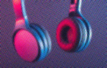
If you’d like to create a colored halftone effect, skip turning the image into Grayscale and head over to Filter > Pixelate > Color Halftone. Use the default settings and click OK.

Step 4
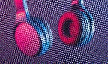
Feel free to change the degrees on each channel to get a different pattern. In this case, I changed the degree evenly.

Step 5
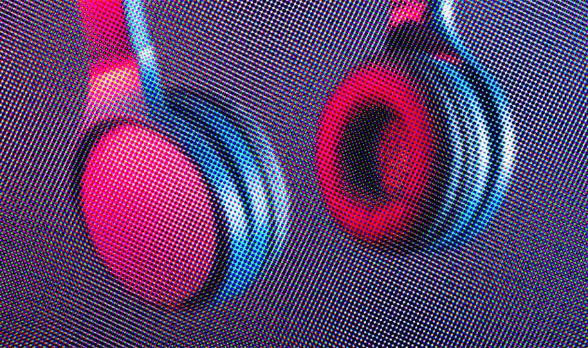
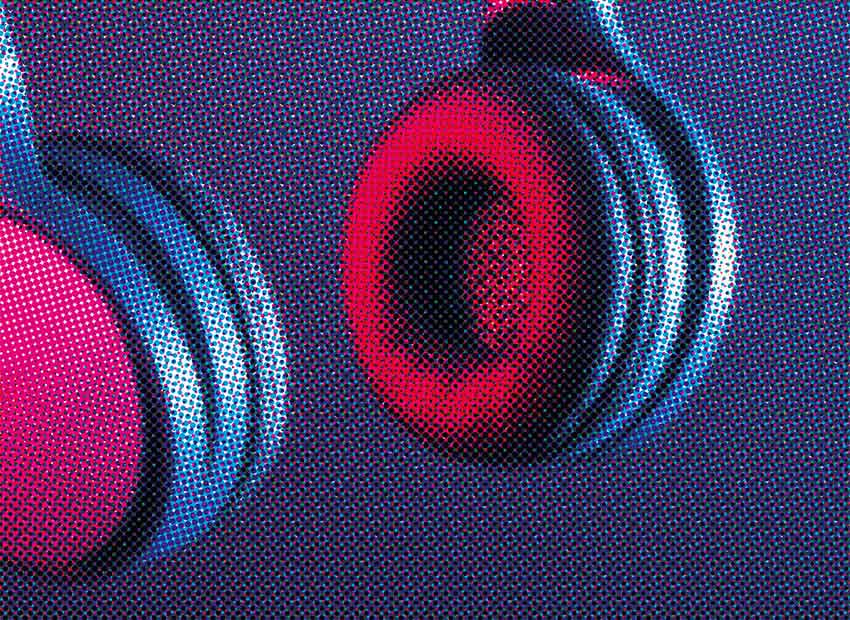
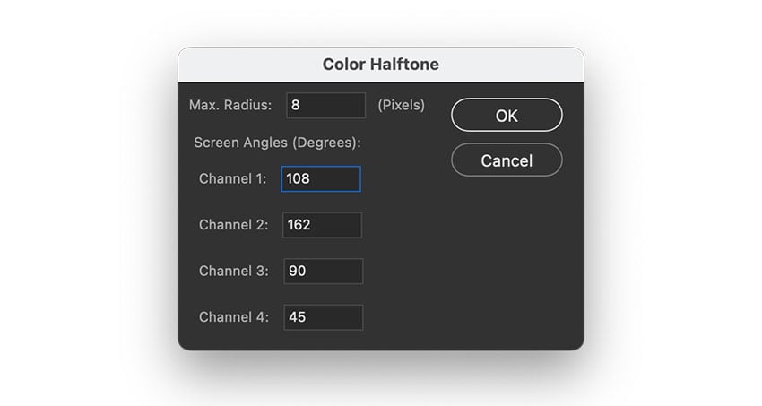
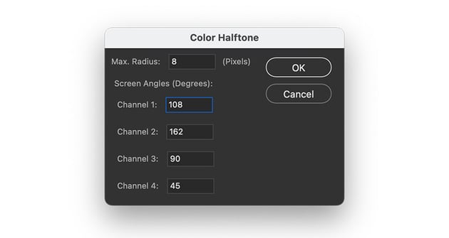
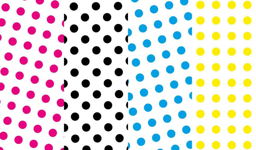
To get a rosette pattern, go to Image > Mode > CMYK Color. For the halftone pattern, go to Filter > Pixelate > Color Halftone.
Set each angle at:
- Cyan: 15°
- Magenta: 75°
- Yellow: 0°
- Black: 45°
2. How to make a halftone effect in Adobe Illustrator
Step 1
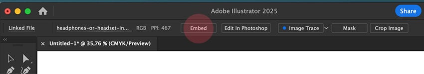
Create a new document in Illustrator. Place an image into the document by going to File > Place Image.

Step 2
On the Control bar, click the Embed button.


Step 3
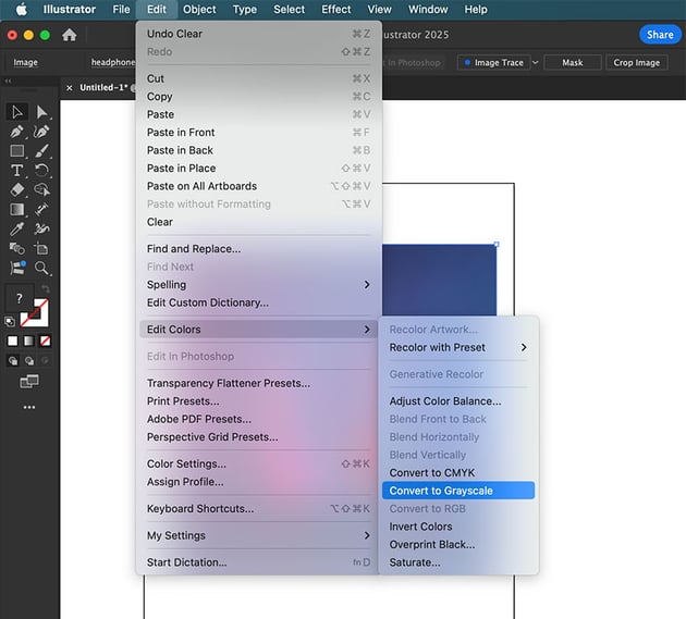
Select the image. Go to Edit > Edit Colors > Convert to Grayscale.


Step 4
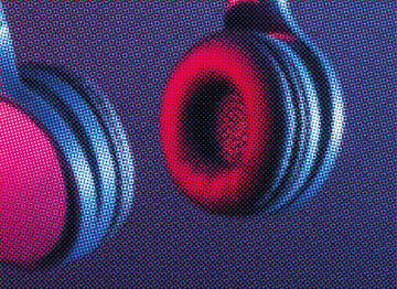
Select the image, and go to Effect > Pixelate > Color Halftone. Click OK in the Color Halftone window.
Step 5
For a color result, stop at Step 2 and go to Effect > Pixelate > Color Halftone. In the Color Halftone window, click OK.


Origin of halftone printing
In the mid- to late 1800s, William Fox Talbot and Frederic Ives developed the first halftone processing method using grids of dots to simulate using different shades of gray. Talbot is credited with the idea of halftone printing, while Ives invented the commercial method.
Before this time, printing relied on other techniques like stippling and engraving to create shading. In the 1850s, Fox Talbot used glass screens to break images into dots in a process called photoglyphic engraving, while Frederic Ives developed an improved halftone process using crossline screens that gave a more refined pattern. In 1881, Frederic Ives’ process became the basis for commercial halftone printing, and newspapers started to use this way of printing as it was more efficient.
By the late 1800s, George Meisenbach refined the crossline method by increasing the halftone accuracy, resulting in consistent and sharp halftone dots. His method quickly gained adoption from the printing industry as it was reliable. The principles of this method are still used today in printing newspapers and magazines.
The New York Daily Graphic was the first newspaper to print a halftone image. Then, in 1886, the New York Tribune was the first major newspaper to adopt halftone printing as its regular method of printing photographs.
The impact of halftone printing
The introduction of halftone printing revolutionised journalism by making it possible to include photographs and detailed illustrations. Hand-engraving was time-consuming, but halftone printing was quick and efficient. It also enabled printing in large quantities and improved visual communication, not only in journalism but also in advertising and books.
Before this time, there were plenty of issues with other printing processes. High-speed letterpress printing applied heavy pressure to the paper and suffered from ink spread or dot gain, resulting in halftone dots that blurred together. Since newspapers were printed on rough, low-quality paper, the ink didn’t absorb consistently.
Later on, halftone printing required refinement. That’s when the standardized CMYK halftone screen angles were established. By the 20th century, advancements in paper quality, ink control, screen angles, and technology made halftone printing a standard around the world.
What is rotational symmetry?
Halftone patterns rely on rotational symmetry to maintain structure. The dots are arranged in a grid, with the angles providing visual consistency and creating moiré patterns.
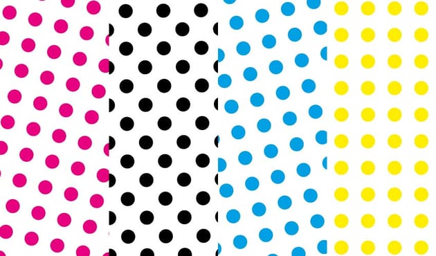
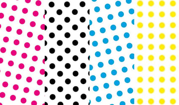
In CMYK printing, each color channel uses a different screen angle to prevent interference. When halftone dots are arranged in a radial pattern, they look the same when rotated at 60°, 120°, 180°, etc.
When this symmetry is interrupted, it’s called a moiré effect. The halftone angles are too close together, and the rotational symmetry breaks down. The ideal rotational symmetry and standard angle for CMYK is 15°, 45°, 75°, and 0.
The halftone look as an effect
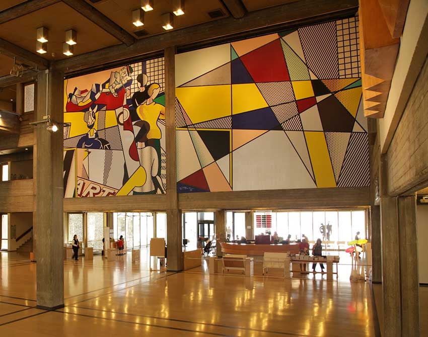
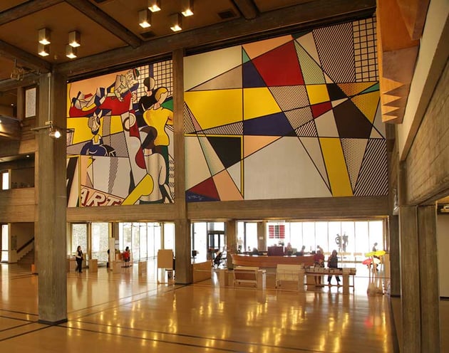
The halftone look became popular in graphic design because it created a visually striking look. Artists like Roy Lichtenstein popularized halftone as a design element, embracing its graphic look and high-contrast quality. Comic books relied heavily on halftone printing, which gave them a specific nostalgic look.
The halftone effect is also linked to vintage materials, zines, and newspapers—it’s the go-to style to evoke a sense of nostalgia. Still in the digital era, the halftone printing effect remains a popular way of mixing old-school charm with contemporary trends.
And there you have it!
Halftone patterns are a major innovation in the printmaking world. These tiny dots have become the carriers of depth, texture, and visual interest in any design. Whether used for printmaking or stylistic effect, halftone patterns offer endless possibilities for experimentation.
By understanding the concept of the technique, you can adapt these patters to suit your own style and projects. With the tools and guidance provided, you’re now ready to explore. Happy designing!
If you liked this tutorial, you might like: