What is an editorial spread, and how do you make an editorial spread design of your own? In this tutorial, we’ll walk through how to design an editorial magazine spread. We’ll also take a look at some two-page spread examples for inspiration (and for download!).


What You’ll Learn
- What is an editorial spread in a magazine, newspaper, or other multi-page design?
- How to create a two-page magazine spread in InDesign
What You’ll Need
You are welcome to use these assets to follow along, or feel free to substitute them with any assets of your choice. The same concepts will still apply.
What Is an Editorial Spread?
An editorial spread—sometimes called a two-page spread—is a layout design often used in print pieces like a newspaper or magazine. The content is typically presented across two facing pages—or a “spread”. Think about the last time you checked out a magazine. A two-page magazine spread is common in most modern magazine publications.
Think of it as a visual arrangement of content like text, images, and other parts of an article. It’s done in a way that’s visually cohesive across the spread (two pages).

So what is an editorial spread in magazine design, newspapers, or other media? Just remember that it’s about content that’s “spread” across two pages. The key here is that the two pages typically look visually related—they are one design across two pages.
How to Create a Two-Page Magazine Spread in InDesign (Editorial Spread)
Step 1
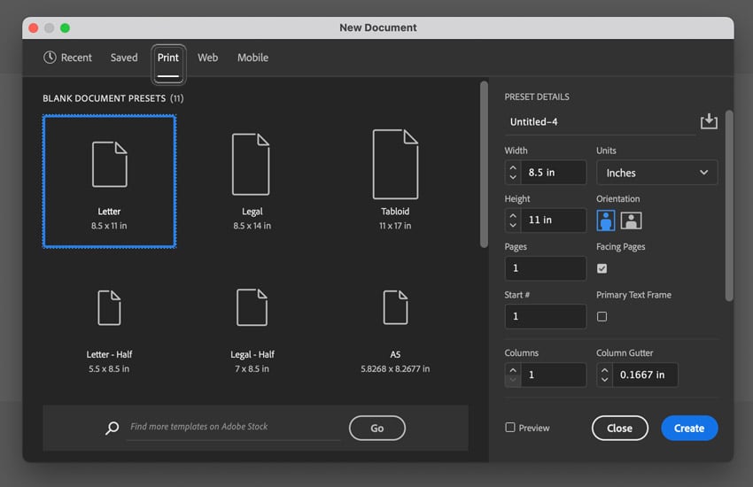
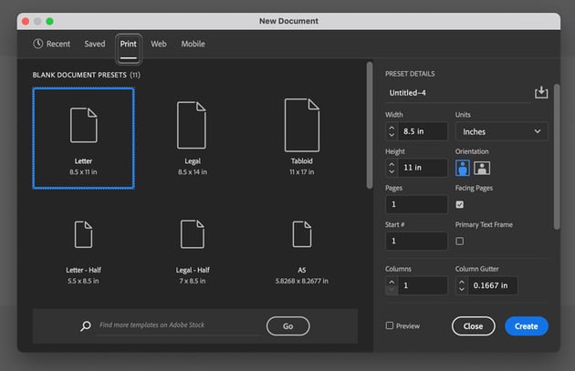
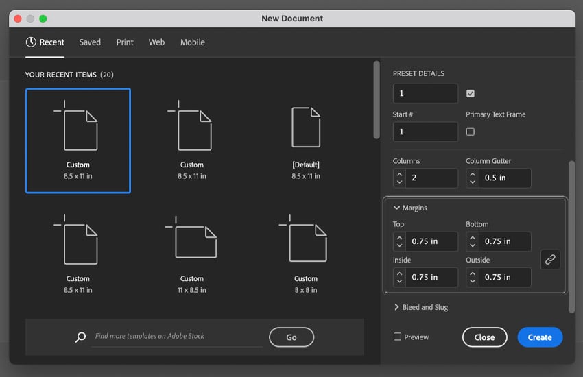
First, let’s start with a New Document in Adobe InDesign. You can create a New Document by going to File > New.
Then, we get a number of options. In this demonstration, I’m going to work with a document that is US Letter sized, or 8.5″ x 11″ inches. You can also find this as a preset under the Print options at the top of this window.
Step 2
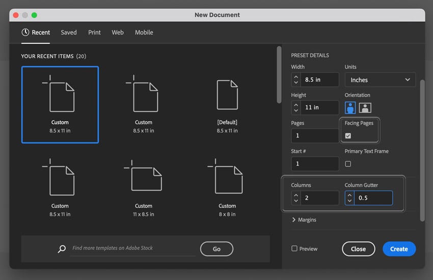
One of the major settings we need to toggle on here is Facing Pages. This will give us two-page spreads in our InDesign document.
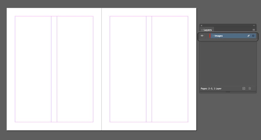
We can also have InDesign set up Columns for us. This is handy in an editorial spread because the text is often displayed in more than one column. This will set up some guidelines for us in advance. Let’s set our Columns to 2 and give them a 0.5″ Column Gutter between them.

Step 3
And let’s look at one more thing before we finalize our document’s settings. Let’s also make sure we have a 0.75″ Margin around all sides, just to act as a safety area for us while we work. You may need to scroll down these new document options to see the margin settings.
Once you’re happy with your settings, click Create to make your New Document.


Step 4
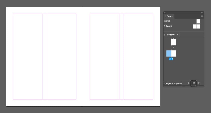
When you first start up your document, you might notice we’re only seeing one page—what’s up with that? Think of this first page like our document’s cover. Let’s begin by opening up the Pages panel. You can find it by going to Window > Pages.
Then, in the Pages panel, let’s add two new pages by clicking on the Create New Page icon at the bottom of the panel, as highlighted below.
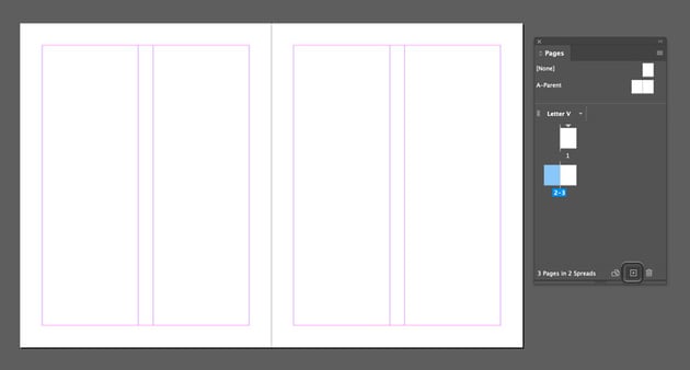
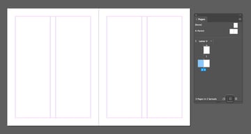
Here’s what our document looks like with three pages. Note that you can see thumbnail previews of our pages in the Pages panel too. You can click on these thumbnails to easily jump to any page in your document.
Step 5
As an optional (but useful) step, I like to use my Layers to help organize my content. You can open the Layers panel by going to Window > Layers. You can double-click on any layer to rename it. I’m going to call my first layer “Images”.
Step 6
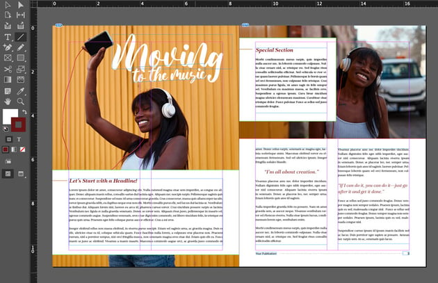
So let’s focus on pages 2 and 3, where we’ll design our editorial spread.
There’s really no right or wrong way to start your design. Some designers might prefer to begin by setting their body copy, which is fine. Personally, I like to get my images down on the page, because they end up having a large influence over my design concept.
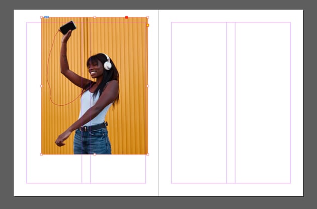
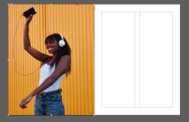
To add an image to your design, go to File > Place and select the image from your computer. Then, click and drag to place the image into your layout (if you single-click, it will be placed at full size).


Step 7
Your image doesn’t have to be perfectly laid out. We can click and drag on the resize handles to resize the rectangular frame itself. Double-click to toggle between resizing the rectangular frame and the image itself. Use these resize handles to position your image in any way you prefer.
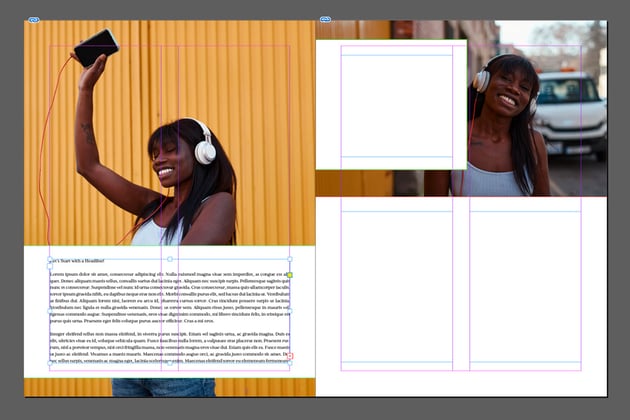
Here’s how I opted to arrange my image on the page.

Step 8
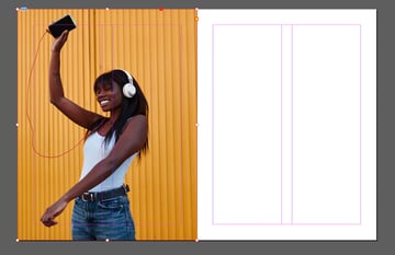
Repeat this step for any images you want to use in your layout. I’m using two images of the same subject, and this is generally where I think I’d like my images to work in my editorial spread.

Step 9
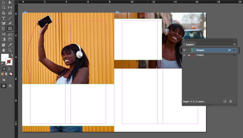
Next, I’ll create a New Layer called “Shapes”. I also like to lock the layer I’m not using, so I don’t accidentally bump it. You can do so by clicking to the left of the Layer’s name—it’ll look like a lock icon.
I’m going to create some white boxes on top of my imagery, where I’m planning to incorporate some copy. To do so, make sure your Fill Color is set to white in the Tools panel.
Then, select the Rectangle Tool and click and drag to create a rectangular shape.
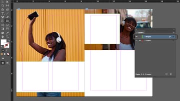
Here are the shapes I opted to go with in my layout:

Step 10
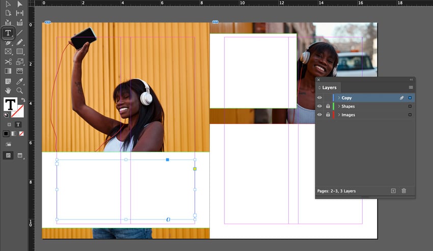
Next, let’s start working with our type. Again, I’m going to work with a New Layer here—follow the same process, and let’s just call this new layer “Copy”. Now, it’ll be easy for me to toggle between and protect my content as I work.
You can either use copy you have prepared, like a written article, or if you need placeholder text, you can use something like Lorem Ipsum (which is dummy copy)—this is also often called “lipsum”. I’ll use this sample text in this demonstration.
Let’s start by creating a text box. To do so, let’s select the Type Tool in the Tools panel. Then, click and drag to draw the first text box. I’m going to place mine on the left-hand side, in the white box we drew.
I’m going to make this first part of my body copy expand across both columns. Keep in mind that those columns are a visual reference that we can use to divide and organize our content in any way you want. Feel free to get creative with it.


Step 11
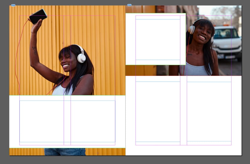
Let’s repeat this process for the other columns in our editorial spread. With the Type Tool selected, click and drag to add text boxes to your layout. There’s no wrong answer here, and you can use your column guides to inspire you.
Here’s what my layout looks like. I have one column on the left and two columns on the right. I also have a little call-out portion at the top.


Step 12
Next, let’s go back to the very first text box in our layout. If your layout is different, that’s fine—just select the leftmost text box, or wherever you envision the start of your body copy.
Start by selecting the body copy you want to insert into your layout. This could be from any resource of your preference, like word-processing software. Copy it to your clipboard.
Then, with the Type Tool selected, click inside your text box. Then go to Edit > Paste to paste your copy. Here’s an example of what this could look like:


Step 13
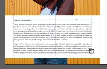
You’ll notice that the copy is only in that first text box. In addition, take a look at the lower right-hand corner. There’s a little red X in a box there—this indicates that there’s more text in this box than the text box can hold. This is often called “overset text”.
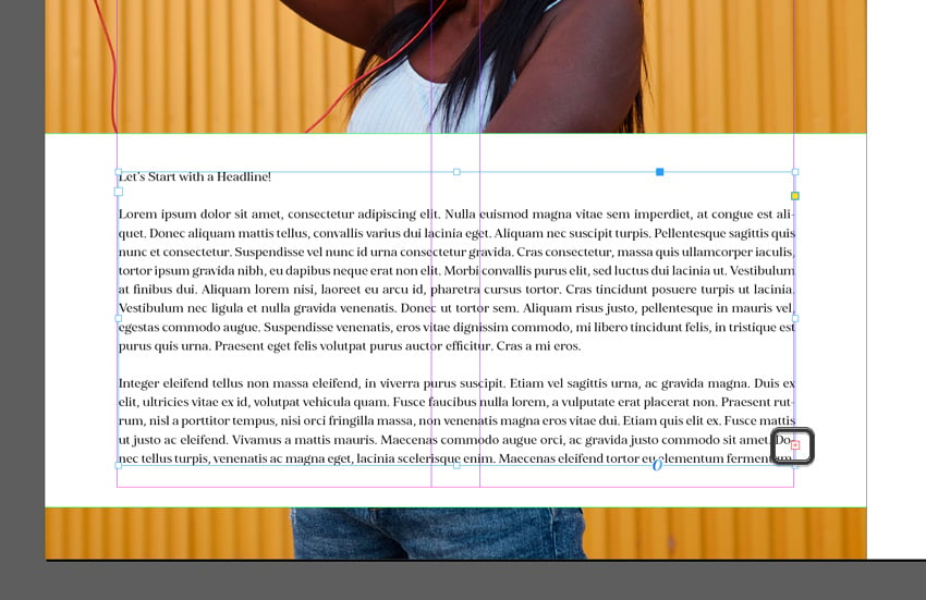
We can click on this red X, and InDesign will “pick up” the text copy for us. Then, we can click on the next text box where we’d like copy to appear in our text flow. Now, my text flows from the first box to the second.

Step 14
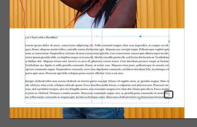
Repeat this process until your text flows from text box to text box. Basically, we’ve created one continuous text box out of the multiple ones we’ve created.
You’ll notice, however, that I left my smaller text box, at the top of the composition, out of the sequence. You can keep some independent like this, too, if you’d like.


Step 15
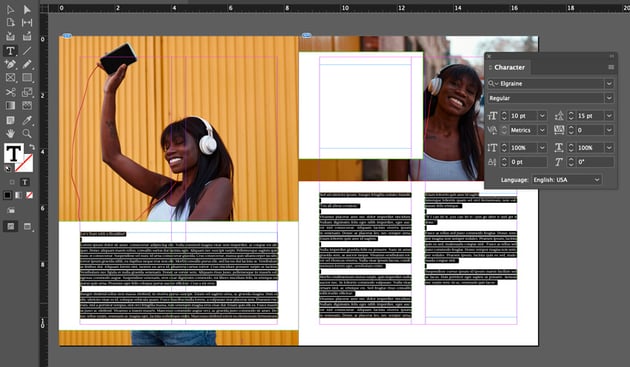
Next, let’s start styling our text. When you have continuous text spanning multiple text boxes, selecting your type is a little different. Instead of just selecting the text box, you’ll have to use the Type Tool to select the content first.
Turn to your Character panel to edit things like the font and font size. We can do this by going to Window > Type & Tables > Character. For this demonstration, I used the Elgraine font from Envato Elements. I went with a Font Size of 10 pt, with 15 pt of Line Spacing.


Step 16
You’ll also want to take a look at your Paragraph panel. You can open this up by going to Window > Type & Tables > Paragraph. This is the panel where you’ll adjust things like alignment. For example, I’m going to set the alignment of my copy to left justify.

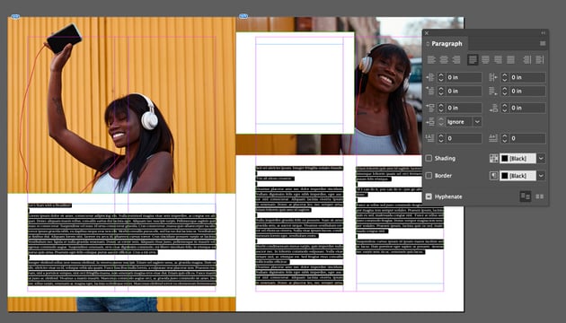

Step 17
Setting copy can be complicated. We chose a clean, serif font with strong legibility, but we still need to check for readability. This means keeping an eye out for little things like odd gaps or too many hyphens at the end of each line—especially if you opt to use justified type. You can turn Hyphenation on and off in the Paragraph panel too. It doesn’t have to apply to your entire body copy.
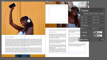
Take some time to read your copy and make sure it flows nicely. I’ve moved things around, added spacing, and experimented with my paragraphs to keep the flow strong.


Step 18
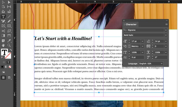
However, we’ll need to establish some typographic hierarchy here. For example, the opening header doesn’t really stand out when it matches the body copy. With the Type Tool, select any headers you’d like to adjust.
Then, you can turn to the Character panel to make any adjustments. I upped the font size to 17 pt and changed the font style to Bold Italic.


Step 19
We can apply this to other parts of our text too. For example, I have a few call-out quotes in the middle of the body copy. It would be nice to have them display at larger sizes, so they stand out from the rest of the text.
Select the copy with the Type Tool, and then turn to the Character panel again in the same way.


Step 20
Let’s add some other text to our design too, like the title. For the title of this editorial spread, I wanted to do something really eye-catching. So I opted to use a display font called Butterie from Envato Elements. It’s a fun script font, and it’ll really stand out.
Use the Type Tool to add a text box for your title. I wanted something large and decorative here. Check it out!
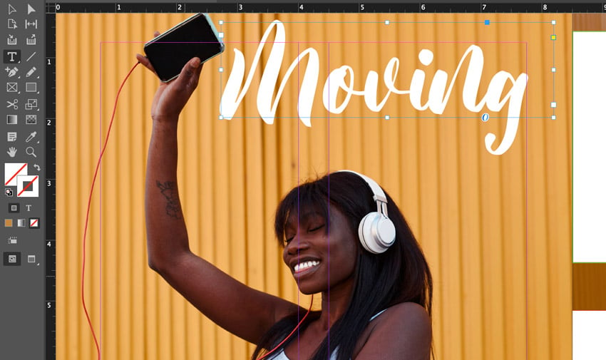

Step 21
I decided to break up my title into two separate text boxes. This is because I wanted to break up the size of the different words in the title. When doing so, I can move and adjust different parts of the word independently.


Step 22
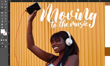
Let’s set some text in our independent call-out section too. Paste whichever content you’d like in this space. Then, style it to match the rest of the document’s copy.
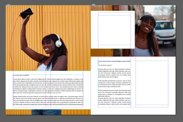
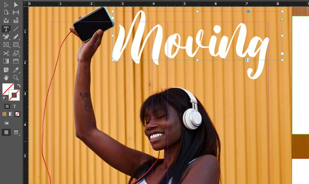
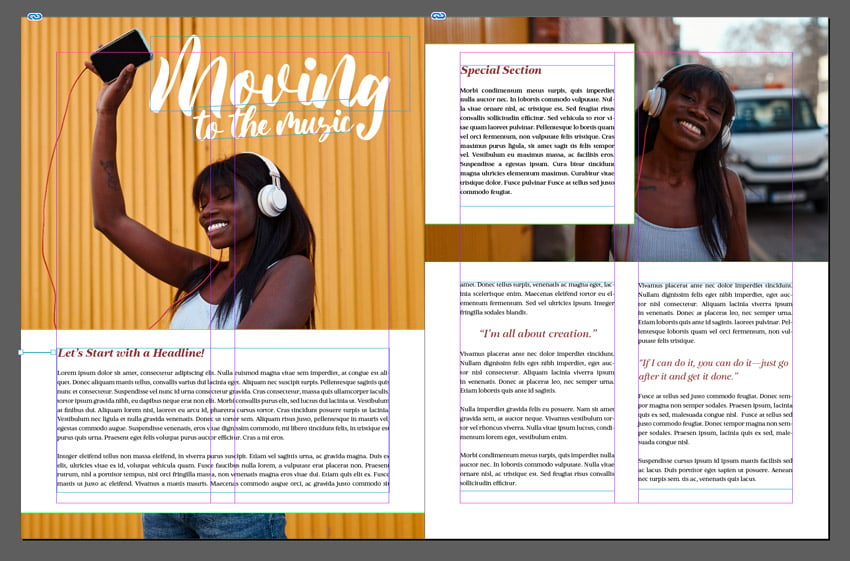
However, let’s experiment with the text color here too. I wanted my headline to be a color that resonates with the images in my layout. There’s a fun red cord in the photo, so I thought red would be a great complementary color. With your text selected and highlighted, change the Text Color at the bottom of the Tools panel.


Step 23
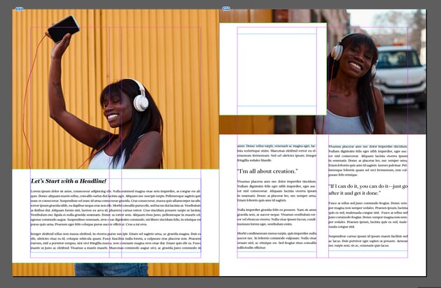
Let’s take this concept and apply it elsewhere in our layout too. The headlines and quotes would also look great in this color—it could prove to be a unifying element that keeps our editorial spread looking visually related.
Here’s a look at my spread with the text color incorporated.

Step 24
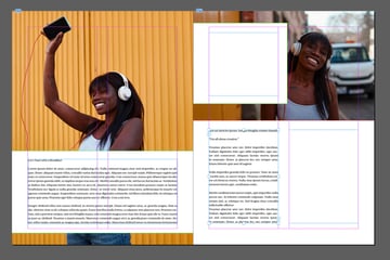
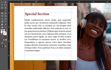
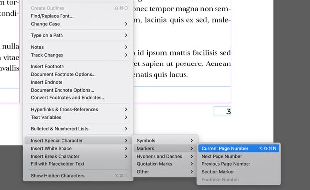
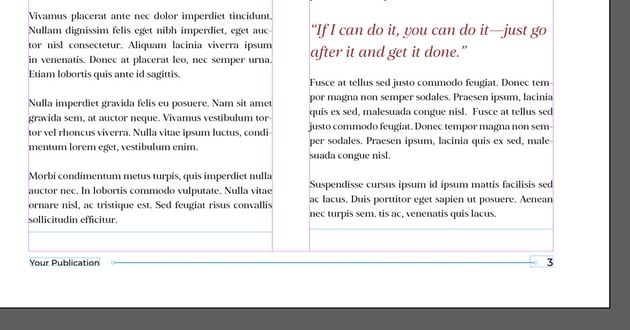
Next, let’s add some supplementary elements we’d need to see in a spread like this. Editorial spreads are usually part of larger documents, so there will likely be a need for page numbers. Let’s add some footer content on the right-hand side of the page.
For starters, let’s insert a page number. We’ll start by creating a text box using the Type Tool. Then, go to Type > Insert Special Character > Markers > Current Page Number.
If you do this in a Parent Page, it’ll be a letter, like A if you’re designing in Parent Page A. It will dynamically display whichever page it’s displayed on. Handy, right?


Step 25
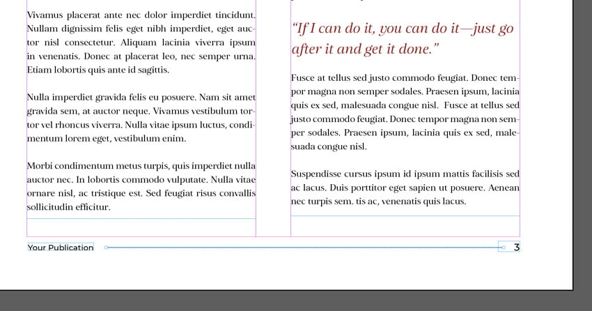
Let’s add some more supplemental content here. For example, I added some copy on the opposite side of the page number, so things look balanced. This would be a great place for something like a section title or the name of the publication.
To tie them together, I added a line. To add a line like this, select the Line Tool and then click and drag to draw a line. To change the line color, you’ll want to change your Stroke Color.
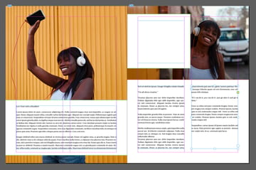
Step 26
Let’s try adding some decorative lines elsewhere too. I thought it would be a nice addition to my headline and to the start of my separate excerpt too. Again, select the Line Tool and click and drag to draw a line. In addition, you can change this line’s properties in the Stroke panel (you can open it up by going to Window > Stroke).
Check out what this looks like!


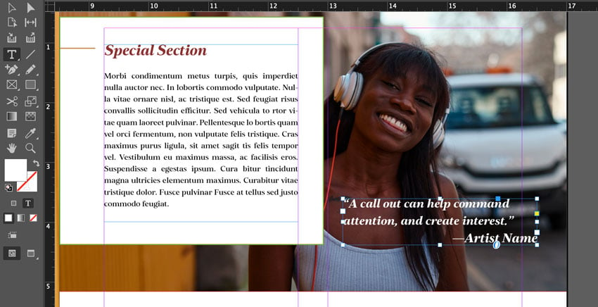
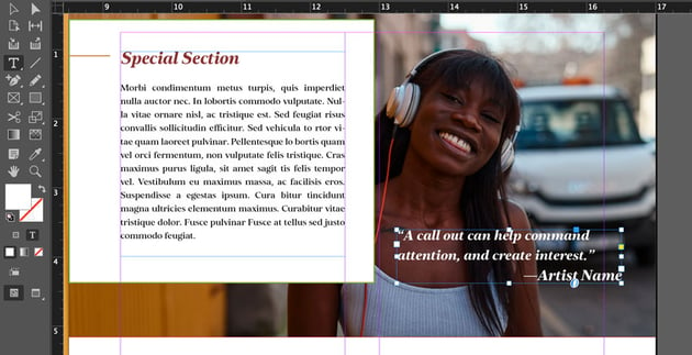
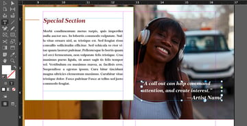
Step 27
But you can also put copy on top of the imagery. Let’s give that a shot too.
Select the Type Tool, and then click and drag to create a new text box. I set my text color to white, and then added a short quote here. Remember, you can use the Character panel to change things like the font and the font size. Bolder weights can work well in situations like this, so the font stays legible.
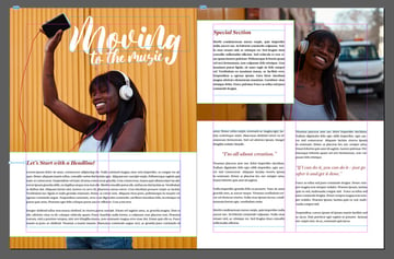
Now You’ve Designed an Editorial Spread
And there you have it! We’ve created a two-page spread in Adobe InDesign. You could use these concepts in so many ways. Create new layouts from scratch, or derive new ones from this tutorial! The sky’s the limit.
Download Two-Page Spread Templates From Envato Elements
Looking for some two-page spread examples? Or maybe you’d like to download a two-page spread template. Envato Elements is an amazing resource for editorial spread design. One low price gets you unlimited access to thousands of templates—as well as fonts, illustrations, photos, and much more.
Check out these inspiring two-page spread examples you can download right now on Envato Elements.
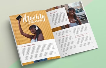
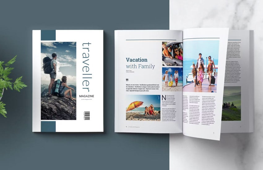
1. Editorial Magazine Spread Template (INDD, IDML)


You get 36 amazing pages to work with in this professionally designed magazine template. It’s full of editorial spreads you could use for a wide variety of design purposes. Just add your content for a complete design.
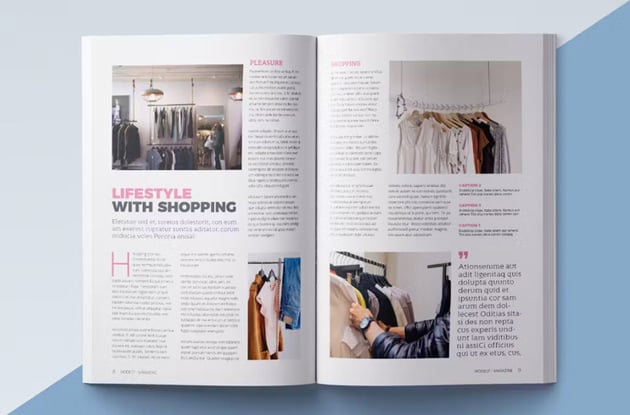
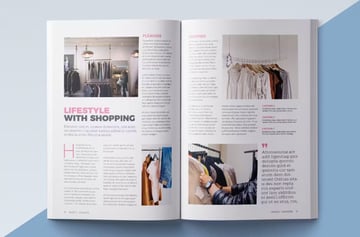
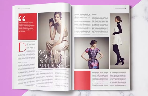
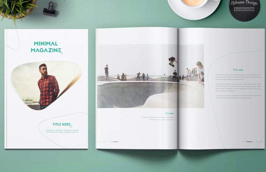
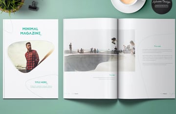
2. Template Magazine Two Page Spread Design (INDD, IDML)


Love a clean, minimalist look? This template would be an amazing choice for beautiful photos, as it has so many placeholders perfect for showcasing that kind of work. Again, it’s easy to jump into InDesign and edit this template any way you like.
3. Template with Two Page Magazine Spread Designs (INDD, IDML)


Here’s another template that’s full of designs you can use in your two-page spread projects. It also comes in both A4 and US Letter sizes, so you have two different templates that you can work with.
4. Magazine Template Design (Two Page Spreads) (INDD, IDML)

Isn’t this magazine design stylish? You can jump right in and edit this design in Adobe InDesign. Remember, if you want a finished design, it can be as simple as adding your content. Or use it to jumpstart your design process and create something completely new.
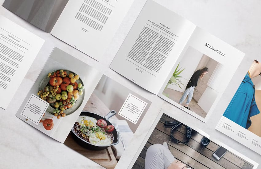
5. Magazine Template (Editorial Spread Design) (INDD, IDML)
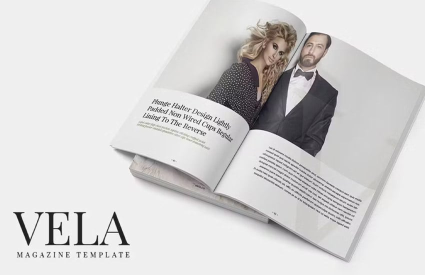


Love big, bold photos in your two-page spread designs? Then you’ll love the layouts that are featured in this magazine template. Take advantage of an amazing 80 pages included with this template—that’s so much content to work with!
Learn More About Adobe InDesign
Want to learn even more about working in Adobe InDesign? There’s a wealth of tutorials here on Envato Tuts+. There’s no better time to dig in and start learning for free! Check out these tutorials today.
Check Out Even More Design Inspiration
Or maybe you’re looking for more design inspiration. These collections of two-page spreads and magazine designs are sure to inspire. Make sure to check them out now.