


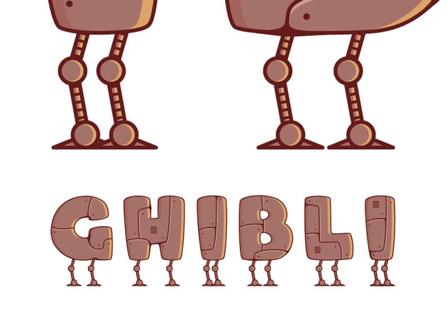
Howl’s Moving Castle is renowned for its enchanting visuals and all those whimsical details that make up the Ghibli aesthetic. In the following tutorial, we’ll jump into Adobe Illustrator and learn to create a text effect inspired by Studio Ghibli’s art style.
Let’s dive in and get some Miyazaki inspiration in this lettering tutorial.
What you’ll learn in this tutorial
- How to create a text effect in Illustrator
- How to create the text effect legs
- How to create the text effect decorations
What you’ll need
You will need the following font to complete this Studio Ghibli concept art:
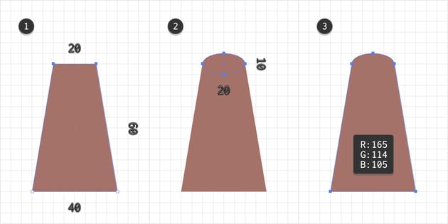
1. How to create a new document and set up a grid
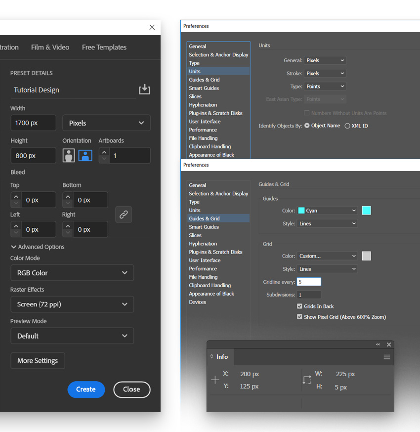
Hit Control-N to create a new document. Select Pixels from the Units drop-down menu, set the Width to 1700 px and the Height to 800 px, and then click that Advanced Options button. Select RGB for the Color Mode, set the Raster Effects to Screen (72 ppi), and then click the Create button.
Enable the Grid (View > Show Grid or Control-“) and Snap to Grid (View > Snap to Grid or Shift-Control-“). You will need a grid every 5 px, so simply go to Edit > Preferences > Guides & Grid, enter 5 in the Gridline every box and 1 in the Subdivisions box. Try not to get discouraged by all that grid—it will make your work easier, and keep in mind that you can easily enable or disable it using the Control-“ keyboard shortcut.
You should also open the Info panel (Window > Info) for a live preview with the size and position of your shapes. Don’t forget to set the unit of measurement to pixels from Edit > Preferences > Units. All these options will significantly increase your work speed. Now that you’re set, let’s start the work on our Miyazaki-inspired design.

2. How to create the text
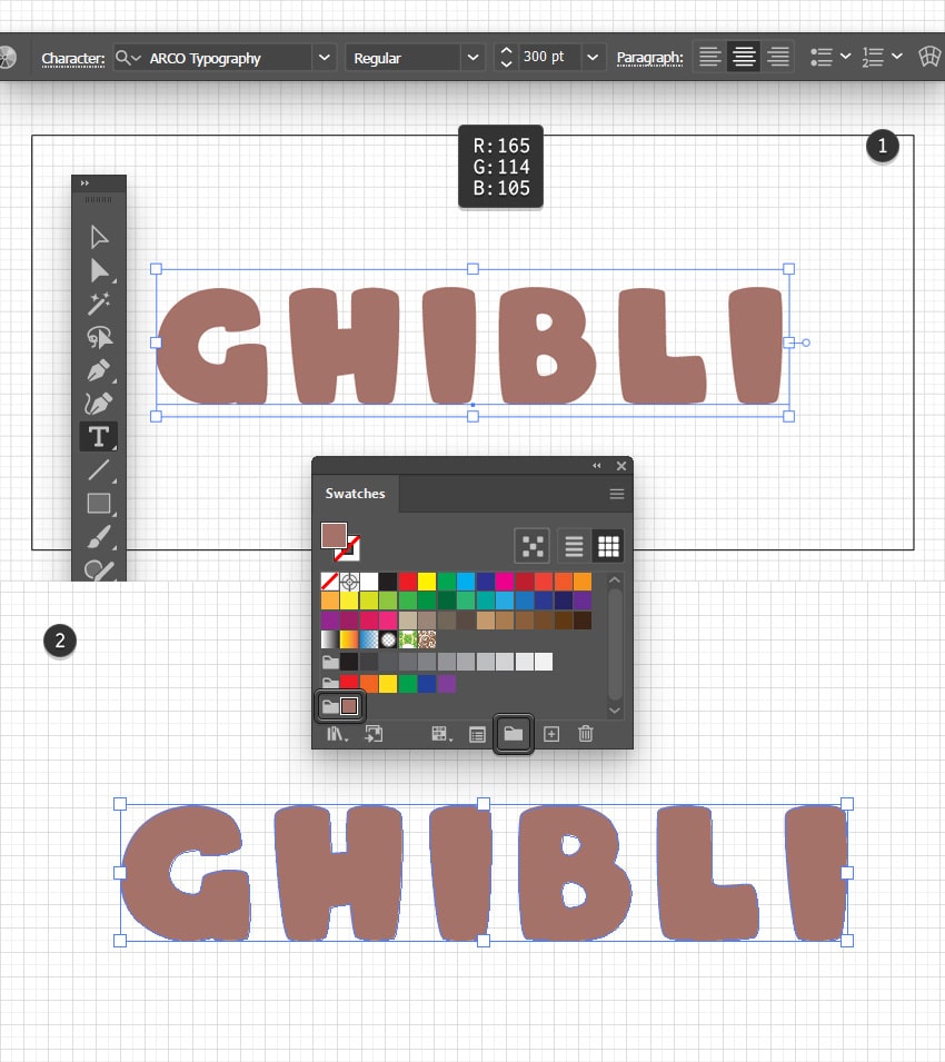
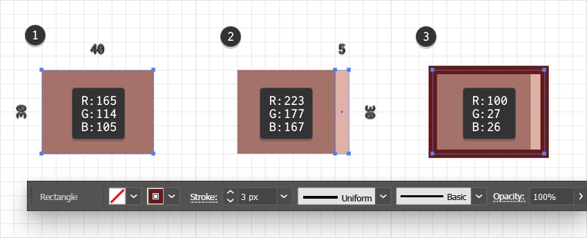
Pick the Type Tool (T) from your Toolbar and then focus on the color settings. Select the stroke and remove the color, and then double-click the fill and replace the existing color with R=165 G=114 B=104. Feel free to save this color inside the Swatches panel (Window > Swatches) as you’ll need it throughout this tutorial.
Move to the Control panel (Window > Control) to set the settings for the text that you’re about to add. Select the Arco font, increase the Size to 300 pt, and check the Align Center button. Now simply click on the arboard to type in your text. For this tutorial, we’ll use “GHIBLI”. Move it roughly to the center of the artboard and then turn it into vector shapes by going to Type > Create Outlines (Shift-Control-O). Press Shift-Control-G to Ungroup the resulting group of shapes.

3. How to create the text effect cutouts
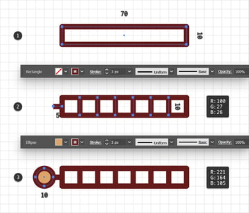
Step 1
Disable the Snap to Grid (View > Snap to Grid or Shift-Control-“) and go to Edit > Preferences > General to set the Keyboard Increment to 5 px.
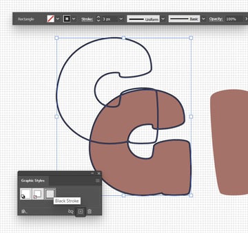
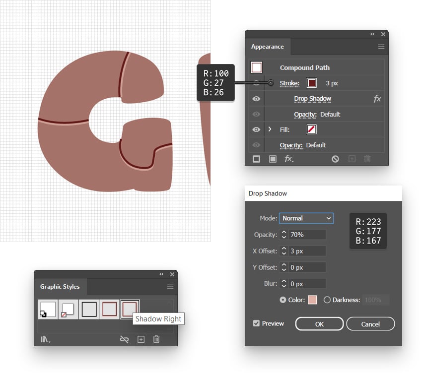
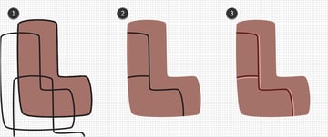
Select your “G” shape and add a copy in front (Control-C > Control-F). Keep the copy selected and press Shift-X which will swap the current Fill and Stroke color settings. Focus on the Control panel to increase the Stroke Weight to 3 px and replace the existing color with black, or any other color that makes your outline stand out. Open the Graphic Styles panel (Window > Graphic Styles) and save the settings of this outlined “G” by clicking the New Graphic Style button. We’ll use this style repeatedly, so having a saved graphic style should save you some time. If you want to be extra organized, you can double-click this graphic style and rename it “Black Stroke”.
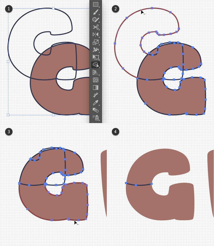
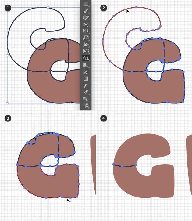
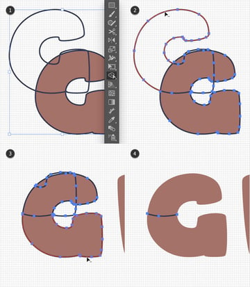
Add a copy of your outlined “G” (Control-C > Control-F). Have this new copy selected and move it 110 px up using the up arrow key and 70 px to the left using the left arrow key. Thanks to the Keyboard Increment setting, your shape will move 5 px with each press of an arrow key. Feel free to increase the value to 10 px, but remember to set it back to 5 px when needed later on.


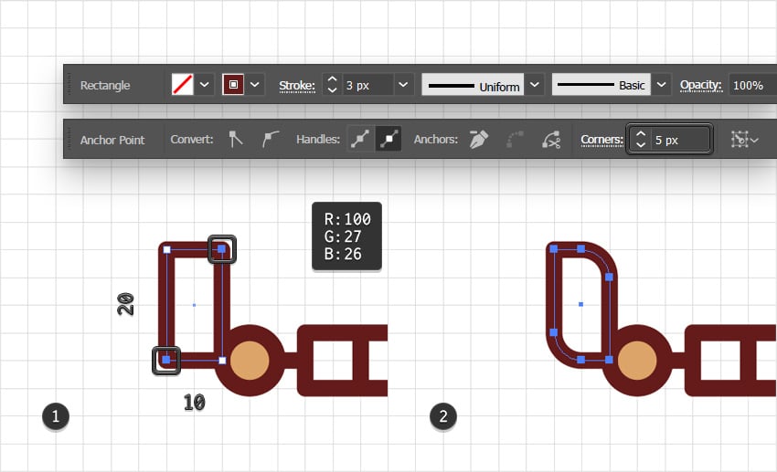
Step 2
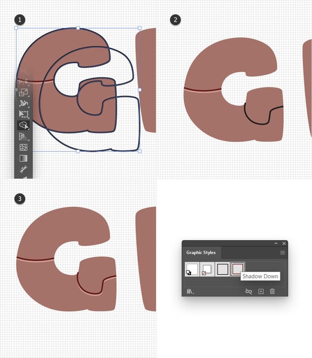
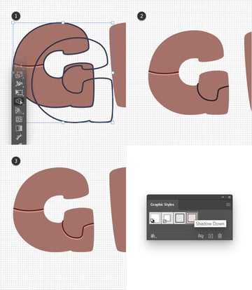
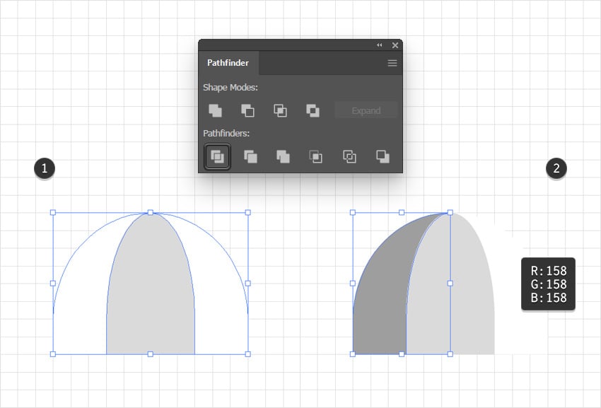
Select both outlined “G”s and pick the Shape Builder Tool (Shift-M) from your Toolbar. Hold down Alt and hover your cursor over the outline that goes outside the original shape. Simply click it to remove it. Use this same technique to remove the rest of the paths until you end up with just the one shown in the fourth image.
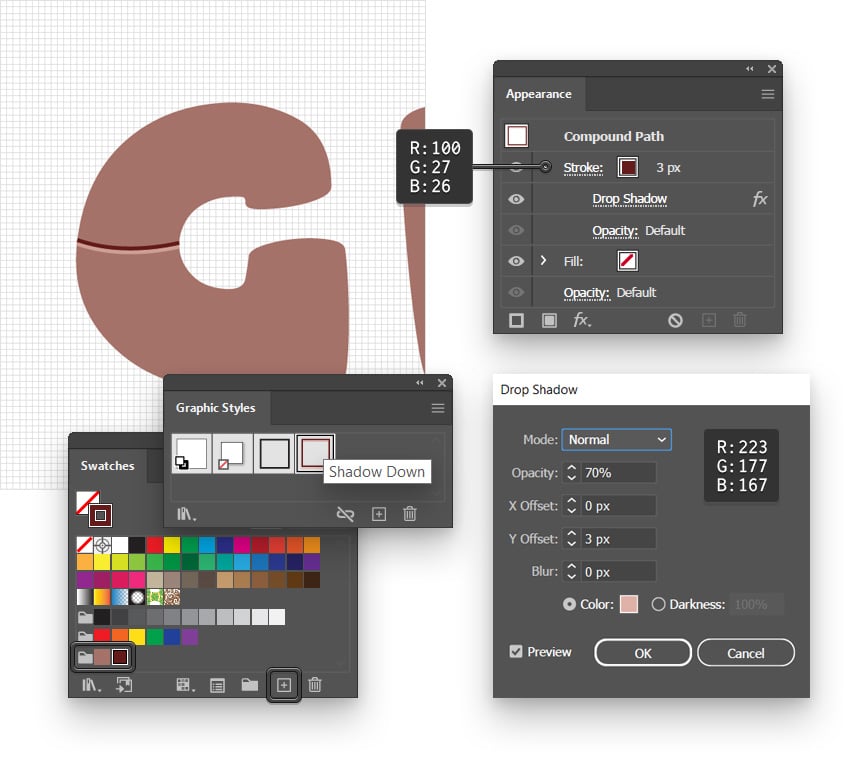
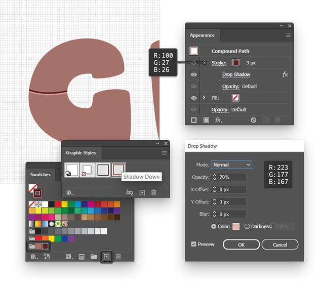
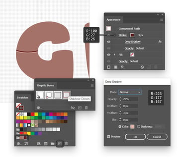
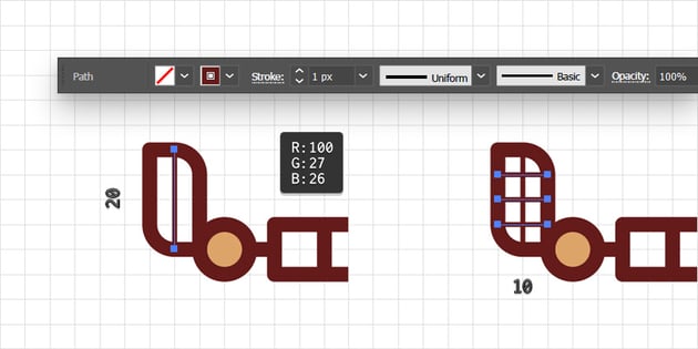
Step 3
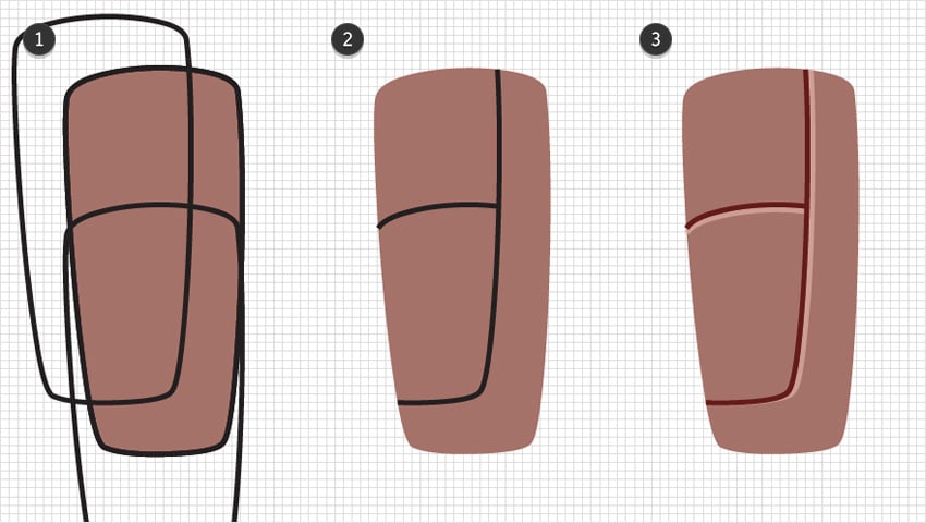
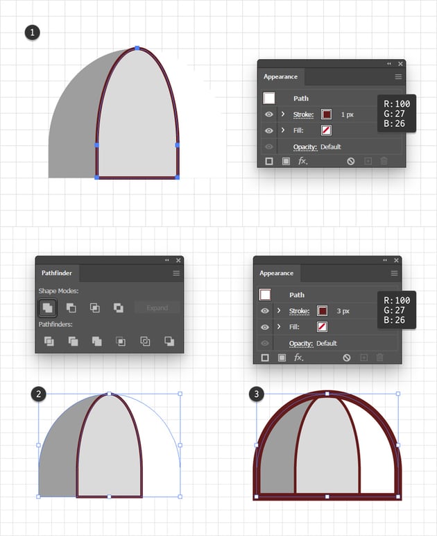
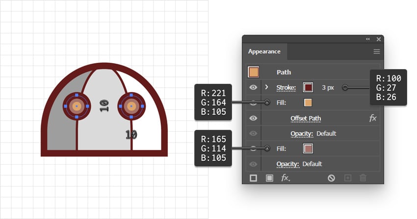
Select the path made in the previous step, and let’s stylize it. Select the stroke, keep the Weight set to 3 px, replace the color with R=100 G=27 B=26, and then go to Effect > Stylize > Drop Shadow. Enter the settings shown below and click OK.
Save the settings of this path as a new graphic style and name it “Shadow Down”. Also, feel free to save the color used for the Stroke in the Swatches panel as you’ll need it again plenty of times.
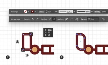
Step 4
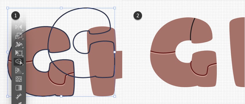
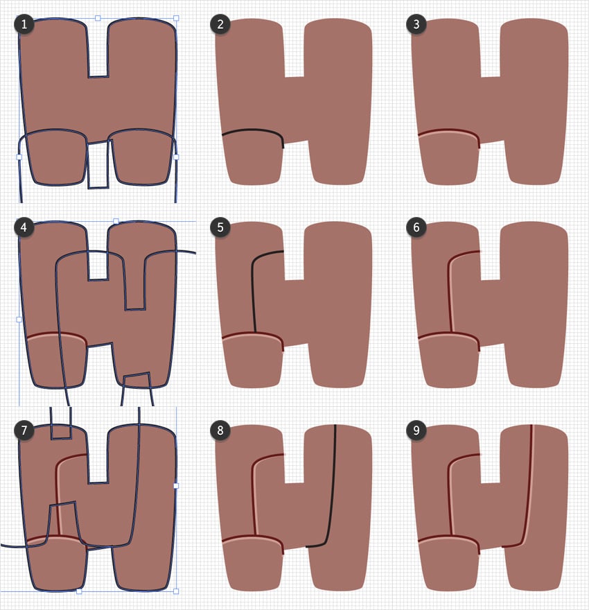
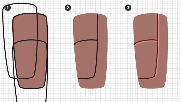
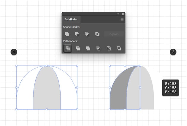
Add a new copy of your “G” (Control-C > Control-F), select it, and apply your “Black Stroke” graphic style. Duplicate this outlined “G” (Control-C > Control-F) and move the copy 40 px down and 50 px to the right.
Select both outlined “G”s and using the Shape Builder Tool (Shift-M) remove all the paths except the one shown in the second image. Select the remaining path and apply your “Shadow Down” graphic style.

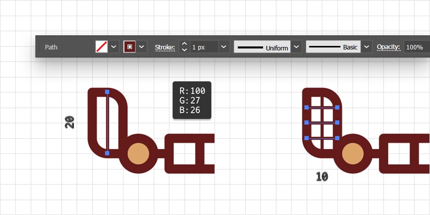
Step 5
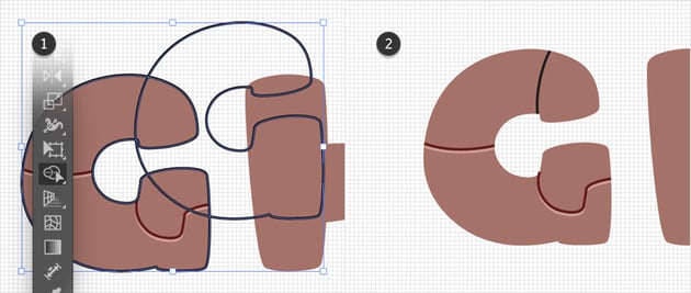
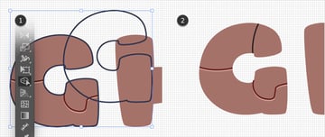
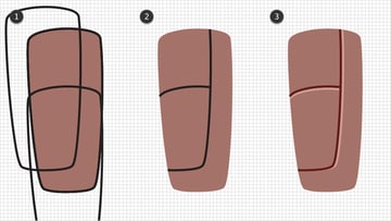
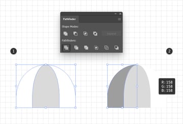
Add a new copy of your “G” (Control-C > Control-F), select it, and apply your “Black Stroke” graphic style. Duplicate this outlined “G” (Control-C > Control-F) and move the copy 60 px up and 130 px to the right.
Select both outlined “G”s and using the Shape Builder Tool (Shift-M) remove all the paths except the one shown in the second image.
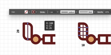
Step 6
Select the path made in the previous step and replace the existing Stroke color with R=100 G=27 B=26, and then go to Effect > Stylize > Drop Shadow. Enter the settings shown below and click OK.
Save the attributes of this path as a new graphic style and name it “Shadow Right”.


Step 7
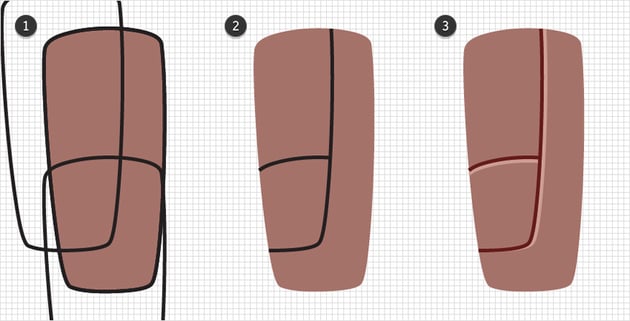
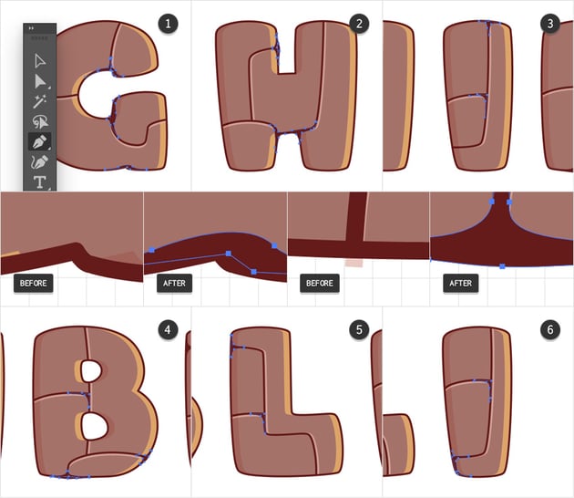
Move to the “H” shape and follow the same techniques that were used for the “G” shape to add the paths shown in the following images. Don’t worry about getting identical designs—just use them as a reference.
Once you get your paths, don’t forget that you can quickly stylize them using your saved graphic styles.
Step 8
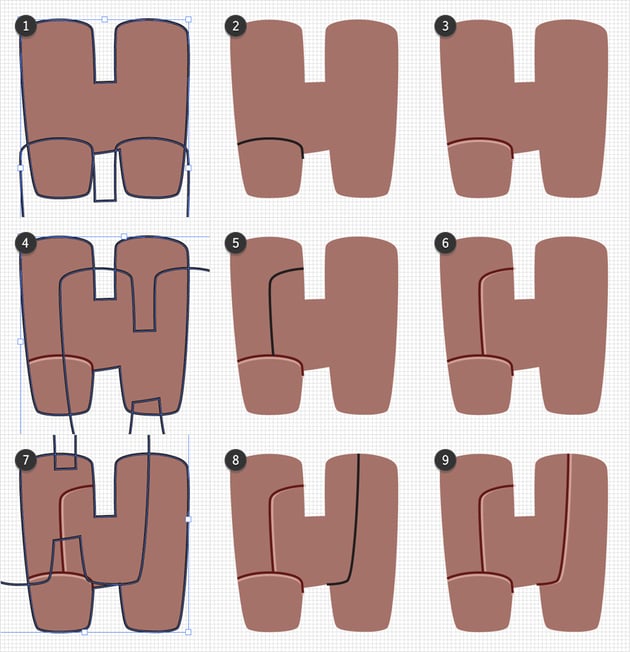
Continue with the first “I” shape and add the two paths shown in the following images.

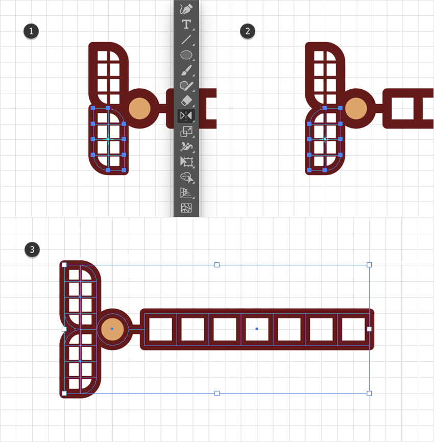
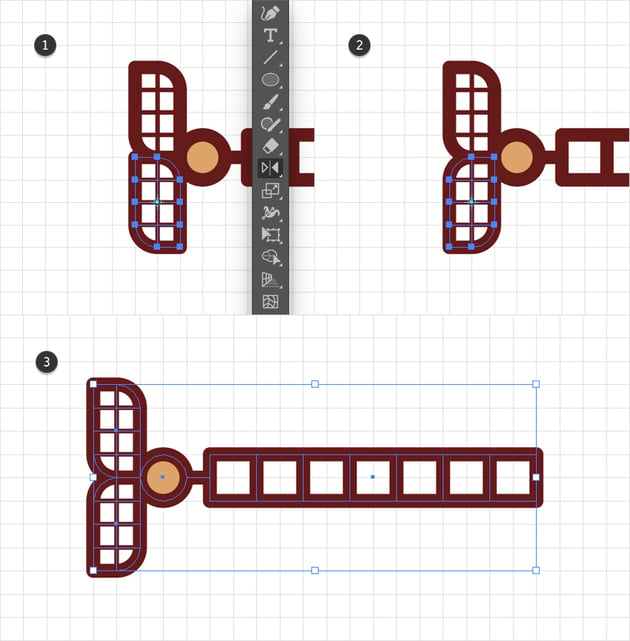
Step 9
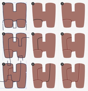
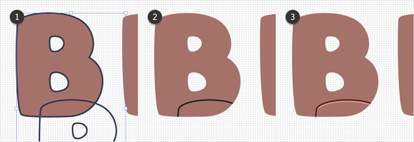
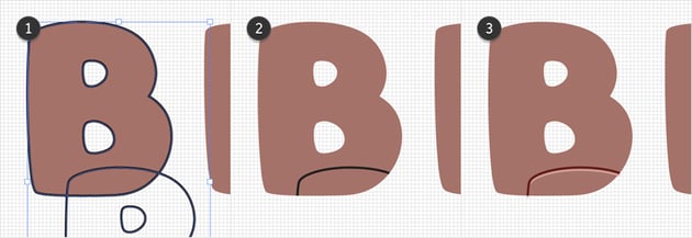
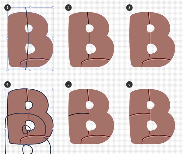
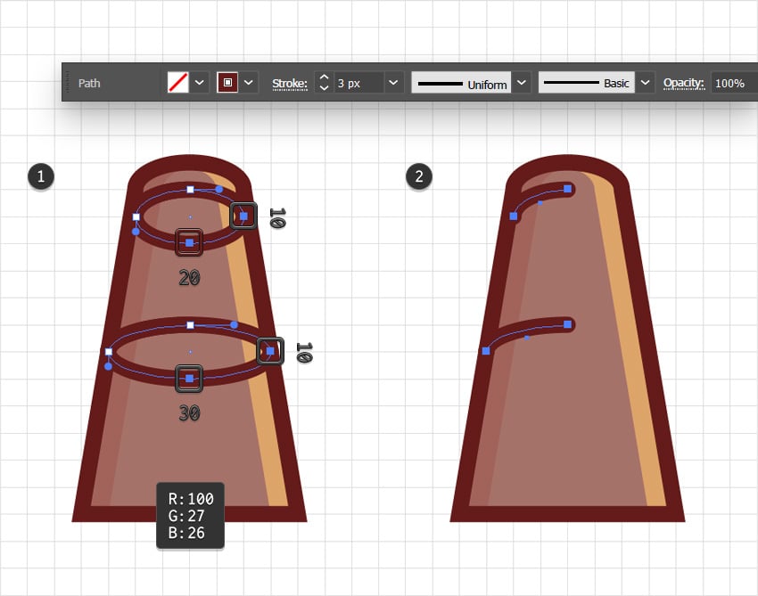
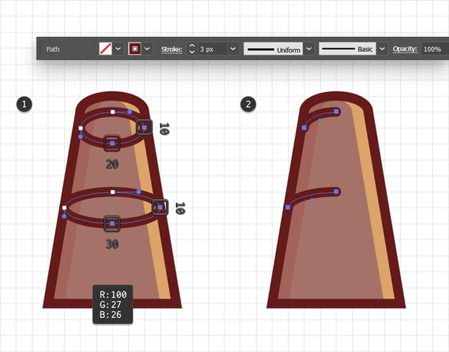
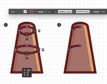
Moving to the “B” shape, let’s add the first stylized path, as shown in the following images.
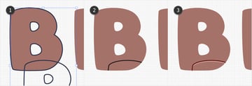
Step 10
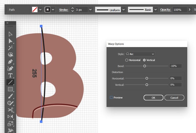
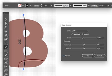
Enable Snap to Grid (View > Snap to Grid or Shift-Control-“) for a few moments. Using the Line Tool (\), draw a 255 px vertical path as shown in the following image. Add a 3 px stroke for this path, and then go to Effect > Warp > Arc. Enter the settings shown below, click OK, and then go to Object > Expand Appearance. Disable Snap to Grid (View > Snap to Grid or Shift-Control-“).

Step 11
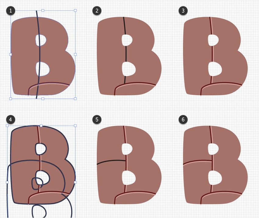
With the path made in the previous step, let’s use the Shape Builder Tool (Shift-M) to add the rest of the paths that cross over your “B” shape.
Step 12
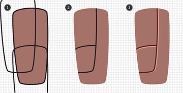
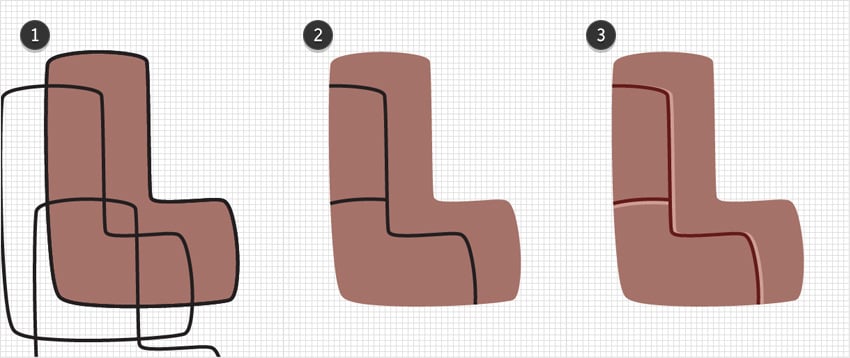
Continue with the “L” shape and add the two paths shown in the following images.
Step 13
Finally, move to the second “I” shape and add the two paths shown in the following images.
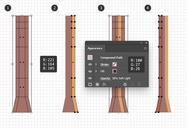
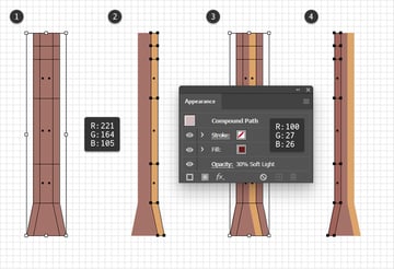
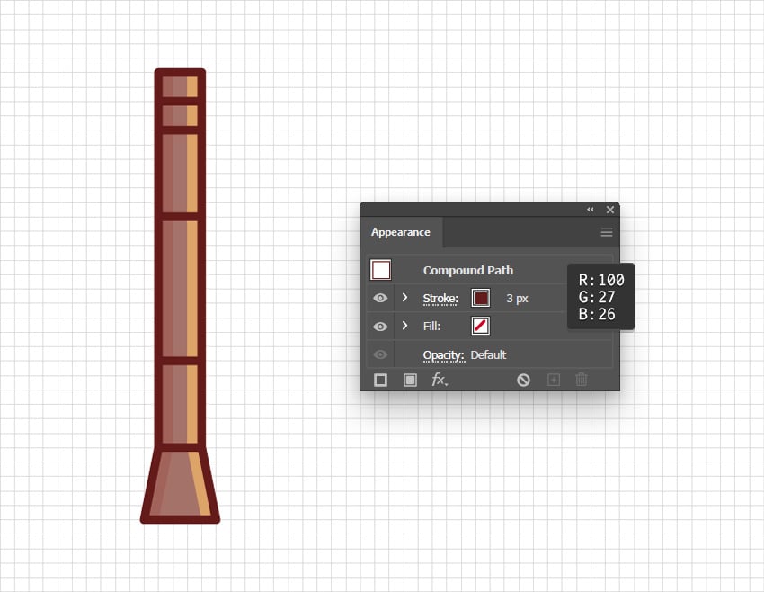
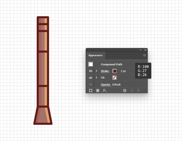
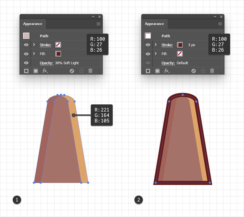
4. How to create the Ghibli aesthetic with shading, highlights, and outlines
Step 1
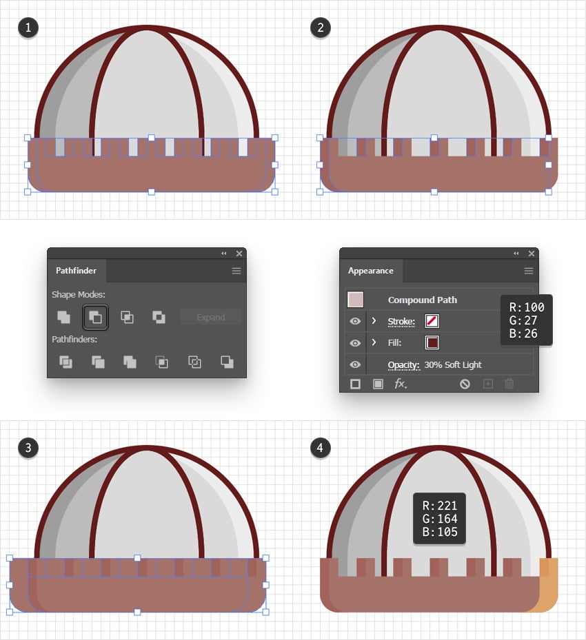
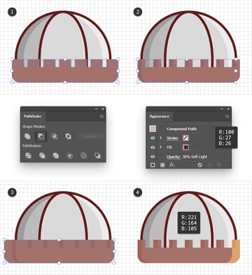
Select all your letter shapes and merge them into a single compound path (Object > Compound Path > Make or Control-8).
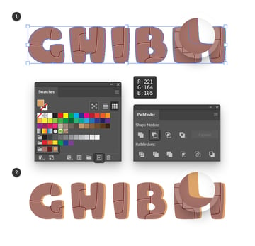
Make sure that your compound path is selected and add two copies in front (Control-C > Control-F > Control-F). Select only the front copy and move it 10 px to the left. Now reselect both copies, open the Pathfinder panel (Window > Pathfinder), and click the Minus Front button. Fill the resulting shapes with R=221 G=164 B=105 and turn them into a new compound path (Control-8). Before we continue, save this color in the Swatches panel as it’s another one of those that you’ll need again.


Step 2
Reselect your main compound path and add another two copies in front (Control-C > Control-F > Control-F). Select just the front copy and move it 10 px to the right.
Again, select both copies and click the Minus Front button from the Pathfinder panel. Turn the resulting group of shapes into a new compound path, fill it with R=100 G=27 B=26, lower its Opacity to 30%, and change the Blending Mode to Soft Light.


Step 3
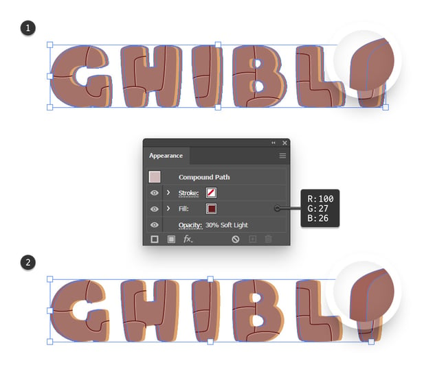
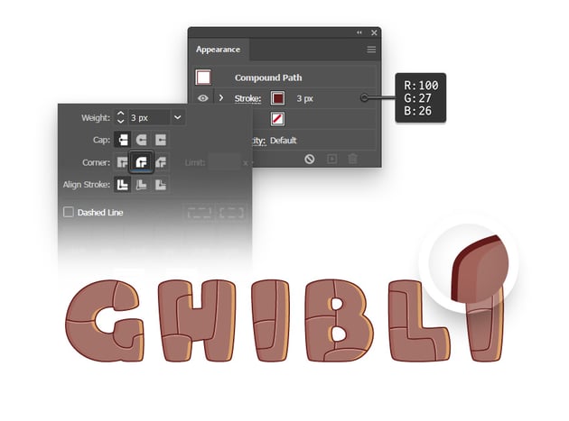
Reselect your main compound path, and this time add a copy in front of your entire design (Control-C > Shift-Control-V).
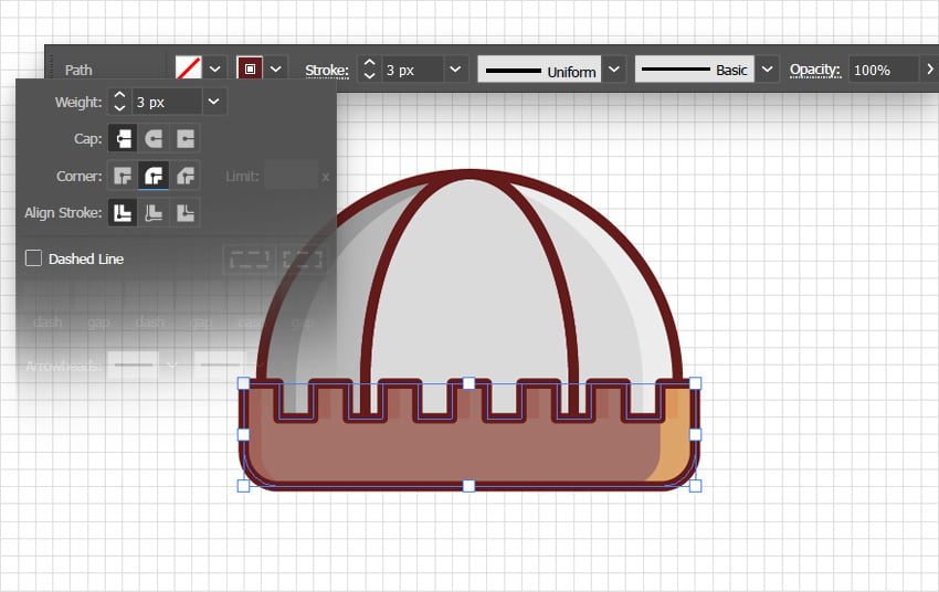
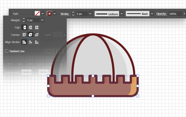
Keep it selected and press Shift-X to swap the Fill and Stroke color settings. Increase the Stroke Weight to 3 px and change its color to R=100 G=27 B=26, and then open the Stroke fly-out panel to check the Round Join button.


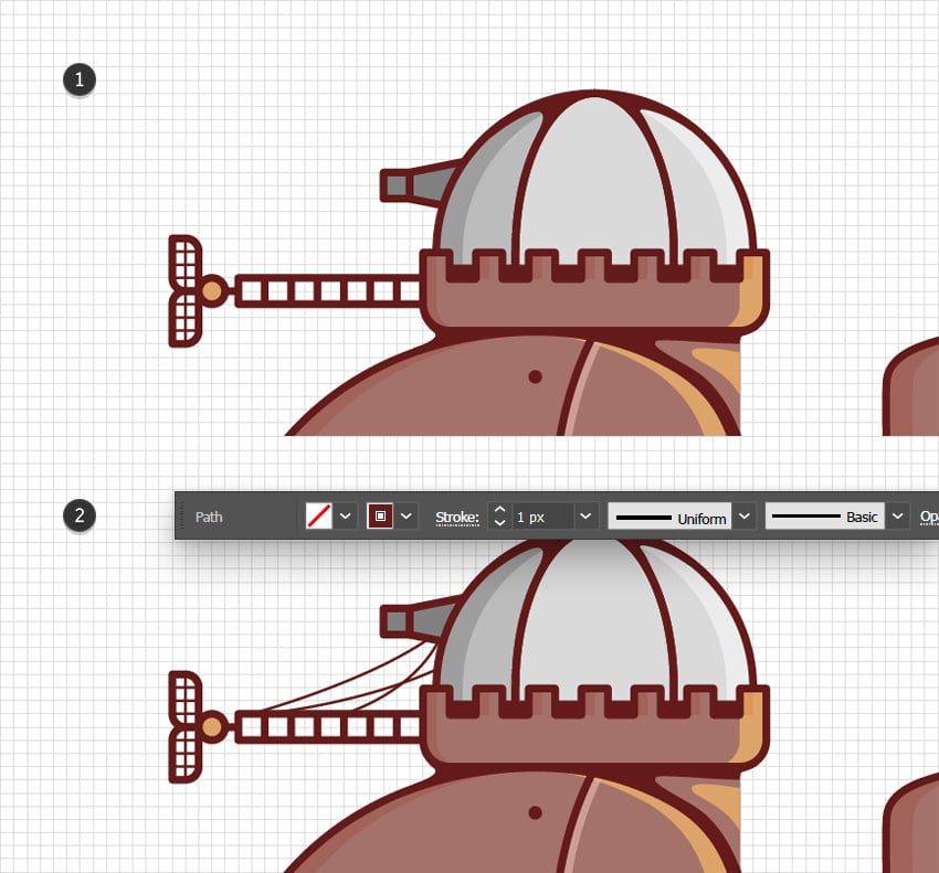
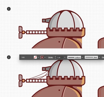
Step 4
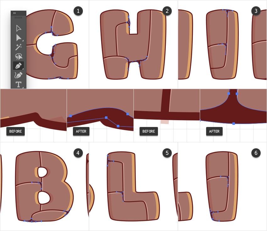
Now, if you take a closer look at the edges of your text, you might notice some subtle paths that extend beyond the edges of your outline. We’ll use the Pen Tool (P) to draw some curvy path that cover these overflowing sections. These paths will also help with the overall look of your design, so don’t limit yourself to the overflowing sections. Add two or three such paths to each letter, roughly as shown in the following images.

Step 5
Enable Snap to Grid (View > Snap to Grid or Shift-Control-“). Using the Ellipse Tool (L), create a bunch of 5 px circles and spread them across your letter shapes, roughly as shown in the following images.


Step 6
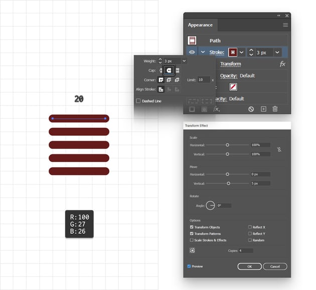
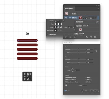
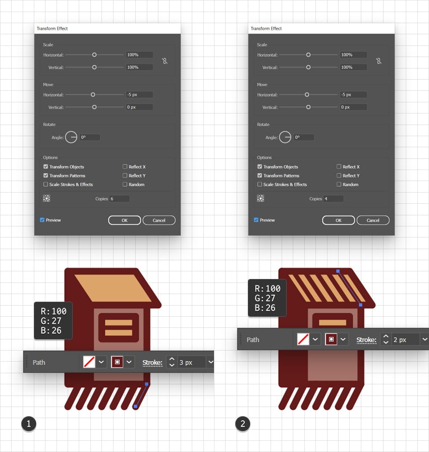
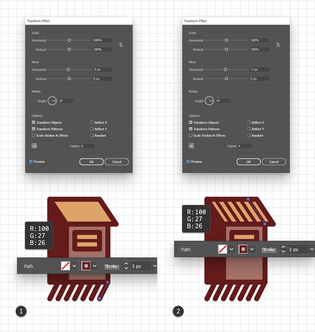
Using the Pen Tool (P) or the Line Tool (\), create a 20 px horizontal path. Add a 3 px stroke, set its color to R=100 G=27 B=26, and don’t forget to check the Round Cap button from the Stroke fly-out panel.
Focus on the Appearance panel (Window > Appearance) to select the Stroke, and in order to multiply it, let’s go to Effect > Distort & Transform > Transform. Set the number of Copies to 4, drag the Move-Vertical slider to 5 px, and then click OK.

Step 7
Keep your horizontal path selected and go to Effect > Stylize > Drop Shadow. Enter the settings shown below, click OK, and go to Effect > Warp > Bulge. Enter the settings indicated in the following image and click OK.
Have a look at the Appearance panel and make sure that the Warp effect goes below the Transform effect. This way, the warp effect will distort all the copies added by the Transform effect, not only the original one.
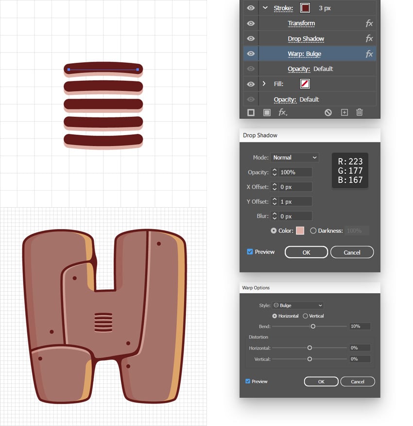


Step 8
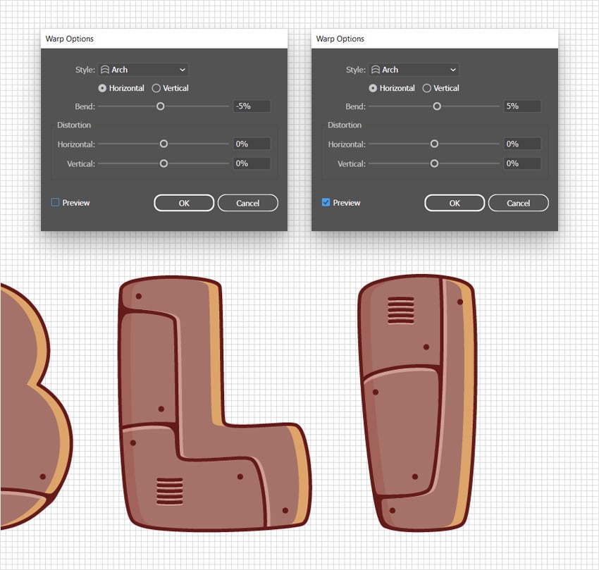
Add two copies of your warped lines and place them roughly as shown in the following image. Select the one that’s on top of your “L” and focus on the Appearance panel. Click the existing Warp effect to edit it. Replace the Bulge with an Arch effect and drag the Bend slider to -5%, and then click OK. Move to the other set of lines and replace the existing Warp effect with the second Arch effect shown in the following image.


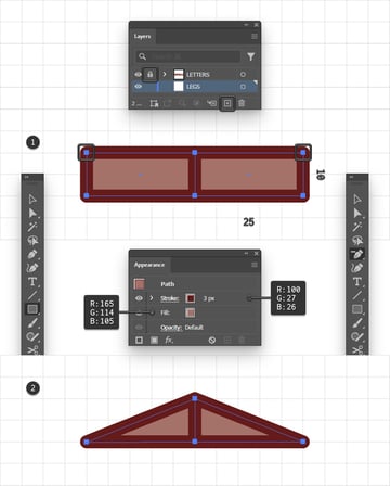
5. How to create the text effect legs
Step 1
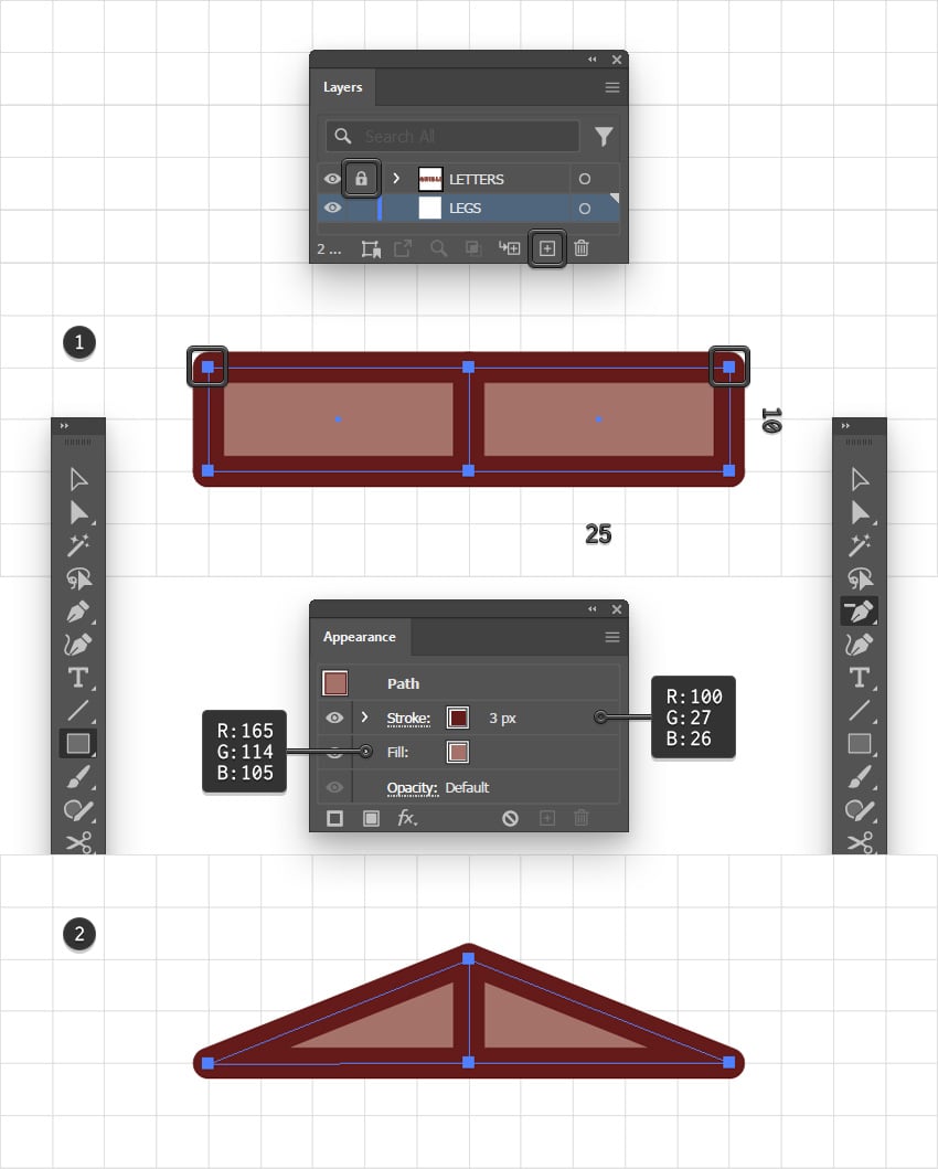
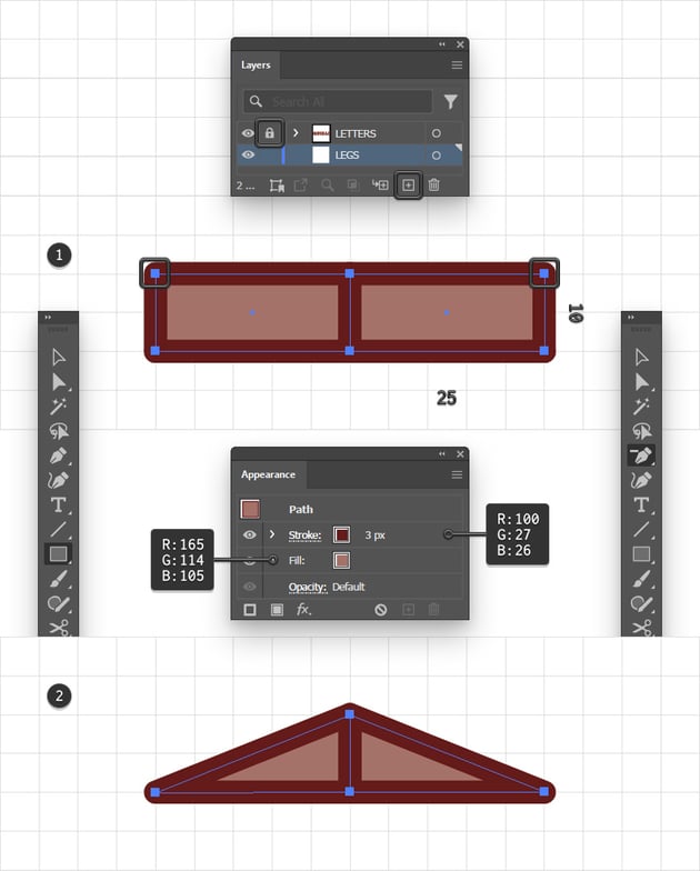
Now, let’s organize your design elements in the Layers panel (Window > Layers). Double-click the existing layer and rename it “LETTERS”, and then add a second one using the Create New Layer button. Name it “LEGS” and drag it below the existing layer. You can also lock the “LETTERS” layer to make sure you don’t select or move objects inside it by accident.
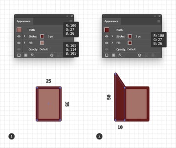
Have the “LEGS” layer selected to make sure that the new shapes that you’re about to add will go inside it. Using the Rectangle Tool (M), create two 25 x 10 px shapes. Place them next to each other, as shown below. Fill both shapes with R=165 G=114 B=105 and add a 3 px stroke. Set its color to R=100 G=27 B=26 and don’t forget to check the Round Join button from the Stroke fly-out panel.
Switch to the Delete Anchor Point Tool (-) and simply click the highlighted anchor points to remove them. This should turn your two rectangles into triangles, as shown in the second image.
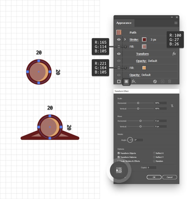
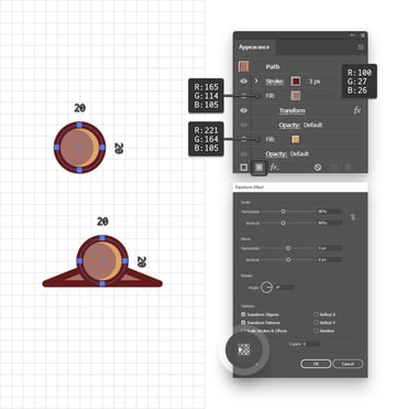
Step 2
Using the Ellipse Tool (L), create two 20 px circles and place them as shown in the following image. Fill these shapes with R=221 G=164 B=105 and add a 3 px stroke. Set its color to R=100 G=27 B=26 and then focus on the Appearance panel to add a second fill for these circles. Select it and set the color to R=165 G=114 B=105, and then go to Effect > Distort & Transform > Transform. First of all, check the middle-right reference point, and then drag both Scale sliders to 80%.

Step 3
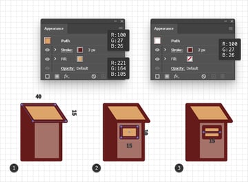
Use the Pen Tool (P) to draw a three-pointed path, as shown below. Add a 10 px stroke for this path and set its color to R=100 G=27 B=26. Simply press Shift-Control-[ to move this path behind the rest of your design.

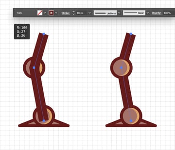
Step 4
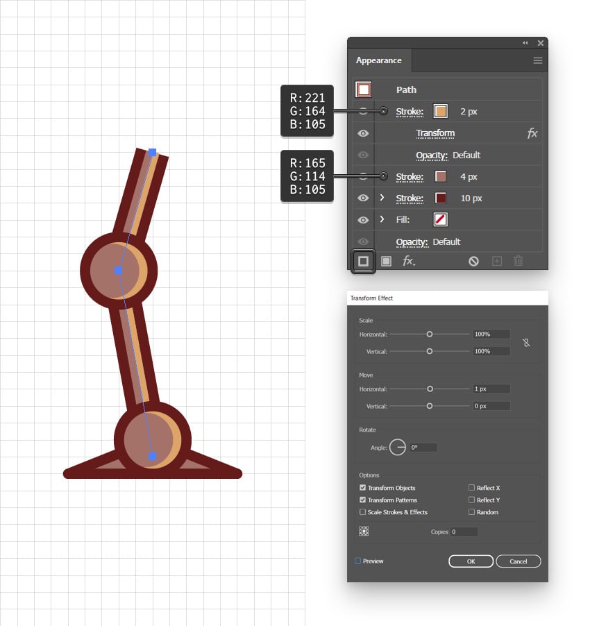
Select the path made in the previous path and focus on the Appearance panel. Use the Add New Stroke button to add a second stroke and select it. Set its Weight to 4 px and replace the existing color with R=165 G=114 B=105.
Add a third stroke on top of the existing ones and select it. Set its Weight to 2 px, replace the existing color with R=221 G=164 B=105, and then go to Effect > Distort & Transform > Transform. Just drag that Move-Horizontal slider to 1 px and click OK.


Step 5
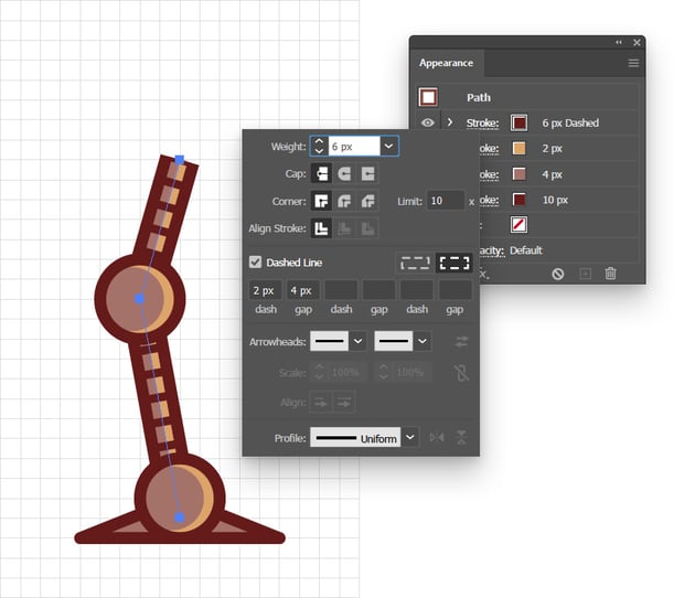
Keep your path selected and add one more stroke on top of the existing ones. Select it, set its Weight to 6 px, replace the existing color with R=100 G=27 B=26, and then open its Stroke fly-out panel. Check that Dashed Line box and then enter 2 px and 4 px in the first dash and gap boxes.


Step 6
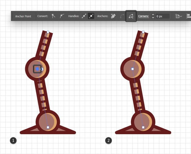
Keep focusing on the path edited in the previous step, and use the Direct Selection Tool (A) to select only the anchor point highlighted in the first image. Go to the Control panel and click Cut path, which will slice your path.


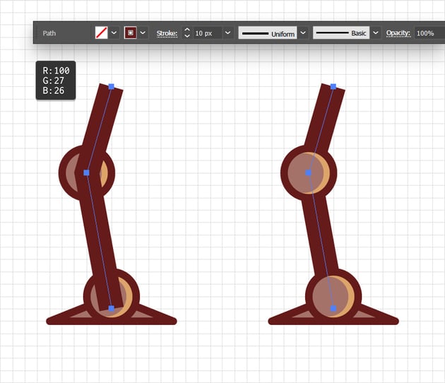
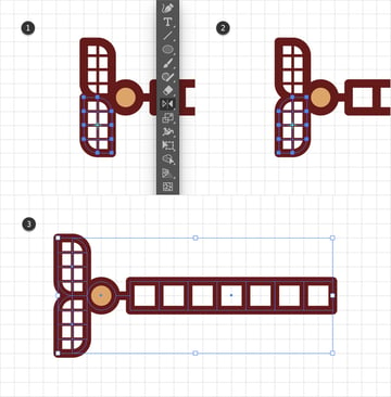
Step 7
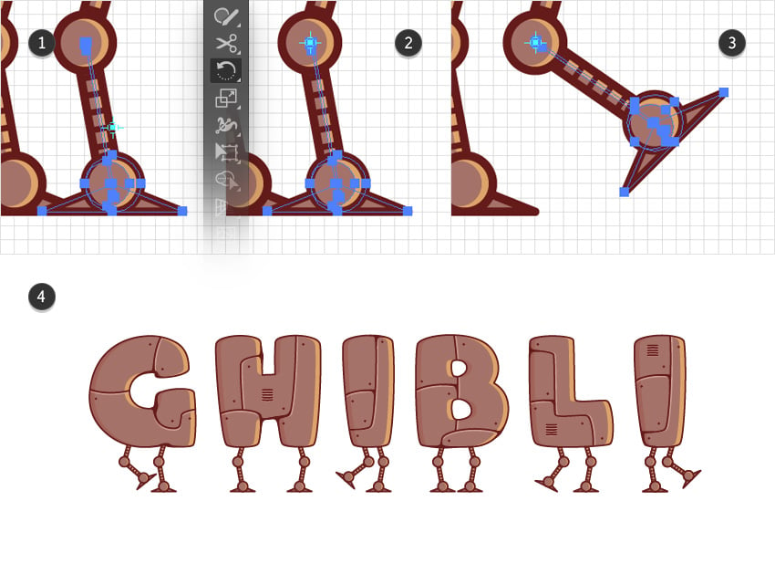
Not that your design is complete, it’s time to multiply it and add a pair of legs for each letter of your text.

Step 8
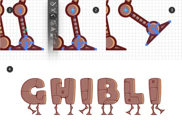
To add a bit of dynamism, let’s move some of these legs. Focus on one of your legs to see how you can adjust it. First, select the bottom of the leg and expand its content by going to Object > Expand Appearance.
Continue with the Rotate Tool (R) and click the center of the top circle to move the reference point to that exact location. The Snap to Grid feature should make it snap nicely. Now simply click and drag to rotate the leg piece as you wish. Use the same technique to adjust the rest of the legs roughly as shown in the final image.

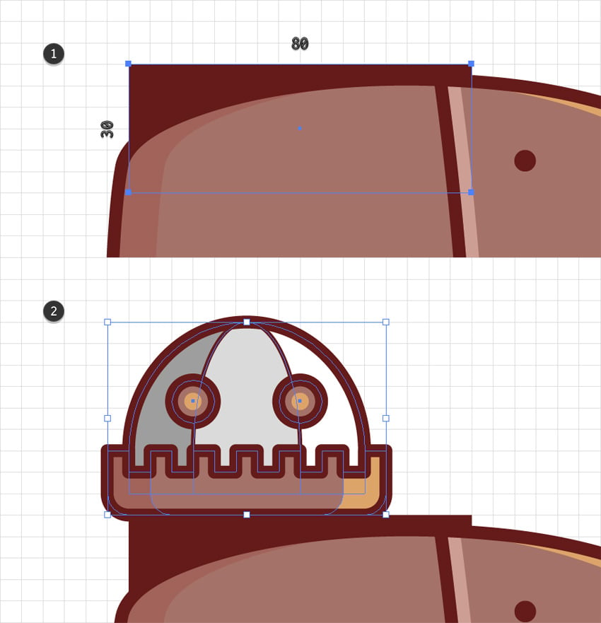
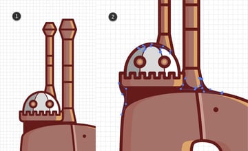
6. How to decorate the text effect with a large castle tower
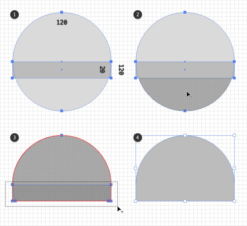
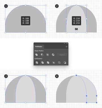
Step 1
Add a new layer, drag it below the existing ones, and then select it. Start with the Ellipse Tool (L) and use it to create a 120 px circle. Continue with the Rectangle Tool (M), create a 120 x 20 px shape and place it on top of the ellipse, as shown in the first image.
Select both shapes and switch to the Shape Builder Tool (Shift-M). First, hold down the Alt key and click on the bottom part of your circle to remove it. Next, hold down the Shift key and click and drag to create a selection around the rectangle. This will merge all your shapes.
Step 2
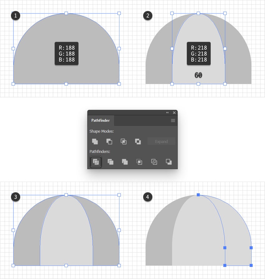
Select the shape made in the previous step and set its color to R=188 G=188 B=188, and then add a copy in front (Control-C > Control-F).
Fill this copy with R=218 G=218 B=218 and then use the bounding box to squeeze it to a width of 60 px.
Once you’re done, select both shapes and click the Divide button from the Pathfinder panel. Ungroup the resulting group of shapes (Shift-Control-G) and then select the rightmost shape to change its fill color to R=218 G=218 B=218.

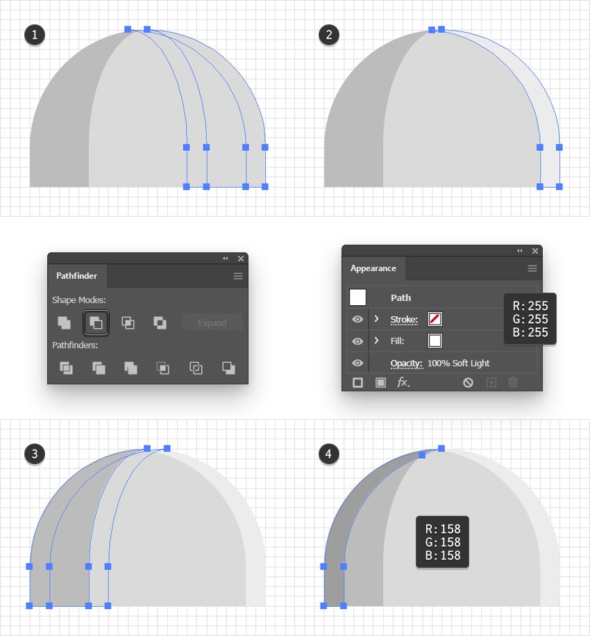
Step 3
Select the rightmost grey shape and add two copies in front (Control-C > Control-F > Control-F). Select just the top copy and move it 10 px to the left. Reselect both copies and click the Minus Front button from the Pathfinder panel. Fill the resulting shape with white (R=255 G=255 B=255) and change its Blending Mode to Soft Light.
Select the leftmost grey shape and add two copies in front (Control-C > Control-F > Control-F). Select just the top copy, and this time move it 10 px to the right. Reselect both copies and click the Minus Front button from the Pathfinder panel. Fill the resulting shape with R=158 G=158 B=158.

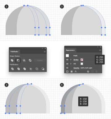
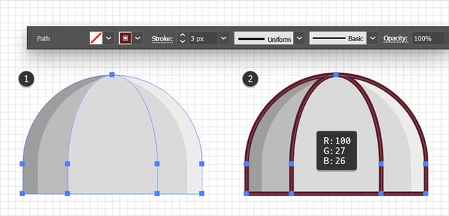
Step 4
Select the three main grey shapes and add copies in place (Control-C > Shift-Control-V). Keep these copies selected, remove the fill colors, and add a 3 px stroke. Set the color to R=100 G=27 B=26.

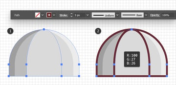
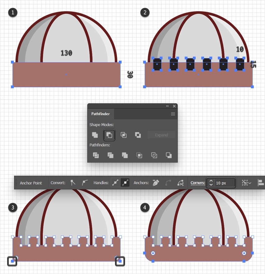
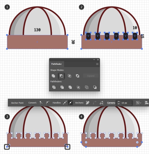
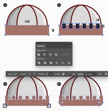
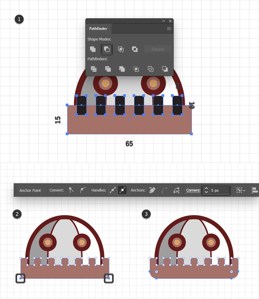
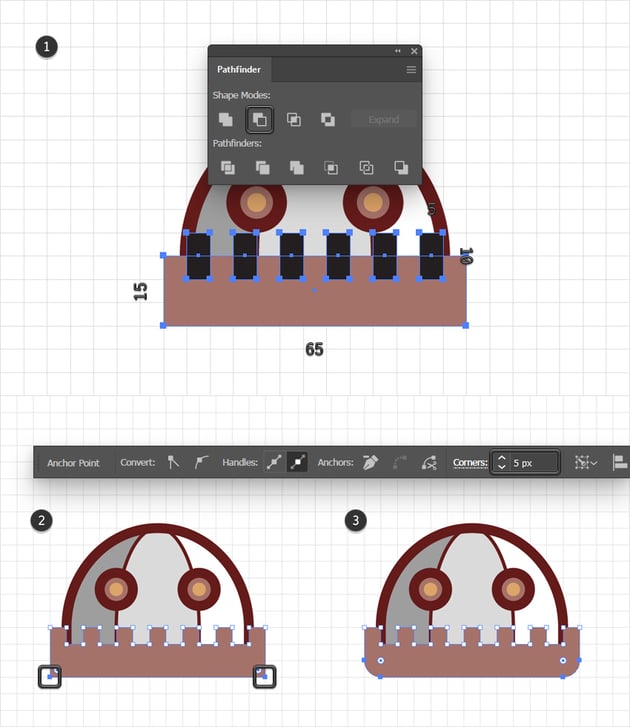
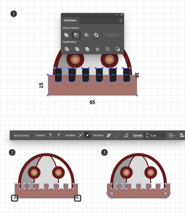
Step 5
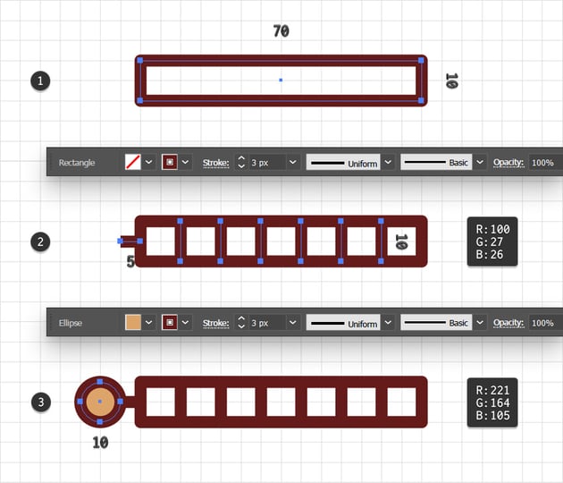
Pick the Rectangle Tool (M), create a 130 x 30 px shape, fill it with R=165 G=114 B=105, and place it as shown in the first image. Using the same tool, add six 10 x 15 px shapes and place them as shown in the second image.
Select all of these rectangles and click the Minus Front button from the Pathfinder panel. Use the Direct Selection Tool (A) to select the two anchor points highlighted in the third image and then go to the Control panel to set the Corners radius to 10 px.
Step 6
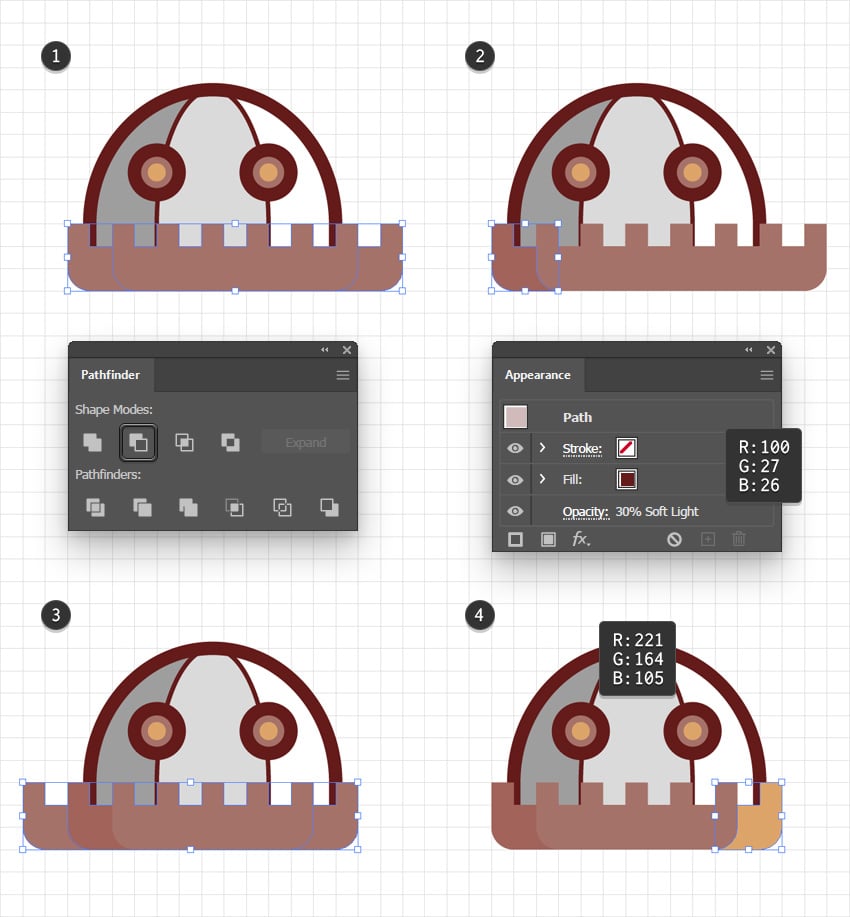
Select your stylized brick-wall shape and add two copies in front (Control-C > Control-F > Control-F). Select the top copy and move it 5 px to the right. Reselect both copies and click the Minus Front button from the Pathfinder panel. Turn the resulting group of shapes into a compound path (Control-8), set its color to R=100 G=27 B=26, lower its Opacity to 30%, and change the Blending Mode to Soft Light.
Reselect your stylized brick-wall shape and add two new copies in front (Control-C > Control-F > Control-F). Select the top copy and this time move it 5 px to the left. Reselect both copies and click the Minus Front button from the Pathfinder panel. Ungroup the resulting group of shapes, remove the tiny rectangles, and only keep the rightmost shape. Set its color to R=221 G=164 B=105.

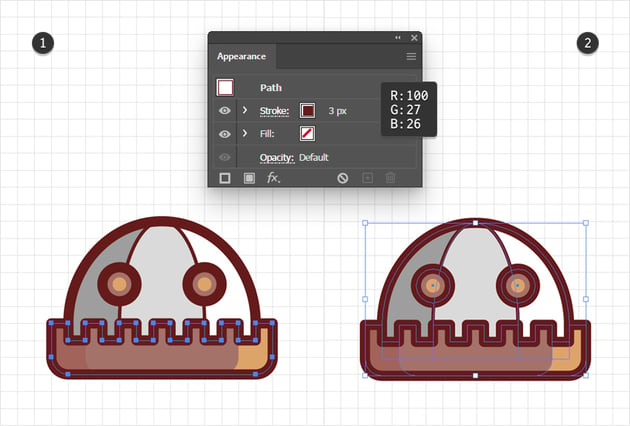
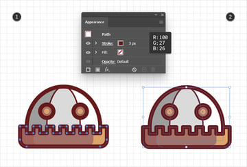
Step 7
Select your stylized brick-wall shape and add a copy in place (Control-C > Shift-Control-V). Remove the fill color of this shape, add a 3 px stroke, set its color to R=100 G=27 B=26, and then don’t forget to check the Round Cap button from the Stroke fly-out panel.
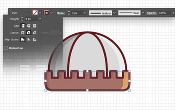
Step 8
Using the Rectangle Tool (M) and the Direct Selection Tool (A), create the square and the trapezoid shown in the following images. Fill both shapes with R=128 G=128 B=128 and add a 3 px stroke. Set its color to R=100 G=27 B=26 and remember to check the Round Join button from the Stroke fly-out panel.
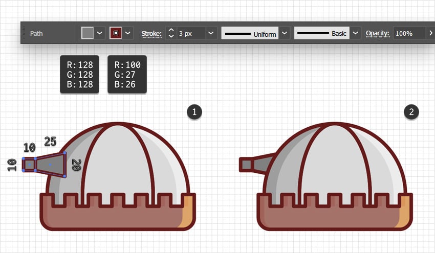

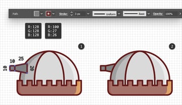
Step 9
Use the Rectangle Tool (M) to add a 120 x 10 px shape, fill it with R=100 G=27 B=26 and place it as shown in the first image. You can press Control-[ a few times to move this rectangle behind the stylized brick wall. Select all the shapes that make up this castle tower and press Control-G to Group them.

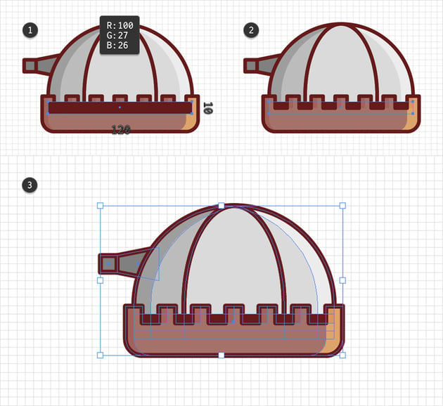

Step 10
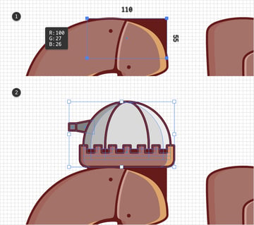
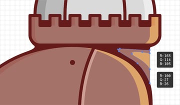
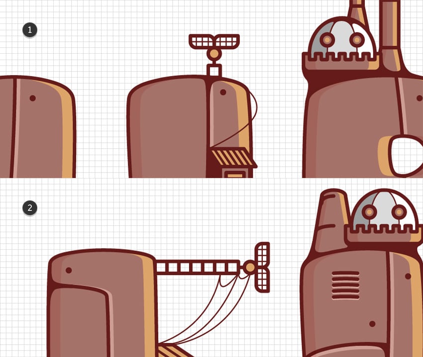
Using the Rectangle Tool (M), create a 110 x 55 px shape, fill it with R=110 G=27 B=26, and place it behind the “G”, as shown in the first image. Next to this rectangle, add your castle tower group.


Step 11
Grab the Pen Tool (P) and draw some curvy paths which should blend your castle tower with the letter shapes.
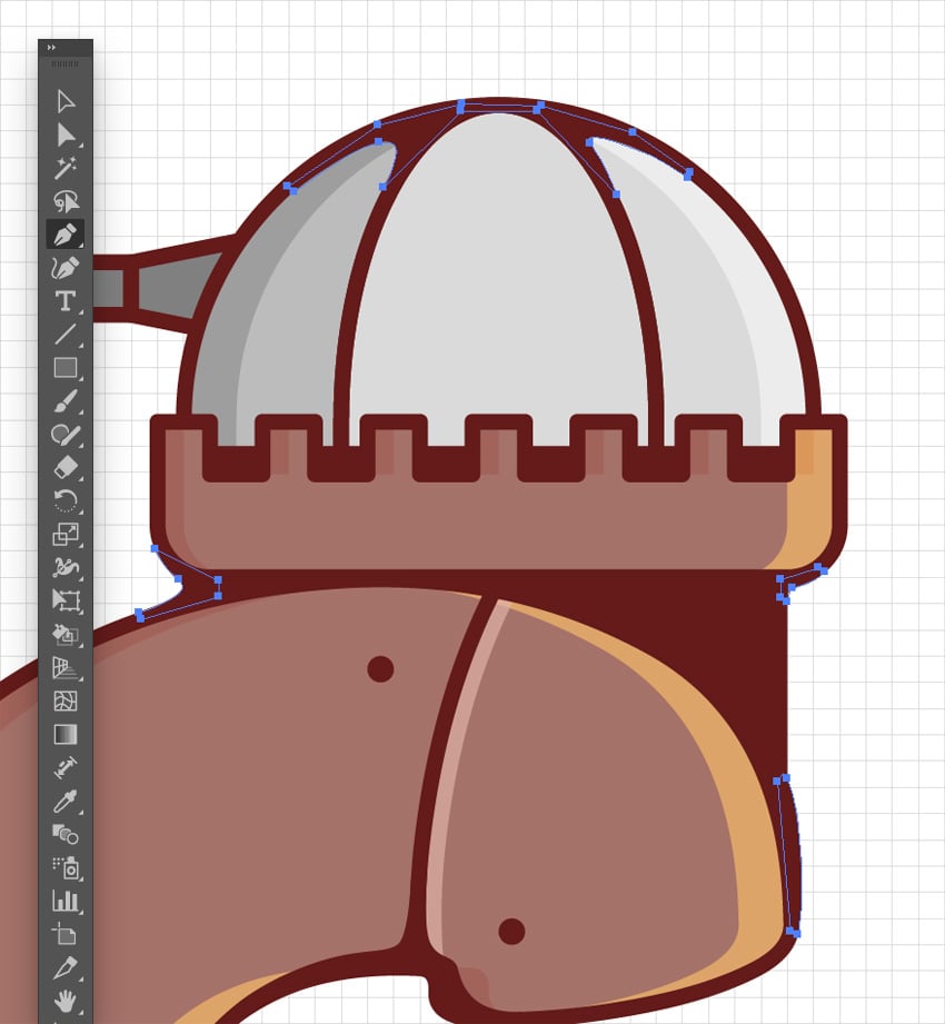
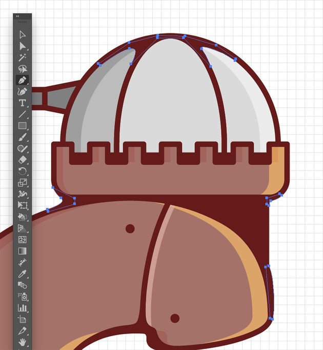
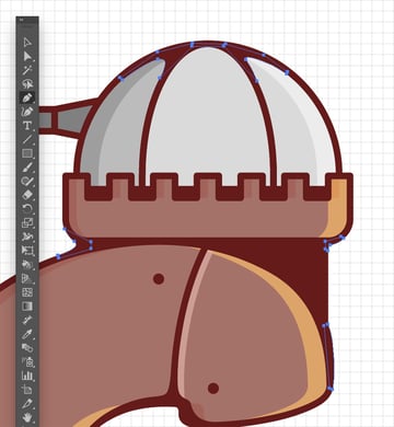
Also add these colored shapes to further stylize the part that connects your castle tower with the letter.


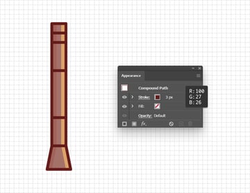
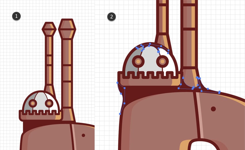
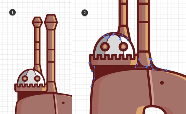
7. How to decorate the text effect with smokestacks
Step 1
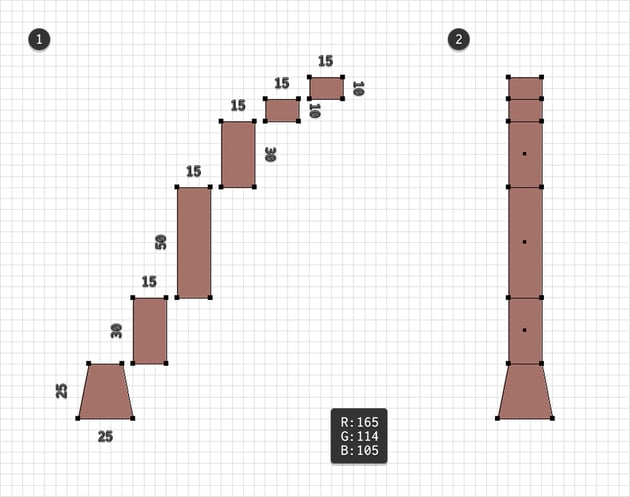
Add a new layer, drag it below the existing ones, and select it.
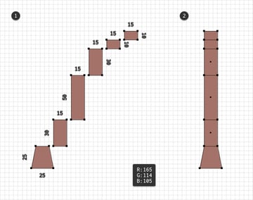
Use the Rectangle Tool (M) and the Direct Selection Tool (A) to create the set of shapes shown in the first image. Fill all of these shapes with R=165 G=114 B=105, align them in a perfect column, and then turn them into a single compound path (Control-8).

Step 2
Add copies of your latest compound path (Control-C > Control-V > Control-F). Select the front one and move it 5 px to the left. Reselect both copies and click the Minus Front button from the Pathfinder panel. Fill the resulting path with R=221 G=164 B=105.
Reselect the compound path made in the previous step and add another two copies in front (Control-C > Control-V > Control-F). Select the front one and move it 5 px to the right. Reselect both copies and click the Minus Front button from the Pathfinder panel. Fill the resulting path with R=100 G=27 B=26, lower its Opacity to 30%, and change its Blending Mode to Soft Light.
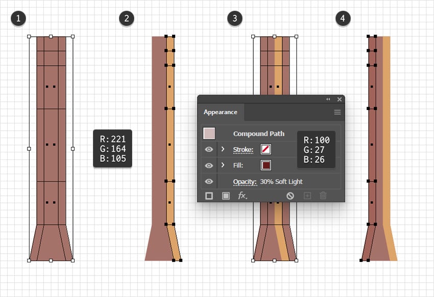
Step 3
Add one more copy of that main compound path (Shift-Control-V). Remove its fill color and then select the Stroke. Set the color to R=100 G=27 B=26 and increase the Weight to 3 px.
Step 4
Using the same techniques to add the two smokestack designs shown below. You can create these from scratch or just create a copy of the existing one and then use the Direct Selection Tool (A) to select and adjust the position of the anchor points.

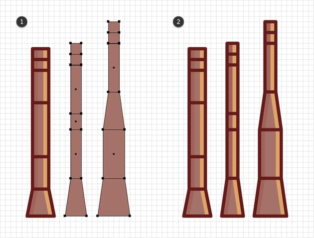
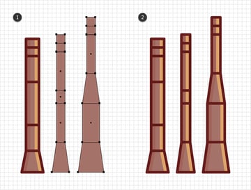
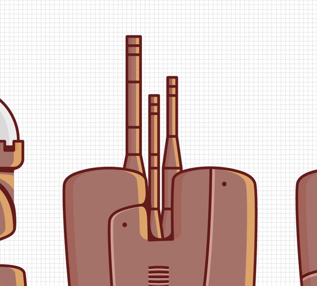
Once you’re done, place your smokestack designs behind the “H”, roughly as shown in the following image.

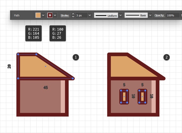
8. How to add the balcony
Step 1
Add a new layer and this time drag it on top of the existing layers. Remember to select it.
Use the Rectangle Tool (M) to create a 25 x 35 px shape. Fill it with R=165 G=114 B=105 and add a 3 px stroke. Set its color to R=100 G=27 B=26 and don’t forget to check the Round Join button.
Continue with the Pen Tool (P) and use it to create the shape shown in the second image. Keep the existing stroke and replace the fill color with the same one that’s used for the stroke.


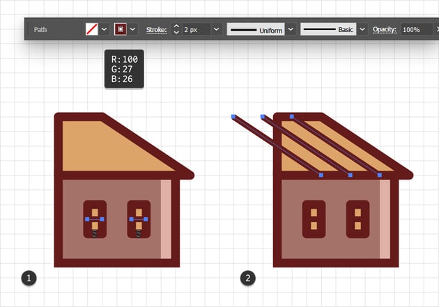
Step 2
Use the Pen Tool (P) to create a shape like the one shown in the first image. Keep that 3 px stroke, but replace the fill color with R=221 G=164 B=105.
Using the same appearance attributes and the Rectangle Tool (M), create a 15 x 10 px shape and place it as shown in the second image.
Reselect the Pen Tool (P) and draw a horizontal path as shown in the third image. You need to lower the Stroke Weight to 2 px.
Step 3
Use the Pen Tool (P) to draw an oblique path as shown in the first image. Select it, increase the Weight to 3 px, and then go to Effect > Distort & Transform > Transform. Set the number of Copies to 6, drag the Move-Horizontal slider to -5 px, and then click OK.
Continue with the Pen Tool (P) and use it to draw the path shown in the second image. Select it and lower the Weight to 2 px, and then go again to Effect > Distort & Transform > Transform. Set the number of Copies to 4, drag the Move-Horizontal slider to -5 px, and then click OK.

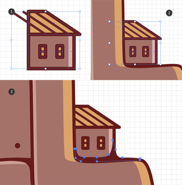
Step 4
Select all the shapes that make up your tiny house and Group them (Control-G). Place this new group as shown in the second image.

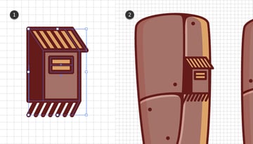
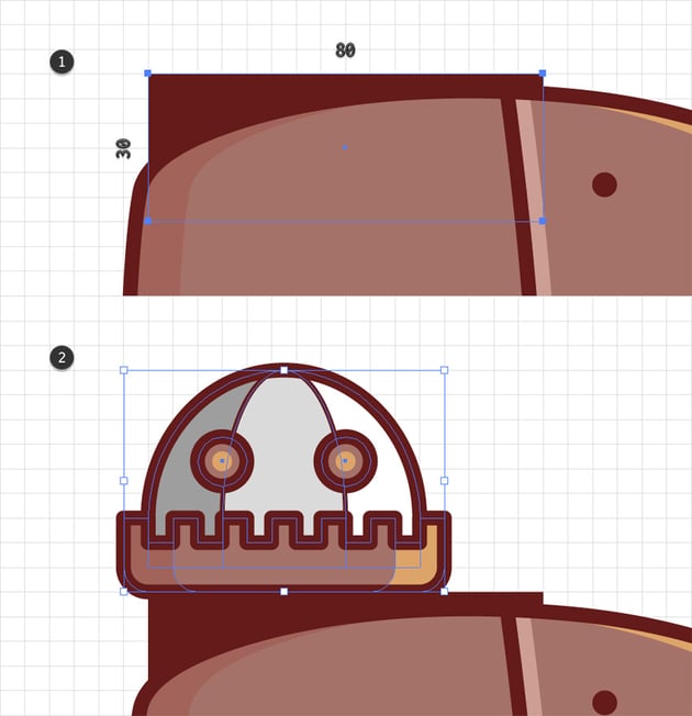
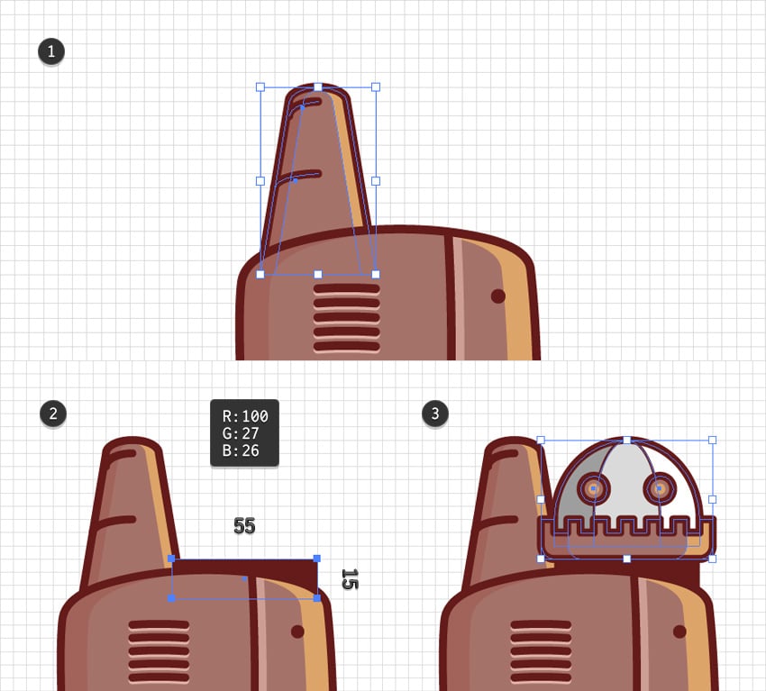
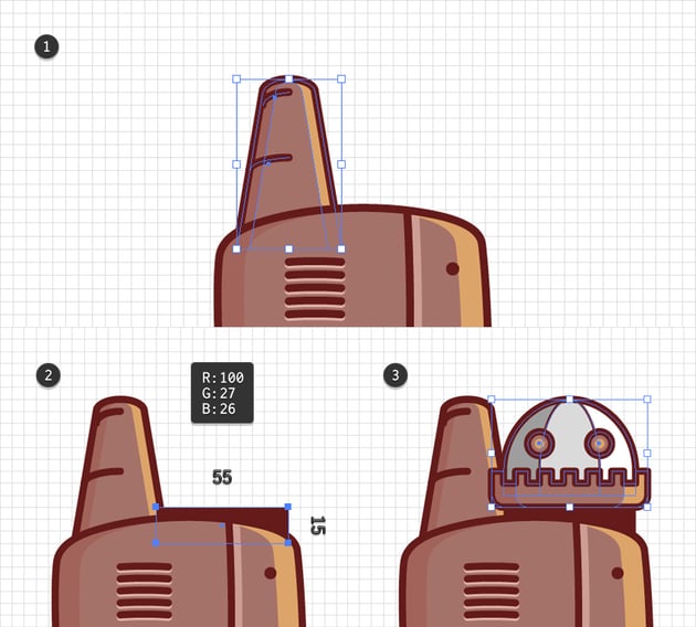
9. How to add the small castle tower
Step 1
Add a new layer, drag it below the existing ones, and then select it. We’ll create a slightly different version of that castle tower design.
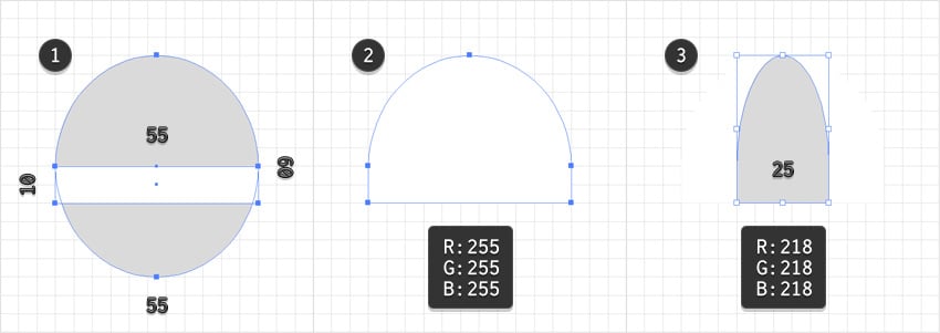
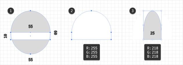
Start with the Ellipse Tool (L) and use it to create a 55 x 60 px shape. Continue with the Rectangle Tool (M), creating a 55 x 10 px shape and placing it on top of the ellipse as shown in the first image.
Select both shapes and use the Shape Builder Tool (Shift-M) to remove the bottom part of the circle and then merge the remaining shapes. Fill the resulting shape with white (R=255 G=255 B=255). Add a copy of this shape (Control-C > Control-F), change its color to R=218 G=218 B=218, and then squeeze it to a width of 25 px.
Step 2
Select both shapes made in the previous step and click the Divide button from the Pathfinder panel. Ungroup (Shift-Control-G) the resulting group of shapes and select the leftmost shape to change its color to R=158 G=158 B=158.
Step 3
Select the middle grey shape and add a copy in front (Control-C > Control-F). Select it to remove the fill color and apply a 1 px stroke. Set its color to R=100 G=27 B=26.
Select all three grey shapes and add copies in place (Control-C > Shift-Control-V). Merge these copies using the Unite button from the Pathfinder panel. Again, remove the fill color that’s applied for this shape and add a 3 px stroke. Use that same color.


Step 4
Use the Ellipse Tool (L) to create two 10 px circles and place them as shown below. Fill both shapes with R=165 G=114 B=105 and add a 3 px stroke. Set its color to R=100 G=27 B=26 and then add a second fill. Select it and set the color to R=221 G=164 B=105, and then go to Effect > Path > Offset Path. Set the Offset to -3 px and click OK.

Step 5
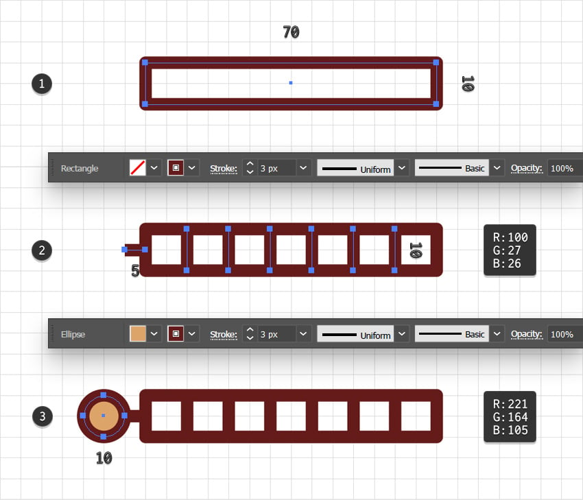
Pick the Rectangle Tool (M), create a 65 x 15 px shape, fill it with R=165 G=114 B=105, and place it as shown in the first image. Using the same tool, add six 5 x 10 px shapes and place them as shown below.
Select all of these rectangles and click the Minus Front button from the Pathfinder panel. Use the Direct Selection Tool (A) to select the two anchor points highlighted in the second image and set the Corners radius to 10 px.
Step 6
Select your stylized brick-wall shape and add two copies in front (Control-C > Control-F > Control-F). Select the top copy and move it 10 px to the right. Reselect both copies and click the Minus Front button from the Pathfinder panel. Fill the resulting shape with R=100 G=27 B=26, lower its Opacity to 30%, and change the Blending Mode to Soft Light.
Reselect your stylized brick-wall shape and add two new copies in front (Control-C > Control-F > Control-F). Select the top copy, and this time move it 10 px to the left. Reselect both copies and click the Minus Front button from the Pathfinder panel. Fill the resulting shape with R=221 G=164 B=105.


Step 7
Select your stylized brick-wall shape and add a copy in place (Control-C > Shift-Control-V). Remove the fill color of this shape, add a 3 px stroke, set its color to R=100 G=27 B=26, and then don’t forget to check the Round Cap button from the Stroke fly-out panel. Once you’re done, select all the shapes that make up this castle tower and Group them (Control-G).

Step 8
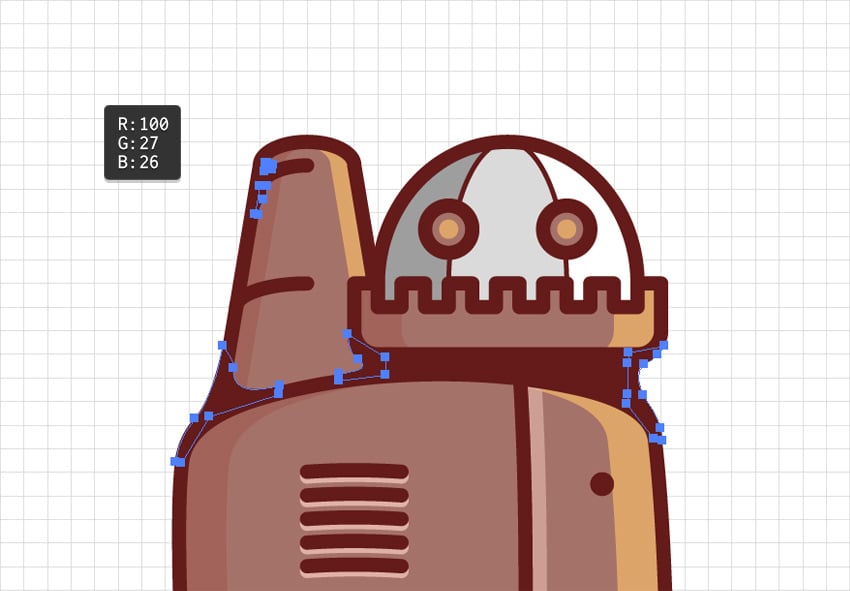
Using the Rectangle Tool (M), create an 80 x 30 px shape, fill it with R=110 G=27 B=26, and place it behind the “B”, as shown in the first image. Next to this rectangle, add your tiny castle tower group.

Step 9
Add some copies of your smokestack designs behind the tiny castle tower. Also, use the Pen Tool (P) to draw some paths connecting these elements with the letter of your text.
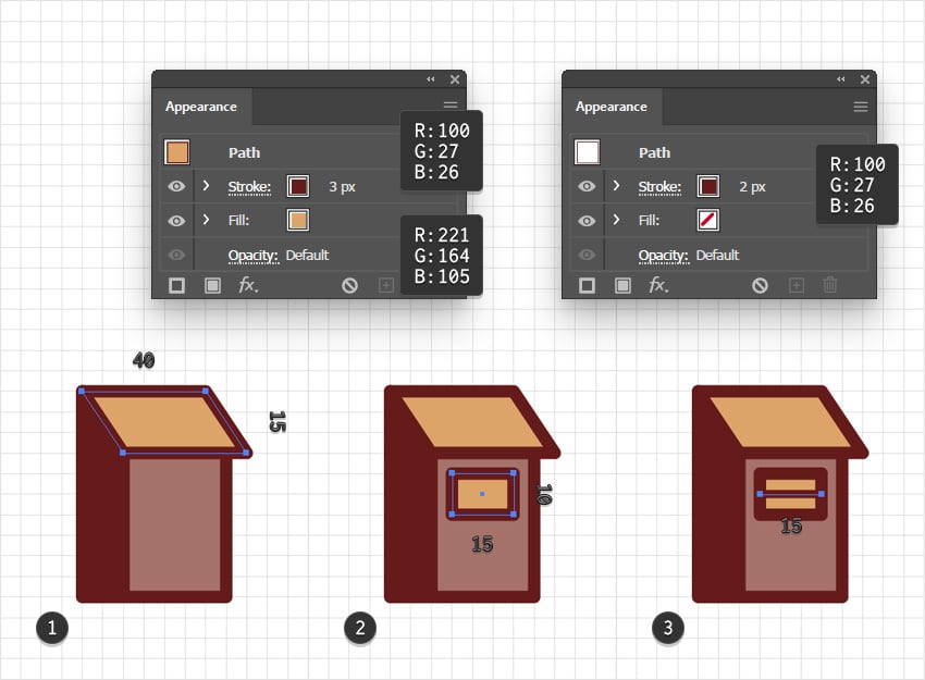
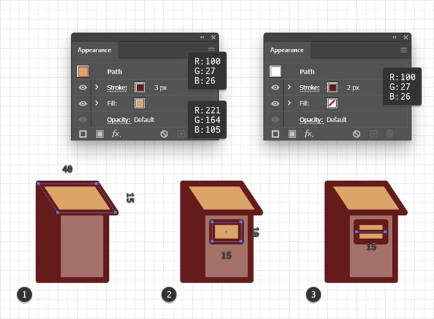
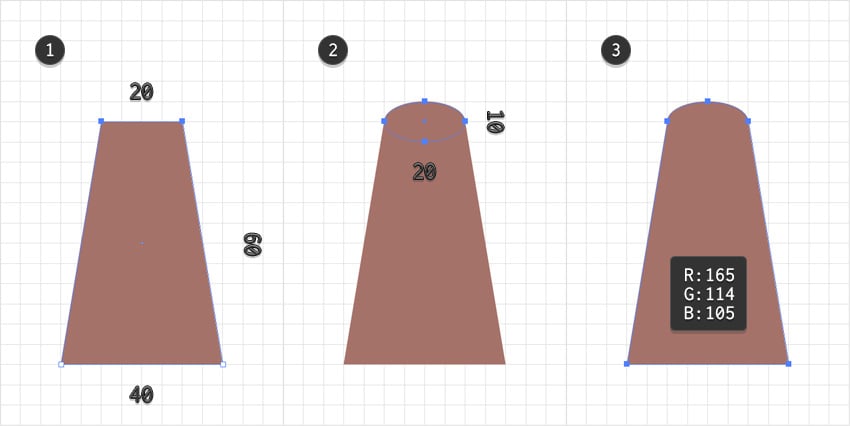
10. How to add a tiny house
Step 1
Use the Rectangle Tool (M) to create a 40 x 30 px shape and fill it with R=165 G=114 B=105. Using the same tool, add a 5 x 30 px shape, fill it with R=223 G=177 B=167, and place it as shown in the second image. Select the larger rectangle to add a copy in place (Control-C > Shift-Control-V) and select it. Remove the fill color and add a 3 px stroke. Set its color to R=100 G=27 B=26.
Step 2
Use the Pen Tool (P) to create a shape like the one shown in the first image. Fill it with R=221 G=164 B=105 and add a 3 px stroke with the color set to R=100 G=27 B=26.
Using the same appearance attributes and the Rectangle Tool (M), create two 5 x 10 px shapes and place them as shown in the second image.


Step 3
Grab the Pen Tool (P) and draw two horizontal paths as shown in the first image. Add a 2 px stroke for these paths and set the color to R=100 G=27 B=26. Using the same tool and settings, add the three horizontal paths shown in the second image.


Step 4
Select all the shapes that make up your house and Group them (Control-G). Place this group next to the “L” and then grab the Pen Tool (P) to draw the paths that should connect the house with your letter design.


11. How to create the larger smokestack
Step 1
Add a new layer, drag it below the existing ones, and then select it.
Start by creating the trapezoid shape shown in the first image, and fill it with R=165 G=114 B=105. Continue with the Ellipse Tool (L) and use it to add a 20 x 10 px shape, as shown in the second image.
Step 2
Add the shadow and the highlight along with the outline, just as you did for the other design elements, and then stylize them as shown below.

Step 3
Use the Ellipse Tool (L) to create a 20 x 10 px and a 30 x 10 px shape, and then place them as shown in the first image. Remove the fill color, and then add a 3 px stroke and set its color to R=100 G=27 B=26.
Use the Direct Selection Tool (A) to select the four anchor points highlighted in the first image and simply press the Delete key to remove them. Keep the remaining paths selected, open the Stroke fly-out panel, and check that Round Cap button to add a nice roundness to the ends of your paths.
Step 4
Select all the shapes that make up this new smokestack design. Feel free to Group them (Control-G), and place the smokestack as shown in the first image.
Using the Rectangle Tool (M), create a 55 x 15 px shape, fill it with R=110 G=27 B=26, and place it behind the second “I”, as shown in the first image. Create a copy of your smaller castle tower and place it as shown in the third image.

Step 5
As always, use the Pen Tool (P) to draw some paths that will connect the two elements with your letter design.


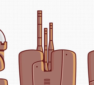
12. How to decorate the text effect with antennas
Step 1
Add a new layer, drag it below the existing ones, and then select it.
Pick the Rectangle Tool (M) and create a 70 x 10 px shape. Remove the fill color and add a 3 px stroke. Set its color to R=100 G=27 B=26, and remember to check the Round Join button to add that nice roundness for the corners.
Continue with the Pen Tool (P) and draw six vertical paths along with a tiny horizontal one, as shown in the second image.
Using the Ellipse Tool (L), add a 10 px circle and place it as shown in the third image. Fill it with R=221 G=164 B=105 and keep the stroke.
Step 2
Pick the Rectangle Tool (M), create a 10 x 20 px shape, and place it as shown in the first image. Remove the fill color and keep the existing stroke settings.
Switch to the Direct Selection Tool (A) and use it to select the two anchor points highlighted in the first image, and then set the Corners Radius to 5 px.

Step 3
Using the Pen Tool (P), draw a vertical path and three horizontal ones, as shown below. Apply a 1 px stroke to all these paths and keep the color set to R=100 G=27 B=26.
Step 4
Duplicate the shapes highlighted in the following image and flip the copies using the Reflect Tool (O).
Select all the shapes that make up your antenna and Group them (Control-G).
Step 5
Place your antenna behind the larger castle tower as shown below, and then use the Pen Tool (P) to draw some simple cables. Add a simple 1 px stroke for these paths.

Step 6
Duplicate your antenna group (Control-C > Control-V). Add a copy behind the first “I” and another one behind the “L”. Connect your antennas with the other elements using the same thin wire designs.


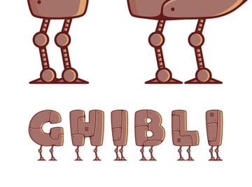
Here’s how your text effect should look in the end, more or less. You can continue and create a background in the Studio Ghibli art style if you want.
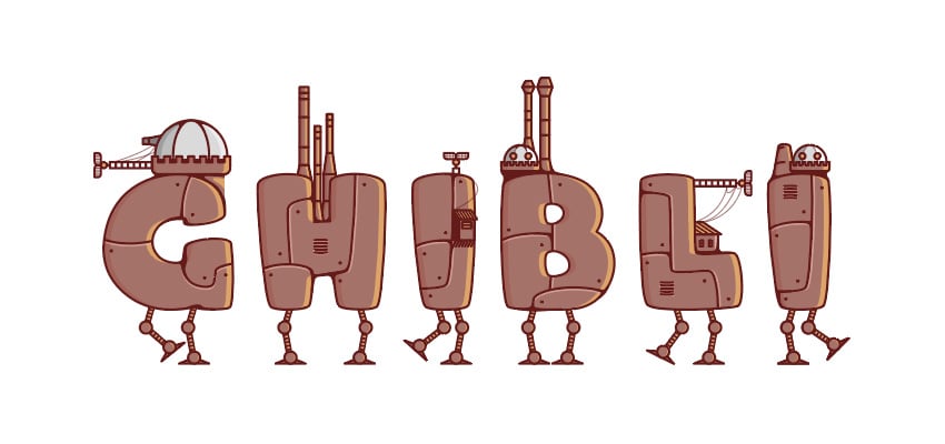


Congratulations! You’re done!
Here is how your Studio Ghibli art design should look. I hope you’ve enjoyed this tutorial and can apply these techniques in your future projects.
Feel free to build on these Ghibli aesthetics and make your own design. You can find some great sources of inspiration at Envato, with interesting solutions to improve your Studio Ghibli concept art.


Popular assets in the Ghibli aesthetic from Envato
Envato is an excellent resource for projects that use the Studio Ghibli art style as inspiration. Here’s a short list of some of the most popular assets that you can find.
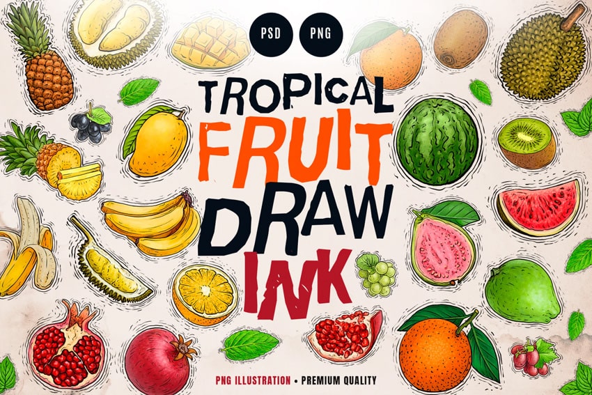
Tropical Fruit Illustration (PNG, PSD)
Here’s a set of illustrations that bring the Studio Ghibli art style to a collection of fruit, capturing their natural beauty with soft lighting and gentle shading.


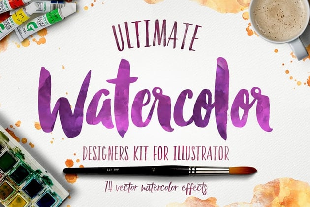
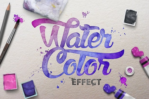
Watercolor Kit for Illustrator (ASL, PNG, PDF, AI)
Here’s a complete watercolor kit, perfect for creating Illustrator text effects inspired by the well-known Ghibli aesthetic.

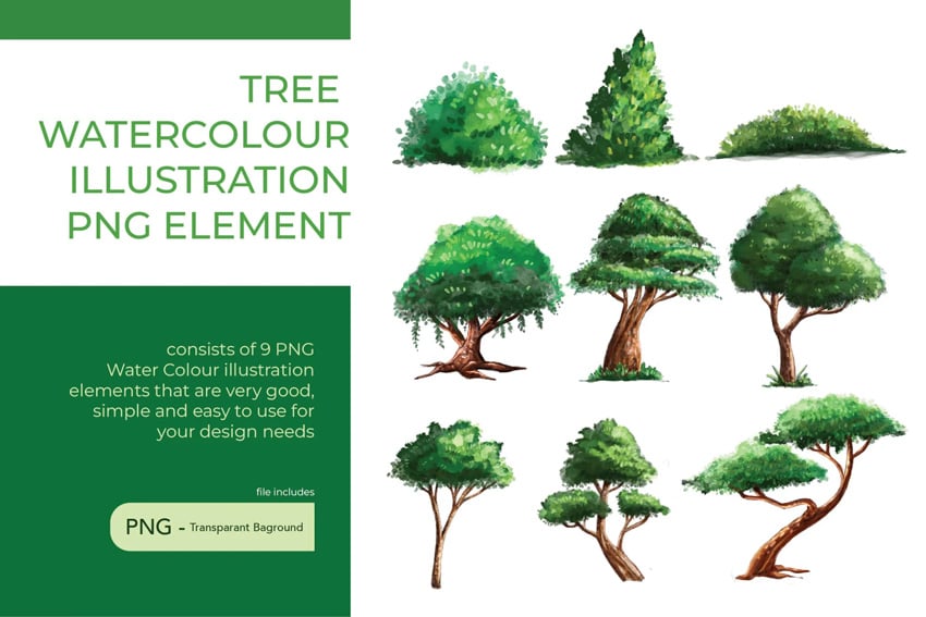
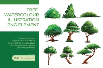
Tree Watercolor Illustration Element (PSD, PDF, INDD, AI)
Bring that Studio Ghibli art style to your designs with this set of watercolor tree illustration elements. Each tree is delicately hand-painted, capturing the organic textures and soft color transitions that are specific to the Ghibli aesthetic.

Watercolor Scene Text Effect (PSD)
Here’s one of the many text effects that can be found at Envato. This stunning watercolor text effect blends vibrant color washes with soft, organic textures.


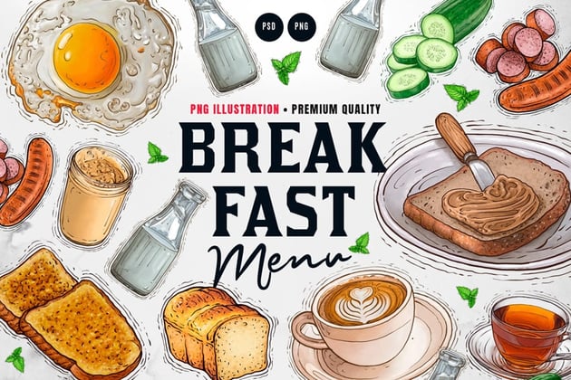
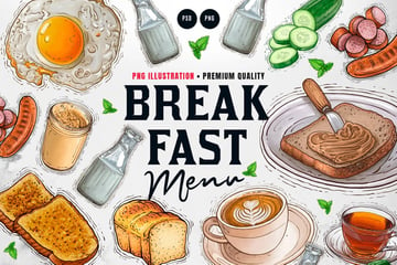
Breakfast Menu Illustration ( PSD, PNG)
Here’s a collection of breakfast menu illustrations, inspired by Studio Ghibli concept art. From fluffy pancakes to perfectly brewed coffee, each illustration captures the cozy, hand-painted feel reminiscent of Miyazaki’s beautifully crafted food scenes.

Want to learn more?
We have loads of Illustrator text effects on Envato Tuts+, from beginner to intermediate level. Take a look!