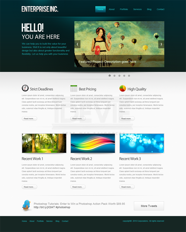
How to Create a Professional Web Layout in Photoshop
Designing good looking clean and functional Web layouts is an essential part of a Web Designers life. In this tutorial we are going to create a clean and professional Web layout in Photoshop from scratch. Along the way you can learn useful methods to create designs. So get started!
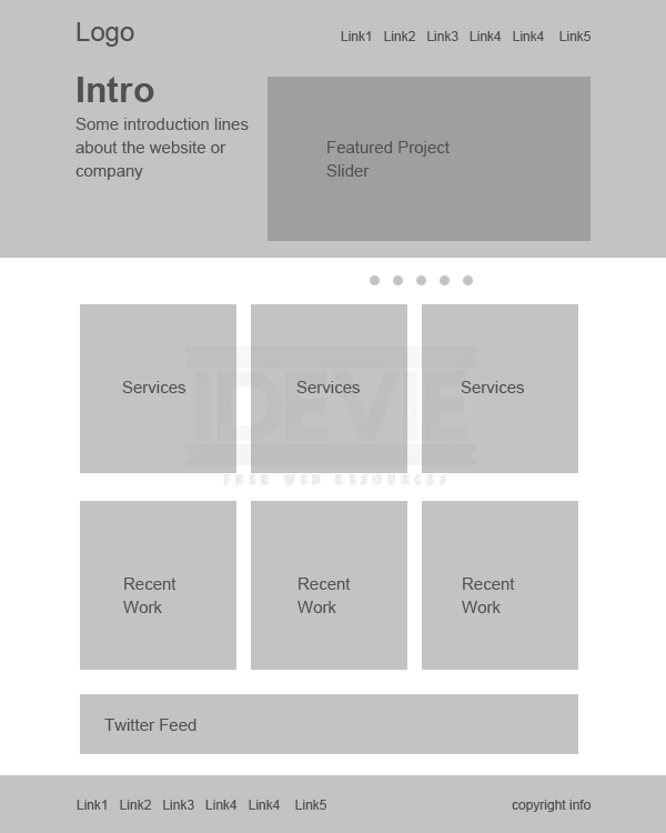
Before we start designing, we need to plan out the requirements, looks and the functionality. Then we need to fit these ideas into a layout to execute them visually. Mockups and wire frames are greatly useful to create layouts with lot of flexibility. It is a best practice and highly encouraged in the Industry.
I put the below one together using only grey tones. That way we eliminate color from the scene at this point. So that we can concentrate on the layout as a whole and avoid messing up with colors. That gives much freedom to quickly alter and rearrange things. A mockup can be as detailed as you want. For this purpose I am going with the below one. Just briefly defining the layout and what goes where.
Step 2 : Set up the Canvas
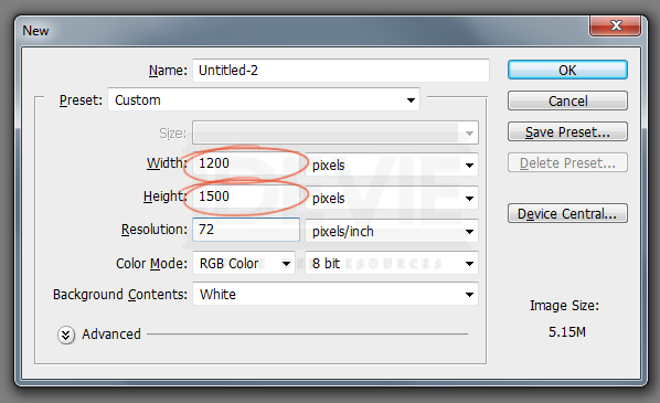
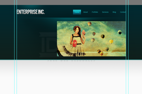
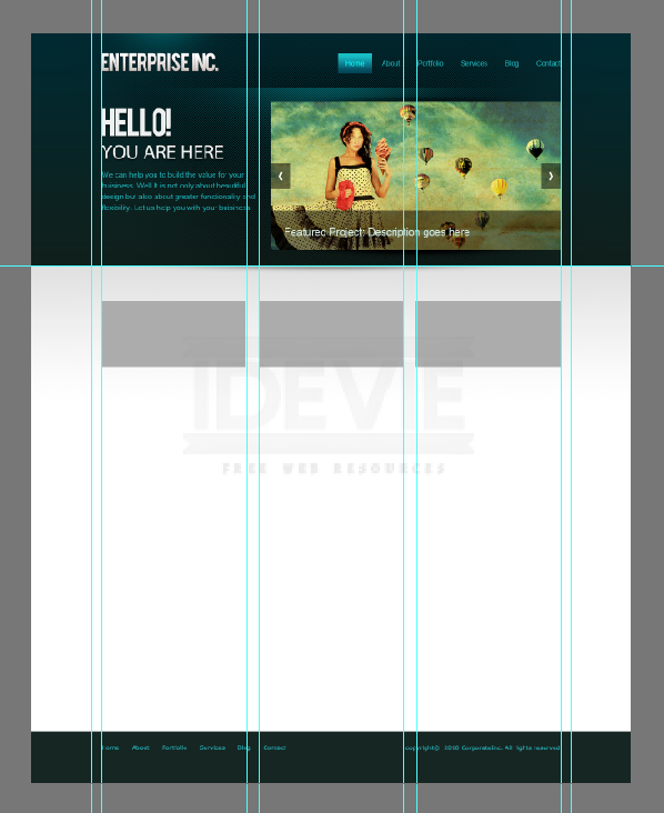
So we have a blue print for our layout. Let’s actually put the design together! We are going to create a 960 pixel wide layout. Create a new document at 1200 x 1500.
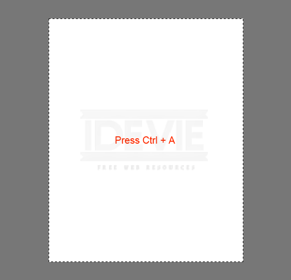
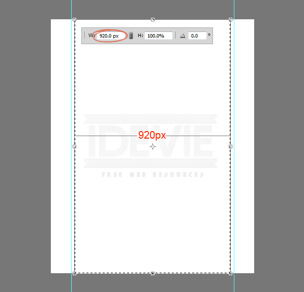
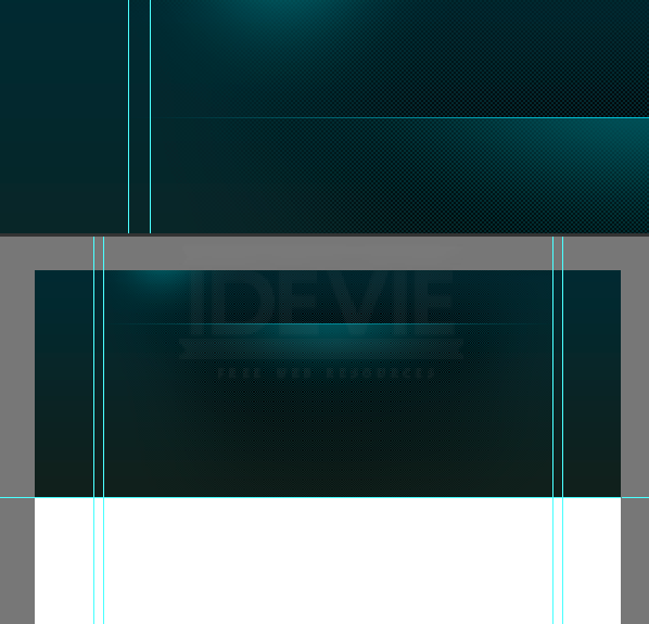
This is a 960 pixel wide layout, so we need define the work area by adding guidelines. Press Ctrl+A to select the entire document.
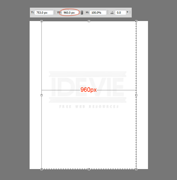
Go to Select > Transform Selection. Shrink the selection down to 960 pixels wide. That is the work area of the layout.
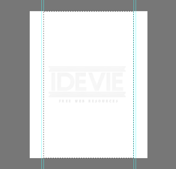
Add guide lines to the selection.
We need to create some padding between the border and the content that we will add later! With the selection active again choose Transform Selection. Resize the selection to 920 pixels wide. That means 20 pixels of padding each side totaling 40 pixels of padding.
Add guides to the selection.
Step 3 : Create the Header
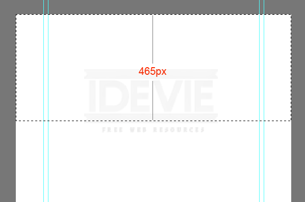
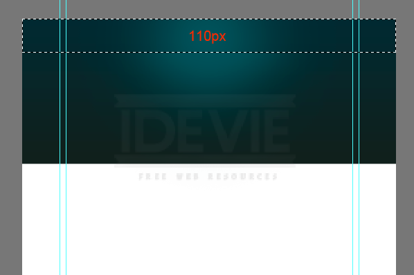
Let’s create the header of the layout! Make a selection that is 465 pixels in height.
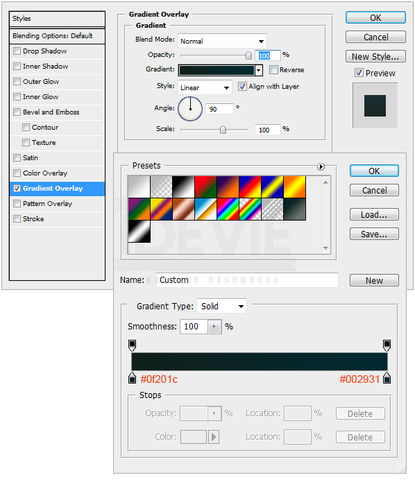
Fill the selection with a gray value first and later use the Layer Styles to add colors and gradients. Follow this throughout the design to maintain a visual hierarchy.
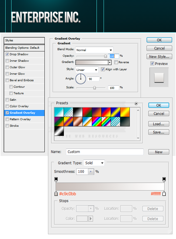
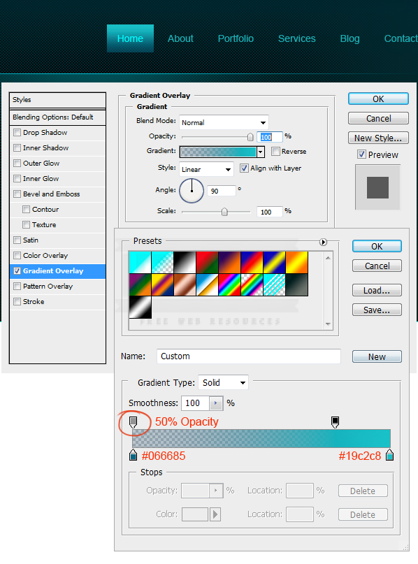
Add Gradient to the header. Double click on the layer thumbnail. Select Gradient Overlay. Create the below 2 color gradient. Use the settings.
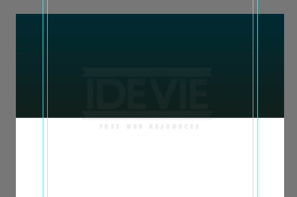
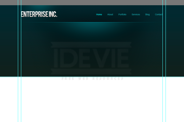
It should look like this.
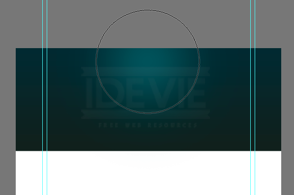
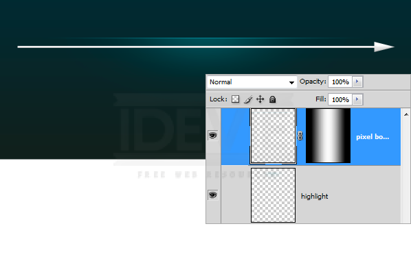
Next need to add a highlight to the header. Create a new layer by pressing Ctrl+Alt+Shift+N. Pick a soft brush with a diameter of 600px. Pick #19535a for brush color. Just click once on the center of the header.
Make a selection from the top that is 110 pixels in height.
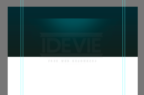
Hit Delete key to delete the selected portion. That looks like below.
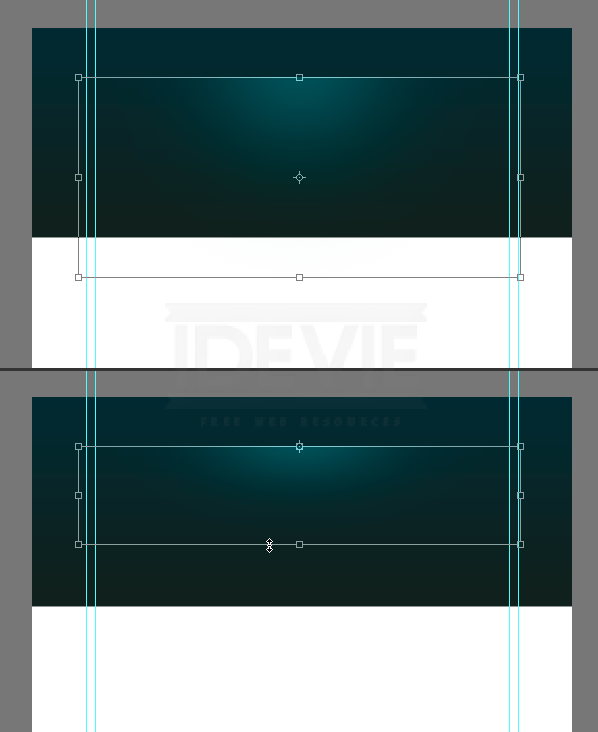
Shrink it vertically by pressing Ctrl+T.
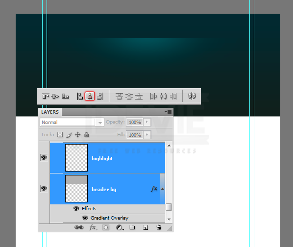
We need to make sure that the highlight spot is perfectly centered to the header. Select layers, header and highlight and press “V” to switch to Move Tool. On the Options Panel select Align Horizontal Centers button.
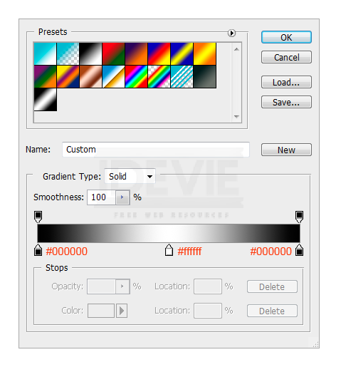
Create a new layer, draw a one pixel highlight line using the Pencil Tool with color #01bfd2.
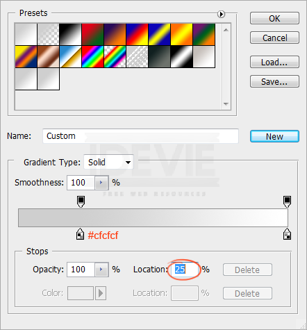
Hide the edges smoothly using a gradient mask. Pick the Gradient Tool, create the below gradient in the Options Panel.
Apply the above gradient.
Step 4 : Create Texture Pattern
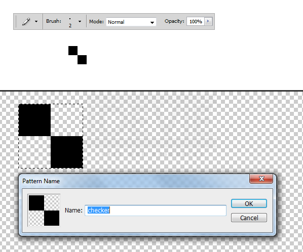
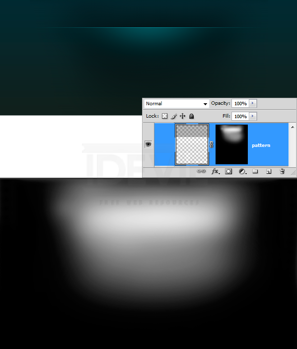
Now create a simple checker pattern and apply to the header. Pick the Pencil Tool, set the brush size to 2 pixels and add two dots that are touching each others corners. Turn off the background and select the dots. Choose Edit > Define Pattern.
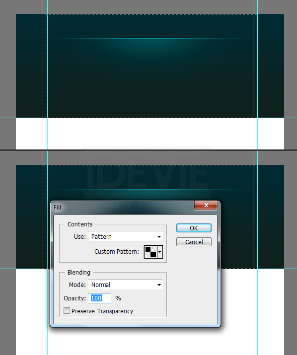
Create a new layer and place it below the highlight layer. Select the area we want to apply the pattern. Press Shift+F5 to load the Fill dialogue box. Choose the pattern that is just created. And OK.
The selection is filled with the pattern. Take a closer look.
Blend the pattern smoothly into the header. Add a Layer Mask to the pattern layer. Pick a soft brush and paint with a large soft brush. Pick #ffffff for brush color. Reduce the brush Opacity to about 60% and paint. If you find it too strong then adjust the layer opacity individually.
Nicely blended.
Step 5 : Adding the Logotype
The background is pretty much completed. Now add the logo type. Before adding the type add a highlight that stays behind the logo. Pick a soft brush with #19535a. Add a spot.
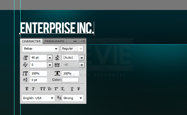
Add the Type. The font face I used is “Bebas”. Download it for free.
Apply subtle effects to the logo.
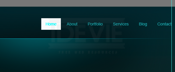
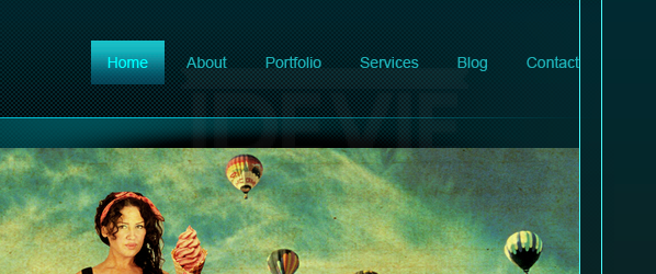
Step 6 : Navigation
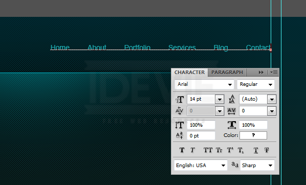
Add the navigation links.
Create the navigation button. Use Rectangular Marquee Tool. Fill any color. Then Lower the Fill Opacity to zero.
Double click on the layer thumbnail, select Gradient Overlay. Use these settings.
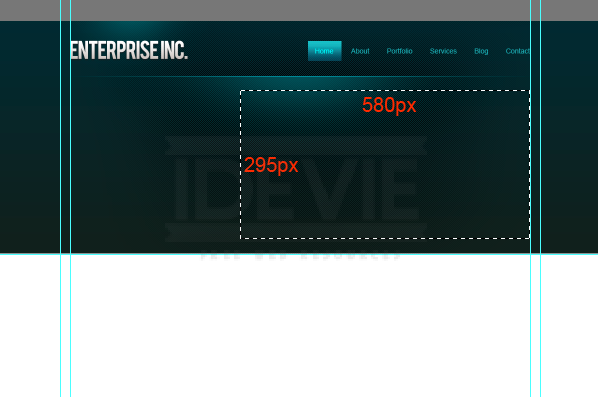
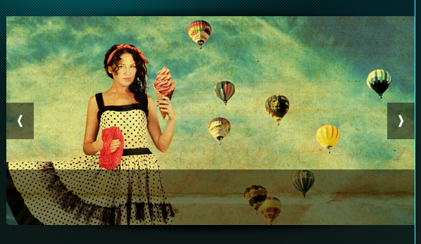
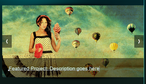
Step 7 : Content Slider
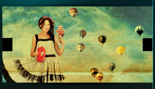
Make selection that is 580 x 295 pixels.
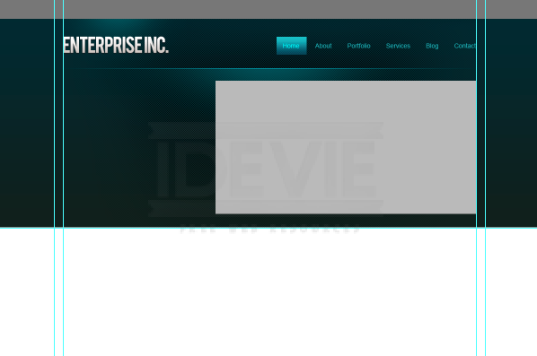
Fill the selection with a grey tone.
Bring in the image you want to use. Clip it to the base layer we created above.
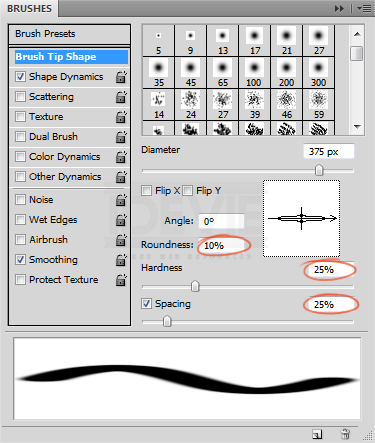
Now add shadow effect to the slider. Create a new layer. Select the Brush Tool, set the diameter to 400 pixels. Open the Brushes palette, decrease the roundness. Use the below settings.
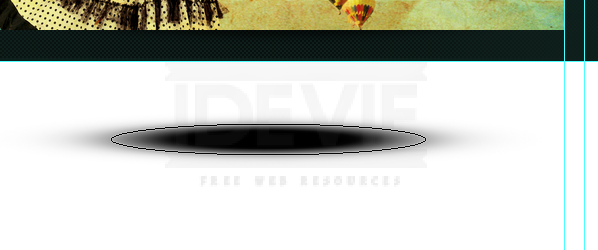
Set the brush color to #000000 and add spot.
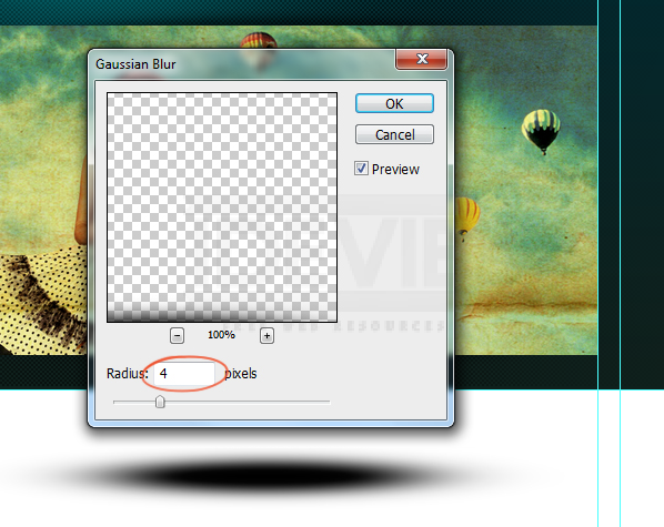
Apply some Gaussian Blur to soften the edges.
Select the bottom half of the shadow and delete it.
Reposition the shadow just above the slider.
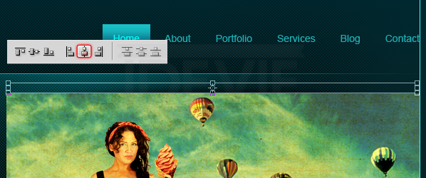
I shrunk it vertically. Next align it centered to the slider. Select both layers and on the Options Panel click on the Align Horizontal Centers button.
Duplicate the shadow and rotate it vertically. Place it on the bottom edge of the slider.
Create slider control buttons using Rectangular Marqee Tool. Fill #000000.
Lower the buttons Opacity to 50%
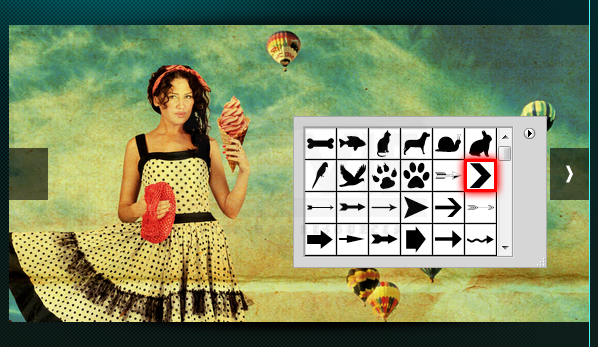
Open the auto shapes from the Options Panel and select this arrow. Add it to the buttons.
Add a strip. Fill with #000000.
Lower the Opacity to 50%.
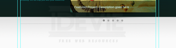
Here we can add description about the project.
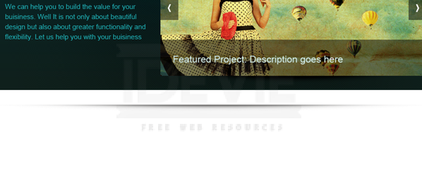
Step 8 : Add some Welcome Lines
A welcome and some description about the website goes here.
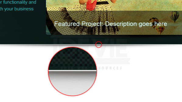
Step 9 : Finishing up the Header
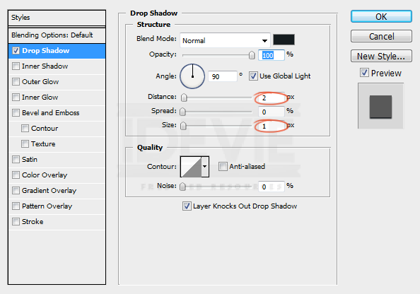
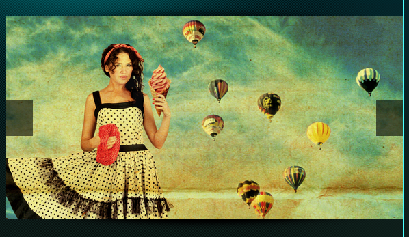
We almost finished the header. Let’s add a subtle shadow effect to the finish things off! Create a shadow just as we created earlier using the brush tool.
Leave 1px gap between the header and the shadow.
Step 10 : Apply Gradient to the Background
Create a light grey to white gradient.
Create a new layer below the header and apply the gradient.
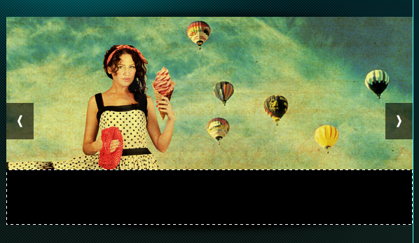
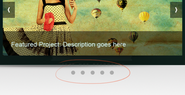
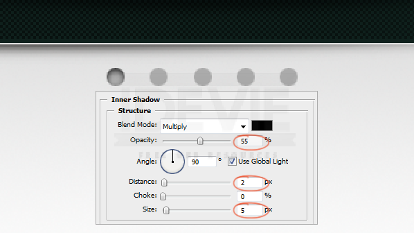
Step 11 : Add Slider Rotation Controls
Create rotation controls.
Apply Inner Shadow to one control to indicate the current active item in the slider.
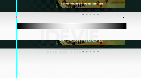
Step 12 : Create Content Divider
Select the Pencil Tool and draw 1 pixel line. Pick light gray (#aaaaaa).
Hide the edges smoothly using gradient mask.
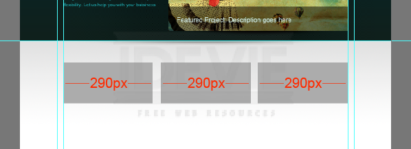
Step 13 : Adding the Main Content
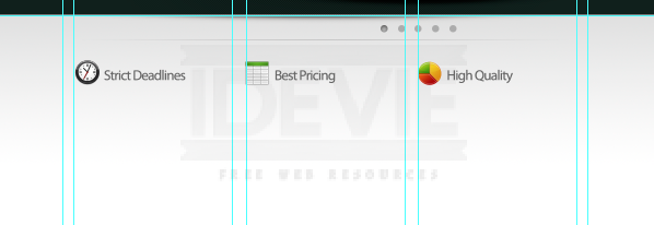
It is time to get into the actual content part. This is a 3 column layout. We need to create 3 equal columns with some padding between them. I did a simple calculation and divided the available space into 3 equal width boxes with 25 pixels padding between them.
Add guide lines to the boxes. Then remove the boxes. And these are the columns.
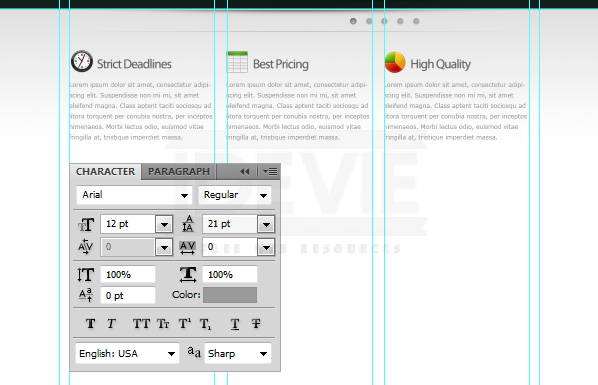
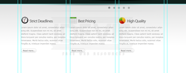
Add some featured services. Drop in the icons from the Function icon set. Maintain distance between objects uniformally.
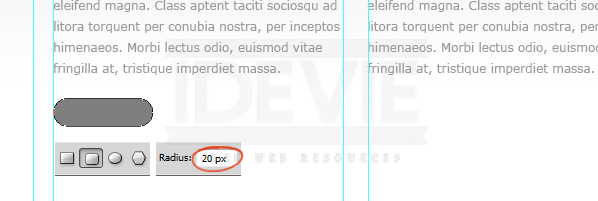
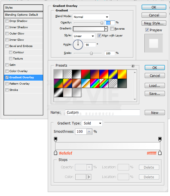
Let’s create a simple “Read More” button. Select the Rounded Rectangle Tool to draw the shape. Make sure it is a Shape Layer.
Apply Gradient Overlay and Stroke to the button.
Duplicate the button.
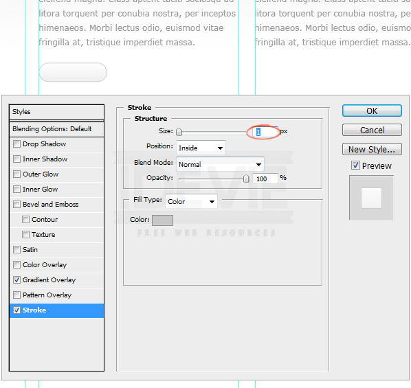
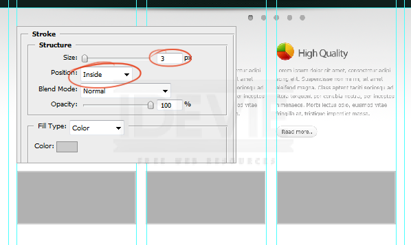
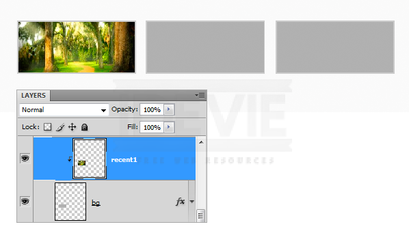
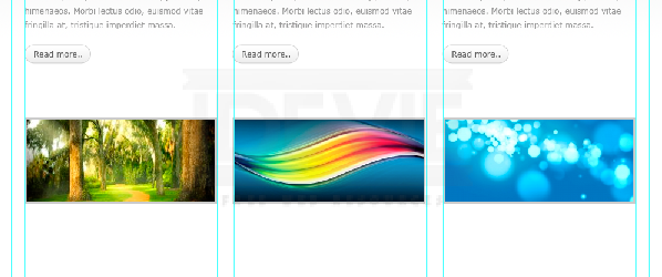
We will add some recent work items. I drew three image holder boxes and applied 3 pixel stroke .
Clip the images to the boxes.
I created shadow like we did earlier and placed it below the boxes.