In the past, we’ve discussed various Bootstrap 4 extensions. Today I’ll show you how to convert Bootstrap pills (tabs) into a dropdown. Most importantly we’ll keep both these components in sync. We’ll use pills for the desktop layout and a dropdown for mobile screens.
Note: for this exercise, I’m going to use Bootstrap 4 latest stable version (v4.6). As soon as v5 goes stable, I might revisit this topic and implement a solution for this version as well.
Our Bootstrap Extension
Check out the final demo! Click on a dropdown item to see how the corresponding tab panel appears. Additionally, open the demo and check its layout on a large screen. You’ll see that pills replace the dropdown without changing the active panel.
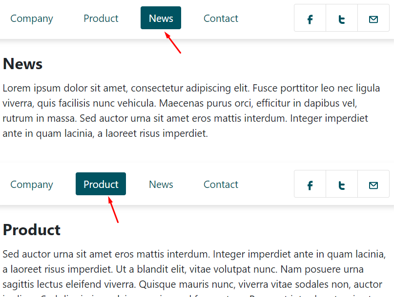
Here’s how they appear in their two states:
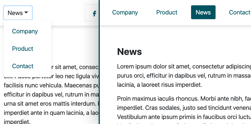
Why do this? By default Bootstrap tabs and pills don’t have responsive behavior, other than stacking/wrapping. A dropdown menu is a far more elegant solution for small screens.
Bootstrap Tabs and Pills
Bootstrap tabs help us divide content into multiple sections that live under a common parent. At any given time only one of these sections is visible. Imagine them like browser tabs; the difference being that you don’t have to change the page to view them all.

Bootstrap pills are essentially just tabs with a different layout.

For this example, we’re going to use pills. However, you can just as easily use tabs instead. All you have to do is to change the tabs-related markup/classes with the pills-related one(s).
1. Include Bootstrap Assets
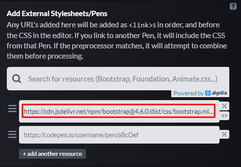
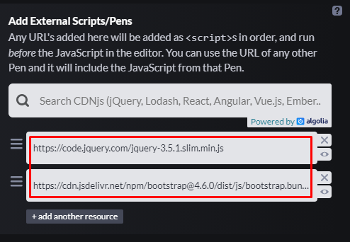
To kick things off, we’ll include the required CSS and JavaScript files within our Codepen demo:
2. Build the Project Layout
Our project on medium screens and above (≥768px) will look like this:
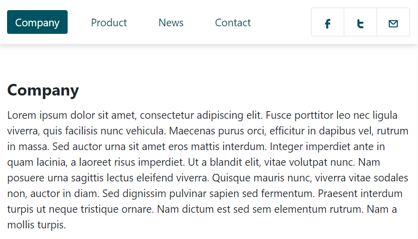
Here we’ll have a container that will include:
- The pills.
- The content for each pill (tab panels).
- The social links.
The required markup:
<div class="tabs-to-dropdown">
  <div class="nav-wrapper d-flex align-items-center justify-content-between">
    <ul class="nav nav-pills d-none d-md-flex" id="pills-tab" role="tablist">
      <li class="nav-item" role="presentation">
        <a class="nav-link active" id="pills-company-tab" data-toggle="pill" href="#pills-company" role="tab" aria-controls="pills-company" aria-selected="true">...</a>
      </li>
      <li class="nav-item" role="presentation">
        <a class="nav-link" id="pills-product-tab" data-toggle="pill" href="#pills-product" role="tab" aria-controls="pills-product" aria-selected="false">... </a>
      </li>
      <li class="nav-item" role="presentation">
        <a class="nav-link" id="pills-news-tab" data-toggle="pill" href="#pills-news" role="tab" aria-controls="pills-news" aria-selected="false">... </a>
      </li>
      <li class="nav-item" role="presentation">
        <a class="nav-link" id="pills-contact-tab" data-toggle="pill" href="#pills-contact" role="tab" aria-controls="pills-contact" aria-selected="false">...</a>
      </li>
    </ul>

    <ul class="list-group list-group-horizontal">
      <!-- social links here -->
    </ul>
  </div>

  <div class="tab-content" id="pills-tabContent">
    <div class="tab-pane fade show active" id="pills-company" role="tabpanel" aria-labelledby="pills-company-tab">...</div>
    <div class="tab-pane fade" id="pills-product" role="tabpanel" aria-labelledby="pills-product-tab">...</div>
    <div class="tab-pane fade" id="pills-news" role="tabpanel" aria-labelledby="pills-news-tab">...</div>
    <div class="tab-pane fade" id="pills-contact" role="tabpanel" aria-labelledby="pills-contact-tab">...</div>
  </div>
</div>
The majority of this markup comes from Bootstrap documentation, just a few things have changed.
On smaller screens (<768px), we’ll replace the pills with a dropdown like this:
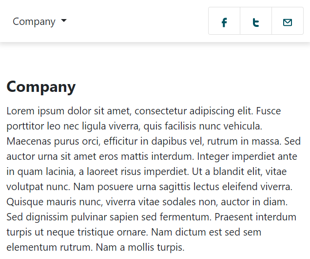
But, here’s the interesting thing: if you check the markup above, you’ll notice that we haven’t defined any dropdown component. We’ll dynamically include it on the page through JavaScript.
3. Add Some Basic Styles
Next, we’ll specify some basic styles for our project. Pretty simple stuff. We’ll only override some of Bootstrap default styles to fit our layout. For example, we’ll change the aesthetics of the pills and give .container-fluid a maximum width of 1250px.
The styles:
:root {
  --darkgreen: #005361;
  --white: #fff;
}

* {
  padding: 0;
  margin: 0;
  box-sizing: border-box;
}

body,
.tabs-to-dropdown .dropdown-toggle,
.tabs-to-dropdown .dropdown-item {
  font-size: 1.3rem;
}

.tabs-to-dropdown .nav-wrapper {
  padding: 15px;
  box-shadow: 0px 5px 10px rgba(0, 0, 0, 0.12);
}

.tabs-to-dropdown .nav-wrapper a {
  color: var(--darkgreen);
}

.tabs-to-dropdown .nav-pills .nav-link.active {
  background-color: var(--darkgreen);
}

.tabs-to-dropdown .nav-pills li:not(:last-child) {
  margin-right: 30px;
}

.tabs-to-dropdown .tab-content .container-fluid {
  max-width: 1250px;
  padding-top: 70px;
  padding-bottom: 70px;
}

.tabs-to-dropdown .dropdown-menu {
  border: none;
  box-shadow: 0px 5px 14px rgba(0, 0, 0, 0.08);
}

.tabs-to-dropdown .dropdown-item {
  padding: 14px 28px;
}

.tabs-to-dropdown .dropdown-item:active {
  color: var(--white);
}

@media (min-width: 1280px) {
  .tabs-to-dropdown .nav-wrapper {
    padding: 15px 30px;
  }
}
4. Add the JavaScript
We’ll start by looping through all .tabs-to-dropdown elements, and for each one of them, several actions will take place:
const $tabsToDropdown = $(".tabs-to-dropdown");

$tabsToDropdown.each(function () {
  const $this = $(this);
  const $pills = $this.find(’a[data-toggle="pill"]’);

  generateDropdownMarkup($this);

  const $dropdown = $this.find(".dropdown");
  const $dropdownLinks = $this.find(".dropdown-menu a");

  $dropdown.on("show.bs.dropdown", showDropdownHandler);
  $dropdownLinks.on("click", clickHandler);
  $pills.on("shown.bs.tab", shownTabsDropdown);
});
Note #1: we’ll use a loop here as we assume that our page can contain more than one .tabs-to-dropdown element.
Note #2: in the code above, first we’ll create the dropdown, then we’ll reference it. That’s why the generateDropdownMarkup() function comes before the dropdown-related variables.
Create the Dropdown Component
First, we’ll call the generateDropdownMarkup() function and pass to it the related .tabs-to-dropdown element.
Here’s the function declaration:
function generateDropdownMarkup(container) {
  const $navWrapper = container.find(".nav-wrapper");
  const $navPills = container.find(".nav-pills");
  const firstTextLink = $navPills.find("li:first-child a").text();
  const $items = $navPills.find("li");
  const markup = `
    <div class="dropdown d-md-none">
      <button class="btn dropdown-toggle" type="button" id="dropdownMenuButton" data-toggle="dropdown" aria-haspopup="true" aria-expanded="false">
        ${firstTextLink}
      </button>
      <div class="dropdown-menu" aria-labelledby="dropdownMenuButton">
        ${generateDropdownLinksMarkup($items)}
      </div>
    </div>
  `;
  $navWrapper.prepend(markup);
}
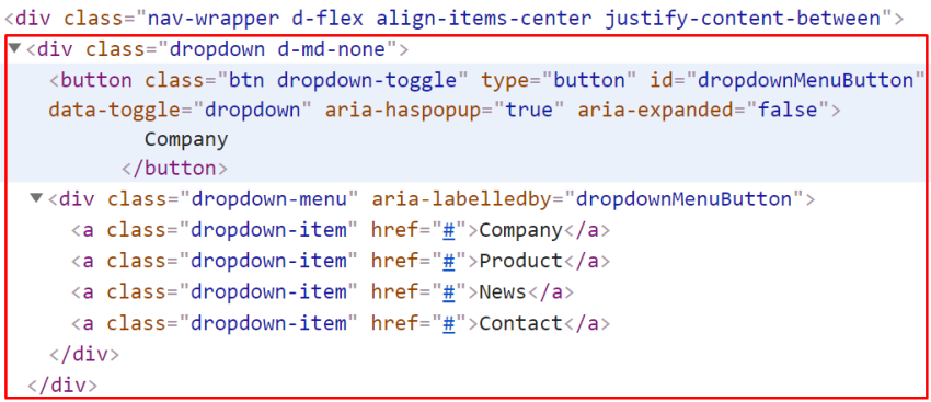
This function will generate the code for the dropdown toggle component and prepend it to the .nav-wrapper element. To achieve this, inside this function, we’ll call the generateDropdownLinksMarkup() one that will be responsible for creating the dropdown menu items. Their text will match the text of the corresponding pills.
Here’s the function declaration:
function generateDropdownLinksMarkup(items) {
  let markup = "";
  items.each(function () {
    const textLink = $(this).find("a").text();
    markup += `<a class="dropdown-item" href="#">${textLink}</a>`;
  });

  return markup;
}
After executing these functions, the dropdown markup will look like this:
Hide Duplicated Menu Item
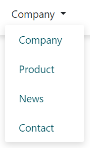
Each time we open the dropdown, we should prevent the toggle button also appearing as a menu item. So, instead of this:
We want this:
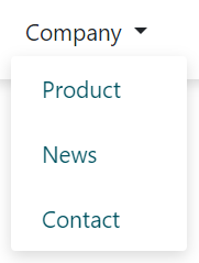
In this scenario, when the “Company” tab panel is active, the “Company” menu item should be hidden.
To implement this functionality, we’ll take advantage of the show.bs.dropdown event that Bootstrap provides:
...

const $dropdown = $this.find(".dropdown");

$dropdown.on("show.bs.dropdown", showDropdownHandler);

function showDropdownHandler(e) {
  // works also
  //const $this = $(this);
  const $this = $(e.target);
  const $dropdownToggle = $this.find(".dropdown-toggle");
  const dropdownToggleText = $dropdownToggle.text().trim();
  const $dropdownMenuLinks = $this.find(".dropdown-menu a");
  const dNoneClass = "d-none";
  $dropdownMenuLinks.each(function () {
    const $this = $(this);
    if ($this.text() == dropdownToggleText) {
      $this.addClass(dNoneClass);
    } else {
      $this.removeClass(dNoneClass);
    }
  });
}
Inside the callback function, we’ll do the following things:
- Grab the text of the toggle button.
- Loop through the menu links and consider if their text matches the button’s text.
- If this is the case, they will receive the
d-noneclass. Otherwise, they will lose this one.
Synchronize Dropdown With Pills
The last and most challenging step is to synchronize the dropdown and pills.
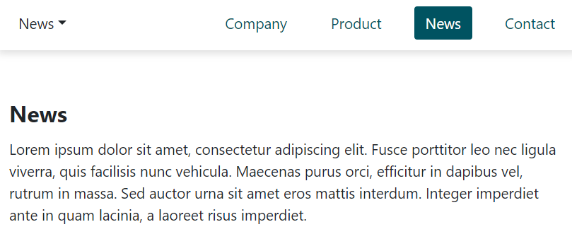
So first, each time we click on a dropdown menu item, the corresponding tab panel should appear.
Here’s the required code:
...

const $dropdownLinks = $this.find(".dropdown-menu a");

$dropdownLinks.on("click", clickHandler);

function clickHandler(e) {
  e.preventDefault();
  const $this = $(this);
  const index = $this.index();
  const text = $this.text();
  $this.closest(".dropdown").find(".dropdown-toggle").text(`${text}`);
  $this
    .closest($tabsToDropdown)
    .find(`.nav-pills li:eq(${index}) a`)
    .tab("show");
}
Inside the callback function, we’ll do the following things:
- Grab the index and text of the target/active link.
- Replace the toggle button text with the text of the active link.
- Select the pill whose index matches the index of the active link and show its associated panel.
Then, each time we click on a pill, the toggle button text should change and match the text of the appropriate pill.
To implement this functionality, we’ll take advantage of the shown.bs.tab event that Bootstrap provides:
...

const $pills = $this.find(’a[data-toggle="pill"]’);

$pills.on("shown.bs.tab", shownTabsHandler);

function shownTabsHandler(e) {
  // works also
  //const $this = $(this);
  const $this = $(e.target);
  const index = $this.parent().index();
  const $parent = $this.closest($tabsToDropdown);
  const $targetDropdownLink = $parent.find(".dropdown-menu a").eq(index);
  const targetDropdownLinkText = $targetDropdownLink.text();
  $parent.find(".dropdown-toggle").text(targetDropdownLinkText);
}
Inside the callback function, we’ll do the following things:
- Grab the index of the active pill.
- Grab the text of the dropdown menu item whose index matches the index of the active pill.
- Replace the text of the dropdown toggle button with the text of the corresponding menu item.
Conclusion
That’s all, folks! Thanks for following along with another Bootstrap 4 tutorial. Hopefully, this extension gave you an idea about how to handle pills in a mobile layout. As you saw, converting them into a fully functional dropdown component isn’t as difficult as it might appear.
Go ahead and do the same work with the tabs this time!
If you found this solution helpful or in case you have any questions, drop me a line! Plus, let me know if you want to see any other Bootstrap extensions.
Here’s a reminder of our extension:
As always, thanks a lot for reading!
Bootstrap Tutorials and Resources
 Bootstrap25+ Amazing Bootstrap Templates to Try in 2021
 Bootstrap 4Quick Tip: How to Customize Bootstrap 4’s Accordion Component
 Bootstrap 4How to Add Deep Linking to the Bootstrap 4 Tabs Component
 Bootstrap15 Feature-Packed Bootstrap Admin Templates
 Bootstrap 4How to Make the Bootstrap Navbar Dropdown Work on Hover


